The Pros
- Comes with a remote
- Smart home screen
- Reasonable price
The Cons
- Canadian support is limited
- Volume rocker a little small
- No Stadia yet
Google has finally released a product that deserves to be at the centre of your living room.
The company has been fighting for living room dominance for years. It may have come close with the first Chromecast in 2013, but I suspect its popularity had more to do with the device’s low price than its feature set. Now seven years later, the company has released the perfect streaming stick for most people, and it’s still reasonably priced.
Since then, other low-cost rivals from Amazon and Roku have threatened Google’s place behind your TV. But, with the newest Chromecast, Google is pulling out all the stops to make sure the new device is the perfect living room companion for everyone. Or at least everyone that is already embedded in its smart home/smartphone ecosystem.
The new Chromecast with Google TV excels in a Google-centric space with a voice control conduit nearby. Plus, the new Google TV interface is a treat compared to the existing Android TV and Chromecast interfaces. To top it all off, the company included a small remote this time around to make it more accessible for all people.
What you need

When it boils down to what people need in a smart TV device, Google has nailed it with this tiny, unassuming smart device.
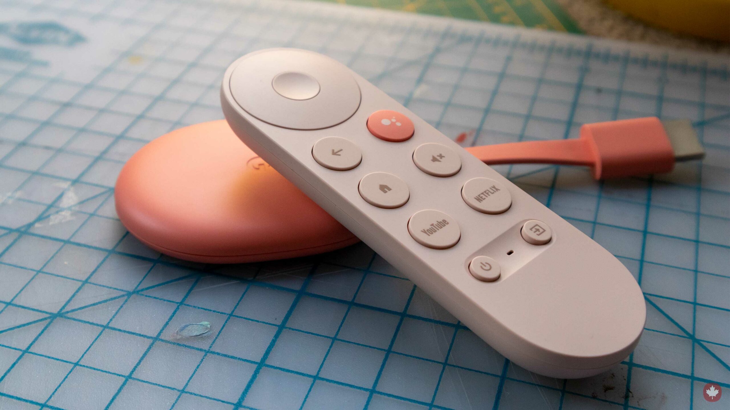
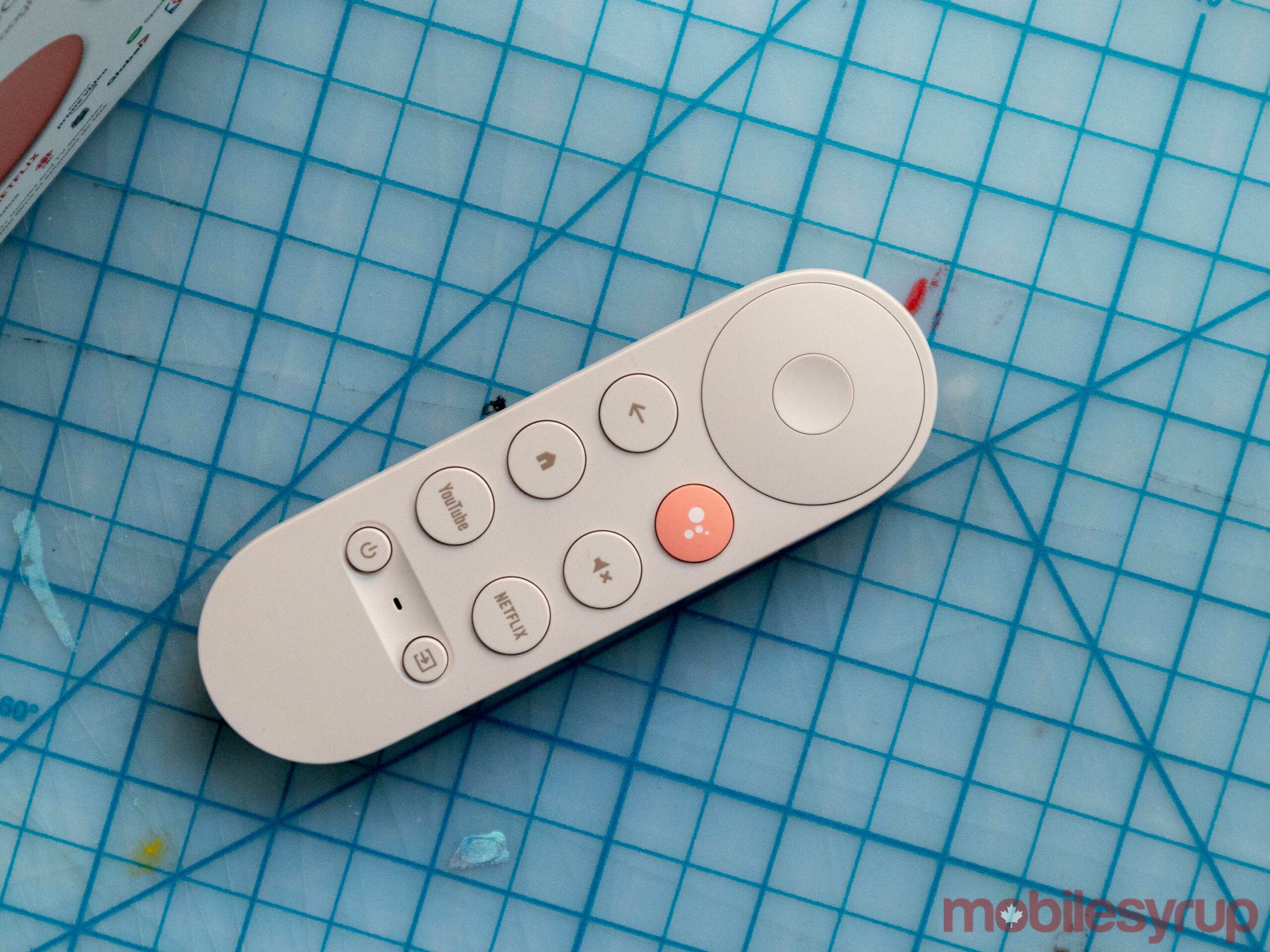
The most significant addition to the Chromecast is the new remote. Beyond looking very cute, it also has quick access to YouTube, Netflix and Google Assistant. While it would have been cool to have a programmable button to map to Crave or another streaming service, I don’t hold much against the controller’s layout. The volume rocker on the right side could be slightly larger, but I’m getting used to it quickly enough.
The remote features an IR blaster, and the device has HDMI-CEC compatibility. This means the Chromecast can control accessories including your TV’s volume, power and inputs with either the remote or voice once you go through the initial set up.
Once you start watching content, it can stream in 4K with HDR, with support for Dolby Vision, HDR10, and HDR10+. It’s equally as well equipped with Dolby Atmos, and Digital Plus surround support on the audio side of things.
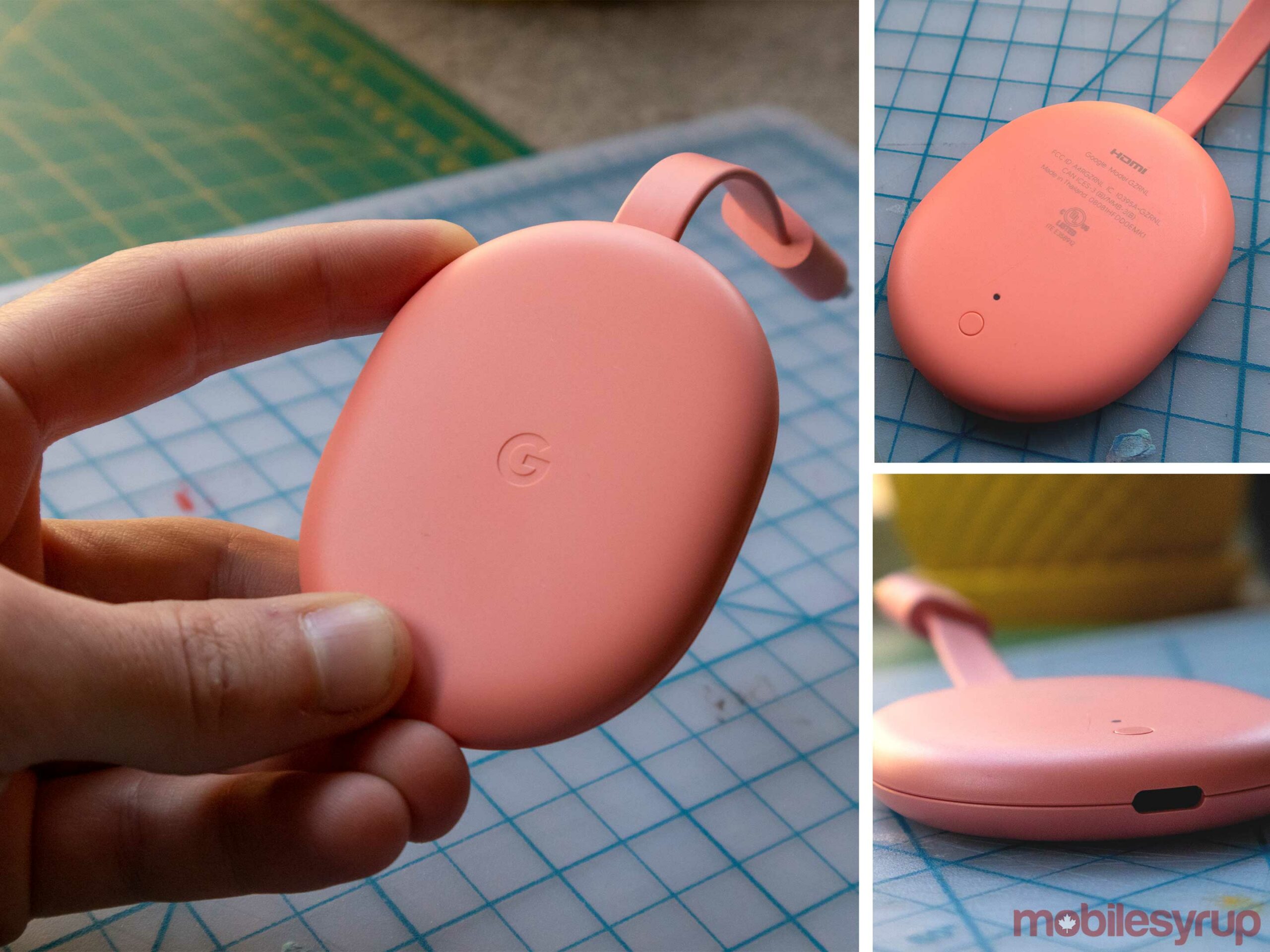
While there isn’t an ethernet connector included with the device, I’ve found no issues with its Wi-Fi connectivity so far. I’ve even been able to play games via Stadia over Wi-Fi without any problems. If you want an even more stable connection, you can buy an Ethernet adapter from Google for $26 CAD.
No smart TV would be complete without an app store, and the new Chromecast has a good one. Since it runs on Android TV, all of the apps you’d expect are here, except for Stadia. However, since it’s running Android TV at its core, you can still sideload apps onto it easily enough.
Overall, you get what you need from the Chromecast with Google TV, making it an easy choice for anyone already in Google’s ecosystem. Since it’s only $70 CAD, it’s the same price as the FireTV stick 4k and the Roku Streaming Stick+.
What you want
Where the device separates itself from the pack is its new Google TV software.
As soon as you open the main screen, you’re greeted with a clean and modern look that instantly fits in with Google’s other software like Android 11 and Chrome OS. Looking nice is only half the battle, and the company also made Google TV straightforward to use.
The main page is where I’ve been spending 80 percent of my time. It starts at the top with some recommended content for me from services like Netflix, Prime Video and Disney+. There are also recommendations to rent right from Google, but so far, nothing from CBC Gem or Crave has appeared on the main screen.
The lack of Crave specifically is annoying since Google keeps recommending HBO content to me on the home page, but instead of directing me to watch it in Crave, it asks me to rent it.
The first row of content includes a curation of recommended shows and movies for the user. Below that, you’ll see a row of apps, followed by a selection of content you’re currently watching. There are also rows featuring your Watchlist and several recommended shows from the services I listed above.
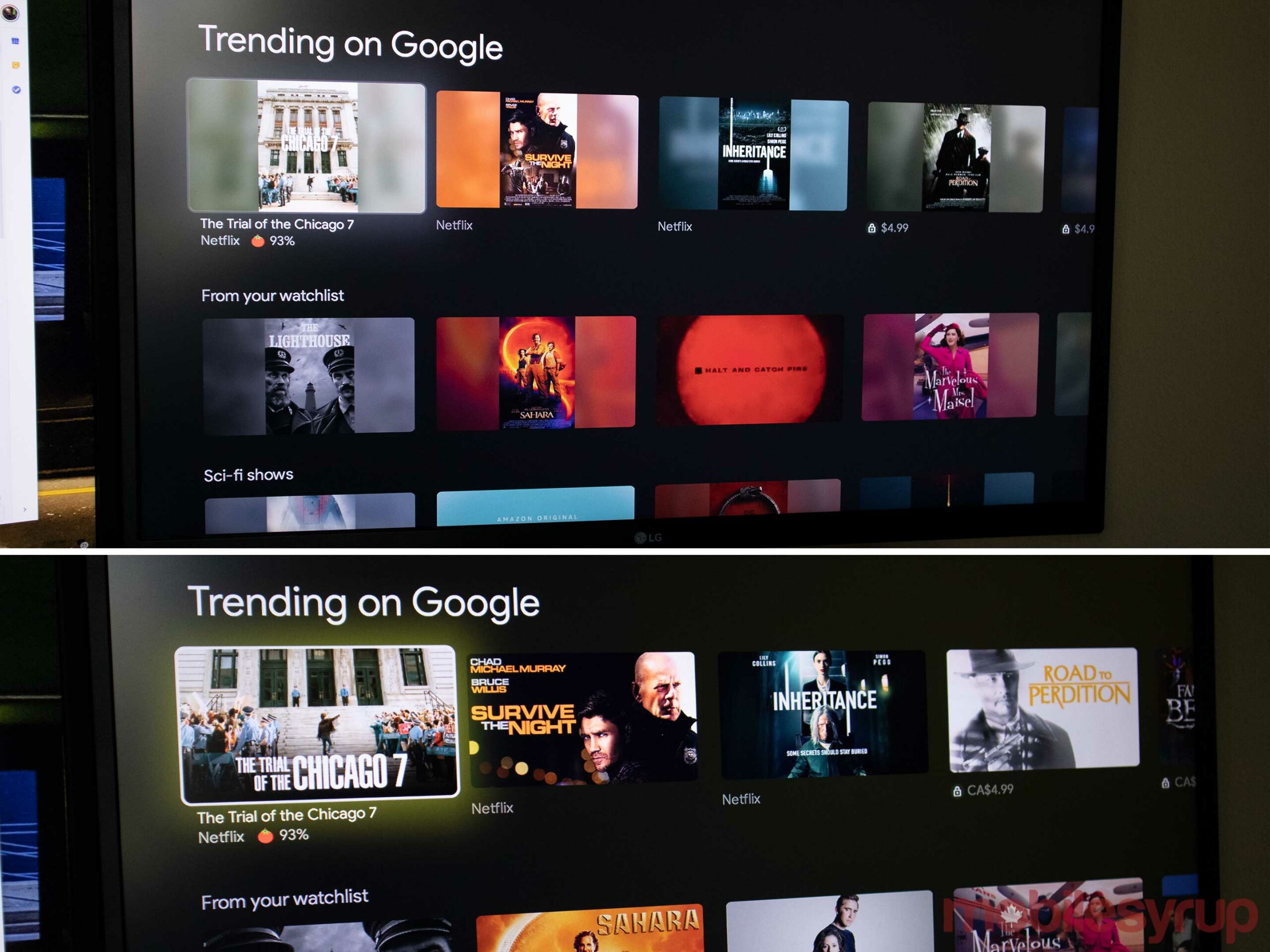
This all looks fantastic unless you select Canadian English during setup. If you do, the title cards display a vertically centred poster instead of an appropriately sized header image like it does when you’re set to U.S. English. In my tests, you still get CAD pricing when you switch to U.S. English, so until Google sorts this out, it’s worth using U.S. English.
I wasn’t sure if I’d like this amalgamation of content when I first saw it, but the more I use it, the more I fall for its simplicity and ease of use. Sure, there’s something in the back of my head that makes me think I’m missing out on features because I’m not diving fully into the Netflix or Prime Video apps, but it’s just so easy to use that I’m getting over it.
Oddly enough, Google doesn’t remove recommendations from this page even after you’ve marked them ‘Watched,’ but hopefully, this will get cleared up soon too.
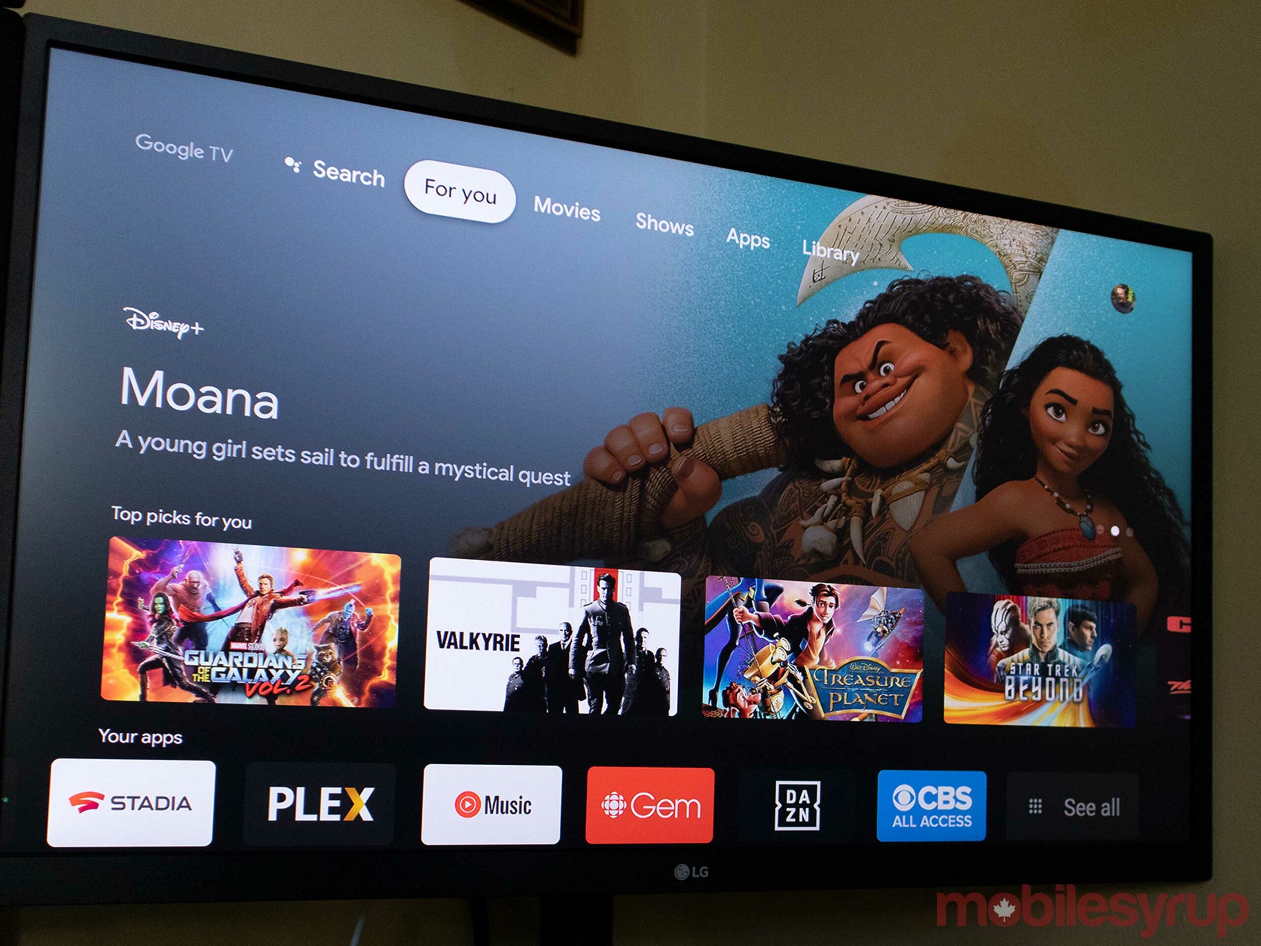
One of the cooler aspects of Google TV is that every time you search for a movie on Google, you’ll see small ‘Watched’ and ‘Watchlist’ buttons. This even includes Google Search on your phone or computer. Adding the movie or show to your Watchlist here means that next time you boot up your Chromecast, it’s going to be there for you to stream easily. Since you can add things to your Watchlist regardless of where they’re streaming, I’ve found myself using this feature way more than I ever have on any other platform.
I also like how Google added Rotten Tomatoes’ scores to its main page, so it’s easy to see if a movie is rated highly or not without having to click on it.
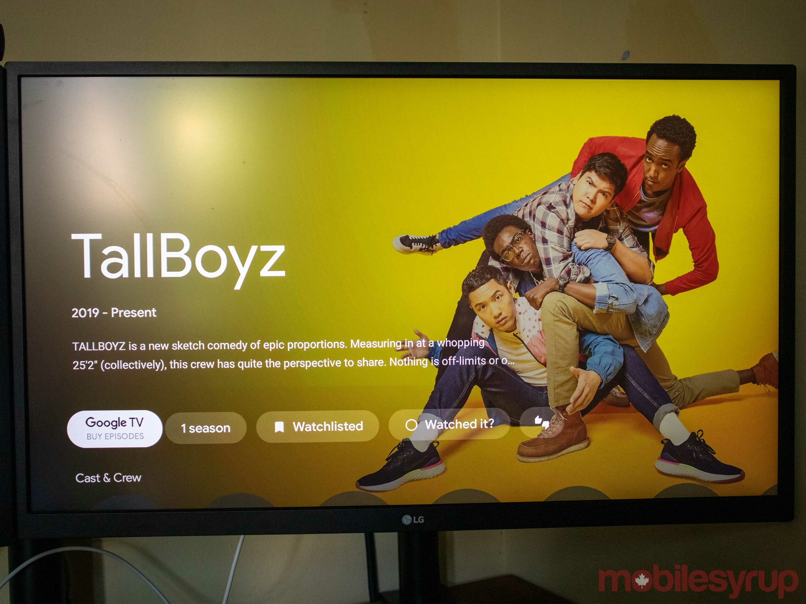
When you select a show, Google shows you all the ways you can watch it (usually steaming and renting), the cast, some related titles and a brief synopsis. Just like the rest of the interface, this is clean and easy to navigate.
The Google TV interface is slated to replace Android TV over the next few years but for now, the only way to get it is with the new Chromecast.
Some fun
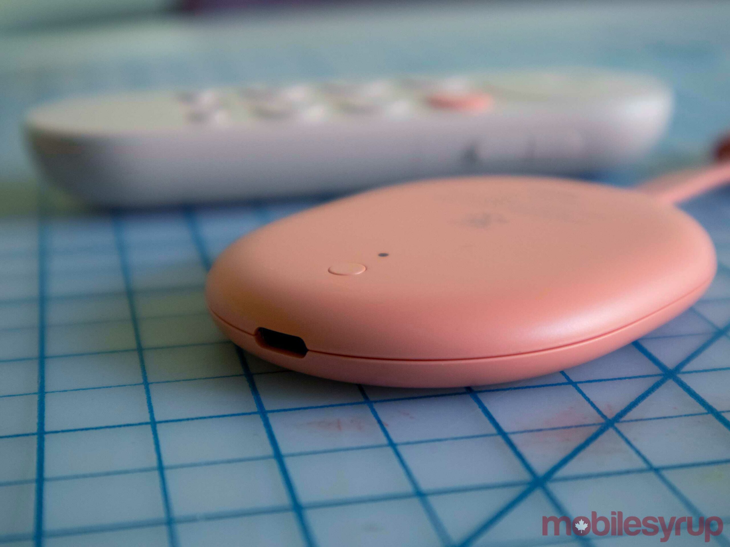
There are a few less apparent quirks with the new Chromecast that aren’t super apparent, but I think they help it overtake Roku and FireTV.
The first is voice controls. If you have a Google Assistant smart speaker nearby, you can talk to it to control your TV just like you could with the FireTV Cube. This means you can say things like, “Ok Google, play The Boys trailer on living room TV” or “Hey Google, pause living room TV” to control the new Chromecast.
While I don’t find myself using these all the time, voice is a lot easier for searching and quickly pausing things if my hands are full.
If you’re holding the remote, you can press down on the Assistant button to do all of this without saying “Ok Google,” which is a nice touch. You can even ask it things like the weather to get a pop-up showing you the forecast. However, even though the device said that Google’s ‘Voice Match’ feature was set up, neither my girlfriend nor I could get personalized commute or calendar information to work.
My absolute favourite thing on the Chromecast is its awesome screensavers. This is a pretty menial thing to most people, but for me, the screensaver hierarchy goes — Apple TV, Chromecast/AndroidTV, FireTV, then Roku. With that said, I think Google’s art and satellite options are fantastic. If you’d like, you can also integrate it with your Google photos account to show your recent pictures or pictures from a specific album or with particular people in them.
What it delivers
Taken as a whole, the new Chromecast is really good, but only time will tell if this content-packed home screen is going to be a major improvement over Roku or Apple's grid of apps.
I'm still not sure if this is the killer device that I'd recommend to someone like my mom since having content sourced from varying places might be confusing for some. Still, for anyone who's actively looking to upgrade their smart TV experience with a stronger focus on content, this is easily the best option.
Flaws aside, even the voice controls are awesome and being able to play/pause content with my voice or easily search for movie trailers on youtube is incredible. Yes, I'm aware that you can do similar features with Roku, FireTV and Apple TV, but Google's version seems to be the most streamlined.
If you already have a house full of Alexa devices, you're still better off with a FireTV device, and if you own an iPhone, the Apple TV will fit better in your ecosystem. That said, previously, there weren't many excellent options for Google fans, but now there is.
You can pick up a Chromecast with Google TV for $70 in Canada, and if you already use Android, and have a few Nest speakers, it's likely the missing piece or your smart home puzzle.
"Only time will tell if this content-packed home screen is going to be a major improvement over Roku or Apple's grid of apps"
MobileSyrup may earn a commission from purchases made via our links, which helps fund the journalism we provide free on our website. These links do not influence our editorial content. Support us here.


