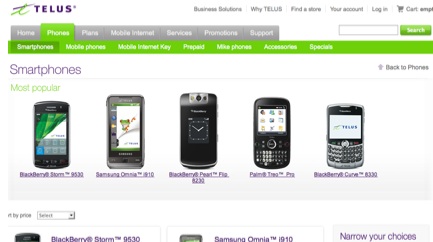
 TELUS has been busy creating a new website that is more user friendly. It looks cleaner and easier to find your way around. One of the major additions they have included, just like all the other carriers have, is the ability to access your account from their homepage.
However the best part that I like about the change is seeing all the devices, nice and big with ALL the rate plans on one page. No more clicking another button to find out what a 3-year vs. a 1-year plan is. Plus you can narrow your selections by carrier and have the choice of shopping from low to high, or high to low depending on your budget. This makes the online shopping experience a great deal better.
Overall, the font and images are bigger, cleaner and it’s easier to find what you want. Bell made changes to their site back in August last year… now we need Rogers to shift to have a friendlier user experience. Check out telusmobility.com
What are your thoughts on the new TELUS site?
Have your say in our Forum
MobileSyrup may earn a commission from purchases made via our links, which helps fund the journalism we provide free on our website. These links do not influence our editorial content. Support us here.


