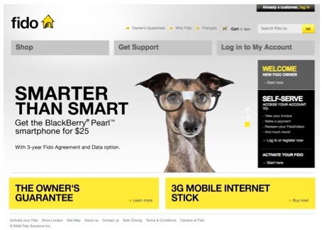
 Back on November 4th of last year Fido became a whole new dog and change their entire brand direction. It was not just a new logo, but a complete change of their website and mobile phone plans.
The public was a bit mixed on what to think, mainly because of the in your face discount “no name” colour of yellow they picked. Today, you can rest assured as it seems the dog went and got some much needed attention and has changed their site again. And I must say it’s a tremendous amount better. It’s basically chopped into 3 areas: Shop, Get Support and Log in to my account. Everything is displayed out so simple with large images and bigger fonts. Their price plans are not confusing to look at anymore and overall it’s more pleasing to the eye.
Check it out here and let us know your thoughts!
MobileSyrup may earn a commission from purchases made via our links, which helps fund the journalism we provide free on our website. These links do not influence our editorial content. Support us here.


