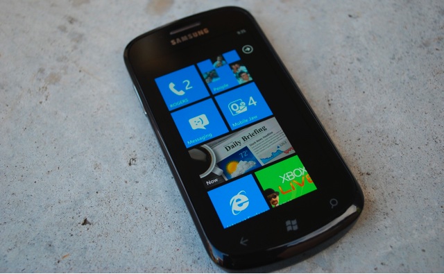
The Samsung Focus is the first smartphone from Samsung powered by Microsoft’s new Windows Phone 7 to be launched in Canada. It will be going on sale shortly at Rogers Wireless outlets across the country. There’s no word on the pricing or exact date of availability, although many are expecting it to be available starting on November 8th.
When it comes to the hardware, the Focus doesn’t disappoint. Let’s run down what you can expect with the Samsung Focus. First, it’s powered by a 1Ghz Qualcomm processor, 512MB of RAM, and 8GB of internal storage. However, that 8GB is expandable to 40GB by adding a 32GB MicroSD card. Next up is the brilliant 4 inch Super AMOLED screen. This is the same screen you’ve seen on many other Samsung devices as of late. There’s also a 5 megapixel camera with LED flash with the ability to record 720p HD video’s, a 1500mAh battery, Bluetooth, WiFi, and GPS. It measures in at 24.7mm x 64.3mm x 9.9mm and weighs just 119.4 grams.
The first thing you’ll notice about the Samsung Focus is just how light the phone really is. In fact, it’s so light that my initial thought was that I was holding a dummy phone that you would see in the store. The next thought I had was about the build quality. If the phone is that light, there’s going to be a lot of plastic, which could result in a phone that has a lot of give in it, but that’s not the case with the Focus. Sure, it’s all plastic, but there’s no creaking or popping like you would expect on cheaper quality phones. When you slip the Focus into your pocket, you can easily forget it’s there.
Samsung is using the immensely popular 4 inch Super AMOLED screen that they’ve used on so many other great devices recently. The screen is simply brilliant to look at. Samsung is claiming that this screen is smudge and scratch resistant. I couldn’t bring myself to attack the screen with anything sharp to test the scratch part of that claim – it’s simply too beautiful to want to hurt it. In terms of smudging, it does show some fingerprints when the screen is off, but once it lights up, you can’t really see them. Regardless, they easily wiped off with a quick wipe on a shirt or pants.

The buttons on the front of the phone along the bottom, are not really buttons at all. At least not in the traditional sense of buttons that move when pushed. These buttons are capacitive based, and don’t actually move when pushed. It’s the same technology used on the screen of the device. The long and short of this is that you can’t interact with the buttons if you’re wearing gloves or if you push on it with a stylus. Just like the screen of the device, it needs your finger to touch it in order to register as a button press. I know some people will prefer the push of a physical button. In my use, I found this to work really well. I didn’t need any extra force to interact with the buttons as I did with the screen of the device. Overall, it was a very natural and consistent experience when tapping between the screen and the buttons at the bottom.
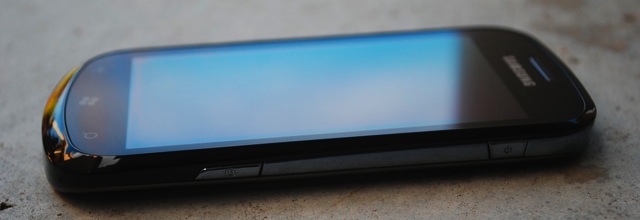
On the right side of the device, you’ll find the power button at the top end, and the camera button about two thirds of the way down the side. Both of these buttons are pretty self-explanatory. I will say that a long press on the camera button will wake up the device and launch the camera, allowing you to quickly snap a picture with one button press. It’s also worth noting that the camera button is a dual-function button. It will launch the camera, and then you press it again to snap your picture.
While I’m talking about the camera, I’ll also mention that Samsung has done a great job with the camera on this device. It offers a very nice Macro mode allowing you to take extreme close up pictures. I found the quality of the pictures was really good, even with indoor shots. If you made any changes to the settings, they would automatically revert back to the default the next time you launch the camera. I’m still not sure if I like this behavior or not. There are times that I want it to remember that I set it on Macro mode. However, I’m certain to be burned by that at another time when I forget that I was messing around and left it on Macro. Perhaps it just needs better control over which settings it remembers and which ones get set back to default. For example, the Anti-Shaking setting is off by default. Which means you have to remember to turn it on every time in order to get the best possible picture.
There’s not much along the bottom of the device, just the microphone hole and a spot for your thumbnail to pry open the back cover. The battery cover snaps on, so you need to use your thumbnail to pop the bottom off, and then gently slide your nail around the sides of the device to pop it the cover off. The back cover is pretty thin plastic, but it’s easy to open and close and the plastic clips don’t stick out in a way that would make them easy to break off. The battery capacity is 1500mAh, and I’ve been able to get 2 full days use out of it – And that’s with 2 Exchange accounts, Facebook, and Windows Live accounts configured, along with WiFi enabled, even if it wasn’t connected for most of the time. I didn’t make many phone calls over that time. So it looks to me like the average user should easily get more than a days use out of a fully charged phone. Your mileage may vary as phone calls can chew more battery power, as can more gaming and push email accounts.
About two thirds of the way up the left side of the device is the volume up down buttons. You don’t have to unlock the device to change the volume. However, you do have to wake the device if it’s in sleep mode. You will then be able to change the volume, even if you don’t go past the lock screen. When the phone rings, pressing the volume buttons will instantly silence the ringer.
Across the top of the device is the power / sync port (MicroUSB) – which is hidden under a sliding door, and 3.5mm headphone jack. Just like many mobile devices with FM radio built-in, the headphones need to be connected in order to use the radio on the device, as they double as the antenna for the radio.

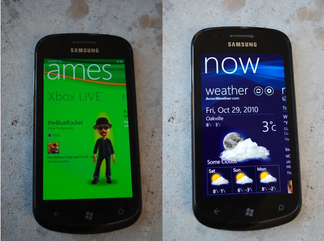
With hardware like this, it’s no surprise that Windows Phone 7 runs quickly and smoothly. The animations are always fast and the device is always responsive to the touch. Samsung has added their own Live tile called “Now” that shows the weather, news, and stock details and is fully configurable, so you can add whatever city you want the weather for, along with any stock symbols. It would be nice if there was a default city pre-loaded, or perhaps a special city that would pull the weather based on the location returned from the GPS.
Samsung has also added a “Samsung Zone” to the market place where you’ll find applications from Samsung specifically for your phone. Currently they have 3 apps listed there – Photo Sharing, 3, and Now. As mentioned above, Now was already loaded on the device, but if you needed to reload it, here’s where you could do that. Photo Sharing allows you to configure various photo sharing sites as locations to automatically upload pictures to. Without this app, Windows Phone 7 supports automatic uploads to SkyDrive or Facebook. The Photo Sharing app lists Facebook, Flickr, Friendster, MySpace, Photobucket and Picasa as destinations where you can put your pictures. When you pick a service, you then need to provide your login credentials. After it’s successfully authenticated, you can select Share from the options when viewing a picture and select Photo Sharing to upload it to the service of your choice.
3 is a hub that allows you to have quick access to customer service and your account details if you’re on the 3 network (3 is a UK based cellular carrier). Clearly there’s no value in adding this to the Samsung Zone for Canadian customers.
Windows Phone 7 is different from any mobile OS you might have used before – and it’s worth going down to a Rogers store to play with a device and experience it first hand. The Gaming hub integrates with Xbox to pull down your avatar along with friends, and gamer scores. Even without Xbox integration, the games are pretty cool – I’ve been playing a lot of Bejeweled Live, and Unite, while the kids have been playing with Galaxy Bunnies a fair amount. Those are rather simple games compared to Star Wars: Battle for Hoth, Harvest, and the ever popular, Earthworm Jim.
The Music and Video hub provides a great experience when enjoying the some tunes. In the past I’ve been pretty critical of the audio quality from Apple’s iPhone. So I took the opportunity to play some tracks on both devices using nothing more than the default speaker on the phone. No surprise from the iPhone, the audio was very flat and tinny sounding. The Focus has much richer sound, with more low end. By no means is it studio quality or anything like that, but it’s noticeably better than the iPhone, and more along the lines of what the consumer should expect to hear from a music phone.
Windows Phone 7 will pull your contacts from everywhere – Facebook, Windows Live, Outlook, etc.. And the People hub is where you can manage that. By default Windows Phone 7 will try and merge contacts together so you won’t find 3 “Mike Temporale” in the list. If it misses a contact, you can always manually merge the two. This merging is only for display on the phone, in the background the details are still being pulled from separate locations. The People hub will also show you what’s new by pulling people’s status updates from the various services, and you can add your comments on the status directly from the hub.
The Pictures hub is also integrated with the various networks and will show you the pictures your friends have posted on Facebook, as well as the ones you have snapped using the camera and sync’ed to the device.
The important thing here, is that Windows Phone 7 is not the same old Windows Mobile you might have used in the past. If you haven’t had a chance to see it in person, you really should check it out. And the Samsung Focus is a great device to experience it on. The phone is slim, fast, light weight, and with a gorgeous screen on it. If I had to change anything on the phone, I would increase the internal storage from 8GB to 16GB or maybe 32GB. The difference in cost isn’t that much, and it provides more space for people to grow into. Other than that, I’m not a big fan of having the charge port on the top of the phone and would rather see it along the bottom, but it’s certainly not a game changing feature – it wouldn’t stop me from buying the Focus.
MobileSyrup may earn a commission from purchases made via our links, which helps fund the journalism we provide free on our website. These links do not influence our editorial content. Support us here.


