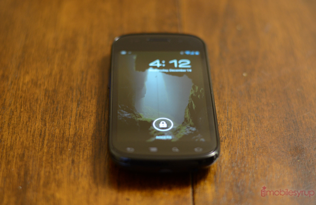
It’s been just over a year since the debut of the last Nexus device, and it’s not for nought that a lot of users are still undeniably infatuated with it. Even at the time it wasn’t the fastest, the hardiest or prettiest, but it’s turned into one of the versatile and comfortable Android phones ever created.
As the Galaxy Nexus dawn breaks, let’s take a look back at this Pure Google device, the Gingerbread experience and how I’m using it now: with Ice Cream Sandwich.
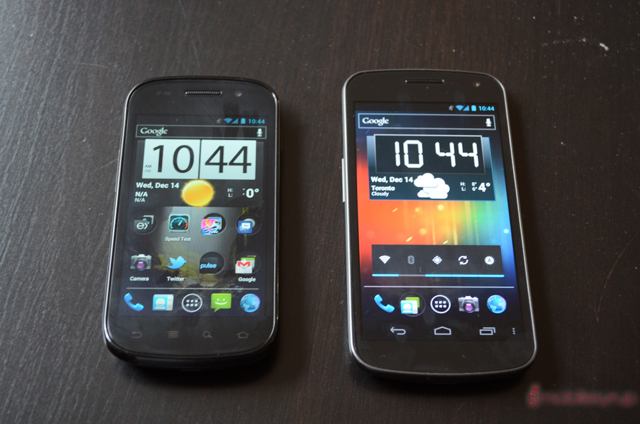
If there was one thing I’ve change about the Galaxy Nexus it would be its screen size. At 4.65″ it’s a bit ungainly. The Nexus S, in my opinion, conforms just about perfectly to the hand; a single thumb can reach any point on the screen without strain. The Super AMOLED display, though it has since been surpassed twice by Samsung’s own Plus and HD variants, still looks great. And most importantly, though “only” a 1Ghz single-core processor, it’s still blazing fast, owed to the skill of Android’s engineers and, ironically, the tendency for bloat by OEMs.
First, let’s talk about build quality. Many fans of the Nexus One were livid over Google’s deference to Samsung over HTC in building the second Nexus device. The N1 was not only well-built and comfortable but nearly two years later still once of the most unique Android devices (though the trackball is looking increasingly retro as time goes on). By contrast the Nexus S was, and still is, a distinctively Samsung-y phone, replete with glossy black plastic and that 0h-so-controversial right-side power button.
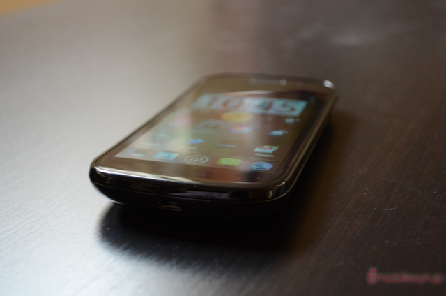
What Samsung did right was imbue the front glass with a subtle curvature that, when combined with its rounded back, made it perfect in the hand. The signature bottom chin from the original Galaxy S was significantly toned down, the battery cover thickened for added robustness.
But the parade wasn’t all horns and cheers: the Nexus S did away with the beloved notification light of the N1, and omitted expandable storage for no practical reason. And despite the significantly faster processor inside, on paper the specs did not look much better than its predecessor: both had 1Ghz single-core processors, 512MB RAM, 5MP cameras, 800×480 pixel screens and, most notably, neither supported 720p HD video.
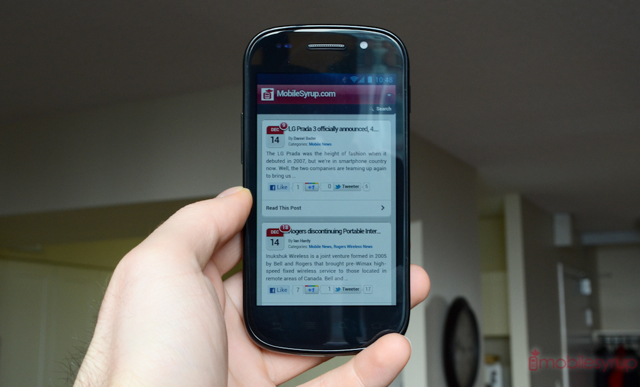
But the devil is in the details, and the Nexus S was a huge usability improvement over the Nexus One. For starters, the screen was SO MUCH BETTER. Comparing the two day is like contrasting a freshly-cleaned windshield with one that hasn’t been washed in a few months. The OLED screen on the Nexus One was grimy and pixelated with touch response that can only be described as challenging.
Next, the Hummingbird processor in the Nexus S was, and still is, a beast. It was Samsung’s first mobile chip, combining a Cortex A8 processor with PowerVR’s venerable SGX430 GPU. And at the time of its debut on the first Galaxy S i9000 it was months ahead of its competitors in terms of overall performance. Indeed, Google is using a variation of the GPU in the Galaxy Nexus.

The Nexus products have never had great cameras, and the Nexus S was only a bit of an improvement over the N1. It came, however, nowhere near the fidelity of the iPhone 4. But it matched, and with enough care, exceeded the quality of equivalent devices on the market at the time.
The Nexus S also came with a couple subtle but significant improvements over its predecessor. For starters the 16GB of internal storage was a godsend to those who were constantly frustrated by the Nexus One’s 150MB of app storage. Sure, Froyo introduced Apps to SD compatibility but it wasn’t enough. The Nexus S also came with NFC, a relatively new (even today) technology that allowed for the wireless scanning of tags, or the initiation of content transfer between devices by touch. Oh, and there was a gyroscope.
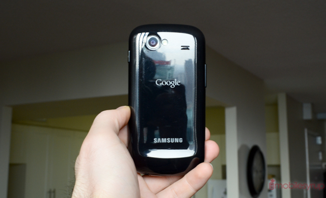
Most importantly, the Nexus S debuted Android 2.3 Gingerbread to the world. While not the visual overhaul many people wanted (and expected) Gingerbread was prettier, faster and more feature-filled than before. But this isn’t a revisiting of the software since, well, we’ve moved on.
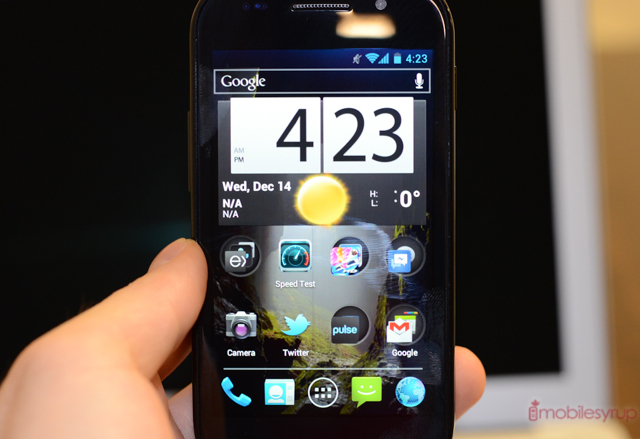
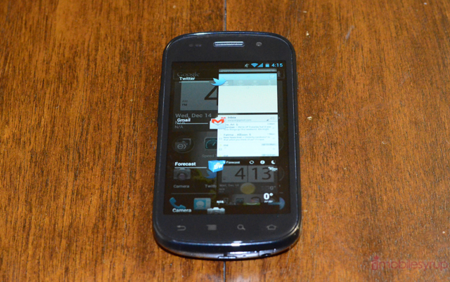
As you can see I have installed a very early alpha version of Ice Cream Sandwich on the Nexus S. While it isn’t perfect, all the core tenets of the software are intact: you can make calls, download apps and tweet. Performance is questionable at best: sputtery and occasionally crash-happy, it’s a great indication of what Android 4.0 will eventually look like when Google releases it officially.
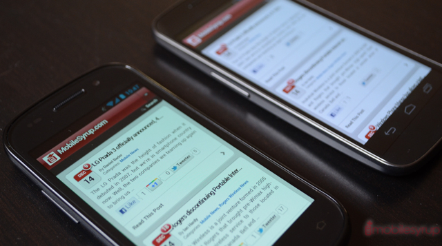
The main difference between Ice Cream Sandwich on the Galaxy Nexus and Nexus S is the lack of software buttons: we still rely on non-dynamic capacitive buttons below the display. Most apps can detect that there are no software buttons and allow access to its menu through the dedicated key. Missing, however, is the dedicated multitasking button; instead, like in Gingerbread, you must hold down the Home button for a second to bring up the updated multitasking menu. Once there you can swipe to exit apps like you’d expect, but that extra second of waiting for the menu to appear is torturous coming from the Galaxy Nexus.
The Nexus S is still a killer phone in many ways. I love it as much today as I did in December 2010 when it debuted, and it’s amazing how well it has aged as the industry speeds on by.
Update: Please note that the majority of this article was written before the official release of Ice Cream Sandwich for the Nexus S, and as such as comments availing its software performance refer to the CyanogenMOD9 Alpha build. There will be a separate article detailing the official version of Ice Cream Sandwich on the Nexus S. Sorry for the confusion.
MobileSyrup may earn a commission from purchases made via our links, which helps fund the journalism we provide free on our website. These links do not influence our editorial content. Support us here.


