When HTC debuted its One Series of devices, the One X, One S and One V, during Mobile World Congress this year, tech bloggers and Android fans were abuzz with their new Ice Cream Sandwich-oriented designs. Finding a middle ground between the legacy Gingerbread “Back/Home/Menu” and Google’s own virtual button layout on the Galaxy Nexus, the company opted for capacitive buttons below the screen, Back/Home/Multitasking.
At first this was deemed a great compromise: ICS multitasking was a huge upgrade over Gingerbread, providing users the ability to switch between and close apps with a single touch-swipe combination. Gone was the ugly “hold the home button for a second and choose between six open apps.” Things were looking up for Android device layout standardization.
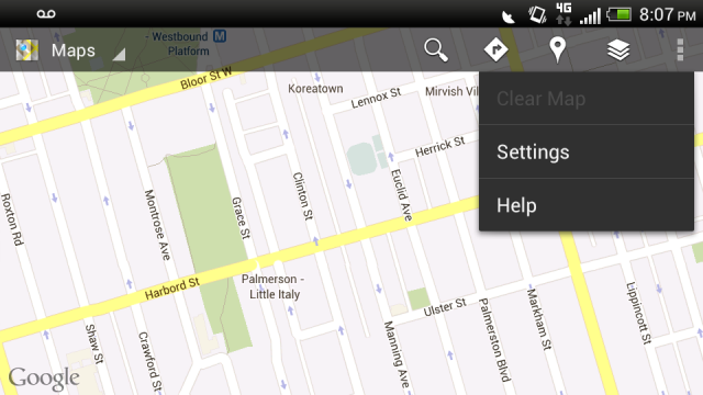
And there was good reason for replacing the dedicated menu button with multitasking. Ice Cream Sandwich introduced the “action bar,” a unified framework for installing an on-screen menu button that would seemingly eliminate the need for one below the screen. Google apps such as Gmail and Google+ added the three-dot menu button to the top or bottom of the screen, with options dropping down below it.
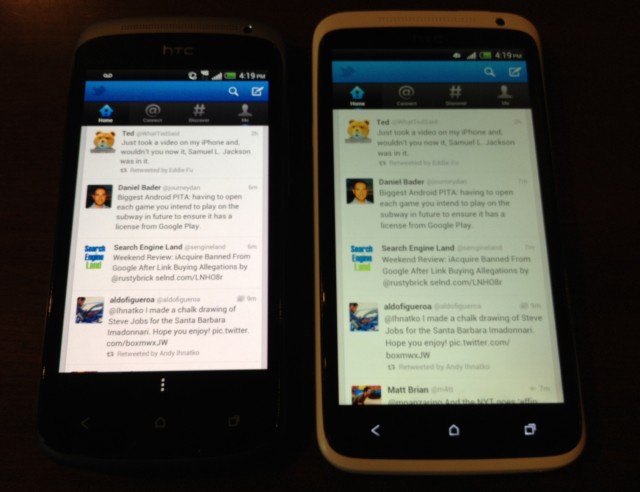
 But the truth struck hard as soon as the One X was released: many developers still hadn’t updated their apps to take advantage of Google’s new action bar layout. The vast majority of apps still rely on the “invisible” menu button, the hit-or-miss, inconsistent and ugly Android navigation system that has been the scourge of app design for years. Ice Cream Sandwich promised to make Android apps beautiful; unfortunately, many developers are yet to heed its master’s call.
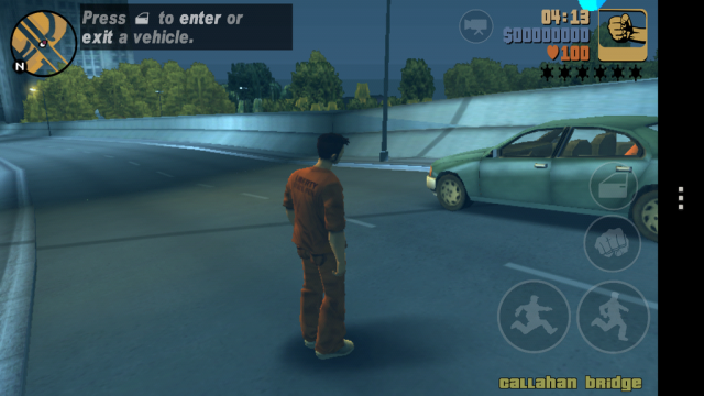
As a result of these laggard apps, HTC needed to find a way for older apps to access the menu button when no action bar was present. Its solution was to install a virtual menu button at the bottom of the screen: a persistent instance that actually shortens the height of every app that uses it. Instead of a full 1280 pixels of vertical resolution the menu button shortens the screen to by at least 100 pixels. It’s not an overlay: the app is dynamically shortened. I found this the hard way when playing Grand Theft Auto 3; although the game is played in landscape mode, the on-screen menu button is perpetually present.

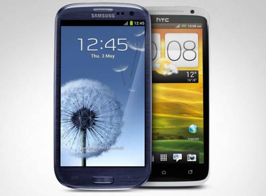
Samsung decided that it would be ahead of the problem with the Galaxy S III by retaining the layout of its former Galaxy series devices: Back, Home, Menu. Yes, even on a device shipping with Ice Cream Sandwich Samsung thought the experience would be better by maintaining the “old way,” with the multitasking menu accessible by holding down the home button. While this appears to be going backwards, especially since Google is encouraging OEMs to use virtual buttons, there are downsides to both scenarios.
The Galaxy Nexus, despite having a 1280 x 720 pixel resolution, runs into the same problem as HTC does in legacy apps: that navigation bar takes space away from the app. By keeping the menu button, Samsung will never run into that problem since apps will be able to use the full 4.8-inch HD resolution. On the flip side, since Samsung sells more Android devices than any other manufacturer, by maintaining the button design status quo, few developers are going to feel the need to change their app layouts. Keep in mind that many apps have already adopted Google’s ICS design guidelines, and are fully backwards compatible with devices still using a hardware menu button.

Going back to HTC for a second, now that its devices have been released it’s easy to see they’re in a bit of a situation. Some apps that use the new menu button still generate the virtual bar at the bottom, likely because developers haven’t anticipated a scenario like the One X/S. I’m sure it would just take line of code to make the virtual bar disappear, but it seems that either developers don’t care or they’re not worried about a poorer user experience.
For the last few days I have been using a custom ROM on the One X which switches the key layout back to the old way. The multitasking menu becomes accessible by holding down the home button, while the right-most button becomes menu again. But what it does is ensure that every app takes up the entire screen space, and because one ends up using the menu button far more than the multitasking the phone’s workflow feels more efficient.
HTC partially solved its own problem on its entry-level One V. Due to the diminutive screen size, instead of a virtual menu button they made it accessible by holding down the multitasking button. This is almost the same as the previous solution, but assumes that the menu button is used less than multitasking.
Now this is no fault of HTC — they were aligning themselves with the future (ICS) instead of the past (Gingerbread) — but they should have seen the writing on the wall. Android is fragmented, and there won’t be a time in the near future when the dedicated menu button becomes obsolete. Indeed, apps such as Rdio, Reddit News and Pulse Reader all take great advantage of many improvements made to the Android design guidelines, but those are the exception, not the rule. Mainstay apps such as Twitter and Facebook are yet to adopt Google’s suggestions, and still heavily rely on the menu button.
It’s not a pretty picture, and HTC is feeling the brunt of the issue because they are pioneers in this space — they were the first non-Nexus phone to ship with Ice Cream Sandwich — but their decision to halfway adhere to Google’s design guidelines may come back to bite them. The question is whether they should have taken Samsung’s approach to multitasking and kept it mapped to holding down the home button, or if they made the forward-thinking decision by preparing for a time when developers no longer use a legacy menu.
What do you think? Did HTC bungle its button layout, or by thinking to the future did they make the right decision?
MobileSyrup may earn a commission from purchases made via our links, which helps fund the journalism we provide free on our website. These links do not influence our editorial content. Support us here.


