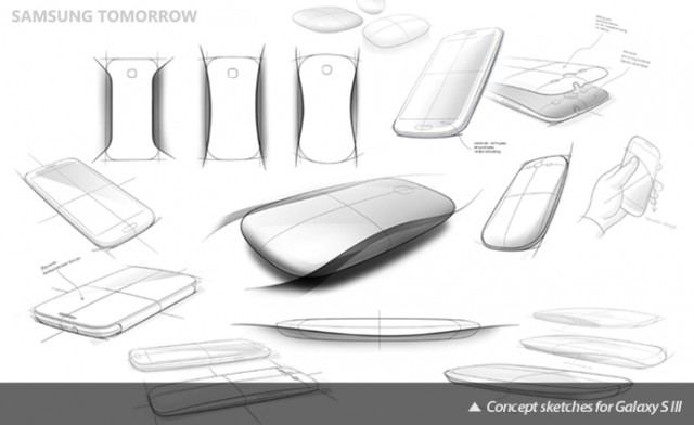
Samsung is going on record that the Galaxy S III was not designed by lawyers. In its latest Samsung Tomorrow blog post, it talks about the design of the SGS3 and how its “nature-inspired minimal organic design identity is reflected in the smooth and non-linear lines of the device.”
Though the tagline says, “Designed for humans,” it’s more accurate to say that the Galaxy S III is designed to be human-centric, which means adhering to the hand in a way no other smartphone has before. This may sound like a bit of hyperbole (and remains to be seen), but it’s clear that the curved design does indeed emphasize the “flow and movement of nature. ‘Most elements in nature come from curves. Instead of straight artificial lines, we focused on the elegant curves'” says Vice President of Product Design, Minhyouk Lee.
He also goes on to talk about the new HyperGlaze material that is meant to make the Galaxy S III stronger than its predecessors. There are three layers of polycarbonate matched with a clear scratch-resistant coating, so despite complaints that Samsung failed to “innovate” in terms of materials, the SGS3 will feel and look different.
He finishes: “Trying totally new designs and materials, we went through a great number of prototypes. Moulding and coating techniques also had to be developed. We did our best not only to provide the most creative and innovative product, but also to match the expectations consumers hold. Everything from their lifestyles to simple habits was taken into account. Not only aesthetic but also technological design was a great factor.”
Source: Samsung Tomorrow
MobileSyrup may earn a commission from purchases made via our links, which helps fund the journalism we provide free on our website. These links do not influence our editorial content. Support us here.


