Motorola’s purchase by Google has just completed, and the resulting hush throughout the industry has been deafening: what will happen to the handset department? Will it still be independent? Or will it get special treatment from the inside?
All the while, Motorola has been steadily releasing devices such as the MOTOLUXE to a market hungry for more Android handsets. Priced at $29 on the SuperTab (or $229.99 on a 30-day plan) on Virgin and $0 on a 3-year term (or $299.95 outright) on Bell, the phone gives a great first impression. Should you consider it over the similarly-priced HTC One V? Let’s take a look and find out.
Specs:
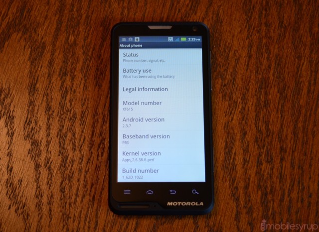
– Android 2.3.7 with custom Motorola skin
– 4-inch 480×854 pixel LCD display
– 800Mhz Qualcomm Snapdragon MSM7227A S1 processor w/ Adreno 200 GPU
– 512MB RAM / 1GB ROM (300MB for apps, 2GB SD card included)
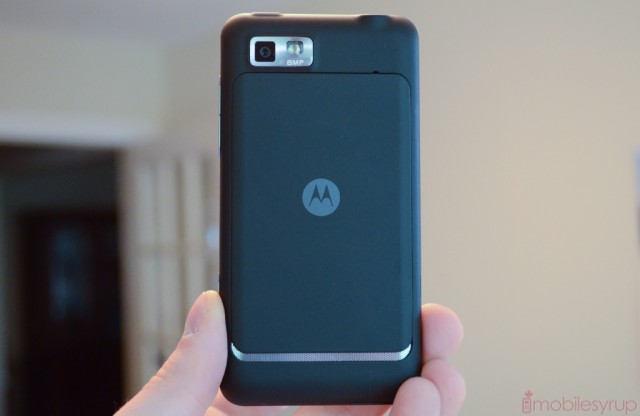
– 8MP camera w/ flash and dedicated shutter button
– WVGA (800×480) video capture
– WiFi (b/g/n), Bluetooth 3.0, WiFi Direct, A-GPS
– 7.2Mbps HSDPA download/ 5.76Mbps HSUPA upload
– 117.7 x 60.5 x 9.9 mm
– 123.6g
Design and Display
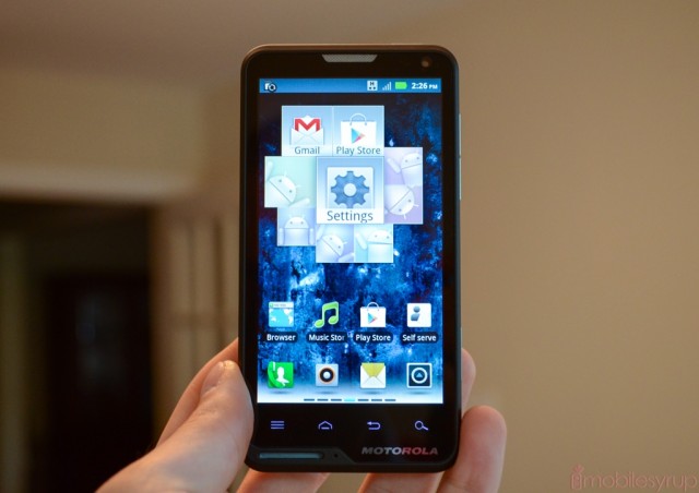
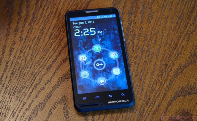
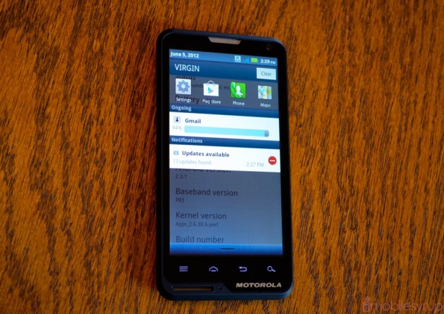
For an inexpensive handset sold primarily on the prepaid market, the MOTOLUXE is remarkably well constructed. The entire front panel is covered by a piece of contiguous glass, though based on its love of fingerprints it’s unlikely to be of the Gorilla variety. The sides and back portion are made of a rubberized matte plastic that retains a fair amount of grip. The battery cover, which clips and slides vertically to reveal a lovely silver speaker grill, is adorned with the same grippish finish but is made of solid aluminum, adding some necessary heft to the diminutive handset.
My main issue with the material is that, like the glass, it attracts finger oils and prints, requiring frequent cleaning. Even then the oils tend to stick to the material, making me wonder how long it will be before deep black becomes an unsavoury shade of smudged grey.
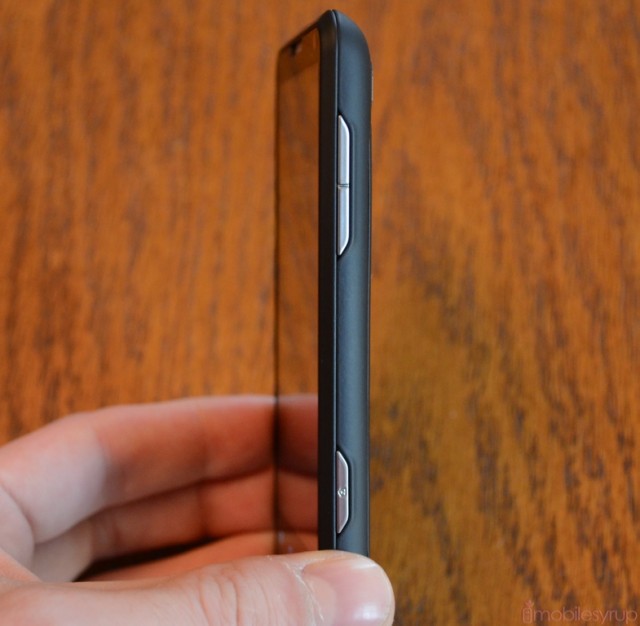
The buttons around the device — volume rocker and camera shutter button on the right, power button on top — are nicely constructed of brushed metal but are very narrow, often requiring you to push down hard to activate. Below the screen is a row of four capacitive touch buttons, standard for a Motorola phone running Gingerbread. I’d have preferred to see only three — the search button is largely superfluous these days, in my opinion, and can be assigned to a long-press of the menu button — but they’re spaced well enough apart.
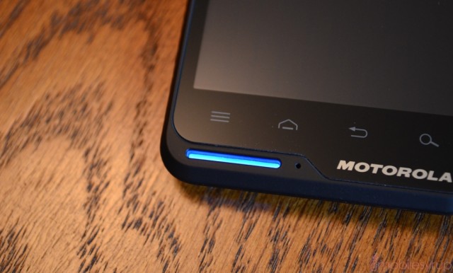
I may as well spend some time talking about what everyone is inevitably going to ask: the large hole on the bottom left of the device is, in fact, a combination notification light and lanyard slip. Yes, a lanyard.
This should tell you everything you need to know about the phone’s target demographic: those who would tolerate, if not yearn for, an oversized flashing multi-coloured LED with space enough for a piece of nylon to slip through. In truth, it actually looks quite nice; the default shade of blue is quite comforting, as are the remaining reds, greens and oranges depending on what is happening on the device.
It’s also distinctive enough to likely raise a few questions from passersby; Motorola’s tagline for the phone happens to be, “It’s not rude to stare.”
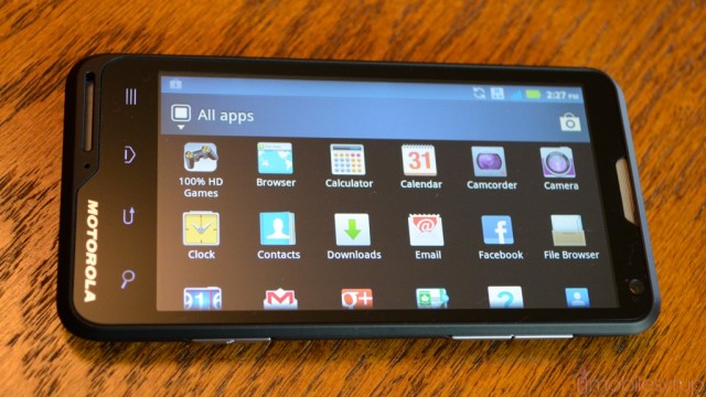 The display is of high enough resolution to be considered sharp, but that’s the highest compliment I’m willing to pay. Colours are cool and foggy, and Motorola’s blue-heavy colour scheme doesn’t help the situation. Blacks, like on most cheap LCD displays, are tinged with grey, but viewed straight on are sufficiently deep. Whites are accurate, and overall brightness is quite good.
The screen’s biggest issue is narrow viewing angles, distorting colours and images within 20 degrees on either horizontal plane. But considering Motorola’s main focus was price, we can’t fault them too much on their choice of display.
Compared to the similarly-priced HTC One V, the MOTOLUXE falls short in the screen department but manages to be competitive in terms of build quality.
Software
The MOTOLUXE runs Android 2.3.7 with Motorola’s typically lightweight launcher and set of widgets. Many of the widgets are pre-installed of the homescreen and comprise of quick access to your friends’ social feeds, recent apps, weather and the like.
The lock screen is quite intuitive, giving you access to six customizable app shortcuts in a ring such as Gmail, Google Play Music and the phone dialler. It’s a similar method to HTC’s, but instead of dragging the icon up from the bottom, the ring of apps surrounds the lock “key” to access the app.
Motorola has skinned many of the apps you’d typically find on an Android smartphone such as Messaging and Email. Other apps, like Calendar, Contacts and Gallery, remain stock Gingerbread versions. The changes are subtle and actually improve on the originals; for example, Motorola’s email app has much more robust Exchange support than stock Android’s. Also included are a media server app called Voice Commands, MediaSee and an FM Radio portal, along with QuickOffice Lite and a few Bell-branded apps such as Mobile TV and Remote PVR.
Performance
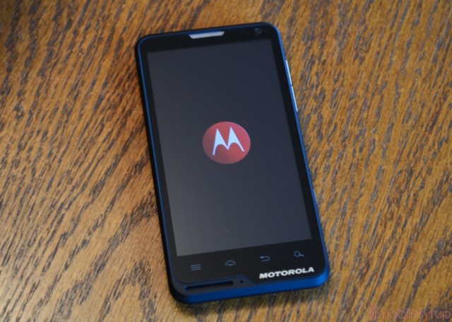
If you’re looking for a top-of-the-line Android smartphone, the MOTOLUXE is not for you. Running an 800Mhz single-core first-generation Snapdragon processor, the device runs at the same speed as the Samsung Galaxy Mini 2 and Nokia’s upcoming Lumia 610. Its processor is some three generations old and it shows.
Scrolling through the various homescreens leaves the phone breathless: opening apps is a struggle; typing on the stock keyboard is often an exercise in frustration as the multitouch keyboard stalls and “catches up” every 10 seconds or so. Basic games such as Words With Friends and Angry Birds perform without issue on the MOTOLUXE, but if you’re looking for a premiere gaming experience you’ll want to spend a couple hundred dollars more or go with a high-end device from last year which often costs about the same when purchased second-hand.
Camera
Outfitting a device like the MOTOLUXE with an 8MP camera was a brave move, but Motorola is positioning the device as media-focused and consumer-friendly. To that end, it has a dual-press dedicated shutter button that can activate the camera software from anywhere within the OS (though it cannot wake the device from sleep like the Xperia S).
Sample photos were average, with nice colour reproduction but a notable fuzziness around the edges of subjects. The autofocus was notoriously finicky, too: I had to re-take the above shots several times to get one that wasn’t blurry or out of focus. When held steady, however, the phone made for a decent photo-taking experience, especially when used inside Motorola’s excellent camera UI.
You can set pre-assigned Scenes and Colour Effects such as action shot or macro mode, though none of them seemed to really affect the outcome of photos. Colour Effects, on the other hand, filter images in monochrome, sepia and aqua, among others.
The MOTOLUXE has a VGA front facing camera that can only be described as ‘noisy’ but again, having a front-facing camera on a device such as this gives it a leg up on the competition. Video quality at the phone’s native resolution was the same: passable.
Battery Life, Network Speed and Call Quality
As a phone, the MOTOLUXE works very well. Motorola has never forgotten it practically created the cell phone, and I’ve always had a great experience using their handsets to make calls. Recipients came through without tinniness or sibilance, and maximum volume was more than sufficient. The back speaker, too, provided enough sound to fill a small room, though I’d suggest using headphones for music.
Considering the MSM7227A chipset from Qualcomm only supports 7.2Mbps download speeds over Bell’s HSPA+ network, I didn’t have high hopes for the MOTOLUXE in that department. As expected bandwidth constraints kept speeds to between one and two megabits per second in both directions. Note that because the device only supports 3G connectivity in the 850/1900Mhz range, you’ll be limited to 2G in most countries outside North America.
Battery life on the MOTOLUXE was sufficient from the 1420mAh cell. The 45nm SoC is not particularly power-hungry, and I was able to get over a day of use from the phone, which is more than can be said for many high-end smartphones today. That said, activities like streaming video and taking photos tended to zap the battery quite quickly, so be mindful of your usage.
Conclusions
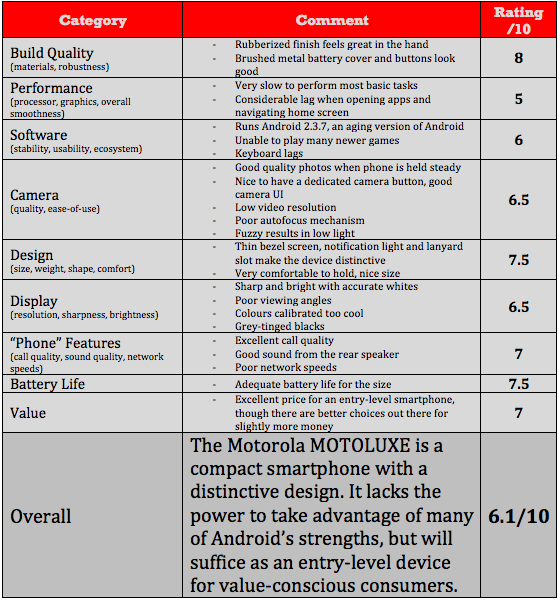
The MOTOLUXE is not out to win the hearts and minds of the high-end market; rather, it fits quite snugly into the low- to mid-range, and does so by checking all the boxes. It has a few highs and some lows, but for the most part performs most task well enough for the price.
For Virgin customers, $230 is definitely attractive on a 30-day plan; Bell customers have some serious competition in the HTC One V, which can be purchased for the same price. There’s no mention of whether the MOTOLUXE will receive Android 4.0 but based on the internal specs I doubt it would perform well enough.
Rest assured, the MOTOLUXE an attractive and well-made product with a decent screen and camera. For many potential buyers, that — and the low price — will be enticing enough.
MobileSyrup may earn a commission from purchases made via our links, which helps fund the journalism we provide free on our website. These links do not influence our editorial content. Support us here.


