It was the release of Samsung’s Galaxy S I9000 in August 2010 that made me want to pursue technology writing full-time. While the device’s hardware was prone to spontaneous failure, and the design was uninspired at best, its release did two things effectively: it established Samsung as a capable vertically-integrated OEM; and it gave Android a higher profile than Motorola or HTC was able to accomplish ’til that point.
With each iteration, the Galaxy S series has improved substantially, both in design, performance and influence. That last piece is especially notable, as Samsung was able to convince (or strong-arm) carriers with its third model to accept a single design, something previously only Apple had been able to claim.
The Galaxy S4 is easily the company’s most impressive and least ambitious flagship released to date, and that suits the them just fine. With back-to-back record quarters and the legroom to experiment with other categories, the company’s design team took it easy this time around. But that doesn’t mean the Galaxy S4 lacks innovation, nor that it lacks substantial improvement over its predecessor. But what if you’re one of those Galaxy S3 owners? Should you upgrade? Let’s find out.
Specs
– Android 4.2.2 with TouchWIZ UI
– 5-inch 1920×1080 pixel Super AMOLED display (441ppi)
– 1.9Ghz quad-core Qualcomm Snapdragon 600 SoC w/ Adreno 320 GPU
– 2GB RAM / 16GB internal storage (expandable)
– 13MP back camera / 2MP front camera
– 1080p video capture
– WiFi (b/g/n/ac), Bluetooth 4.0, NFC, A-GPS, Miracast
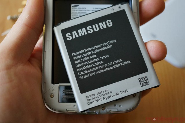
– 2600mAh removable battery
– 136.6 x 69.8 x 7.9 mm
– 130g
– HSDPA (3G) 850 / 1900 / 2100Mhz, LTE 700 / 1700 / 2100
Introduction
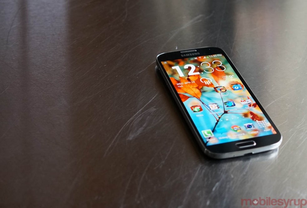
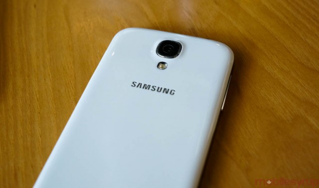
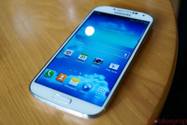
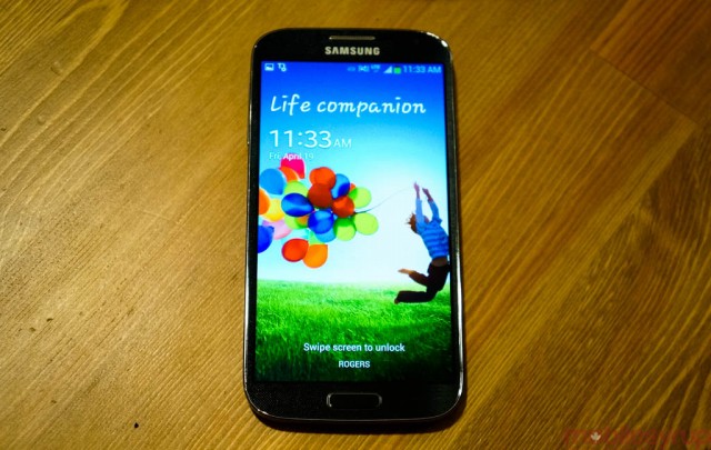
The Galaxy S4 looks uncannily similar to its predecessor, which introduced a brand new design from the Galaxy S2. But where the Galaxy S3 was all curved lines and asymmetry, the Galaxy S4 brings it back to basics with an unbroken metallic bezel and a centred home button.
Impressively, Samsung managed to fit a larger 5-inch screen into a chassis slightly narrower and thinner than its 2012 offering, and the Galaxy S4 benefits from these design modifications. The body is still produced from slippery polycarbonate, the kind we’re used to from Samsung, but this is a harder material, less disposed to creaks and scratches. Indeed, the chemical coating used to protect the body from abrasions is more substantial, as is the strength of the Gorilla Glass, now in its third iteration, that protects the Super AMOLED display.
If you weren’t a fan of the Galaxy S3, this version isn’t likely to change your mind. It still feels like Samsung is resting on its laurels, settling on a design language that neither puts its extensive R&D resources to good use, nor offers consumers something effectively new. There are two ways to think about this: the Galaxy S3 still looks modern, and aside from some anti-plastic sentiment, its build quality was not met with disapproval; the Galaxy S4 merely continues down this path, albeit more conservatively.
The second way is to consider the Galaxy S4 as the second in a two-year cycle Samsung, like Apple before it, wants to affect. Because there are moderate improvements to design and build quality, this is no mere “S” variant — an iPhone 4S to the Galaxy S3’s iPhone 4 — but it’s close enough.
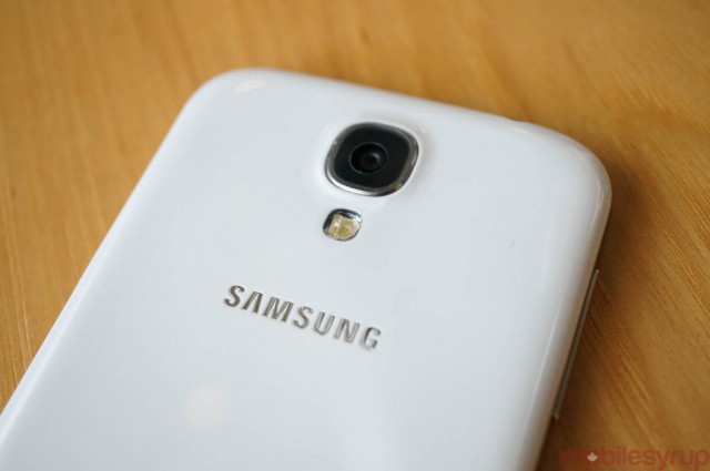
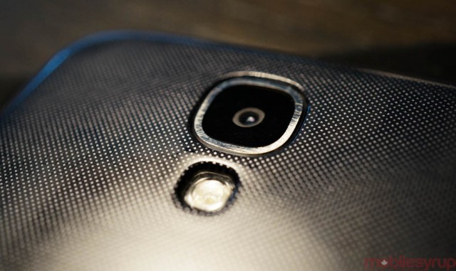
The Galaxy S4 employs a repeating dotted texture across its front and back which, while primarily aesthetic, works to minimize the feeling of slipperiness. I like its subtlety and playfulness, though others I’ve shown the phone have the opposite reaction, thinking it superfluous.
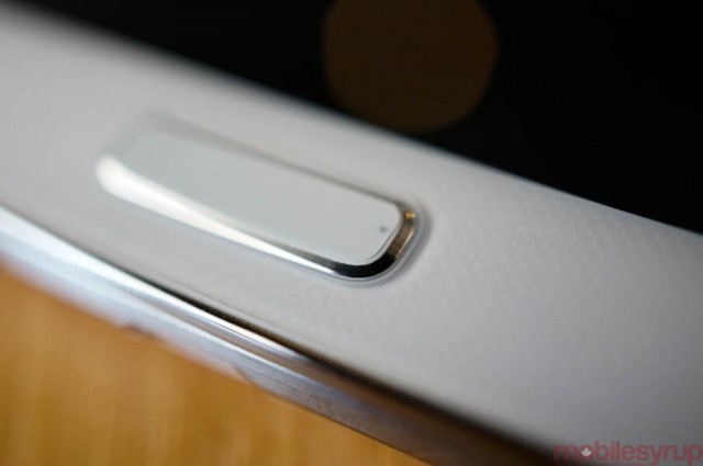
Keys and ports are identically placed to the Galaxy S3, too, which is just fine: the right-side power button is something I wish more OEMs would adopt, as I do the bottom middle microUSB port. These are practical, easy-to-reach placements, with the highest degree of accessory compatibility.
The buttons themselves are dramatically improved, both in responsiveness and build quality, over their squishy, cheap-feeling counterparts on the GS3 and Note 2. The tone of “practicality” continues with the removable battery cover and battery and the presence of a microSD slot. This is good, because the Galaxy S4 has significantly less out-of-the-box storage than the GS3 — only 9.5GB of the advertised 16GB is accessible to the user.
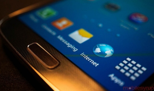
The phone’s Super AMOLED screen is one area that has been significantly improved, upping both the resolution and the colour accuracy from its predecessor. I’d challenge you to single out the individual pixels from this 5-inch 1080p panel, though critics are going to harp on the fact that Samsung has once again opted for a PenTile array on the GS4. Unlike in the days of WVGA and qHD, PenTile, the name for the way red, blue and green subpixels make up each pixels, it is nearly impossible to discern on a screen this dense.
But not only is the density higher, but the pixel array has been improved; as opposed to “standard” PenTile displays, which have typically employed rectangular grids of alternating green, blue/red pixels, the GS4 uses a Diamond Pixel array. Green pixels are oval and repeat in a single line, while red and blue pixels are larger and alternate between the lines of green. This ensures more uniform colours with fewer aberrations. Were this a 720p display you’d be able to tell the difference between it and the more traditionally-PenTile Galaxy S3. But this is 1080p, so the array improvements coupled with the higher-resolution screen makes it one of the best displays on the market.
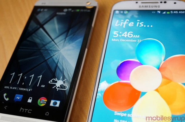
More important is the user experience which, independent of such technological marvels as AirView and AirTouch, is suitably impressive for a high-end device. Viewing angles, maximum brightness and colour accuracy are all improved over the GS3, and though the phone lacks the density and clarity of the HTC One’s SuperLCD3 display, it is otherwise without compare.
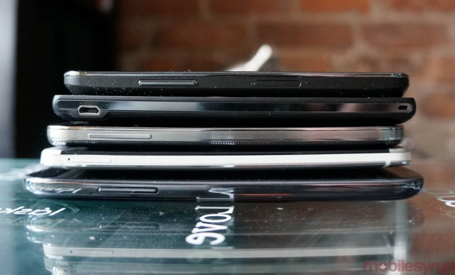
Samsung also rid the GS4 of as much screen bezel as possible, allowing for an aesthetically-pleasing edge-to-edge display that we’re sure to see grace many upcoming Galaxy products. Though the new Galaxy isn’t quite as compact as Sony’s Xperia ZL, one of its most effective design tricks is fitting the industry’s fastest Android hardware inside a chassis smaller than last year’s flagship. To dismiss this is as a minimal achievement, even in light of the extraordinary design accomplishments of the HTC One, would be foolhardy. Some, including me, maybe be disappointed in a lack of envelope-pushing but, for better or worse, Samsung stuffed as many features as possible inside that thin, white receptacle.
Performance
Inside the Galaxy S4 is the fastest combination of phone hardware and software on the planet right now, and that continues Samsung’s trend of vertically-integrated prowess. The company sources as many of its own components as possible, or where necessary, pushes the limits of its adopted parts. To that end, the Qualcomm Snapdragon 600 SoC inside the GS4 runs each core 200Mhz faster than the HTC One, which improves not only single-threaded performance but frame rates in 3D games and benchmarks.
Upon acquiring the phone for review, I was told that there may still be some outstanding bugs and performance glitches on the device, as it was running pre-release software. I held off benchmarking the phone until receiving what I believe to be final shipping software, JDQ39.I337MVLUAMDJ, which not only made a huge difference to the smoothness of the operating system but should give you a better idea of what to expect when you purchase the Galaxy S4.
The phone runs the latest version of Android, 4.2.2, and though the only obvious additions to the UI come from lockscreen widgets (which are turned off by default), the TouchWIZ experience here is very similar to the last few versions. There is a kitchen sink of functionality here, including a number of new “S”-branded products, from S Health to Samsung Hub to Story Album to Air Gesture. Some of these will be ignored by the average consumer, or used once and forgotten about. Others will be seen as integral to the Galaxy experience and adopted as daily features. It’s a good thing the Galaxy S4 has such capable hardware; features like Air View and Dual Shot, which are hardware-intensive, would not have been possible two years ago.

The Galaxy S4 beats the One handily on 3D benchmarks such as AnTuTu and the higher-resolution 3DMark test, both of which are GPU-intensive, and excels in all categories regardless of vocation. The takeaway is this: the Galaxy S4 is technically faster than its peers, including the One, but doesn’t always feel so during regular use. This is especially true when utilizing non-standard Android tools like the aforementioned Air View, Air Gesture and Smart Scroll. These additions feel tacked on to the OS, and fall short of providing a satisfying, engaging experience. In all other areas of the operating system, from playing games to browsing the web, the Galaxy S4 stands above everything but the HTC One, to which it is equalled matched.
More impressive is just how much faster the Snapdragon 600 chip is than the Exynos chip inside the Galaxy Note 2. While the 1.6Ghz quad-core Exynos CPU is still quite fast, it is the Mali-400 GPU, with its limited OpenGL performance, that fells the phablet in 3D benchmark results. But while its GPU underwhelms, the CPU is clearly optimized more heavily for Javascript performance, as the aging Note 2 beats all the other devices in the SunSpider test. Also worth noting is how well the Nexus 4 and Xperia ZL stack up to the newer flagship devices in both 2D and 3D tests.
Software
The GS4 runs a heavily modified version of Android 4.2.2 called TouchWIZ. If you’re not familiar with Samsung’s rather garish interpretation of the Android experience, let me run it down for you: Samsung believes more is better, but many times the ‘more’ feels unfinished or poorly-implemented.
Starting from the home screen, you’ll notice that there are a number of Samsung-related widgets pointing to new experiences like S Health, Samsung Hub and more. You may open the Gallery and find an image suddenly pop up without having touched the screen — that’s Air View, and it uses dual IR sensors on the phone’s face to detect whether a digit is a certain distance from the screen. Compatible apps will “pop” images or information temporarily as you hover over it.
The “more” continues with Multi Window and Smart Stay, both of which were implemented in previous Galaxy models, but here they are met with Smart Scroll, Smart Pause and Air Gesture, logical extensions of features Samsung believes you want on your phone.
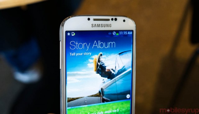
The trouble is this: some of these, like Multi Window, are useful and mature — it lets you have two apps open at once, toggled by holding the back button for a moment. It’s a truly great way to multitask, and Samsung should focus on getting more developers on board. Other features, like Air Gestures, feel superfluous and half-baked, especially since there are multiple tenets within each faculty.
For example, gesturing allows you to swipe at your screen when a call is incoming, avoiding jabbing at the display when driving or otherwise indisposed. This is a great idea, and works well as long as you take your time and ensure the IR sensors at the top of the phone detect your hand. Less great is the ability to move icons from one screen to another with the swipe of a hand. The Galaxy S3 offered the same functionality by tilting the phone one way or another (which is still present, just less publicized).
You’ll find this in a number of places on the GS4: multiple, incongruous ways to accomplish tasks neither faster nor more assiduously. Then again, one of my favourite uses of Air Gesture was to check the time and any missed notifications by swiping my hand over the display when the phone is sleeping.
Another highly-publicized feature of the new TouchWIZ is Smart Pause, which ostensibly pauses the resumes video playback when looking away and back at the phone respectively. The main issue with Smart Pause is that it doesn’t work. At least it didn’t work for me, not once, the entire time I had the phone for review.
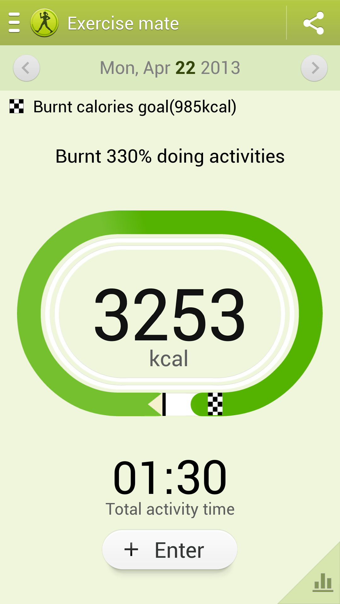
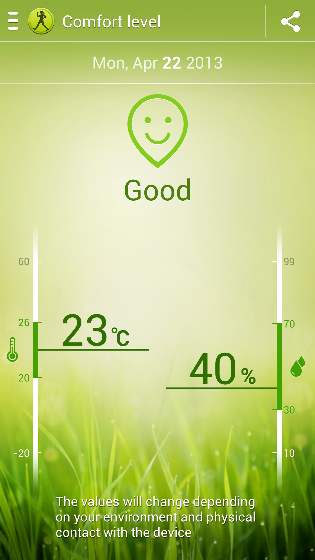
S Health is a suite of apps that uses the phone’s accelerometer, in addition to the barometer and thermometer, new to the GS4, to count your steps and ensure temperature and humidity are within acceptable bounds. I use a Jawbone UP for my exercise tracking and found the Galaxy S4 to be within a few steps of the bracelet. Less impressive is the S Health UI which feels, as do many of Samsung’s first-party apps, like it was borne from the depths of the Android Design Handbook circa 2009.
S Health promises to work with a number of accessories in the future, including a Jawbone UP-like bracelet, a WiFi-enabled scale and a heart monitor. While it’s admirable that Samsung wants to poke its head into the burgeoning (and profitable) wearable computing category I wonder, like the S Health app itself, whether they shouldn’t just leave it to companies like Jawbone and Fitbit to focus not just on usability but design.
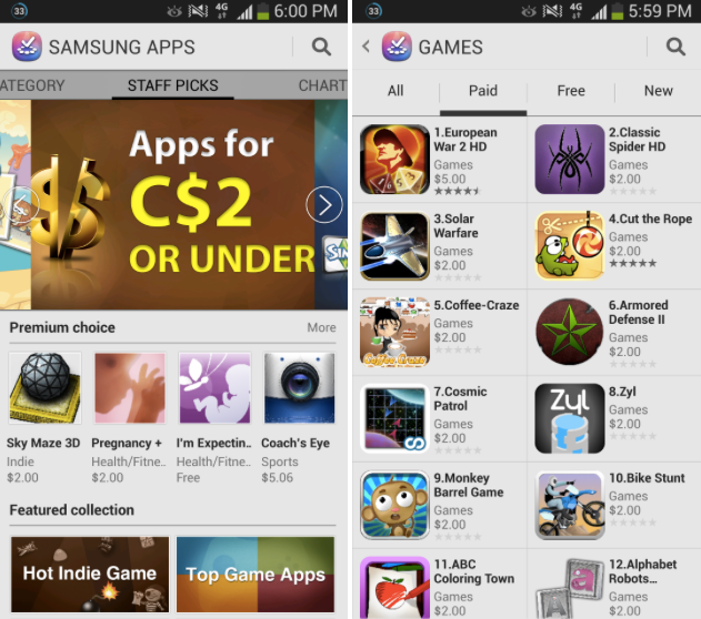
Samsung Hub is a consolidated version of the company’s previously-disparate content sources wrapped in a nice interface. Indeed, Hub is likely the company’s most well-designed app, but its egregious attempts to emulate (and, let’s be honest here, nullify) Google Play’s considerable library of apps, music, books, movies, TV shows and music is, sadly, not a good move. Samsung has had its app store for a couple of years now but has yet to give users a reason to buy into it. Not only are most apps and other forms of content purchased through Samsung available on Google Play, but they’re tethered to a Samsung device through DRM.
My favourite new feature of the GS4 is one that I have yet to try due to the phone’s lack of wide availability. Group Play employs a local mesh WiFi Direct network between multiple Galaxy devices (right now limited to the Galaxy S4 but we’d imagine, with an update to 4.2.2, the GS3 and Note 2 as well) to sync music, games and others.
The GS4 has a decent little speaker, but playing a song among four or even eight devices, with a Master unit controlling the others in local space, is an astounding achievement. Think a localized Sonos network.
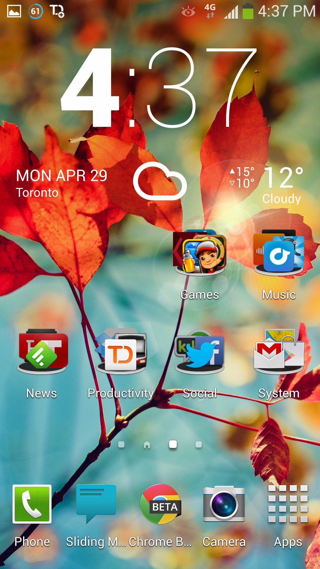
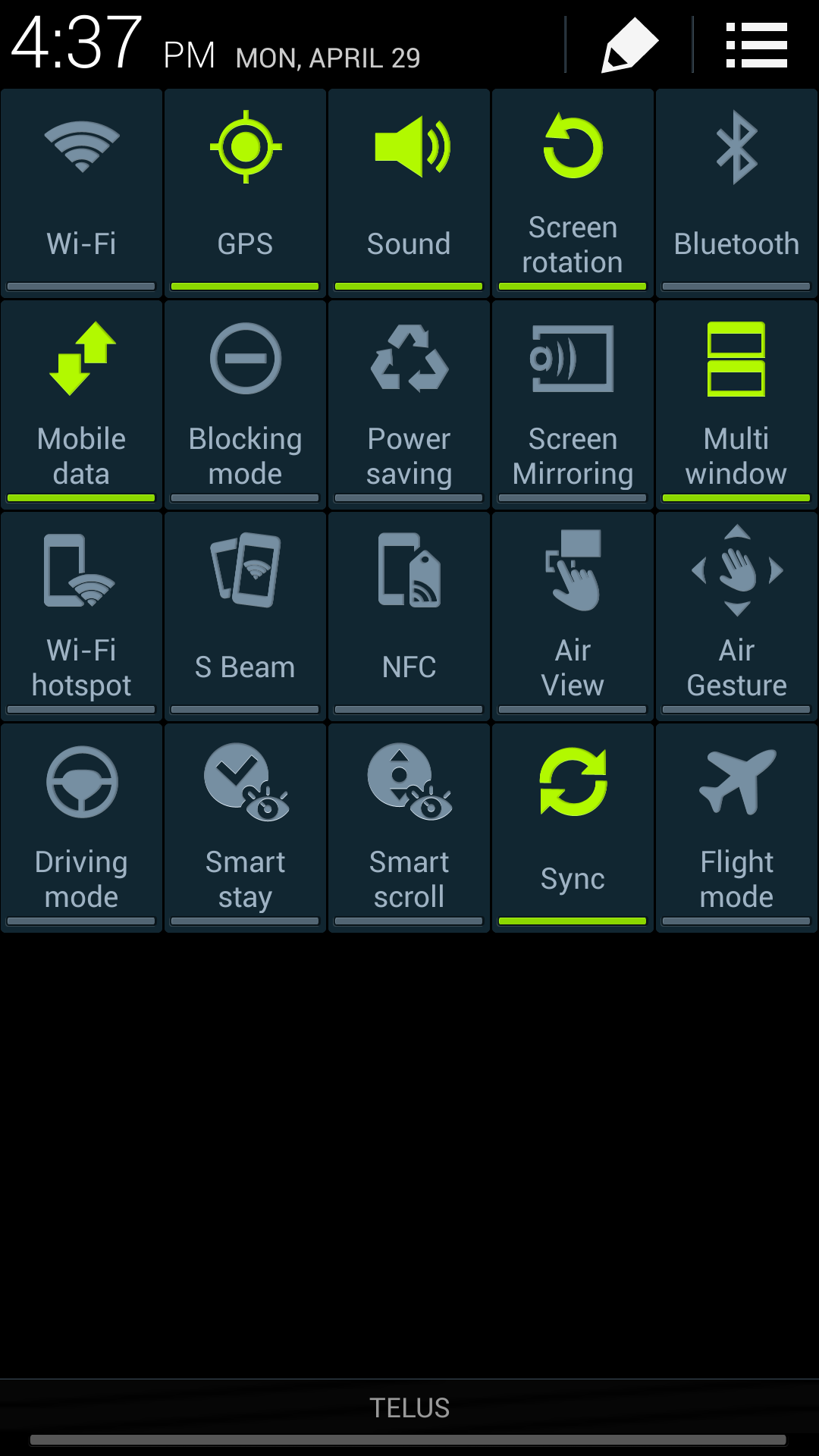
Other areas in which the experience has been improved is the notification bar, as Samsung has modified slightly the standard quick settings button from Android 4.2.2 for its own purposes. Not only is the established horizontal-scrolling bar present when the shade is open, but you can expand it (and edit it) to control 20 different functions of the phone, from WiFi to Smart Stay to NFC.
There is also a new brightness toggle which can now alter the standard Auto setting between -5 and +5 below or above the standard number. This can help save battery and provide better visibility in sunlight while maintaining auto brightness algorithms.

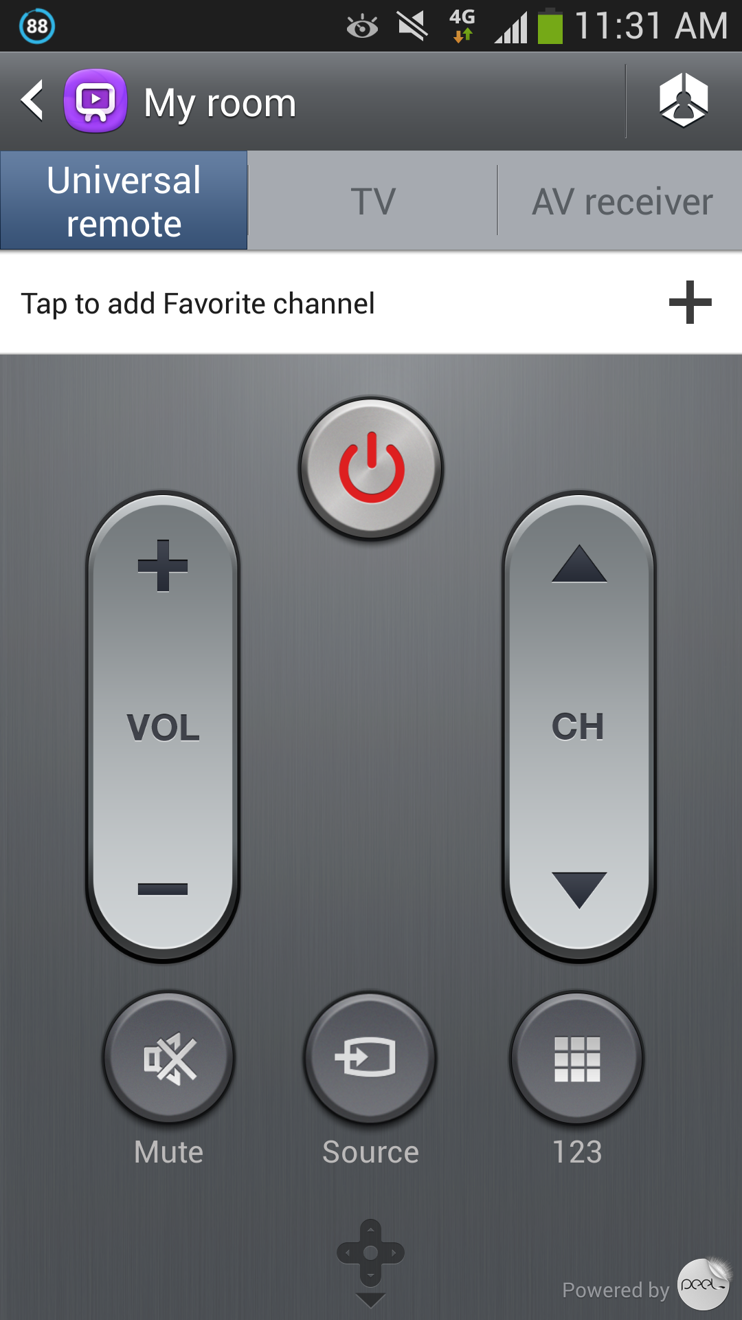
Samsung’s WatchOn app, like HTC’s and Sony’s before it, allows users to control their televisions and stereo equipment through an application. Powered by Peel, the as the HTC One’s TV app, WatchOn lets you program several stereo components to change inputs, volume, channels and more. It also acts as a de facto PVR remote, letting you set reminders for various shows or begin recording an episode or two. The built-in remote mirrors many popular universal remote styles and the whole thing just works. It’s so good that I’ve done away with my physical remote controls entirely.
To keep you from snoozing, I’ll omit the mention of several other less monumental features of the GS4. Suffice it to say, you can feed yourself for days on the phone’s feature set alone, and while all are not useful for all, many will be useful for some. Carried-over features like “do not disturb” Blocking Mode and a newb-friendly Easy Mode are somewhat buried — the device could use a 10-minute tutorial on first boot, if you ask me — but still present, and the various sound and display settings (pick Movie mode for less garish colour saturation) are more accessible on this year’s model than last. Samsung went in the opposite direction to HTC’s feature-pruning in Sense 5.0, but TouchWIZ is every bit as responsive and colourful as it has always been.
For better or for worse.
Camera
The Galaxy S4 has more camera modes than you’re ever likely to use, but thanks to a UI adopted from the Galaxy Camera it’s possible to safely stay in Auto Mode and never miss out on fantastic photos. Not only are the 13MP sensor and f/2.2 lens significantly improved over the GS3 and Note 2, but they form one of the best combinations to ever grace a smartphone.
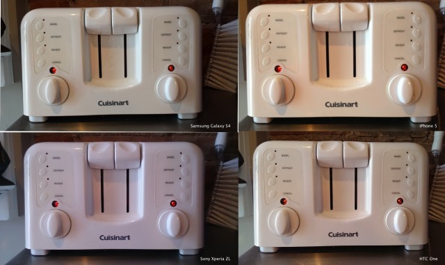
When compared to the HTC One, we found that the Galaxy S4 beat out its rival in all categories except for low-light performance and a few situations like action shots that benefited from the One’s optical image stabilization. The 13MP camera in the GS4 captures an amazing amount of detail in good lighting conditions, a prerequisite for users who do a lot of editing.
In real world scenarios the extra pixels are unlikely to be fully utilized, but that doesn’t mean that they should be dismissed; Samsung may be overdoing it with the sheer number of pixels, especially when the sensor itself is the same size as on previous generations, but the excellent results speak for themselves.
The Galaxy S4, despite its fairly long 31mm equivalent focal length, can pull off some of the best macro photographs I’ve seen from a mobile phone. In fact, everything I took in good lighting conditions was a cut above the others in the same category, including the iPhone 5, Note 2, Lumia 920, Xperia ZL and HTC One. And where the GS4 fails to deliver high quality photos in low light, its situation-specific Night Mode nearly makes up for it. In Night Mode, the shutter speed is slowed and the phone enables anti-shake mode in addition to taking multiple exposures.
This results in a photo with a remarkably low amount of grain and one that is no longer underexposed. You have to be very, very stable when shooting in this mode, as the slightest movement will affect blur (due to the low shutter speed) but if you’re patient you can get great low-light shots from the GS4.
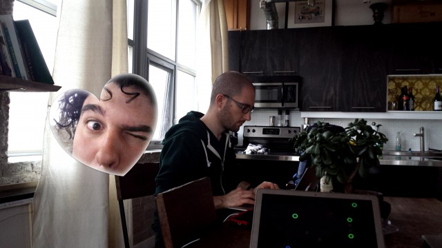
Many of the modes announced at the press conference will be little used, but ones like Dual Shot, which opens up the front and rear cameras at once and makes for some interesting and potentially troll-worthy photobombs. It’s also great, when used earnestly, for families and friends, when it’s not possible to get everyone in the photo.
Other modes, Sound & Shot, remind us of HTC Zoe, recording several seconds of audio in addition to still photos. Drama shot captures multiple exposures over a couple seconds and intelligently merges them into one photo, great for soccer games and dogs in the park. Animated Photo is like Cinemagram, where you can specify certain areas of the photo to animate. It works well enough but its implementation isn’t as intuitive as the aforementioned app, nor is it as fast as Nokia’s interpretation of the technology for its Lumia series.
There are others, still: HDR Mode takes multiple exposures of the same image, allowing for better dynamic range between areas of low and high brightness; Eraser mode takes five photos and lets you remove unwanted objects from the amalgamation; Panorama mode is a great way to capture a wide landscape vertically or horizontally, and feels faster and more intelligent than on the GS3.
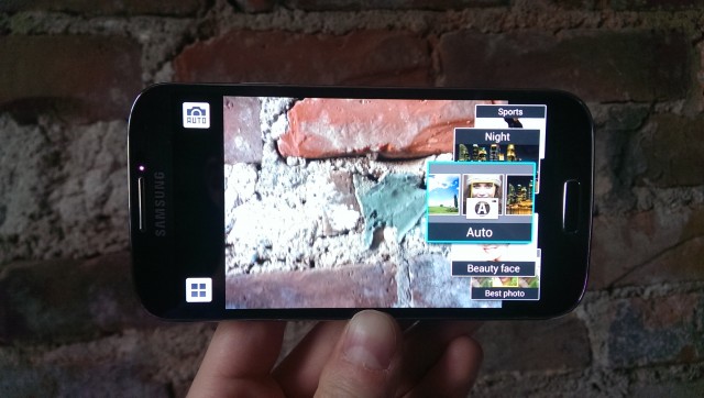
The more you play with the camera features, the more you realize they are meant for the average consumer looking for “modes” and not enthusiasts looking for tweaks. Unlike in old versions of the app, you can no longer swap out shortcuts for your favourite settings on the left side of the screen, nor can you adjust brightness, colour saturation and sharpness manually, though ISO and exposure metering are still available.
Video capture is not quite as complicated, but there are still numerous settings to choose from. In addition to standard 1080p shooting mode, which captures 30fps video at 17Mbps using the H264 codec, you can shoot in slow motion, capturing video at 120fps. And unlike the Sony Xperia ZL and HTC One, there is no HDR video capture mode, nor does the phone boast optical image stabilization, lending videos a frenetic, uneven candidness. Audio capture is also not as full as the HTC One, though it’s a marked improvement over the Galaxy S3.
Ultimately, the Galaxy S4 is a far more versatile camera option than the HTC One, though the latter does boast far better low-light photos and a less complicated workflow. It also promises better video results, with less shakiness and superior audio. Most people will prefer the GS4 mainly because it obtains photos in more situations.
Battery Life
The Galaxy S4 is a two-faced kind of phone. On one hand it promises all-day battery life that can extend to multiple if you have a spare cell. On the other it is a battery-chewing fiend, what with its various sensors and background processes sucking down juice like a sportsman after practice.
Therefore my battery experience also went through two notable periods: one where I was testing out the phone’s many, many features; and other where I switched off the S Health, Smart Stay, Air View, etc., and used it as I would a phone from any other manufacturer. While the results weren’t exactly night and day, they were certainly close to dusk and morning.
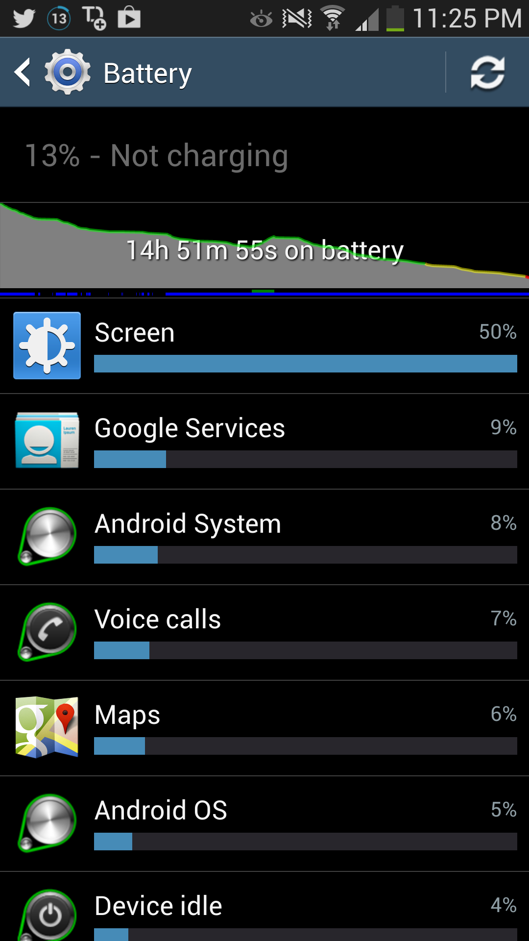
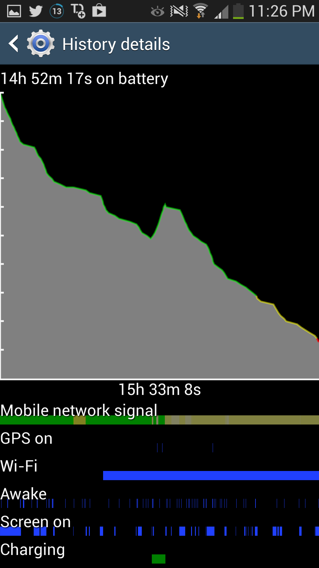
I was easily able to surpass the majority of devices, including the HTC One, with typical use. That spelled 15 or so hours from a single battery charge, roughly equal to 8am off the charger ’til 11pm in the red zone. That is the kind of result I like to see, because I always have an external battery or spare cell at hand if necessary. More impressive was the uptime when all the extraneous, sensor-using features were turned off. In that scenario I reached 11pm with between 25 and 35% left in the proverbial tank.
Samsung offers a Power Savings mode similar to the HTC One which, when enabled, limits maximum CPU speeds, maximum brightness and haptic feedback. Whereas the HTC One lowered its CPU 1.1Ghz per core, Samsung slides maximum frequency to 1.35Ghz per core, still more than high enough to navigate the UI smoothly and engage with the phone as normal. With this mode enabled all day I managed to eke out an extra five hours of battery life, though that number may not be reproducible on a day-to-day basis.
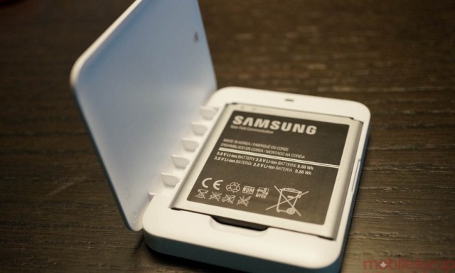
I haven’t been able to detect any significant inherent advantages to battery life from Android 4.1 to 4.2, but the Galaxy S4 still manages to beat the HTC handily when it comes to battery life. Being able to change the battery cell or purchase a larger one with a custom backing from companies like Mugen Power further enhance the phone’s versatility as a work tool.
The phone also takes around four hours to charge, slightly longer than the 2300mAh HTC One, but with secondary cells and a number of first- and third-party charging accessories available, this isn’t likely to be as significant an issue as on other devices.
Reception & Call Quality
Thankfully, the Galaxy S4’s many bleeps and bloops don’t undermine its use as a phone; the device makes crisp, loud and extremely reliable phone calls.
I used the device on TELUS’ LTE network and found signal to be rock solid and some 10-15dB better than the HTC One in some areas of Toronto. The Rogers variant of the device offers 2600Mhz capabilities — in fact, all LTE-capable models do, but Rogers is the only one advertising it — but I wasn’t able to test its veracity.
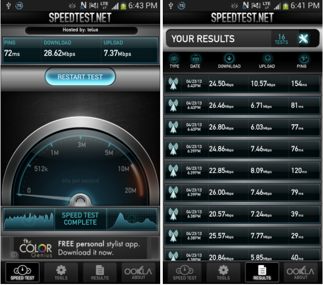
Over TELUS’ LTE network, I consistenty achieved over 25Mbps down and often 8-11Mbps up. More importantly, ping times were extremely low, rarely rising over 50ms during speed tests. This translated into responsive DNS resolution and web page loading, as well as quick download speeds. In parts of the city LTE was absent, TELUS’ DC-HSPA+ network was rock solid and pushed 12Mbps down and 2Mbps up.
The Galaxy S4 has a vastly improved rear speaker, though it is still a single driver. While I’ve been spoiled by the HTC One’s dual front-facing speakers, the Galaxy S4 rarely disappointed in real-world scenarios. Its placement on the back of the phone, near the bottom left, is perfect for when the phone is held in the hand, as the slight hollow space between the palm and speaker amplifies the sound towards the phone’s two sides. While not ideal, it’s the best secondary placement for a speaker that I’ve found.
A Few More Notes
– The Galaxy S4 doesn’t get as hot on the back as the HTC One, nor as spicy as the Galaxy Note 2. While the backing does get warm to the touch when the processor is heavily taxed, I rarely noticed it or found it to impede my enjoyment of the device.
– The LED notifier is located near the top left of the phone, and blinks a variety of colours. In this way it is more versatile than the HTC One, which can only display a limited number of hues.
– Its screen has a High Sensitivity mode that allows for use with gloves or through garments. I found the implementation to work less consistently than on the Nokia Lumia 920 but it does work, and that’s more than can be said for the majority of Android devices today.
– The Galaxy S4’s keyboard, despite being powered by SwiftKey, is nowhere near as good as SwiftKey proper. This boggles my mind, as there was every opportunity to make this the truly best native keyboard on an Android phone, but alas, you’re still going to want to download a third party keyboard.
– The phone’s 2MP front-facing camera is no better than most other flagship devices, which means that while OEMs are still attempting to innovate on the rear camera they have hit a plateau on the front one.
– All carrier bloatware is pre-loaded into a single folder but, unlike on the HTC, they can cannot be deleted from the phone.
– It appears that Samsung has left the device’s bootloader alone on the Canadian builds which, unlike on the AT&T model, means there shouldn’t be an issue loading new software on it. The problem is that because the Canadian model shares the same underlying architecture as the aforementioned U.S. variant, initial availability of custom ROMs and kernels will be limited due to a shortage of developers with access to the phone’s bootloader. This is an unfortunate situation alleviated somewhat by the fact that the device runs Android 4.2.2, the latest version of the Android software.
Accessory Ecosystem
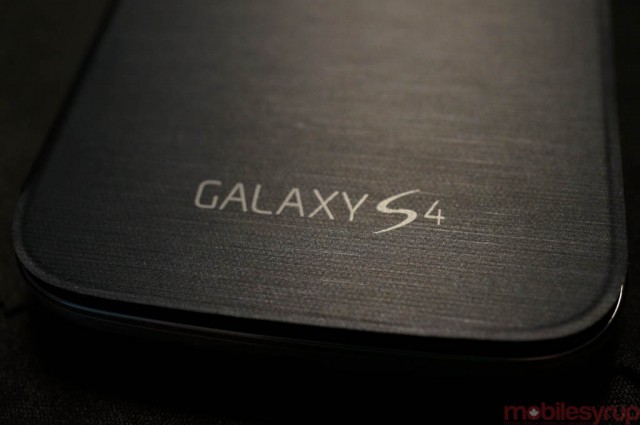
The Galaxy S4, like its predecessor, is likely to be the most popular Android device of 2013. Accessory manufacturers, as well as Samsung itself, will be flooding the market with quality and questionable-quality add-ons for the device, and we managed to steal some time with some of them during the launch announcement.
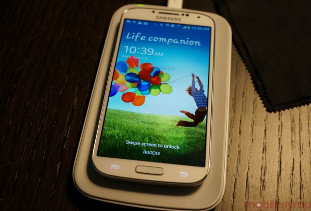
The device will support wireless charging through a custom removable back and separate charging station which together will cost around $150. Because the backing is compatible with the Qi wireless charging standard, it will likely work with existing mats and adapters, but at the very least it is an added expense. The custom backing also adds some bulk to the phone, around 1mm or so, and interrupts its lithe profile.
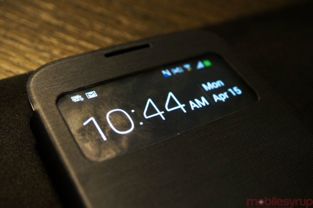
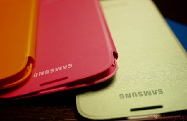
There will be a dock and secondary battery charger, as well as various cases like the Air View case that, when closed, displays the time and various notifications through a window slit.
You can also look forward to several official coloured cases, both in slip-on TPU forms and, as with previous generations, front cover cases that wrap around the device with a custom backing.
The Competition
The Galaxy S4 is not being released in a vacuum, and this year the company’s competition comes not only from itself (the Note 2 and discounted Galaxy S3) but from Sony, LG and especially HTC. And there’s always the iPhone 5 to consider if you’re looking for the best possible app ecosystem.
The HTC One is the favourite here, both in terms of design and build quality, but the Galaxy S4 edges it out on photo quality and software. Yes, despite TouchWIZ’s many questionable design choices, that the GS4 runs Android 4.2.2 and comes with a million and one features does give it an advantage. These features can be turned off is desired and what’s left is an extremely fast, versatile Android device which never runs into the problems of older software or a virtual menu button. It’s uncertain when HTC will update the One to 4.2, and it’s likely that Samsung will be well on its way to another version by then.
The Galaxy Note 2 is also a device to consider. Despite its lower screen resolution and slower specs, the massive phone/tablet hybrid offers a Wacom-powered touchscreen and an excellent tactile S Pen for note-taking and annotations. It’s also come down significantly in price since the announcement of the GS4, making it more attractive to those who don’t need the newest device. Samsung is still a few months away from the Note 3, so its current offering is still a great choice.
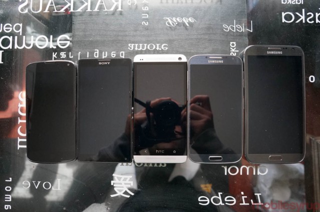
The Nexus 4 is also still a fantastic option for many people; it runs stock Android, will always receive updates before carrier-released devices, has an unlockable bootloader with tons of custom ROM options like CyanogenMOD, and it’s way, way cheaper than the Galaxy S4. It doesn’t match the GS4 or HTC One in screen resolution or camera quality, but at $359 it’s half the price.
The Sony Xperia ZL is another good option, but doesn’t compete on screen or camera. It does have fantastic build quality, though, and is currently cheaper than its two 1080p rivals.
Of course, the iPhone 5 is coming up on eight months old, but it’s still the best choice if you’re looking for a a device with unmatched one-handed usage, a high quality app ecosystem, superior music and movie purchase choices and excellent build quality.
Conclusions
Last year, I had few final words: “Buy the Galaxy S3, as there isn’t a better phone on the market.”
This year, the scenario is complicated by the entrance of the HTC One and a few mystifying design choices by Samsung. Why does the phone still employ materials that undermine the fantastic hardware underneath? Why does its creator feel the need to cram as many features into the device with little concern for quality control and design consistency?
The Galaxy S4 is still a top-tier smartphone, a product with hundreds of iterative and substantive improvements over its predecessor. It’s a good thing the company is not able to rest on its laurels, with HTC and others chipping away at its Android dominance, because it will hopefully act swiftly to remedy the concerns of reviewers and users alike.
With a gorgeous screen, an excellent camera and industry-topping performance, Samsung’s Galaxy S4 comes highly recommended.
What Works
– Beautiful, high-resolution screen with improved colour accuracy over previous models
– Excellent camera quality and lots of opportunity for tinkering
– Many of the new features like Air Gesture, S Health and WatchOn are well received and useful
– Impressively compact for 5-inch device
– Improved build quality over predecessor
– Removable cover and battery, plus expandable storage is a bonus
– Android 4.2.2 brings access to lock screen widgets
– Good battery life
– Excellent call quality
– Lots of accessories available
What Needs Work
– Low-light photo quality is lower than competition
– Build quality still below that of the HTC One and iPhone 5
– Comes with nearly half of its 16GB storage already in use out of the box
– Many features like Air View and Smart Scroll feel underdeveloped
– Emphasis on using Samsung-branded content portals feels forced and undermines Google Play
– A few performance hiccups
– Comparatively expensive when compared to other flagship devices available
MobileSyrup may earn a commission from purchases made via our links, which helps fund the journalism we provide free on our website. These links do not influence our editorial content. Support us here.


