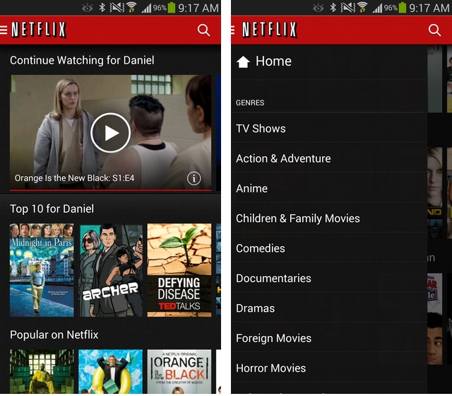
Netflix for Android is being overhauled in a new release rolling out today.
While, aesthetically, Netflix 3.0 doesn’t look all that different from previous versions, the team has completely reworked it from the bottom up to offer performance that doesn’t suck. If you’ve ever used the app, either on a tablet or a phone, you’ll have noticed that regardless of processor speed or resolution, scrolling was janky and the app had a tendency to just stop responding whenever it felt like it.
In addition to performance improvements, the team has added a left-side “hamburger” navigation bar for easier moving between categories, and text and screenshots have also been sharpened on higher-resolution devices.
Netflix for Android lacks one important feature, profiles, that rolled out to iOS and PS3/Xbox 360 devices earlier this year, but the company says it’s working to bring the feature to Android as soon as possible.
The app may not change the fact that Canada still has an underwhelming choice of content compared to the U.S., but there are always ways around that.
Android Police has some mirrors to the APK, too, if you’re not fond of waiting.
[source]Google Play[/source][via]Android Police[/via]
MobileSyrup may earn a commission from purchases made via our links, which helps fund the journalism we provide free on our website. These links do not influence our editorial content. Support us here.


