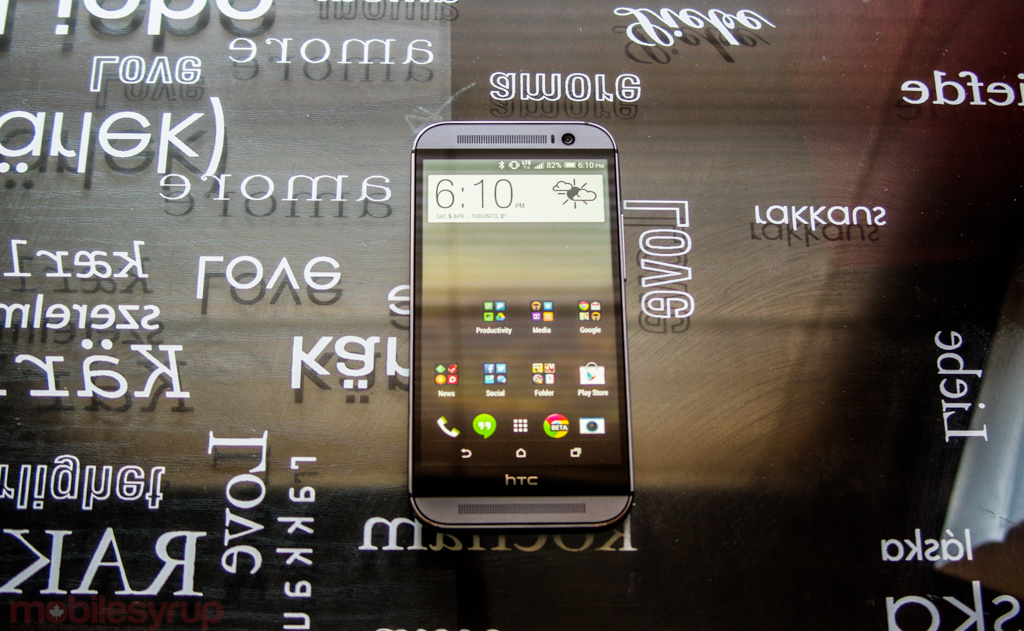
There’s a popular idiom reinforced in schools every year to millions of students: two heads are better than one. The thinking goes, one person is an island, and smart as he may be, there’s always another way to look at a problem. With the second HTC One, the M8, the Taiwanese manufacturer worked closely with chip designer Qualcomm to create a device with two cameras that work together to seamlessly solve one problem: depth.
While there’s no question that the all-metal One M8 is beautiful, fast and well-made, some of HTC’s decisions, including that dual-camera array, provoke more questions than they answer. That there is so much to like about the phone makes its failings even more frustrating — and disappointing. This is the year HTC needs to make its comeback, and with the One M8 as its vehicle, can the once-leader of the Android market regain its footing?
Specs
- Android 4.4.2 with Sense 6.0 overlay
- 5-inch 1920×1080 pixel Super LCD 3 display
- 2.26Ghz Qualcomm Snapdragon 801 SoC w/ Adreno 330 GPU
- 2GB RAM / 32GB internal storage + microSD slot up to 128GB
- Duo Camera (4MP main “Ultrapixel” sensor + secondary sensor for depth) / 5MP front-facing camera
- 1080p video capture (front + rear)
- WiFi (a/b/g/n/ac), Bluetooth 4.0, NFC, A-GPS, GLONASS
- 2600mAh non-removable battery
- HSPA+ 850/1700/1900/2100 LTE 700/AWS/2600
- 146.3 x 70.6 x 9.35mm
- 160 grams
Design & Display
The HTC One M8 is dense. It is taller, wider, thicker and heavier than last year’s model, and where the M7 was all smooth and angular the 2014 model is fuller, the power forward to its point guard.
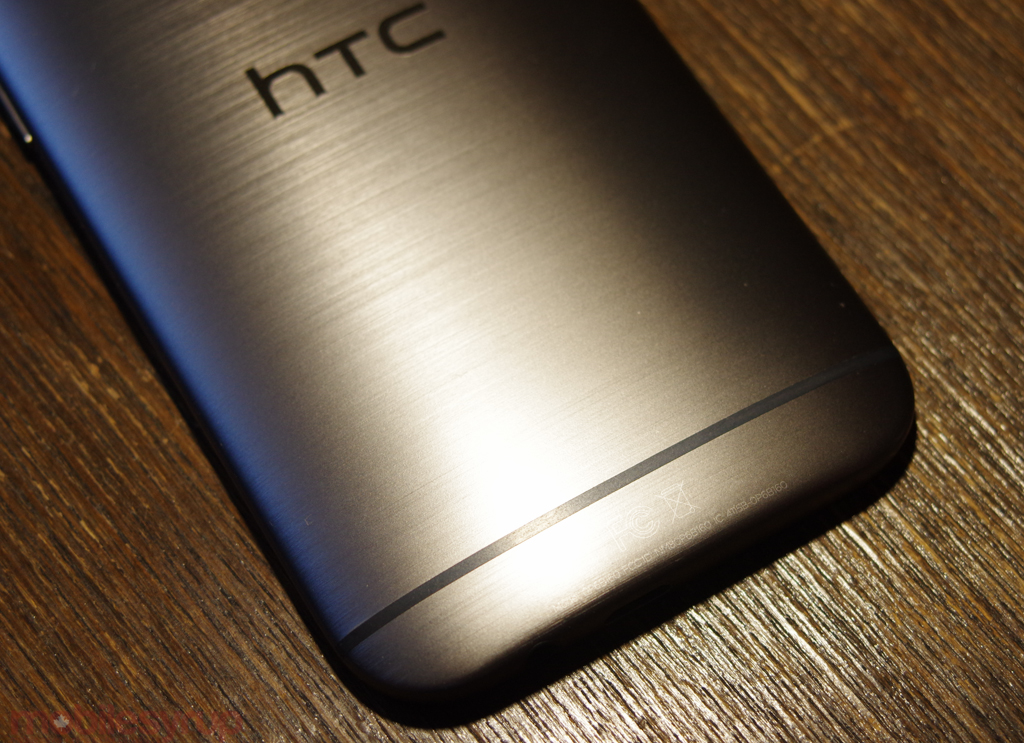
That extra size is a direct result of HTC putting more into the phone itself: more antennas, faster chips, a large battery, and a higher proportion of metal. HTC says this year’s One is comprised of 90% metal, compared to 70% last year. Managing to overcome the attenuation issues associated with antennas bundled into metal chassis — the company went through countless prototypes before getting it right — the new device feels much more solid as a result.
The finish, though seemingly a result of the metal, is actual artificial, and purports to hide scratches through myriad horizontal valleys. In reality, the not-quite-glossy finish is slippery, at least on the Gunmetal Grey version I reviewed, and makes it imperative to either buy a case (HTC has you covered there) or take extra care when shifting the phone in your hand. The 5-inch 1080p display is excellent, but the larger size over last year’s model does make it feel rather unruly; I truly noticed the size increase, and find myself lusting after the relatively compact form factor of the original One after weeks of using the M8.
Like last year’s model, HTC continues to offer one of the best mobile displays on the market. This is a standard full-RGB LCD, which means that viewing angles are superlative and colours are accurate, even if contrast isn’t quite as thorough as the new crop of Super AMOLEDs from Samsung. But even’s Samsung’s improved Galaxy S5 display can’t match HTC for colour accuracy, which is where the screen excels over its competitors. The One M8’s screen is slightly more well-calibrated than its predecessor’s, and boasts extremely high maximum brightness, making it a cinch for outdoor viewing, but it’s no longer alone at the top of the pile; Samsung, LG and even Sony have managed to secure or manufacture extremely high-end screens of their own for the S5, G2 and Xperia Z2 respectively.
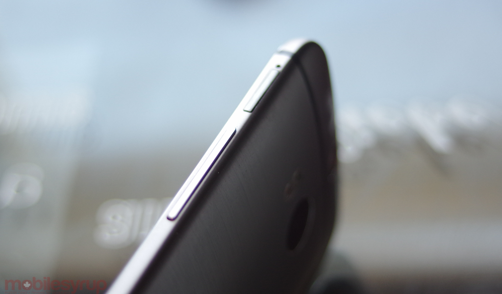
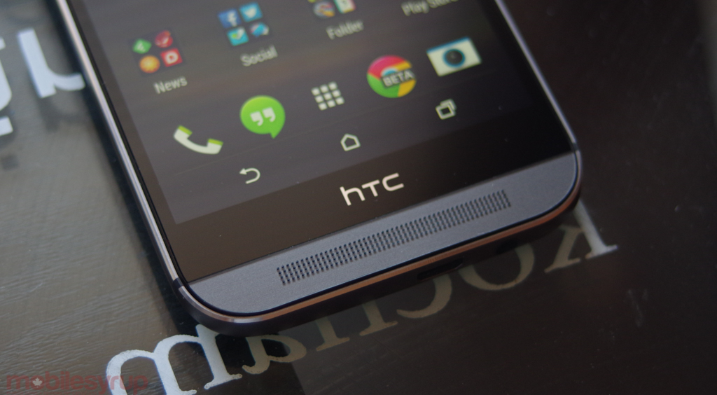
The One M8 is certainly nicer than the M7, but I’m still unconvinced the choices are wholly positive. Despite the presence of on-screen buttons, the device is too tall for my liking, owing to the dual stereo “BoomSound” speakers and accompanying circuitry therein. The bezels around the screen are larger than the latest crop from LG and Samsung, too, which makes the M8 feel gangly, like it’s wasting space. While that inference is not necessarily true, the average consumer may see it next to an S5 or G2 and declare it too big. What’s worse is that the power button, relocated to the top right of the device, is still too difficult to reach. Samsung understands this and continues to place its power buttons parallel to the volume controls on the right side of its Galaxy devices. Even with Motion Gestures, which lets you turn on the screen by double-tapping or swiping, powering off the device still involves some readjustment.
Other areas of the device have seen substantial improvements in usability. The volume rocker protrudes more, making it easier to press and the rounded sides and chamfered edges are deliberate and playful; like the amount of metal in the body, the M8 appears 90% complete, whereas the predecessor felt naked, more raw. For better or worse.
Ultimately, this is one of the most well-made devices on the market, one that will likely stand a beating and may even look better for it. Whether it’s a more attractive phone than last year is up for debate — personally, I don’t think so — but it’s still gorgeous, and better-looking than most smartphones on the market.
Performance and Software
I never disliked Sense, but this year I love Sense. HTC has taken the best of Android 4.4.2 and heaped spoonfuls of colour in measured doses, expertly taking advantage of the various new APIs offered by Google.
There are a few quirks that I’m not yet sold on — the staged-scroll vertical app drawer, for one — but HTC has a sense of app design shared by few of its peers. The software feels like it was built specifically for the hardware, much like iOS 7’s pronounced colours and flat UI was matched by the neon colours of the iPhone 5c. The launcher is familiar but for one main difference: there are on-screen navigation buttons, the first for an HTC product and a sea change from a company that resisted integrating them for so long. Martin Fichter, HTC’s VP of Product and Operations for North America, told me it was the integration of Immersive Mode, another under-appreciated feature of KitKat, that convinced the company to make the change. In fact, they were months away from releasing the M8 with capacitive buttons, and had prototyped both versions just in case.
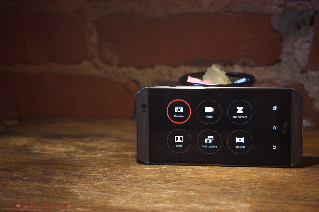
Many of the new Sense’s best features are hidden away in the Settings, but once discovered are extremely useful. Motion Launch gestures, for instance, let you turn on the screen by either double-tapping or swiping up from the bottom. Putting the device in landscape mode and tapping once on a volume key immediately launches the new camera interface (which is a big improvement over Sense 5.5). These are phenomenally useful improvements to the Android experience that build on the addition of a low-power “sensor core” to the Snapdragon 801 SoC. HTC worked with Qualcomm to build out the Motion Gestures, which use a negligible amount of battery; using a combination of accelerometer and gyroscope, the Snapdragon “wakes up” one of its cores when it detects the phone is being held — the gestures don’t work when the phone is lying on a table — and quickly puts it to sleep again.
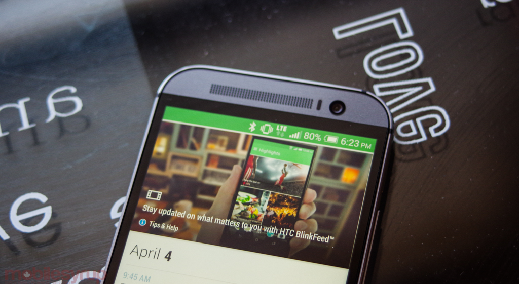
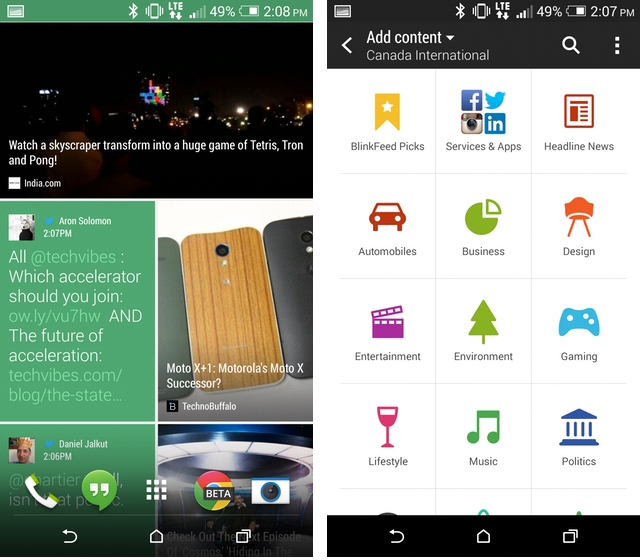
Existing Sense features have also been fleshed out in version 6.0, though none of them continue to be as contentious as BlinkFeed, HTC’s would-be consolidator of news headlines, lifestyle articles, Tweets, Facebook updates and whatever else you happen to enjoy. Like the Gallery, Calendar, Dialler, and other first-party apps, BlinkFeed has been “flattened,” its chrome and excess textures eliminated in favour of solid blocks of colour and easy-to-read typography. And, as with many infotainment apps like Flipboard, Zite and even Google’s own Play Newsstand, BlinkFeed attempts to summarize what’s important, and despite being more customizable and less busy than its former incarnation, I still prefer separate versions of apps to accomplish the same thing. That Samsung felt the need to match HTC with its own My Magazine feature means that there is certainly commercial potential here, and my reticence to use it is less about the feature itself than amount my workflow. I can see “average” smartphone users (read: non-hardcore nerds like me) quite enjoying it.
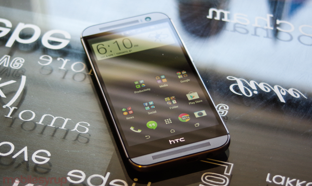
That the HTC One comes preloaded with Android 4.4.2 KitKat out of the box means that it’s easy to compare performance next to other products running the same software. But whereas other manufacturers like Samsung have ceased their benchmark-cheating ways, HTC still activates a High Performance Mode when certain apps are run, making it impossible to do apples-to-apples comparisons. That said, there is a lot more in the Snapdragon 801 than a few extra megahertz in each of the four cores.
That is, however, a good place to start. Last year’s M7 came with a Snapdragon 600, which was a slightly higher-clocked variation of the S4 Pro. But, like that 600 to the S4 Pro, there are a number of more subtle hardware improvements in the 801 that make it far more than a “marketing” upgrade over the 800. For starters, even though the 2.26Ghz CPU core speeds remain the same as the Snapdragon 800, both the graphics processor and RAM are significantly faster — 28% and 15% faster, respectively.
So too is the ISP, or image signal processor, which facilitates Zoe’s constant capture and UFocus’s ultra-fast rendering speeds. Anyone who’s used a Snapdragon 800-based device may not notice an appreciable speed bump on the One M8, but users of the M7, which used a last-generation Snapdragon 600, will most certainly enjoy the extra headroom.
Subjectively, the One M8 was a pleasure to use. It loaded apps quickly, and maneuvered between windows with ease. Where it faltered was where all high-end Android devices did: in badly-coded apps that scroll poorly. It appears that Android hardware is outpacing the platform’s developer tools, and many apps are still built with cement in the white spaces.
Camera
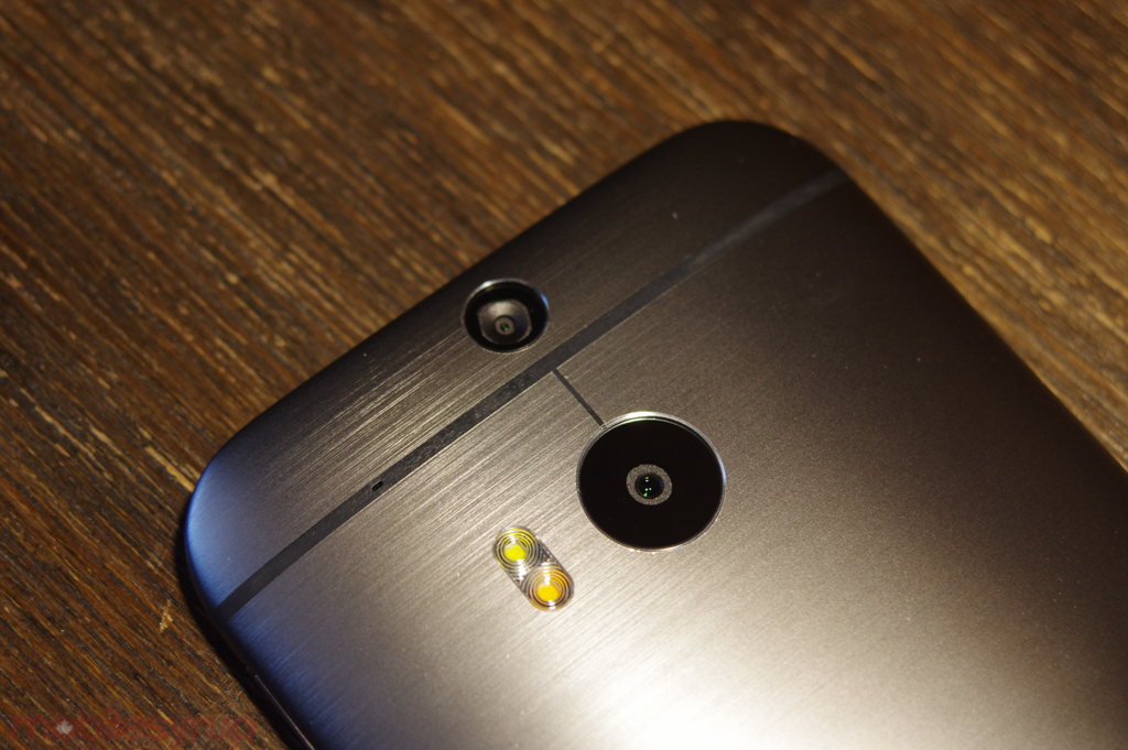
The Duo camera will forever be the most contentious aspect of the One M8, mainly because HTC chose to reuse the same 4MP Ultrapixel sensor as last year’s M7. In fact, the sensors aren’t exactly the same, but the specs are: a 1/3″ sensor with 2µm pixel size and a wide-angle f/2.0 lens with 28mm equivalent focal length. In theory, as HTC often reasserts, the relatively large sensor (for a phone), coupled with larger individual pixels in fewer numbers (four megapixels means four million individual pixels; in contrast, the iPhone 5s has an identically-sized 1/3″ sensor with eight million pixels) equates to more light being captured, and higher-quality low-light shots.
That was last year’s pitch, too. And it worked, some of the time. Most photos shared on the internet are, indeed, lower than 4MP, and when working within those limits the One M7 acquitted itself brilliantly. But the moment you compared a shot taken in good lighting conditions with any other high-end smartphone, from an iPhone 5 to a Galaxy S4, the lack of detail became very apparent.
This year, HTC’s newest trick is the combination of a smaller second sensor, hence Duo camera, with a much faster ISP inside a higher-clocked SoC. The former does not explicitly capture photos or video — there’s no way to isolate that second photo — but instead the camera uses the extra data to create a depth map of the scene, facilitating a number of interesting editing features. Many of these will go unused, but the most impressive is UFocus, which uses the extra metadata to blur out the background of a photo, or conversely refocus the background at the expense of said foreground object. It doesn’t always work, but when it does the results are absolutely wonderful. I really, really enjoyed playing with this.
The issue with the Duo camera is that although the quality of the 4MP photos are generally better this year than last — the sharpening algorithms are more accurate, and there’s no pink hue in the middle of the photo — they’re still just that… 4MP photos. The second camera does not magically combine with the first to create a 6MP shot, and while the One M8 is capable of capturing some superlative images, especially in less-than-ideal lighting conditions, the lack of detail relegates the camera to “point-and-shoot” status when I’m looking for “prosumer.” In short, when doing any sort of cropping or post-processing, you quickly lose much of the photo’s fidelity, and you’re stuck with a cropped photo just over 3MP.
Punctuating the irony of the situation is the fact that the front-facing camera is of a higher resolution than the rear one. The 5MP front shooter also has a wide-angle lens, and though it lacks the large pixel size and dual-toned flash of its rear counterpart, it’s quite a consummate selfie shooter on its own.
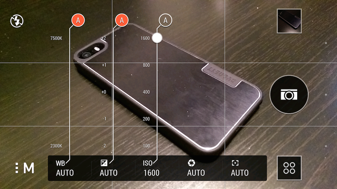
But let’s move back to the rear camera(s) for the remainder of this section. Does the HTC One M8 take great photos, in daylight or night light? Yes, most of the time. The lens focuses quickly — again, much faster than the M7 — and the entire camera experience is just wonderful. Truly, no one designs camera interfaces like HTC.
The new camera app is great for a number of reasons. The UI gets out of your way until you want it; when you do, there are a host of manual settings for exposure, maximum ISO, white balance and more. Custom camera settings can be saved as presets for quick retrieval later. Like Nokia’s Camera app on Windows Phone devices, when in manual mode these settings appear in a vertical slider, making it easy to adjust ISO or change white balance. The issue is that, like any digital viewfinder, the screen approximates your final image, and at high ISOs the frame rate suffers tremendously. That the maximum ISO is 1600 means it’s possible to take decent photos extraordinarily dark circumstances, but let’s not kid ourselves here: this is still a smartphone camera, and there is mud and grain aplenty when trying to decipher a smiling face in the dark.
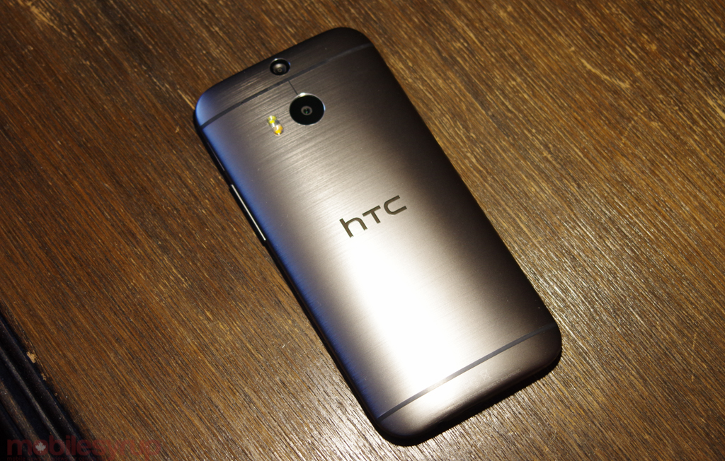
When artificial light is needed, HTC has sprung for a dual-tone flash, and like the iPhone 5s, it’s very good at adjusting for skin tones in the murky-lit indoor. Like all small LED flashes, it does still have a tendency to wash out faces, especially if the room is completely dark, since the sensor has no reference point for its subjects, but for the most part it works well.
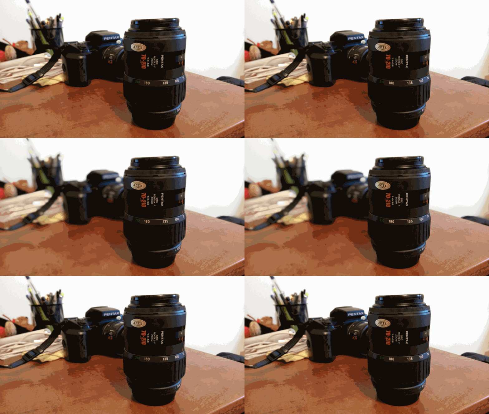
Returning to HTC’s Duo camera editing suite, the good outweighs the bad, but it’s hard to overcome the fact that despite two cameras and plenty of metadata, this is very much a digital salvo. For example, UFocus only captures two planes of data, and sometimes the transition from foreground to back sacrifices some fidelity in the middle. In the case above, which has been crudely laid out in animated GIF format, you can see the changes that happen from a well-executed UFocus capture. The foreground is plainly in view, and the background defocuses, creating a gorgeous blurring without sacrificing fidelity.
Because the depth of field is artificial, though, stray objects often get caught in the middle of the front and back camera, and the software isn’t sure how to handle it. In most cases, the background (or foreground) blur is well executed, but you’ll occasionally find situations where part of the background is still in focus, tripped up by perspective.
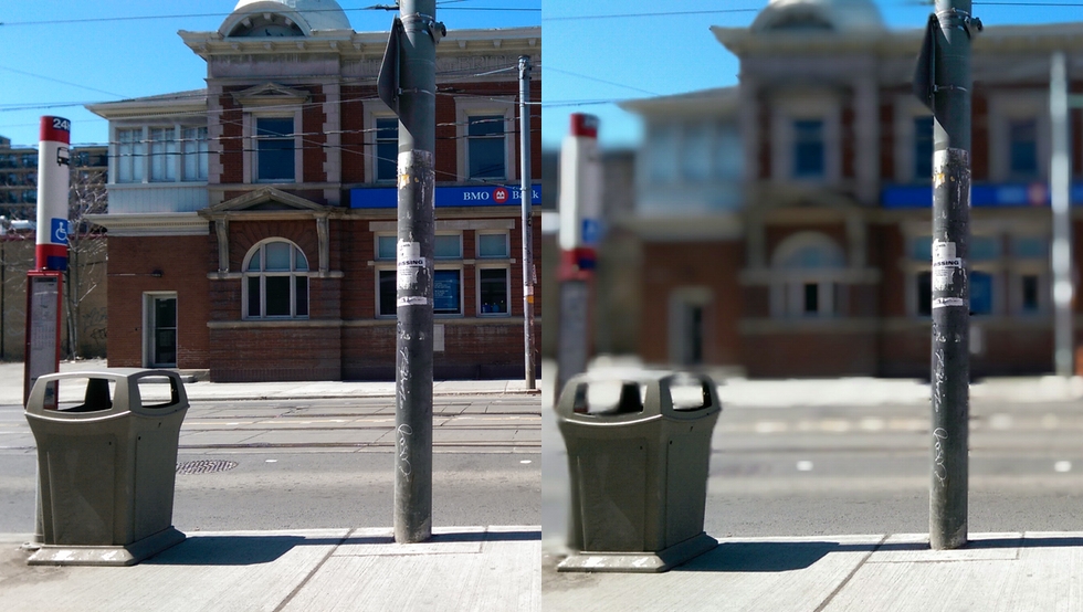
As you can see from this shot above, sometimes UFocus attempts to create a tilt-shift effect, but fails because the two camera sensors overlap in their detail. The effect is interesting, but jarring; it’s fun, but not always useful. UFocus works best when there’s a single foreground object to focus on, using the background defocus a bokeh simulation.
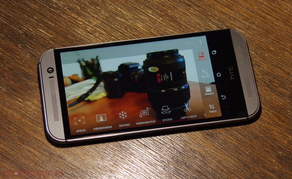
The Duo camera allows for other editing effects besides UFocus, though none that I use on a regular basis. Foregrounder lets you set the background as a painting, or cartoon; Seasons adds real-time 3D effects to your photo; and Dimension Plus is both the most interesting and most useless because it proves that using two sensors can facilitate some interesting three-plane effects.
Of course, Zoe share is back with Sense 6.0, and is significantly improved over the previous version. The feature, which allows you to capture moments of photos and video at the same time, is not only versatile but fun. The resulting videos, similar to Google+’s Auto Awesome output, uses one of 12 themes, combined with music, for an easy-to-share video clip. Later this summer, HTC will release a dedicated Zoe Share app to Google Play, allowing its community to not only share their own Zoe but remix those of friends and family.
As for video, because the sensor is just under 4 million pixels in width, it’s impossible to match the latest crop of Android devices capturing 4K video. Subjectively, this isn’t a huge loss: I have no use for such high-resolution video, and will unlikely found one over the M8’s lifespan. But it’s certainly a mark against HTC on paper which may not be able to shake the Ultrapixel stigma when comparing photo quality next to the iPhone 5s, Galaxy S5 and Xperia Z2.
Then there’s the omission of optical image stabilization, which helped the M7 produce steady, blur-free photos in situations where other devices couldn’t. Due to the complicated internal design of the Duo camera setup, HTC had to leave out the hardware stabilizer, and the results are immediately apparent, especially when shooting video. While the company claims that its digital stability algorithms do just as good a job, they don’t. Period. And it’s another mark on an otherwise great experience.
The TL;DR version of the camera is this: the HTC One M8 can and often does capture some outstanding photos, and is still one of the best for low-light photography in the smartphone market. But this year, Samsung, Apple and Sony stepped up their games significantly, and what was once a great, albeit low-resolution camera, is now merely a good one with interesting software quirks. The second camera sensor is intriguing, not essential. Next year, hopefully HTC understands this.
Battery Life & Connectivity
Despite sporting a battery only 300mAh larger than last year, the M8 often lasts twice as long as its predecessor. The M8’s uptime is fantastic, and while it doesn’t compare to the LG G Flex, more often than not it competes with, and occasionally surpasses, the uptime of the 3000mAh LG G2.
In real-world testing, the HTC One M8 was the third in a new cohort of Android phones I’m taking to calling the “Oneplus Generation” (which has nothing to do with the device manufacturer of the same name). These Oneplus devices will almost certainly last from morning to night without needing even the slightest recharge. And on the heavier-use days, we’re looking at a good 14 to 16 hours of good, solid use. This Oneplus Generation lasts, as you would expect, one or more days on a single charge, and it’s absolutely lovely.
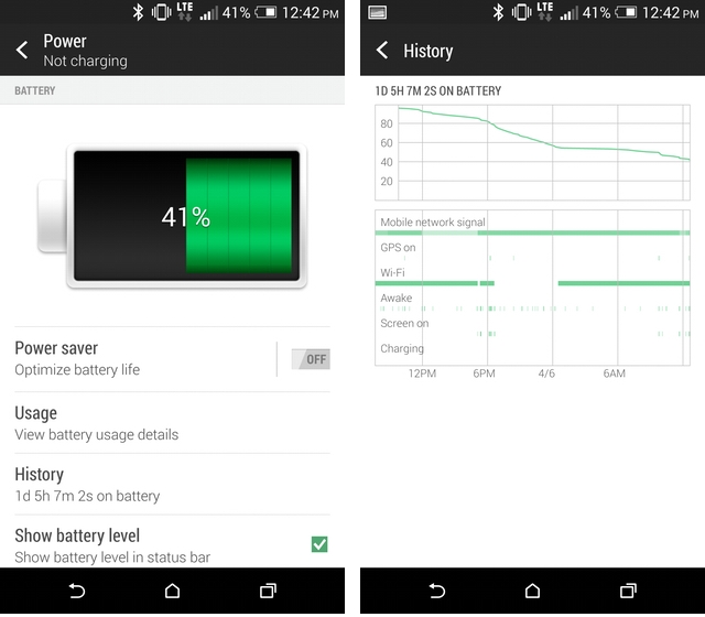
In our video looping tests, where we take a clip at medium brightness and loop it until the battery dies (and yes, we know that “medium brightness” varies from device to device — we’re working on getting a light meter for this very purpose), the HTC One M8 lasted approximately 12 hours, a quarter more than its predecessor on the same clip running the same version of Android.
HTC has continued its foray into battery-saving measures with the M8, even if it’s not as necessary this year. A Power Saving mode allows users to tame the CPU, brightness levels and vibration intensity, either manually or at pre-determined battery levels. In a future update, the M8 will be able to go into Extreme Power Saving Mode, which shuts off all non-essential radios and functions to prolong the wisps of a fading battery cell. HTC was contrite about its absence in US and Canadian M8’s at launch, saying that the regulatory process took longer in North America than anywhere else in the world.
BoomSound, HTC’s proprietary front-facing stereo speaker and high-power amplifier combo makes a return, and cements the company as providing the best aural experience on the Android market. While the speakers alone are not going to fill a room with tubthumping bass, they reach decibel levels, without clipping, that other devices couldn’t dream of. Moreover, the headphone amplification has been boosted since last year — 2.25 volts compared to 2V on the M7 — allowing it to push higher-impedance headphones while maintaining a full, rich sound.
Most people don’t take smartphone sound too seriously anymore; the combination of low-quality streaming audio files and crappy bundled headphones has significantly lowered the fidelity bar. But HTC and Apple appear to be the two companies making strides in this area, and we’re happy to see Android represented.
A few more thoughts:
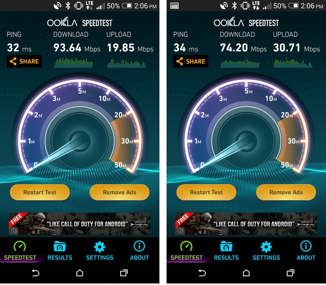
- LTE speeds in Toronto were excellent on Rogers (the demo carrier I used). The device supports triband LTE (700/AWS/2600) along with quad-band HSPA+ (850/1700/1900/2100) so it will work on WIND, Videotron and Mobilicity, too.
- There’s a microSD card, something that HTC said was added after receiving small number of very loud, adamant requests. Supporting cards up to 128GB, it’s a great way to add local storage to Android, but as we’ve talked about before, the OS is no longer as friendly to external media as it used to be.
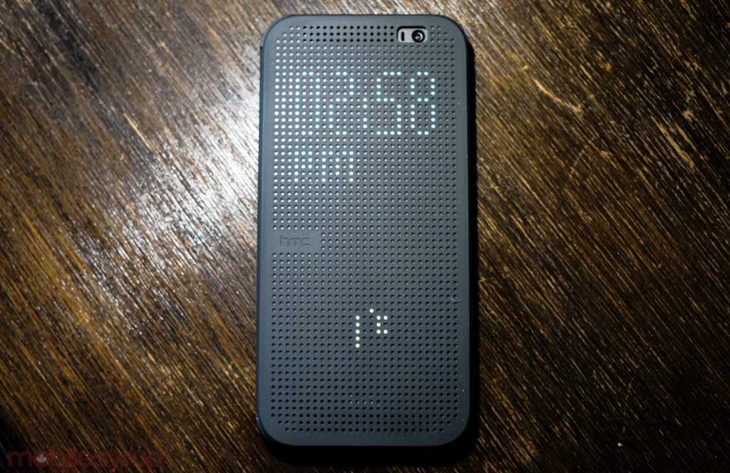
- I played around with the Dot View case for a bit, and it’s absolutely fantastic — until you open it and try to use it. Because of the tight hinge (which may loosen over time) it’s difficult to use the M8 when the case is open.
- The device uses one of those newfangled nano-SIM cards. Where have we seen those before? Ah, yes: the iPhone 5. The new card standard is slowly expanding its reach, available on the iPhone 5c, iPhone 5s and Motorola’s Moto X. Hopefully devices from other OEMs will begin shipping with the standard soon, as it’s been annoying having to flip back and forth between micro- and nano-SIM for my main line.
- Call quality was excellent, as one would expect from a modern smartphone. It’s not the clearest sound I’ve ever heard, but it’s good enough.
- As with the M7, the One M8 has an IR blaster in its power button to facilitate home theatre, TV and game console controls. The Sense TV app is once again powered by Peel for its TV guide listings, but the design has been given a nice makeover in line with the rest of the first-party apps from HTC.
- As part of the HTC Advantage, the company promises to keep its devices updated to the latest version of Android with 90 days of its release from Google, for two years after coming to market. That means the One M8 will likely receive the next few versions of Android long after some other companies discard theirs for something newer and shinier.
- The M8’s bootloader can be unlocked through the HTC Dev portal, though there aren’t many reasons to do so at this point. Still, it will be nice when custom ROMs are released.
Conclusions
The HTC One M8 is a better phone than the original, but it’s no longer easily the best high-end Android smartphone. Samsung, Sony and LG have cleaned up their acts, announcing and releasing stellar devices in recent months. Motorola came out of nowhere in August with the Moto X, and even the Nexus 5, a device half the cost of the One M8, is a contender.
And yet the M8 is holistically delightful: its well-built frame and intuitive software often overreaches, and where it succeeds, the experience is superlative and unmatched. The issues with the camera are built into the framework of what makes the One a One; it’s something you either have to get over, or avoid completely. There is no middle.
Everything else, from the performance to the display to the seemingly-endless battery life, is top-notch, and we’re so, so excited to see HTC at the top of its game. While the company’s future is still shaky, at least we know through the tumult they’ve been building and crafting an excellent Android device.
MobileSyrup may earn a commission from purchases made via our links, which helps fund the journalism we provide free on our website. These links do not influence our editorial content. Support us here.


