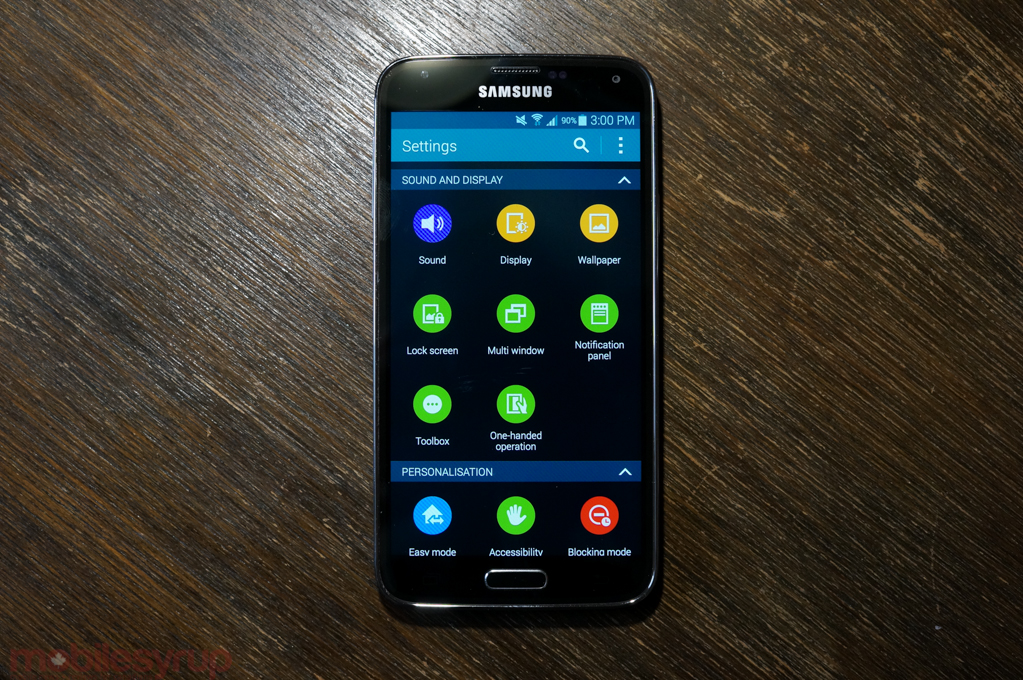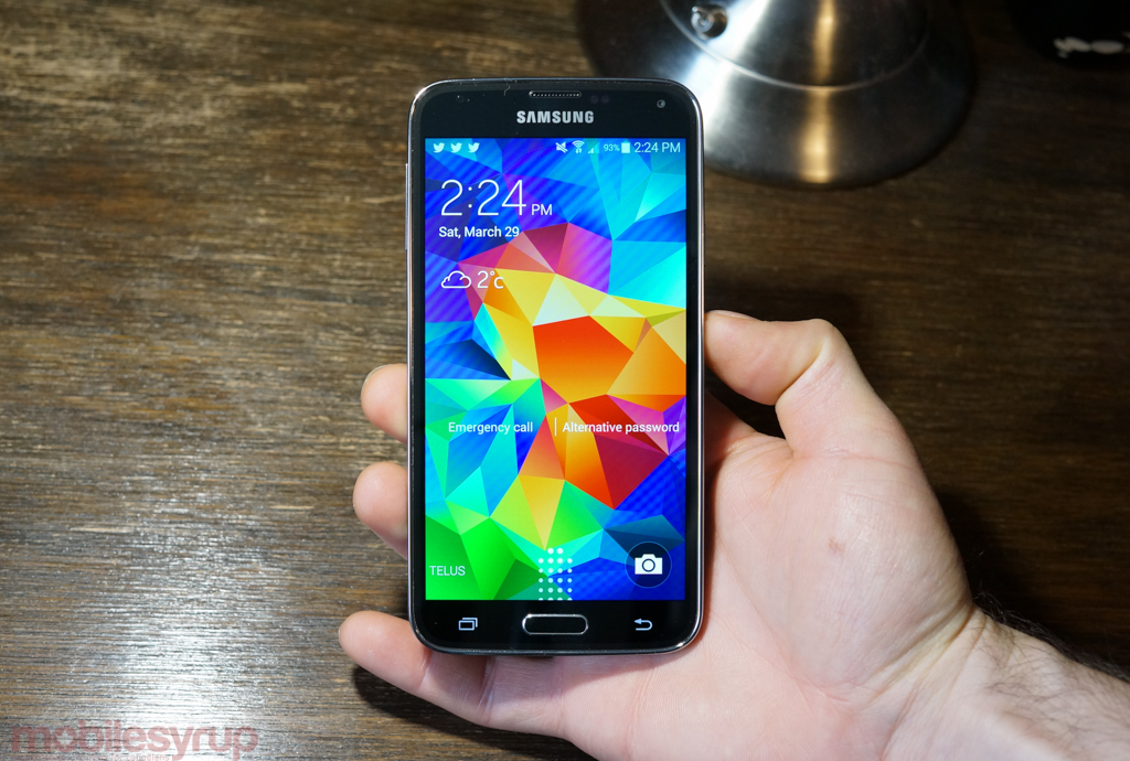
Few devices this year are going to receive the attention, and scrutiny, of Samsung’s newest flagship. The Galaxy S5 is the star of Samsung’s expanding smartphone lineup, and as the Korean company’s reach that grown beyond Android enthusiasts, its products have gone through a number of quiet evolutions.
Befitting the fifth product in a series, at the top of an industry settling into a comfortable middle age, the GS5 is mature, taking aim at pain points raised in previous versions. Speeds and feeds are secondary to what the phone can do, and though the company continues to look outside its walls for inspiration, the implementation of those ideas is all Samsung — for better or worse.
Coming to TELUS for $229 on a 2-year and other carriers on April 11th, the Galaxy S5 is a great Android smartphone, but is it a good buy?
Specs
- Android 4.4.2 with TouchWIZ Flat
- 5.1-inch 1920×1080 pixel Super AMOLED display
- 2.5Ghz Qualcomm Snapdragon 801 SoC w/ Adreno 330 GPU
- 2GB LPDDR3 RAM / 16GB internal storage (with microSD slot)
- 2,800mAh removable battery
- 16MP rear 1/2.6″ sensor f/2.2 lens | 2MP front-facing camera
- 4K video capture @30fps | 1080p video capture @60fps
- 2×2 MIMO WiFi (a/b/g/n/ac), Bluetooth 4.0, A-GPS
- Fingerprint scanner, heart rate sensor
- IP67 dust and water resistance
- 142 x 72.5 x 8.1 mm
- 145 grams
Design & Display
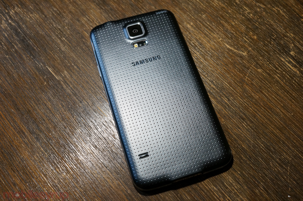
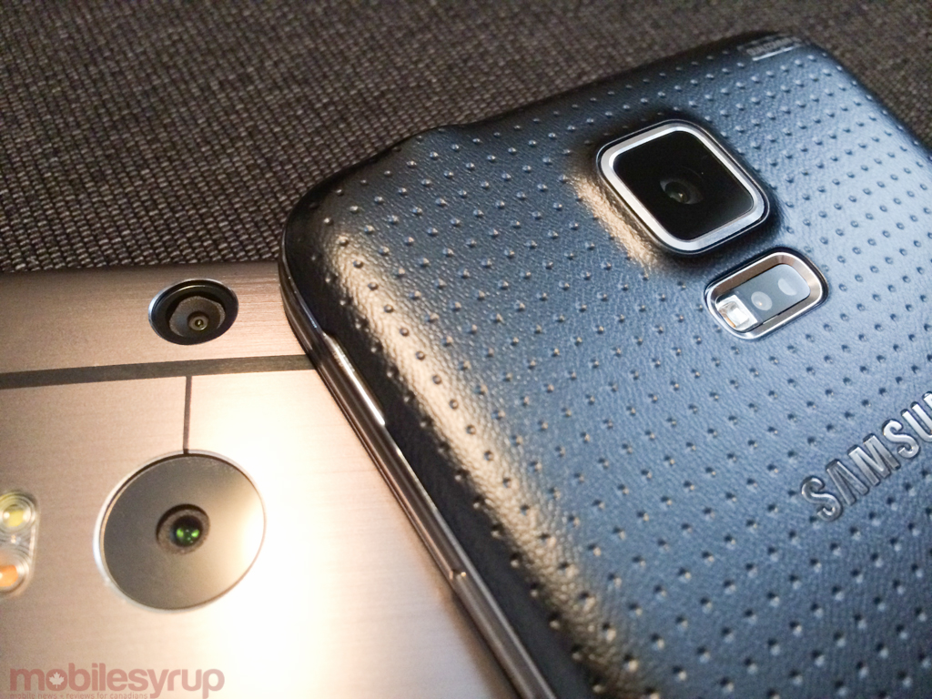
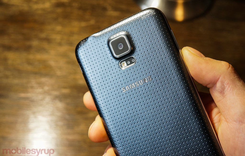
As predictable as the seasons, Samsung’s uninspired Galaxy S5 design may seem lazy, but it’s the result of consistent user feedback, complaints and compliments. Dimpled backing aside, Samsung didn’t make a lot of changes to the phone’s outside, but that’s OK: the Galaxy S5 looks better in person than in images, and feels more solid than any of its predecessors.
Last year’s Hyperglaze back coating, that slimy plastic outrage, has been replaced by a perforated soft-touch surface that feels far nicer in the hand and slips far less. The sides are still chrome, and feel far too cheap for a $700 device, but remain the outlier in a design that has gone from awful to acceptable.
The utilitarianism of the whole thing feels inevitable, but the Galaxy S5 is better for it. Its biggest liability has now been eliminated, so and the exterior retires to the resplendence of the 5.1-inch Super AMOLED display, which is far better than its predecessor’s. Brighter, more accurate, and more pleasing to the eye, the Galaxy S5’s screen makes up for its marginally lower pixel density with higher sensitivity and a wider colour gamut. (The GS5 has a high-sensitivity mode for those glove-filled winter months, too.)
Creating a better-looking version of the S4 while maintaining the same design language and seamlessly integrating new hardware into the body is impressive; unfortunately, the value of the hardware additions themselves is questionable. Taking a Synaptics-built fingerprint scanner and using the bottom of the AMOLED screen as a “beacon” of sorts, the home button functions as a swipe-based unlock and purchase mechanism.
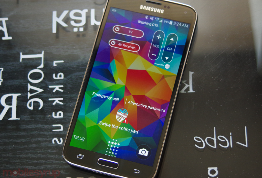
Unlike Apple’s Touch ID, which pairs the optical sensor with a metal ring around the home button itself, Samsung’s version is clunky and unreliable. Because it requires a vertical swipe to activate, unlocking the phone in one hand, which orients the thumb at roughly a 45-degree angle, rarely works. Instead, you’ll have to hold the phone in one hand and swipe straight down with an extended thumb of the other, making it more time-consuming than a PIN or pattern. Yes, it’s roughly more secure, but unlike iOS, which previously offered just PIN and alphanumeric password options, Android’s pattern-based unlock scheme is both quick, secure and one hand-friendly.
Integration with PayPal, which does not work with Google Play purchases, is not enticing enough to justify the loss of functionality (nor does it work yet in Canada). It would be one thing if the scanner worked well, every time, but the number of false positives — “wipe your finger”, “readjust your position”, “sit up straight,” “don’t chew gum,” — were too many, too often. The trick I learned was to register the same finger in multiple positions, making it more like that the Finger Scanner would recognize my right thumb when swiping diagonally, holding the phone in one hand. It was never perfect, nor as reliable as the iPhone 5s’s Touch ID, but it progressed from annoying to tolerable.
An advantage of the finger scanner, other than the nonexistent PayPal integration (which we hear is coming to Canada, eventually), is the ability to use it to enter Private Mode, a way to silo photos, music and other content, from prying eyes.
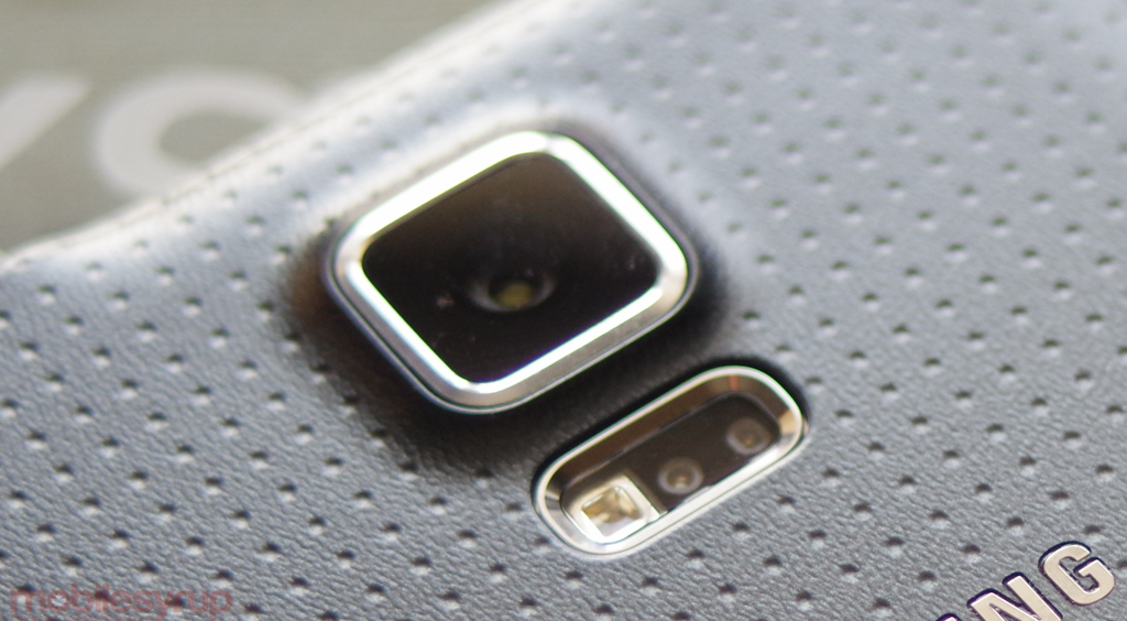
The heart rate monitor, which is located next to the rear camera flash, shares a similarly ambiguous distinction: it’s just not that useful. I’m no athlete, but I enjoy a good run now and again, and the practical case for a heart rate sensor is during intense cardio activity. The practicality of having to open S Health, which is admittedly improved over last year, place your finger gingerly (and, like the finger sensor, correctly oriented) over the sensor and wait, ultimately losing your peak heart rate, is low.
Though Samsung isn’t marketing it as such, the heart rate sensor is likely more useful for fringe medical cases, like identifying panic attacks or other time-sensitive heart issues, but athletes will be far better served by a Gear Fit or TomTom Runner Cardio, which permanently affixes a heart rate sensor to ones wrist.

The Galaxy S5 is certainly better for its new IP67 certification, which covers dust and water resistance. The latter is safe for one metre up by 60 minutes, but other reviewers have those numbers to be relatively conservative. It’s a practical and welcome addition to a phone that continues to prove its mettle in real-world application; Samsung wants this to be a phone its owners will use all day, every, regardless of weather or activity.
And that’s really the story of Samsung’s new flagship. Improvements such a fingerprint scanner and heart rate sensor are of dubious usefulness because they either don’t solve a problem, or solve it poorly. But the overall package is excellent, and the tangible upsides over the Galaxy S4 are many.
Performance & Software
We’ve done a bunch of benchmarks to gauge just how much faster the Snapdragon 801 SoC is than the previous generation, but here’s the short version: it wins in every one. Not only is each of the four Krait 400 CPU cores clocked 200Mhz faster than the HTC One M8, but its internal memory is much faster as well.
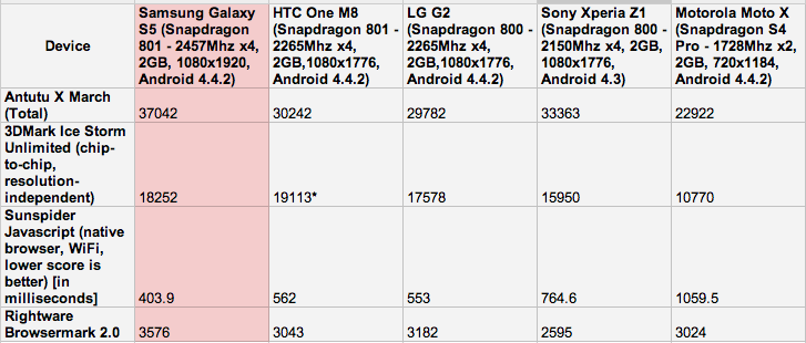
The advantage over the last-generation Snapdragon 800 is between 20% and 30% depending on the category — GPU and IO gains are higher than CPU gains — but Samsung doesn’t need benchmarks to prove this is a faster device than the LG G2 or Sony Xperia Z1.
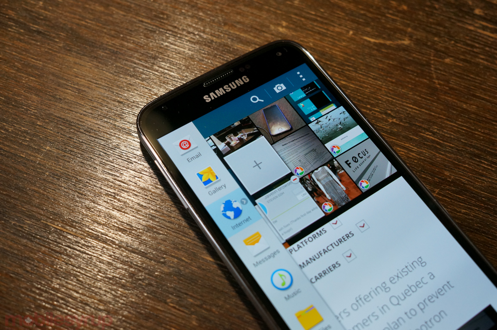
Samsung has done made important changes to the software experience on the Galaxy S5: it has improved the look of the UI, with a flatter, more accessible layout of menus, buttons and input boxes; it’s substantially beefed up performance throughout the UI, eliminating any jerkiness and app loading issues from the Galaxy S4; and, most importantly for the average person, it has obfuscated some of the more intrusive and superfluous features that resulted in such a bloated experience.
That’s not to say the GS5 is free of gimmick, but Air Gestures, Smart Pause and multitudinous Hubs for all kinds of content have been simplified, hidden and eliminated respectively. JK Shin wasn’t kidding when he said, during the device’s subdued launch, “Our consumers don’t want the most eye-popping technology, and they don’t want the most complex technology…[they] want durable design and performance… a simple yet powerful camera… faster and seamless connectivity.”
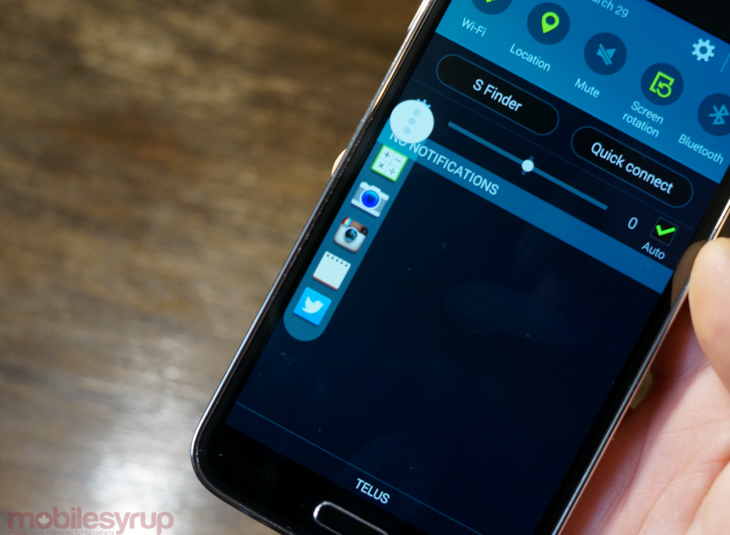
This year’s TouchWIZ may not be the most cohesively-designed Android skin ever made, but it’s considerably more attractive than anything Samsung has accomplished before. Aside from flatter UI elements, there’s a lot less to distract users from just getting on with their lives. For example, a new opt-in feature, Toolbox, acts like a Chat Head for quick app launches, floating a customizable list of five favourites on the current screen. It’s a truly useful addition, especially for quickly accessing the camera, notepad or calculator, and goes from opaque to translucent when not in use.
Another good example of Samsung’s newfound self-restraint is the new notification shade design. It’s still chock-full of app icons, but the editable menu of quick shortcuts looks good and works well. The non-removable S Finder and Quick Connect shortcuts, while less useful, are rationally placed. S Finder is Samsung’s equivalent to Google Search, combining local and web search into a single text input. But where S Finder excels is its speed, as results are generated almost instantly, and make hunting for on-device content a non-issue. It even searches within apps like Evernote, which I use all the time, and allows for filtering specific types of information. Yes, like many aspects of TouchWIZ, it reproduces functionality already provided by Google, but S Finder is nimble and versatile, and has since become indispensable to me.
Less obviously useful is Quick Connect which, like Apple’s AirDrop, attempts to find other devices to share content with over Bluetooth and WiFi Direct. Samsung has been heavily pushing the notion of sharing files between devices in its ecosystem, and Quick Connect acts as a hub for sharing anything, be it a file between two smartphones via its proprietary AllShare service, or a song between a tablet and connected speaker. Unfortunately, due to the closed nature of the portal, Google’s Chromecast and other streaming services don’t seem to play nice with Quick Connect, but that’s not an issue unique to Samsung.
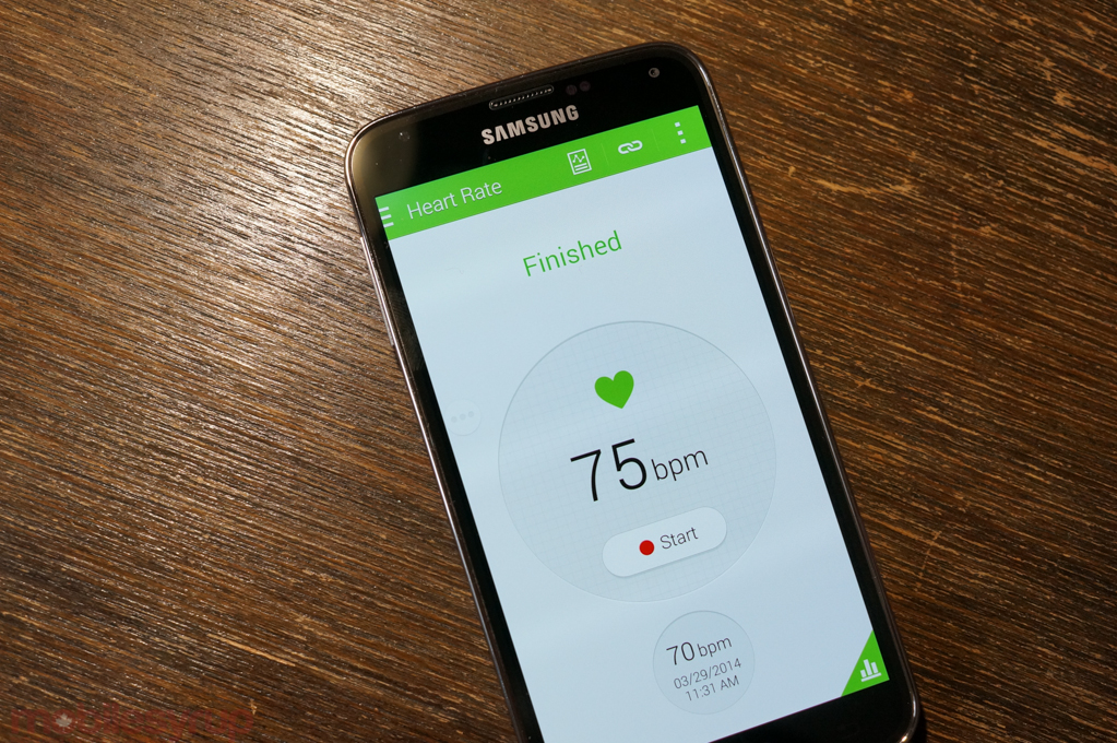
One of Samsung’s biggest pushes this year is in health and fitness management, and its evolution of S Health is a key component of that. At once its most attractive and functional first-party app, it’s clear that it’s been developed with an ecosystem in mind. Though you’ll need the Gear Manager or Gear Fit Manager, downloaded separately from S Apps, to control the wearable accessories themselves, S Health has been tuned to work well with or without additional hardware.
Using my phone as a pedometer has never really appealed to me, not because I don’t trust the results but because the activities during which I really push myself — soccer, ultimate frisbee, etc. — are seldom paired with a phone. As HTC attempted to do with the One M8 by partnering with Fitbit, using the Galaxy S5 to gauge activity levels always feels incomplete, an approximation of one’s daily movement. The same is true of the heart rate monitor, which I used several times alongside a pulse oximeter to determine the GS5’s accuracy, and came away unimpressed. As already stated, few athletes are going to care about accumulating pulse data after the fact, and I found the data itself to be consistently 3-10bpm off the medical-grade oximeter. Of course, Samsung would never want a consumer device to be used for diagnosis or treatment purposes, but I question the soundness of increasing costs both to the BOM and, inevitably, consumers, by adding a half-baked feature like this.
As a casual tool, though, S Health is quite good. It makes it easy to track eating habits, weight, exercise, heart rate trends and more, and will eventually integrate with third-party apps with an SDK. The Galaxy S5 is also much more power-efficient than its predecessor, so using the device to track steps over a whole day will no longer consume large amounts of battery.
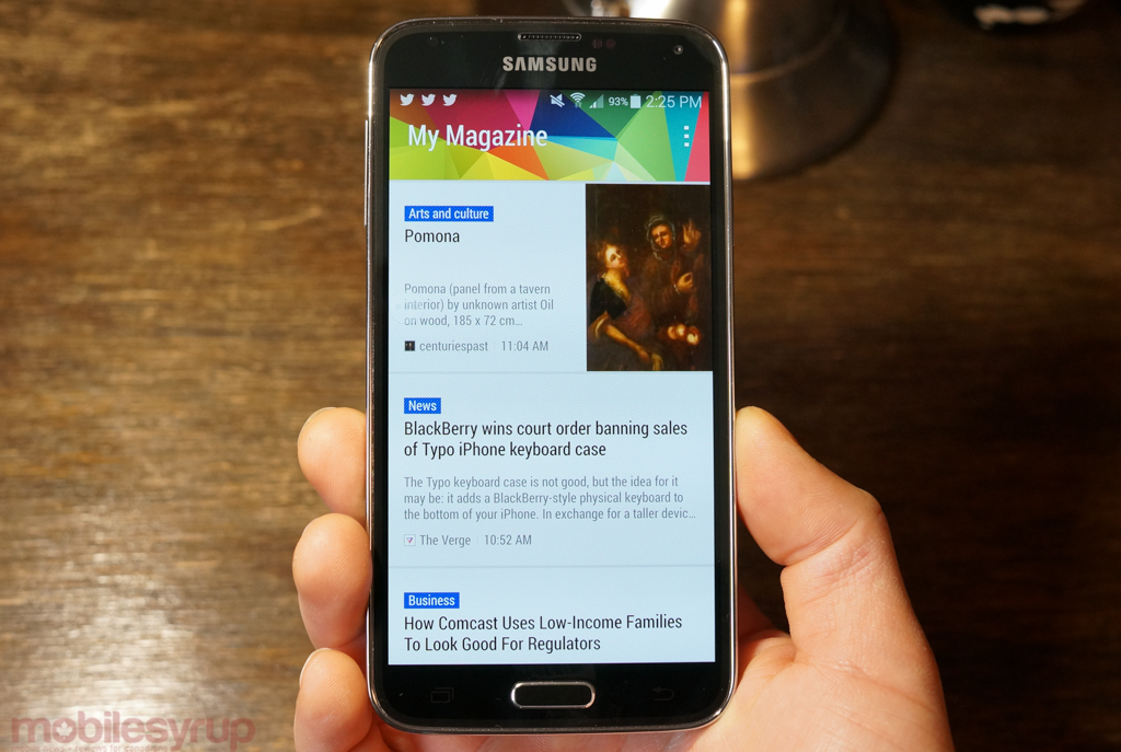
Samsung has also further integrated Flipboard into its core Android experience, moving the My Magazine section from a relatively hidden spot on the Note 3 to its impossible-to-miss place on the far-left home screen. Like HTC’s BlinkFeed, My Magazine consolidates a number of topics, from tech news to politics to sports, in a single section, but it’s far less versatile, with fewer content sources and, for some inexplicable reason, no Facebook support. It is removable if desired, but I found it to be a quick-and-dirty way to catch up on daily news without opening Flipboard proper.
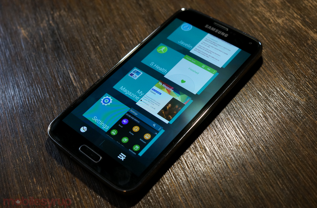
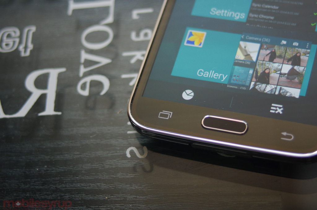
Samsung has finally done away with its capacitive menu button, opting for a slightly more modern combination of physical home button, right-side back button and left-side multitasking button. This is the same layout that caused so much angst when the HTC One X was announced in February 2012, but today far fewer apps rely on the old Gingerbread-style menu layout. Samsung has wisely opted to emulate a menu press for those legacy apps by holding down the multitasking button for a second, but I rarely found it necessary.
This brings us to an important aside about Android as a platform. Samsung would love if it you purchased Amazing Alex from the Samsung Apps store, but it’s clear that widespread adoption of an alternative app store is going to be extremely difficult for the company to achieve. There are many, many apps, mainly from smaller startups, that are not yet on Android, but the vast majority of well-known companies have attractive and capable versions on the Play Store.
It can’t be overstated that the Galaxy S5, like the HTC One M8 and Nexus 5 and Moto X and any other KitKat-running device, is hugely advantaged by the platform’s progress in general. Core experiences like Twitter, Rdio, Instagram, Evernote, Dropbox and thousands of others perform almost identically on Android to their iOS counterparts, which is a far cry from its sorry state just 18 months ago.
But in some ways, Samsung tries to undermine this progress by preferencing its inferior first-party apps. This makes sense, but it’s frustrating to users. Why are there two app stores, two gallery apps, two messaging apps, two search apps, two browsers, two music apps and two office suites? It’s impossible to expect Samsung, or any OEM for that matter, to cede these options completely to Google, but some culling would be appreciated. But the fragmentation is a result of Android’s cockamamie app associations.
For example, it’s Google’s fault there are two gallery apps: they began bundling a separate Photos app with a recent version of Google+, whereas Samsung’s Gallery app is actually a container for its camera — without it, the camera would simply not work. It also appears that Google now forces OEMs to bundle Chrome with other Play services, but Samsung’s browser continues to be far faster, and because it takes advantage of KitKat’s Immersive Mode, more suitable for the big screen. Samsung is also partly to blame here: Google Now is far more useful than S Voice, but double-tapping on the home button brings up the service, version after version, year after year.
In many ways, Android users are both lucky and disavantaged by the sheer volume of services choice. There are ecosystem pressures at every turn, from Google at the framework and content level, Samsung at the software level, and companies like Evernote and Dropbox at the client level. There are a million ways to do something, and none of them are good at everything.
Camera
The 16MP 1/2.6” sensor bundled with the f/2.2 lens is, quite simply, amazing. Yes, the device would be better served by lowering the total pixel count and increasing the size of the individual pixels, but the GS5 takes incredible photos, with some of the fastest autofocus I’ve ever seen on a smartphone.
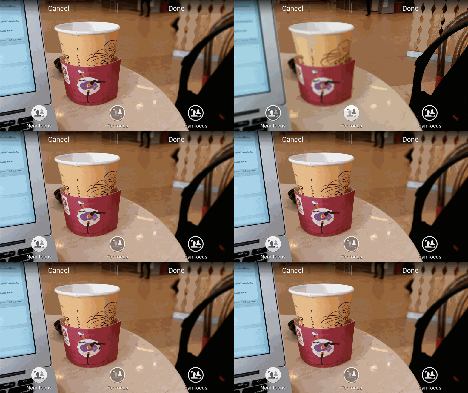
The camera interface, which has always been too busy on Samsung flagships, has been considerably toned down, with the number of Modes down to six by default, with more available in the Samsung Apps store (including the excellent Surround Shot mode). While many sites are making noise about the Selective Focus feature — the ability to blur out the background or seemingly refocus the photo after the fact — the feature is simplistic and not always effective. Because the HTC One M8 actually has two sensors, it doesn’t need to take separate photos which, as you can above by the moving feet, is what the GS5 is doing.
If you’re having a tough time deciding between the Galaxy S5 and HTC One M8, the camera may be your tipping point. It’s not the fact that the phone has four times the spatial resolution of the M8 — the photos aren’t four times better, you linear thinker, you — but the difference is notable. It’s not even the extra detail captured, but the accuracy of those details. The camera launches quickly, focuses quickly and nine times out of ten takes a great photo. It pulls in macro subjects with ease, solves exposure in troublesome lighting, and prevents blur with one of the best software stabilization algorithms I’ve ever used.
The Galaxy S5 falls short of the HTC One M8 when shooting in low light — the smaller individual pixels, even with Samsung’s new ISOCELL-based sensor, are the reason — but still manages to best its predecessor by a healthy margin in this regard. Fortunately, I require a great low-light camera less often than I do a consummate all-round shooter, and it’s for this reason I’d pick the Galaxy S5’s sensor over the M8’s, even if HTC’s camera experience, especially when factoring in its superior front-facing camera and Zoe movie clips, is better.
Like the Galaxy Note 3 before it, the GS5’s ability to shoot 4K video (3840×2160 pixels) is a non-starter for me. It’s too processor intensive — though fewer frames are dropped with the improved ISP and faster memory on the Snapdragon 801 compared to its immediate predecessor — and far too storage expensive to leave on by default, but it’s an interesting technology demo. The captured video is indeed beautiful, and even without hardware stabilization results impress. It comes nowhere near the smoothness of a Nokia Lumia 1020, for instance, and we’ll have to test it against the Bell-exclusive Sony Xperia Z2 when it arrives, but the GS5 provides an unparalleled shooting experience on Android at the moment.
Battery Life & Connectivity
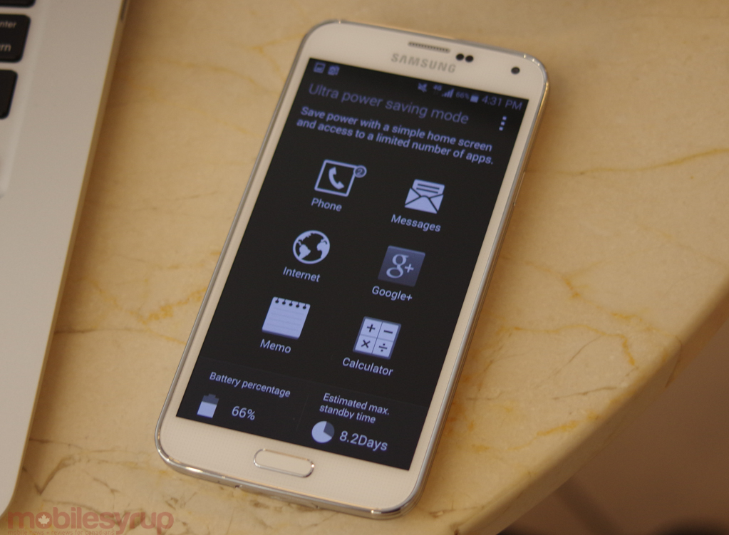
The final chapter in the success (or failure) of the Galaxy S5 comes in terms of battery life and connectivity, and I’m happy to say the device comports itself extremely well in both cases. Even without utilizing the strange and wonderful Ultra Power Saving Mode, which shuts off background processes, makes the screen monochrome, and limits the number of apps you can run, the Galaxy S5 sips power.
It lasted a couple of hours longer in our tests than the HTC One M8, with its higher clock speeds offset by a slightly larger 2,800mAh battery. That the cell is replaceable, too, is an advantage, especially since Samsung was able to add water and dust resistance to the device while maintaining a removable battery cover. In our video looping tests, where we take a clip at medium brightness and loop it until the battery dies, the Galaxy S5 lasted approximately 14 hours.
Subjectively, the device lasted 30-40% longer than the Snapdragon 600-powered Galaxy S4, bringing it into one day-plus territory. When we spoke to Qualcomm about how the company achieved such battery savings with faster cores, a company rep pointed to two specific advancements in this generation of SoCs: a more efficient 28nm manufacturing process, which uses comparatively less power per cycle; and envelope tracking, a feature of the baseband that matches antenna transmit and receive power to the CPU speed for higher efficiency. The device uses much less battery power staying connected to a nearby cell site when reception is good, and ramps it up when a stronger signal is needed.
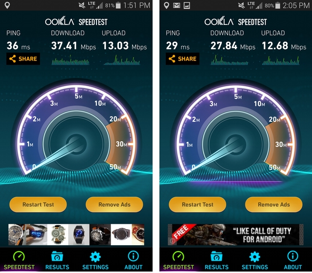
As is customary with new Samsung hardware, the Galaxy S5 excels in the connectivity department, too. It’s the first device with 2×2 MIMO 802.11ac WiFi, which boosts its theoretical maximum downlink throughput to a staggering 436Mbps. Of course, a compatible router is necessary to negotiate those speeds, and while WiFi-ac is becoming a standard on midrange models, it’s still difficult to find MIMO (multiple in, multiple out) in anything but the $150-250 range.
Being a Category 4 LTE device, the Galaxy S5 can achieve speeds of 150Mbps down and 50Mbps up over cellular networks. Of course, it’s very difficult to achieve such speeds in reality, and we were comfortably able to hit 40Mbps down in some areas of Toronto, with ping times under 50ms in most cases.

The Galaxy S5 supports all LTE bands currently rolled out in Canada, including 2600Mhz, and as you can see above it connects to Rogers on Band 7 with 20x20Mhz channels, for a theoretical maximum speed of 150Mbps. Curiously, when limited to HSPA+, the Galaxy S5 connects to Rogers on Band 2 (1900Mhz) using the DC-HSPA+ technology, for a theoretical maximum downlink of 42Mbps.
New to the device is Download Booster, a way to combine the downlink capabilities of the WiFi and cellular connections. When enabled, downloads larger than 30MB will attempt to use both radios, though only over HTTP — anything downloaded outside of the browser is not eligible. It’s a great idea, and works quite well in practice, though Samsung acknowledges that customers with limited cellular packages may want to keep the feature disabled.
A few more thoughts:
- The physical home button is so much better than any Samsung device before it. It’s clicky and springy and a joy to use.
- Even though the phone is ever-so-slightly larger than the Galaxy S4, it never feels bigger, and is easily usable in one hand with almost no readjustment to reach the top of the display.
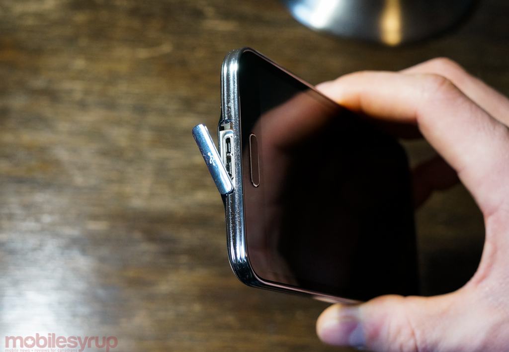
- To ensure IP67 certification, the USB 3.0 port is covered with a plastic clip that feels quite flimsy. It’s a necessary evil, but I hope next year Samsung will figure out another method — maybe a slider.
- Speaking of the USB 3.0 port, the device charges extremely quickly when connected to a compatible port, but achieving those higher transfer speeds requires explicitly switching to High Speed Transfer Mode, which looks like a limitation of the OS X and Windows transfer protocols.
- Call quality was very good, with excellent dynamic range and good noise cancellation.
- The GPS locked on quickly and accurately, both in Google Maps and other location-based apps like Transit.
- The rear mono speaker, located in its regular bottom-left position, sounds thin, weak and sibilant, especially after reviewing the HTC One M8.
- Even though wireless charging isn’t built into the device, Samsung sells a rather expensive $30 back cover replacement.
- There’s an IR blaster built into the device, too, but unlike HTC’s home theatre software, which received an extensive design overhaul, Samsung’s Smart Remote software looks and functions like it was made in 2010. Just an awful experience.
- Canadians must deal with a base 16GB model in white or black, which comes with around 10GB of user-accessible space. A microSD card is, unfortunately, almost a necessity.
- Where’s my nano-SIM?
Conclusions
Samsung’s fifth-generation Galaxy S flagship takes a checklist approach to improving upon its predecessors. A less slippery back cover, water resistance, a more elegant software experience, a vastly improved camera and impressive leaps in performance contrast with hardware additions of dubious merit. The fingerprint sensor is useful but often frustrating, while the heart rate sensor feels superfluous, an example of Samsung’s profligate feature creep we hoped it would leave behind.
While the Galaxy S5 boasts one of the best Android experiences currently available, Samsung can no longer claim unchecked dominance over the market; HTC has upped its game this year, while Sony, LG, Motorola and others are quickly learning from past mistakes.
If you have a Galaxy S4, there is little reason to shell out the money for its successor, but a Galaxy S3 owner approaching the two-year market in his or her contract should feel comfortable making the leap to Samsung’s latest. A great AMOLED screen, the latest processor from Qualcomm, some of the fastest connectivity in the business, and a consistently excellent camera will surely challenge the iPhone 5s in the right places, but more so than in years past the Galaxy S5 sees Samsung playing catch up.
*Disclaimer: This review was published using a TELUS-branded Galaxy S5, but some of the network-specific tests were done using other carriers.
MobileSyrup may earn a commission from purchases made via our links, which helps fund the journalism we provide free on our website. These links do not influence our editorial content. Support us here.

