In the past two years, Expedia.ca has seen its tablet traffic jump from almost nothing to a major component of its overall bookings. This past Memorial Day weekend, 50% of Expedia.ca’s bookings come from tablet and mobile. But until last week’s major update, the company’s tablet experience was a mirror of the one provided for its desktop customers: people who know where they’re going and when, and want to scour for the best prices.
“If you had to think about Expedia in the past, we’ve been really good at helping customers who know where they want to go to book their trip,” says John Kim, Expedia.ca’s Chief Product Officer. “In some cases, it could take up to 48 searches for the flight you want. Then imagine you do that same process for hotels.”
Unfortunately, the detailed, “lean forward,” outcome-focused experience Expedia.ca was providing on its website doesn’t match well to the late night, discovery-focused, “curl up” experience that has fuelled the incredible growth of m-commerce. Expedia.ca knew it was missing out on capturing a much broader demographic of customer – one that doesn’t know where it wants to go, but wants to explore.
“It’s too hard unless we make it entertaining,” Kim said.

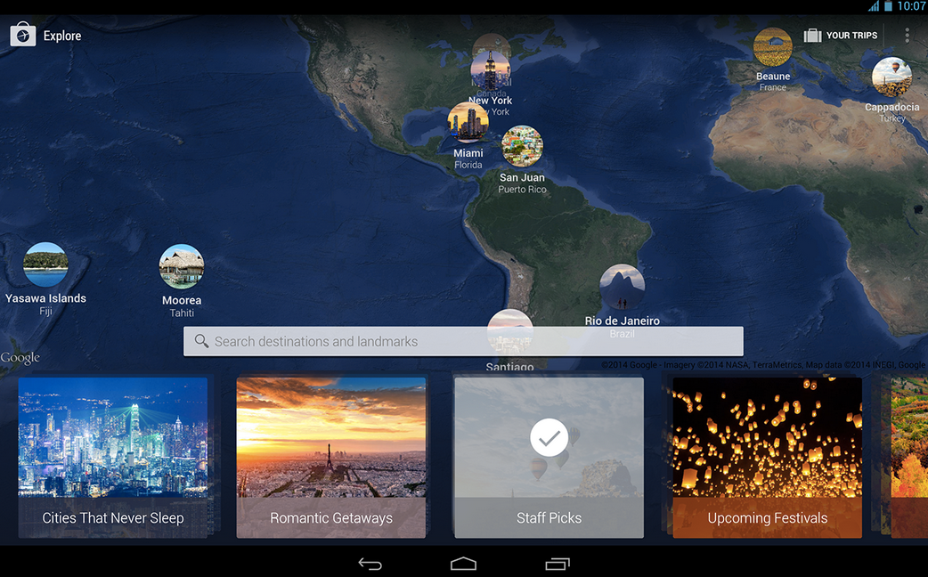
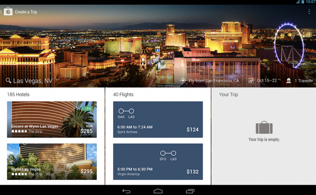
Expedia.ca’s new tablet app (available both for iOS and Android), has been rebuilt from the ground up to address this opportunity. The app’s main conceit is a single, unified search box, combining hotel and flight travel search. Those succumbing to wanderlust can simply enter in a city name, landmark, or airport code to start sourcing relevant flights or hotels – specific details like dates are no longer required to start exploring.
The switch to a unified search box simplifies the user experience, but is anything but simple from the technical level. Kim told me that Expedia.ca had to integrate a number of technologies, as well as a robust predictive engine, to handle the myriad results spurting from multiple search engines cleanly onto one screen.
“If you’re a single product – all you sell is one thing – it’s very easy to go with a single search box. It’s not that hard technically. The big deal that we see is a single search box for multiple products – it’s very challenging,” he said.
“It’s too hard unless we make it entertaining.”
For those simply hoping to browse, Expedia.ca has also added ‘Collections’ to the app, curated themed travel destinations packed with relevant information and rich visuals, similar in some ways to Airbnb’s ‘Discover’ feed. Kim believes Collections to be one of Expedia.ca’s “most promising” new initiatives, and says the company plans on expanding it with additional content based upon user feedback and Expedia.ca’s internal metrics.
Kim was kind enough to share some information on its Canadian customers as an example of how it can curate content for a better travel experience. Firstly, Canadians love Vegas. It is our fair country’s favourite travel destination “by a long shot,” he said. Canadians also feature a predilection for prepackaged travel deals, preferring to make a one-time purchase rather than build their trips à la carte.
MobileSyrup may earn a commission from purchases made via our links, which helps fund the journalism we provide free on our website. These links do not influence our editorial content. Support us here.


