Despite the endless stream of device announcements each fall, it’s rare to see something that truly knocks you off your feet. Even the big sellers have an air of sameness about them.
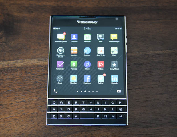
Not only is the BlackBerry Passport the most unique looking smartphone you’ll see in 2014, it also features an innovative approach to input design, merging a large touchscreen with a touch-enabled keyboard. In honour of today’s Passport announcement, we took a look back at BlackBerry’s long history of innovation in input design, starting with phones so old their parents were pagers.
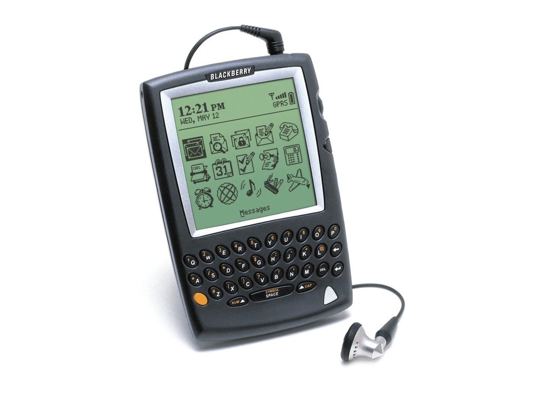
BlackBerry 5810 (2002)
While the RIM 850 pager was the company’s first device with a trackwheel, and the 957 was the first to look like a modern BlackBerry, we’ll start with the actual first BlackBerry, the BlackBerry 5810. Why? Because it’s the first to integrate all the elements we came to associate with the smartphone: email, SMS, telephony (albeit via a headset), a web browser, and a big beautiful (for the time) screen. The BlackBerry 5810 also solidified the interface dynamic that would define RIM’s creations for the next 10 years: keyboard + something, in this case the trackwheel.
The 5810 is not as iconic as some other classic BlackBerrys, like the Quark line immortalized by Jay-Z and named one of Time’s top 100 gadgets of all time, but the essence of everything that would make BlackBerry great is there. And compared to some of the other phones released in 2002, it was a revelation.
BlackBerry Pearl 8100 (2006)
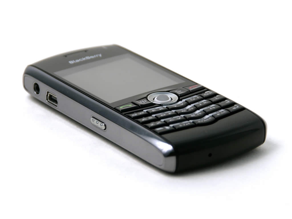
The BlackBerry Pearl 8100 was the evolution of RIM’s SureType 71xx line, but more importantly, it was the first smartphone the company designed for the average consumer. As such, the Pearl’s candy bar design is the perfect indication of broad consumer tastes in the mid-2000s. Remember: the average consumer, if they had a cell phone at all, was likely carrying around a Moto RAZR or something from Nokia’s Series 60 line. And you thought iPhones were too small.
The smaller, sleeker Pearl, was also also the first BlackBerry to replace the iconic trackwheel with a trackball to save on device thickness. The trackball was much less reliable, wore out more easily, and got stuck constantly, but the freedom of 2-axis scrolling made it a welcome tradeoff. It was also a sign that RIM was still willing to experiment with new interfaces in order to expand its marketshare. The SureType + trackball combination wasn’t for everyone, but RIM’s efforts would eventually pay off in the highly successful mid-range BlackBerry Curve line, and the Blackberry Bold 9000, easily the best BlackBerry ever made at that point.
BlackBerry Storm 9500/9530 (2008)
It could be said that the success of Apple’s competitors in the last decade are defined by how they responded to the gauntlet thrown down by the original iPhone release. Some laughed it off. Some were caught flatfooted, and slow to respond, died. Others didn’t respond so much as react.
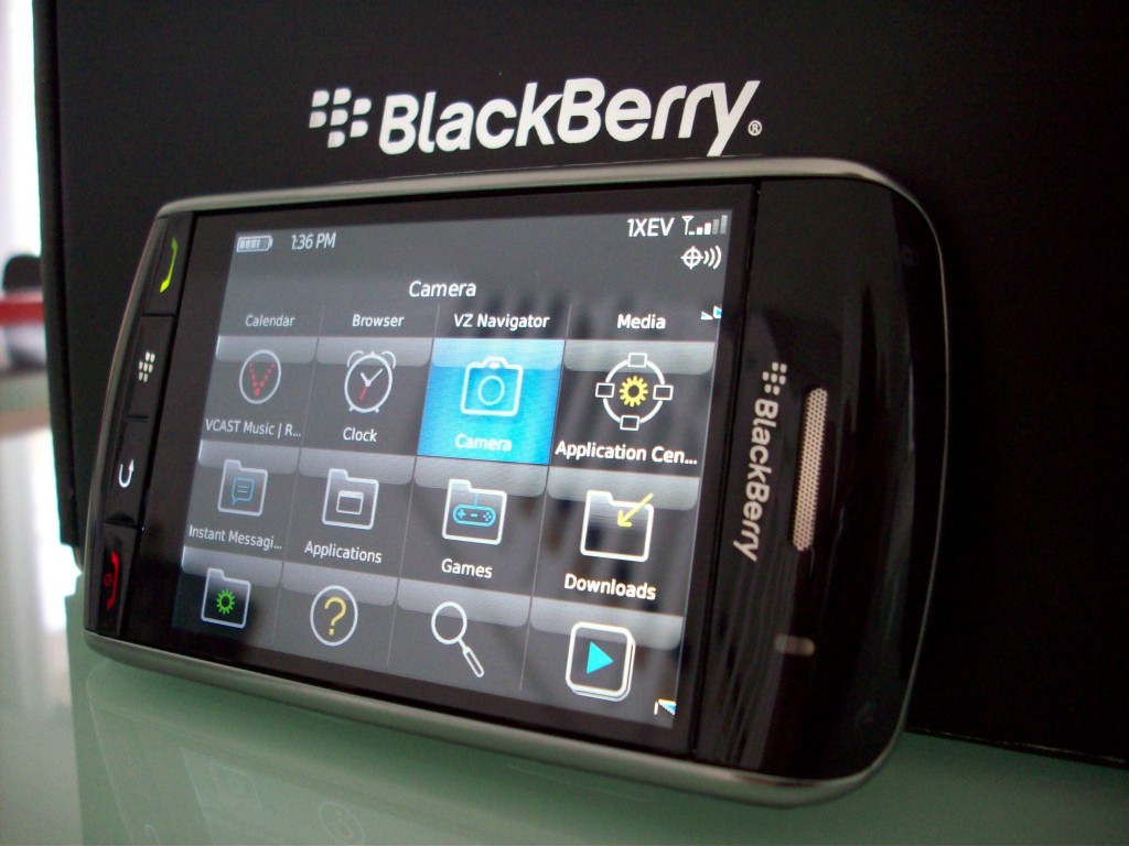
Despite doubts expressed at the time by both of RIM’s co-CEOs on the viability of keyboardless smartphones, the BlackBerry Storm was made at Verizon’s behest to combat AT&T’s iPhone exclusivity. The BlackBerry Storm was RIM’s first touchscreen device, and took a typically original approach to its user interface, using SurePress technology to turn the entire screen into one big button for haptic feedback. The assumption was that a clickable screen could best replicate the tactile feel of a QWERTY keyboard, making it superior to other touchscreen devices for communication.
But the technology wasn’t ready for prime time, and rushed out the door in time for Black Friday shopping rush, the Storm’s software was buggy and poorly equipped to support the novel interface. While more refined, its successor, the Storm 2, didn’t fare much better, and the Storm line was eventually replaced by perhaps an even stranger breed of touchscreen phones.
BlackBerry Bold 9700 (2009)
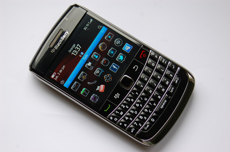
The BlackBerry Curve 8520 was technically the first BlackBerry smartphone to feature an optical trackpad by a few short months, but I’d be remiss if I didn’t feature a least one Bold on this list. The Bold was RIM’s flagship line of smartphones, representing the company’s best stab at a high-end, productivity-focused mobile experience. When you think of a BlackBerry, the image that likely appears in your mind’s eye is a Bold, or its spiritual predecessor, the 8700.
Wedged between the aforementioned Bold 9000 and the last hurrah 9900, the Bold 9700 broke away from the family template. Codenamed Onyx, the Bold 9700 eschewed its siblings’ wide face, arching curves, and production materials, opting instead for a sharp, wedged look. But the real kicker was the optical trackpad, essentially “an infrared video camera turned upside down,” which provided greater responsiveness over the trackball and eliminated any nagging wear and tear issues. A staple in many of RIM’s forthcoming BlackBerry smartphones, the trackpad brought a refined sense of elegance and control to the company’s input methodology.
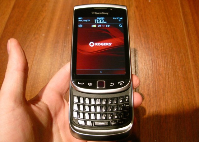
BlackBerry Torch 9800 (2010)
Which isn’t to say that things didn’t get out of hand every once in a while. Enter the BlackBerry Torch.
Discussions about mobile hardware design are often conversations about compromise: the endless series of concessions manufacturers must make to bring a device to market. The Blackberry Torch 9800 is an example of no-compromise design. Burned by its past attempts at a novel touchscreen interface, combining a touchscreen, optical trackpad, and vertical sliding keyboard into one device was RIM’s way of saying “let them eat cake.”
Of course, by avoiding any concessions on input method, the Torch 9800 placed a heavy burden on its owner. Oftentimes it was unclear which input method was the best one to choose in a given situation, if there was a preferred input method at all. The Torch wasn’t going to make a decision for you; you were on your own.
But for those willing to take the time to figure it out, the Torch could be a powerhouse of productivity. RIM’s attempts to infuse all the input methods that had worked in the past into one device would continue with the Bold Touch and the Torch 9860, and seems to be making a comeback with the upcoming BlackBerry Classic. Hopefully the new device will better synthesize the company’s old design doctrine.
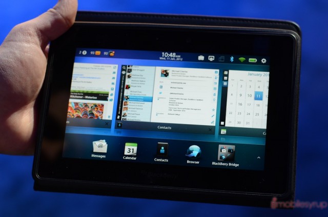
BlackBerry PlayBook tablet (2011)
What a disaster. Or rather, 1000 little tragedies wrapped into a 7” tablet.
The PlayBook’s failure and its impact on RIM’s fortunes have been well documented, and I have no interest in rattling old bones. What’s important for our purposes is the PlayBook’s role in the modern BlackBerry design we know today.
Powered by QNX, the PlayBook featured an all-touch interface that was both well-conceived and a breath of fresh air, offering engaging gesture-based navigation that broke free from the stagnancy of menu-based interaction. The secret sauce was the PlayBook’s bezel, a thin portion of which was touch-enabled, allowing the tablet’s interface to live beyond the screen. This sensibility of freedom would become a major pillar of RIM’s interface design going forward.
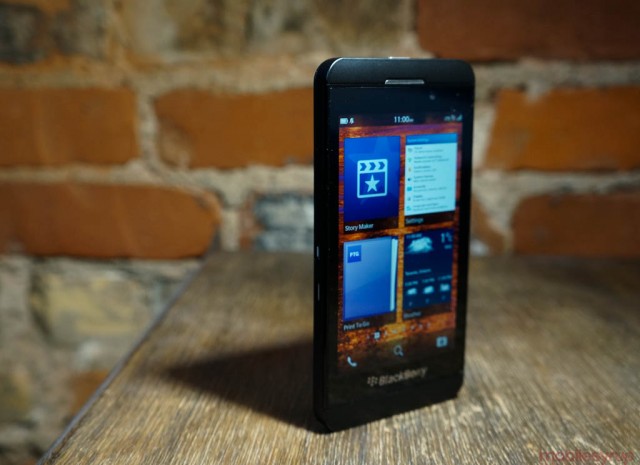
BlackBerry Z10 (2013)
In many ways, the BlackBerry Z10 was simply a smaller PlayBook, featuring similar build materials and a lack of secondary input methodologies in favour of a swipe-or-bust design (for more on this, see our interview with BlackBerry designers Joseph Hofer and Brian Paschke). But as the first smartphone to run the QNX-powered BlackBerry 10 OS, the Z10 evolved and refined the interface pioneered by the PlayBook to create a smooth and continuos experience that was both elegant and a huge productivity boon.
A new OS. A new company name. A new CEO. But for all the newness surrounding the BlackBerry Z10’s release, the device seemed designed to settle old scores: one last real swing at dethroning the iPhone. While the Z10 made an excellent first impression on us, iPhone users simply didn’t want a touchscreen smartphone from BlackBerry, and the device was a steep learning curve for generations of BlackBerry users used to dedicated phone buttons and keyboard shortcuts. As much as the company wanted to move forward, BlackBerry’s customer base demanded a return to its past glory.
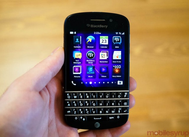
BlackBerry Q10 (2013)
In many ways the Q10 was the perfection of a device BlackBerry had been building for a decade. In our review we said that it continued the Bold’s design pedigree, merging BlackBerry 10’s refined touch interface with BlackBerry’s best keyboard ever – that, in fact, it was the best BlackBerry ever made. It did not sell.
I’m uncertain then if the upcoming Q20, with its “Classic” moniker and return of the optical trackpad and belt, is an attempt to reclaim lost customers, or perhaps simply to maintain those still entrenched in outdated understanding of what a BlackBerry smartphone can be. In either case, simply being the ‘best BlackBerry ever’ is likely not enough.
BlackBerry Passport (2014)
The BlackBerry Z3 is an entry level device built from off-the-shelf parts designed to flood emerging markets at a low price-point. The BlackBerry Classic is the continued iteration of what is essentially the BlackBerry Bold 9900, released in 2011, which BlackBerry recently started selling again. These decisions would seemingly indicate a company stuck in the mud of its own past glory.
But then there is the BlackBerry Passport. A device that, like Frankenstein’s monster, first looks like an experiment gone wrong, but becomes evermore compelling. A device that looks both futuristically new and yet instantly recognizable, inspired as much by the 5810 as the Toronto-Dominion Centre, a building one might say was built on the thumbs of BlackBerry. It’s a freaking QWERTY phablet with a touch-enabled keyboard, for crying out loud.
For all of the Passport’s strangeness, the device is a sign that BlackBerry is still willing to take big swings, and innovate while doing so. It’s also a sign that BlackBerry doesn’t have to sacrifice its heritage in service of innovation. And according to one poll, it’s the 2014 smartphone that has mobile users most excited for its release (it certainly excited us enough to write a 1600 word retrospective).
When was the last time you could say that about BlackBerry?
To read our BlackBerry Passport review, click here.
To read our Q&A with Passport designers Joseph Hofer and Brian Paschke, click here.
Disclosure: I worked for BlackBerry from 2009-2011. They never listened to any of my phone design suggestions.
MobileSyrup may earn a commission from purchases made via our links, which helps fund the journalism we provide free on our website. These links do not influence our editorial content. Support us here.


