Speaking with an industrial designer is a rare opportunity to see the world in terms of form and function. Oftentimes, the little details and big ideas that go into the technology we use everyday would be overlooked without their perspective.
The BlackBerry Passport features an extremely unique design, so we jumped at the opportunity to speak with Joseph Hofer and Brian Paschke, Senior Industrial Designers at BlackBerry responsible for the Passport as well as a slew of other iconic devices. Read on to learn more about the Passport’s unique construction, as well as BlackBerry’s approach to industrial design.
Joseph, you delivered the BlackBerry Bold, which is easily one of the most iconic BlackBerrys of all time, and certainly one of the most fondly remembered. Can you share any stories on the development of the Bold? How much of an influence was ‘Electron’ (the BlackBerry 8700)?
Joseph Hofer: The BlackBerry Bold design philosophy was shaped to reestablish a premium mobile experience for BlackBerry. Setting precedence with the Bold 9000, we crafted the essence of what Bold DNA stood for, knowing it would influence future generations and tiers of devices. Learning from the Electron family of products influenced the keyboard with regards to the curved rows of keys as well as the key surface sculpting for continual evolution of typing accuracy and comfort.
The design attributes of the BlackBerry Bold included innovation in premium materials and technological advancements, purpose and robustness of design, as well as efficiency through ergonomics and details.
The experience of building the BlackBerry Bold 9900 is still one of my career highlights. The brushed metal frame, acting as part of the RF antenna, reflected design and engineering innovation in unison. Serving as the structure of the device it was polished and brushed to wear in and look great over time. The glass weave battery cover was not only a materials development, but also a production process development which took months to complete. I smile when I recall the work of tuning the lighting sequence of the keyboard, trackpad and display that added a theatrical sensibility experience. Nearly every pre-release software build affected our previously designed fades, so we often found ourselves adjusting the timing and acceleration in the nearest dark environment: a first aid room!
What’s the best Bold ever made?
Joseph: A tough question to answer, as the German engineered Bold 9700 devices were extremely robust and compact, with the Bold 9900 characterizing in my mind the Bold DNA best.
The Z10 was the first BlackBerry 10 device and the first buttonless touchscreen BlackBerry. Can you talk about what went into designing a whole new interface for both longtime BlackBerry users and new customers? Did you feel like you were throwing the baby out with the bathwater? How much of an influence was the PlayBook?
Brian Paschke: The Z10 industrial design does have a formal relationship to the PlayBook. You have a keen eye! The Z10 is roughly 1/3 of the PlayBook and also shares similar materials and corner radii. While the BlackBerry 10 operating system was under development, we tested many design details and found the Z10 construction framed the experience best while providing a unique look and complimented the gestural nature of the BlackBerry 10 interactions.
Joseph: Exactly, with the Z10 user interface and experience design being developed together with the industrial design, collaboration was key. We were confident that the possibilities of the new interface that allowed delightful, efficient experiences, such as peeking into your email while doing another task, would appeal to current and new BlackBerry users.
Brian: Yes, and refinements continue, both in software and hardware. For example, we engineered an ‘edge to edge’ shaped glass lens on the Z30 to makes the gestures even more comfortable. Passport also uses a similar detail. At BlackBerry, the hardware design must always compliment the software.

When building a smartphone, in general, are you starting with a design concept or a market need that you’re then trying to solve with a device?
Brian: We always approach problems from different angles; this could include uncovering market gaps as well as addressing common wants and needs… but always with functionality as the driver. BlackBerry customers such as Doctors, Journalists or World Leaders value accuracy and productivity in their mobile devices, so we need to approach problems from a BlackBerry point of view. We love designing for them.
Joseph: And for Passport specifically, the BlackBerry Design Insights team introduced us to a framework that presented different ways to approach change; different philosophies that one could take in shaping a new product. While we could have chosen to reference our heritage, or refine what previously worked, we decided to test the current idea of what a mobile phone is and embrace a design that challenged both our and our users’ mindsets around what a productive mobile device could be.
In the case of the Passport, was it any different? Did the tech (i.e., the Passport’s touch-enabled keyboard) spur the idea for the phone, or did you pursue the tech to solve the design need?
Brian: The intelligent keyboard was envisioned by the design team before the Passport was developed. We looked at integrating it into many formats, but with Passport we found a real sweet spot where the device was pocketable while allowing a large display and keyboard to coexist and work together in unison. As a result, close to 80% of the front of the product can be used for input. That’s efficiency!
I’m guessing the Passport is a device that would have to go through a number of iterations before both the form of the device and its function is aligned. Were there earlier concepts that were significantly different from the final product, or was it a matter of refinement?
Brian: Early on, we found inspiration in the format of a passport, the universal symbol of mobility. We explored many different shapes, materials and methods of construction. With a product this size, it needed to be solid, precise and reliable, so we developed the unique stainless steel frame for structure, part of the RF antenna as well as a tool for organizing all of the details such as microphones, connectors and keys.
The BlackBerry industrial design team held workshops in a building overlooking the Toronto Dominion Centre designed by Mies van der Rohe. We were inspired by his method of exposing a building’s structure, specifically I-beams, to create visual lightness and strength. For the design team, the building represented a new future, a new way of thinking and a new model of construction.
Joseph: In refining the Passport to be efficient and comfortable, we softened the back cover to create a great fit in one’s hand while allowing a battery that lasts. Many 3D prints were made and reviewed to get this just right. The key topology was shaped to allow both gestures and accurate typing, while maintaining a strong centerline that aids in developing muscle memory.

Looking back over past BlackBerrys, the Passport seems to harken back to the old BlackBerry 5810. Was that intentional design callback or is it just ingrained in the DNA of the device? How does it feel knowing that, despite all that has changed in the past ten years, there’s still continuity between the hardware?
Brian: Right! It’s a compliment to us that you noticed this. Actually the 5810 and the 8800 were strong inspirations. They were created with a pioneering spirit and there is an honesty to the construction and layout that still makes it quite fresh.
The Passports design is, in a word, unique. Did you have to sell it internally, or did everyone just ‘get it?’ Was it a matter of putting it in people’s hands before having them make a judgement?
Joseph: Good music is a metaphor that helps me explain one’s discovery of the Passport. Many tend to tire quickly of songs that are loved initially, whereas songs that grow in appreciation over time become the ones that are often lifetime favorites.
Brian: Yes, like music, it created an emotional response for sure – and this is what we hoped it would do. Any new product ideas that require considerable R and D investment need a group of people that believe in the product or it simply wouldn’t happen. Working prototypes certainly help. I think people really connect with the passport format… It’s just so familiar to us all – no matter where in the world you live.
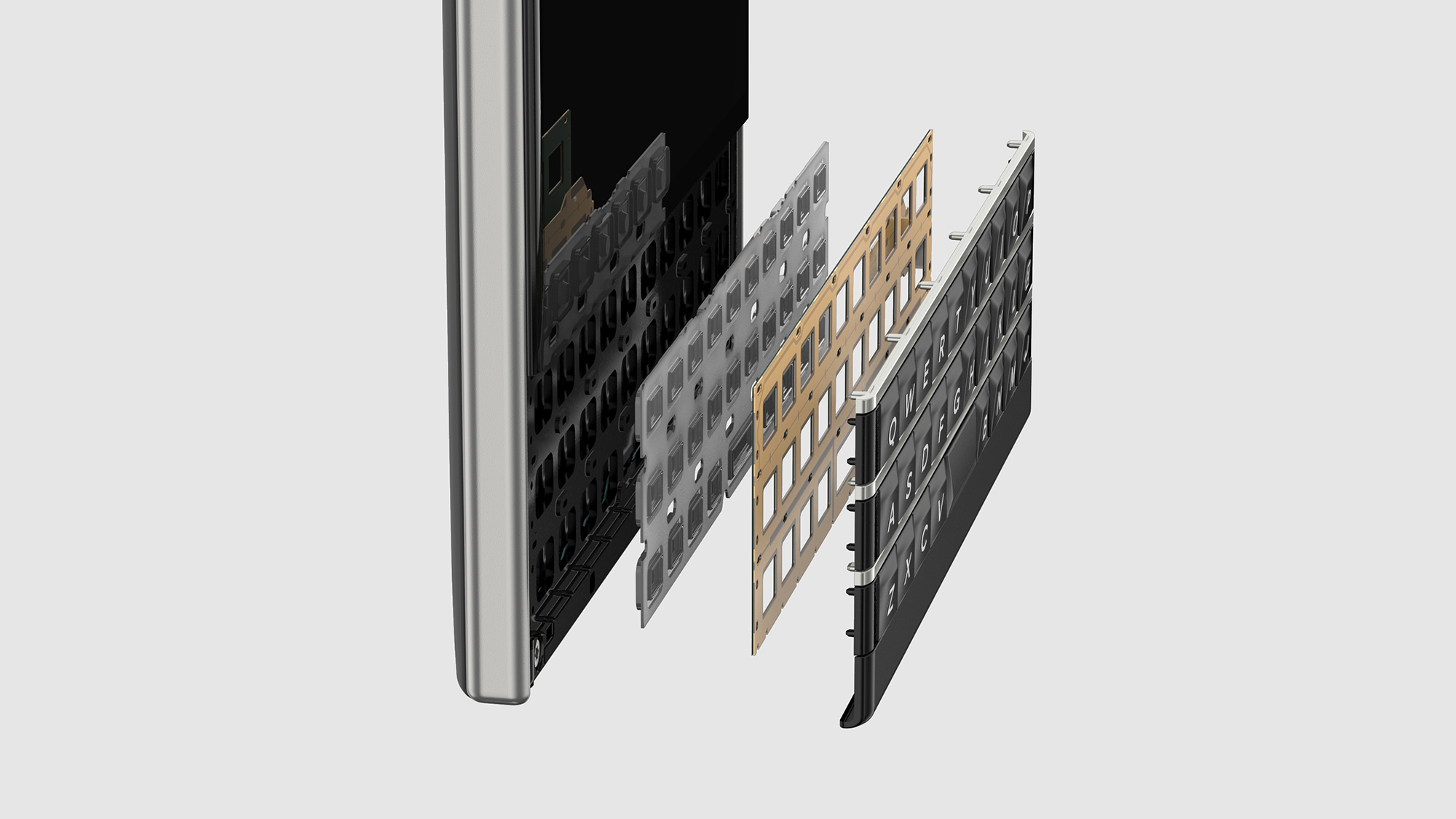
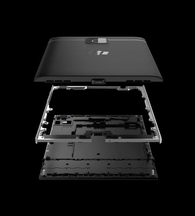
Can you explain what we’re seeing in the two Passport images you’ve shared exclusively with MobileSyrup?
Joseph: The construction image shows the steel frame support inspired by modernist architecture exemplified by the TD buildings, which are strong with the use of I-Beams but then visually light because of the glass. The steel is forged for strength (sand blasted with a specific texture to minimize finger prints), and is part of the antenna providing great RF quality.
The keyboard image shows standard QWERTY inputs in addition to a capacitive layer for the touch-enabled keyboard.
—
To read our BlackBerry Passport review, click here.
To read our BlackBerry input retrospective, click here.
Disclosure: I worked for BlackBerry from 2009-2011. They never listened to any of my phone design suggestions.
MobileSyrup may earn a commission from purchases made via our links, which helps fund the journalism we provide free on our website. These links do not influence our editorial content. Support us here.


