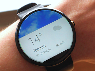
Though waiting games are never pleasant, the protracted launch of the Moto 360 gave us time to acquaint ourselves with the smartwatch, as well as with Android Wear.
With all of that under our belt, we meet the Moto 360 with a keen eye. We already know our Android Wear likes and dislikes, and what we love about the G Watch and Gear Live. Now it’s time to figure how the Moto 360 stands apart.
Specs
- Android Wear
- 1.56-inch 320 x 290 pixel IPS LCD
- 512 MB RAM
- 4 GB storage
- Bluetooth 4.0
- Pedometer, optical heart rate sensor, accelerometer
- 320 mAh battery
- Wireless charging
- Black/Silver colours
- IP67 rated
- Interchangeable straps
The Moto 360 has been one of the most continually anticipated Motorola devices in some time. When Google gave us our first glimpse during Android Wear’s unveiling, tech fans around the world fell in love with the 360’s elegant design. It was round, and it looked like a real watch! The concept was so simple, but it was the making of what would become the most sought after smartwatch of 2014.
In some ways, being a little late to the party worked to Motorola’s advantage, as reviews of the device tend to focus more on the hardware. Because Google doesn’t allow OEMs to alter the software experience, we have to look at the Moto 360 on its set of hardware merits.
So, how does the Moto 360 stack up against the competition? This is a tough one, because a lot of the Moto 360’s best features leave us wanting a little bit more. At the same time, Motorola goes so much further than Samsung and LG in delivering a watch first, accessory second.
A brief note on Android Wear
Android Wear won’t be getting much air time in this review, because while it’s the most important aspect of the 360 in terms of function, it is really only slightly different to what one will get from the G Watch or Gear Live (or any of the other upcoming Android Wear smartwatches).
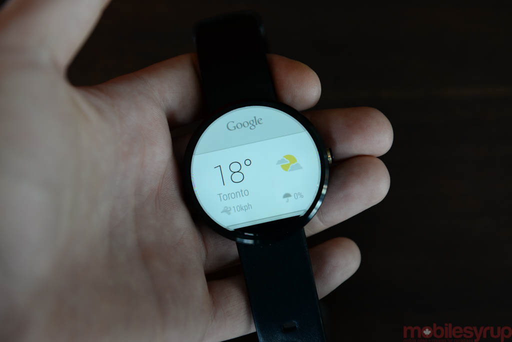
There are, however, some subtle differences thanks to its round display. For example, instead of that little red ‘Google Now’ blob appearing in the upper right, it appears at Moto 360’s 12 o’clock. At the same time, there are also some issues with Android Wear apps created by third party developers (like the Android Wear version of 2048), as they’ve been explicitly developed for angled displays.
What works
Design
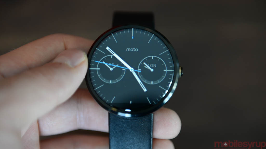
The 360 isn’t just a beautiful device; it’s a beautiful watch. And that was intentional. Motorola said it set out to create a watch first and a wearable second. “It’s a timepiece,” Motorola told us, not a smartwatch.
To achieve its goal, Motorola ditched the square design that has predominated the market until now.
Instead, the company has opted for a more traditional round shape. This is the most notable thing about the design of the Moto 360, causing one to stray from the notion of its ultra lightness and high comfort.
Comfort
Cast your mind back to the heady days of summer for a moment. Samsung’s Gear Live was the frontrunner in this nascent space.
I found that the Gear Live put uncomfortable pressure on either side of my wrist, causing a constant pinching sensation. The stiff rubberized band was not only difficult to fasten, but was sometimes downright painful. One is forced to press the watch strap deep into the wrist to ensure the plastic nub remains firm.
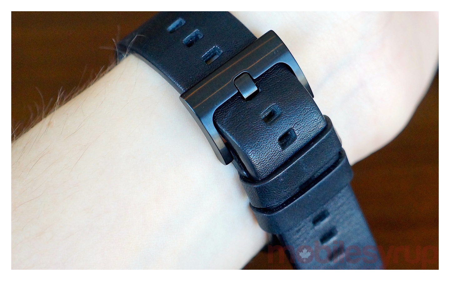
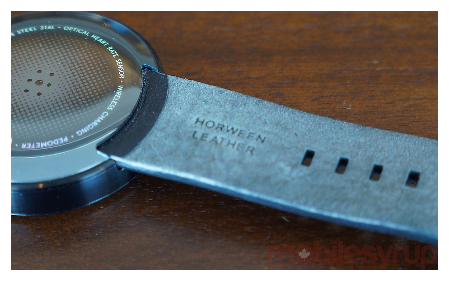 In contrast, the Moto 360 uses a soft, supple leather (sourced in Chicago) along with a traditional stainless steel fastener that matches watch’s frame. The company hasn’t tried to reinvent watch wearing, sticking to what is comfortable and has proven stylish for many, many years. The straps are also interchangeable, though you’ll have to visit a jeweller to change from one strap to the next.
Motorola also has plans for some metal options for those that want a sleeker, more business-like timepiece.
 Personalization
Android Wear is a review on its own (we talked extensively about it in our Gear Live and G Watch overview). It’s still relatively new, and Google is eager to keep it unsullied by third party customizations or skins.
Unfortunately, Google’s ban on customizations means OEMs are left with very few options when it comes to differentiating their devices from others on the market.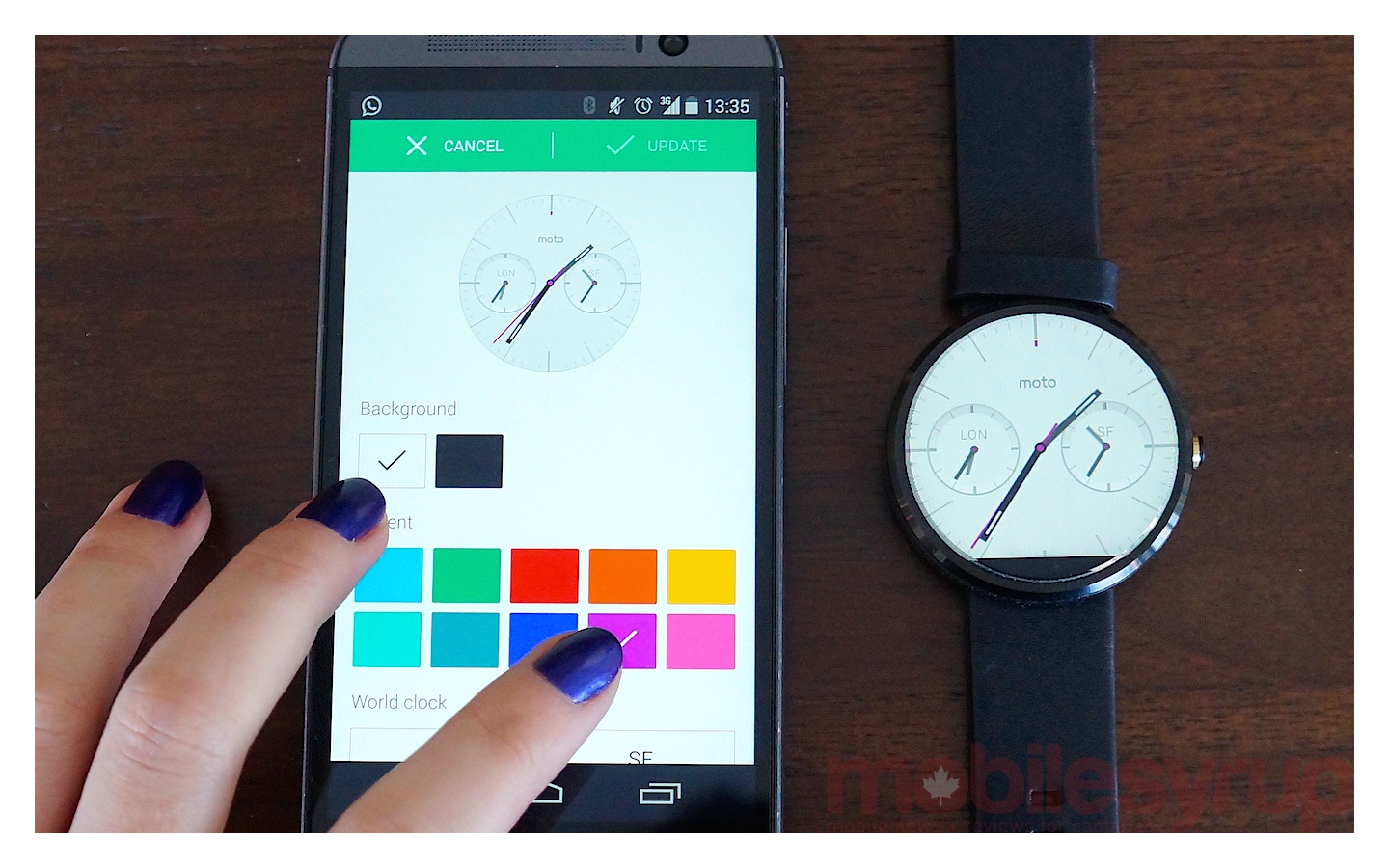 One way to create unique experiences is with default watch faces. Each Android Wear watch has a different set of watch faces or wallpapers and they all alter the experience. (As Daniel mentioned in his G Watch/Gear Live review, LG’s superior selection was almost enough to snag it a recommendation over the Gear Live).
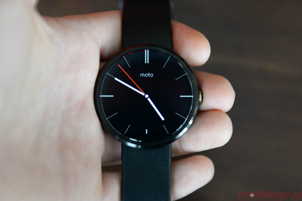 Motorola’s choices are somewhat businesslike; there are few options for those who prefer colour or whimsy. But Motorola does offer customizations of its stock watch faces via the Motorola Connect app. Connect allows users to change the background colour of each watch face, as well as accents for the second hand.
Being able to make the second hand pink or blue isn’t much, but it does offer more options in an area where Android Wear itself is quite limited, and that is greatly appreciated.
Customizations aside, Motorola Connect also displays the watch’s last known location. Most of the time, that’s its current vantage, since one is generally going to keep the watch and smartphone close. In the event of a lost watch, it can only display where it last was, since it contains no GPS radio of its own.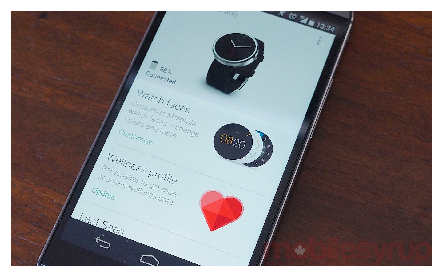 Lastly, Connect acts as a conduit to a user’s “wellness profile,” which lists height, weight, date of birth, and age (just in case one doesn’t already have that information on hand). This pairs with Motorola’s Heart Activity app on the watch, using the hardware optical heart rate sensor to monitor heart rate during day-to-day activity. It’s nice to have that information on hand, and I found the data consistent (Google Now was always able to tell me my heart rate when I asked) but it wasn’t a well-used feature of the device.
Battery
Battery life on this watch is excellent, and charging is quick (less than an hour from near zero). Thanks to a recent update from Motorola, I was able to get about 18 hours of moderate use out of the Moto 360 with Ambient Mode switched on. With Ambient Mode switched off (that is, the screen switches off completely until a notification comes in or you need to interact with the watch), uptime rose to a solid 24 hours per charge. I even hit 26 hours with 10% left on occasion.
Your mileage will obviously vary. I wasn’t going easy on the 360 at any point, nor was I pummelling it with apps, questions, or dictated messages. For the most part, I used it as an extension of my smartphone, allowing me to view notifications while keeping the Android in my purse.
Performance
Performance was good overall. Though there were some glitchy moments every now and then (for example, it sometimes took a couple of taps to activate the screen), they rarely led to frustration. There’s very little to say about the performance (that hasn’t already been covered in battery life) except that any momentary bouts of unresponsiveness were, for the most part, forgivable. This is all the better considering the Moto 360 runs a custom Cortex A9-based Texas Instruments OMAP 3-series SoC from around 2010.
What doesn’t work
Design
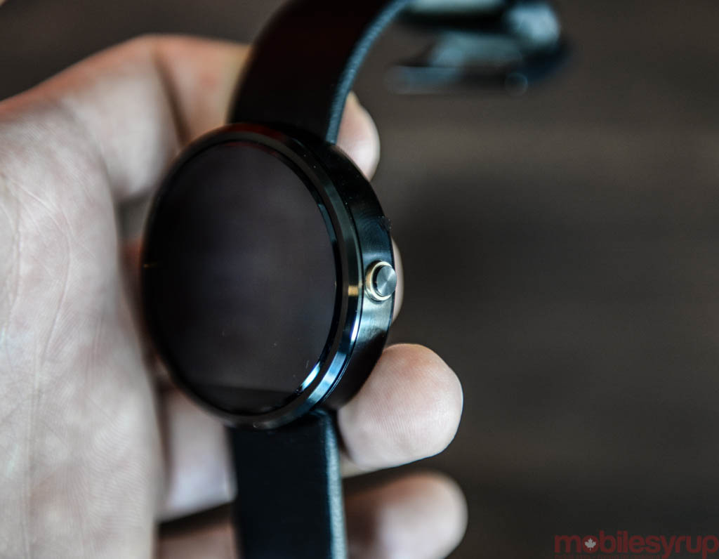
Some of the things that work best about the Moto 360 are the very things that frustrated me the most. Top of that list is the design, because though the 360 is very beautiful, the unboxing can be somewhat of a shock. When you first meet the 360 in person, it becomes clear that the device’s ‘good side’ is that head-on angle we first saw back in the spring. 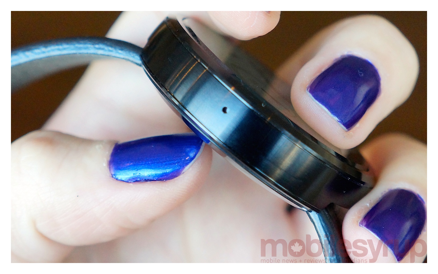 Its ‘bad’ side is that edge angle, which shows off the watch’s ample thickness. This is one of my only complaints about the Moto 360’s design, and it doesn’t even feel fair, because at the end of the day Motorola has squeezed the guts of the watch into a chassis not much thicker than many larger-faced analog watches sold today. Still, it was disappointing to discover the watch wasn’t as low profile as the teasers led us to believe.
Display
As Tom mentioned in our hands on, the panel used in the Moto 360 isn’t the sharpest, which is forgivable for a first-generation product — and the edge-to-edge display goes a long way towards creating a wonderful viewing experience.
But some users may be turned off by the black bar at the bottom, the purpose of which may not be immediately clear to the average consumer. It is necessary: the black bar ruining the watch’s circular symmetry and creating that so-called ‘flat tire’ look is where Motorola stashes display drivers and the ambient light sensor that enables the 360’s unique luminance-sensitive display. The bezel is completely necessary. If Motorola had taken longer, it might have been able to figure out a way to eliminate it, but for now it exists due to the limitations of sensor sizes, and factors little into the device’s day-to-day functionality.
The charger
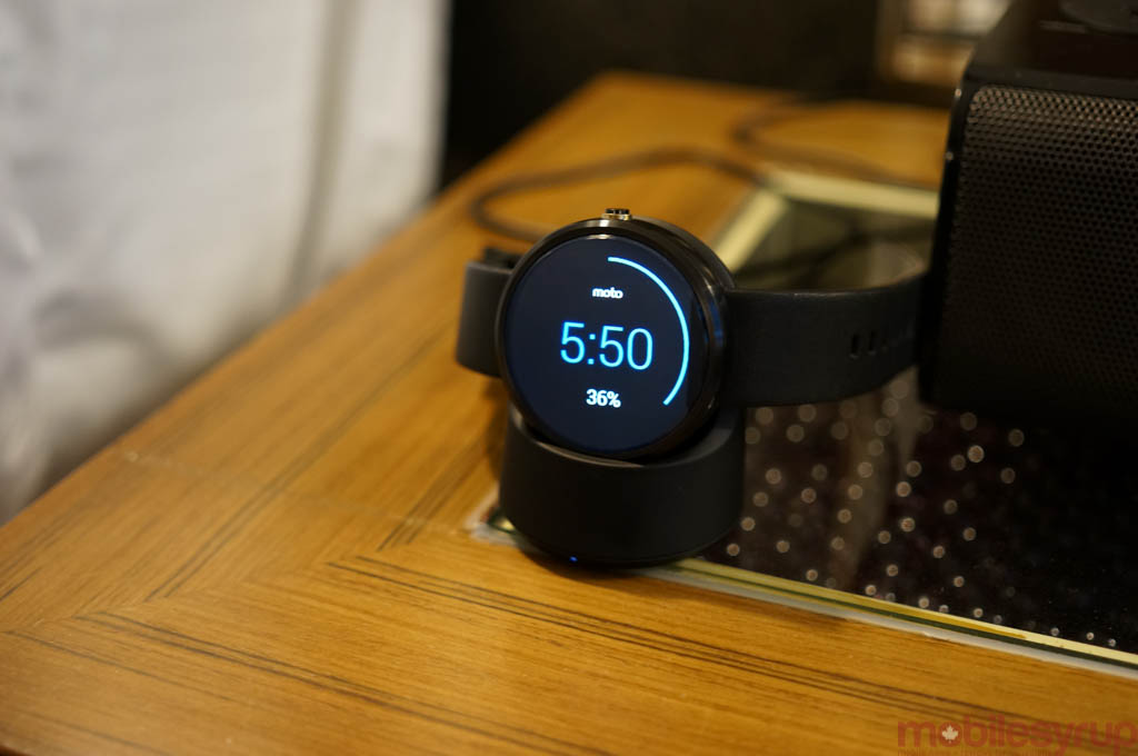
Another gripe is the battery charger, which is elegant only in theory. The wireless charger’s execution is actually a pain in the neck.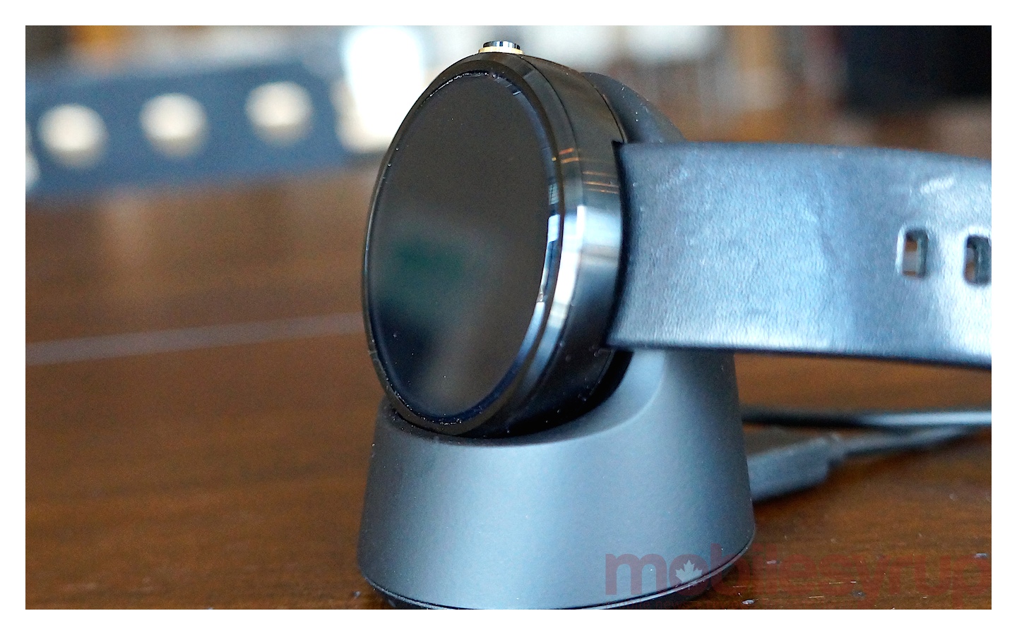 Though the device rests in the cradle, which is beautiful to look at, the watch is relatively easily knocked out of place and can sit idly for hours before one realizes something is amiss. (You can see from the image below how hard it is to tell that it’s not seated right.)
The charger, designed to be used as a bedside alarm clock, is not at home on an office desk. I found myself knocking it out of place with my elbow every time I reached for my Tim Hortons cup.
Price
The last pain point with the Moto 360 is its price. In today’s market, a smartwatch is first an accessory. Because it’s not a standalone device, but is something supposed to be worn daily, one has to consider if the near-$300 price is appropriate.
In general, I think smartwatches today are altogether too expensive for what they offer. To really appeal to the mass market, they need to be more affordable, low enough to enter ‘reasonable gift’ territory. Right now, that price range includes smartbands like the Jawbone Up24 and Fitbit Flex, which don’t offer the same functionality but offer more reasonable entry prices.
Conclusion
None of the criticisms change the fact that Moto 360 is the most universally-appealing smartwatch available right now. Yes, it’s a little pricey, and it’s a little more bulky than we’d like, but in terms of design the 360 is simply unmatched.
Motorola got it right first try, and competitors like LG are rushing to make up that ground with round designs of their own (LG’s G Watch R is pictured below but not yet on sale).
In late 2014, the smartwatch market is still in its larval stages and it has a long way to go in terms of design, functionality and price. A recent study showed a large portion of would-be purchasers of wearable devices cite cost as their principal barrier of entry to the market (even for cheaper devices like the $100 Fitbit).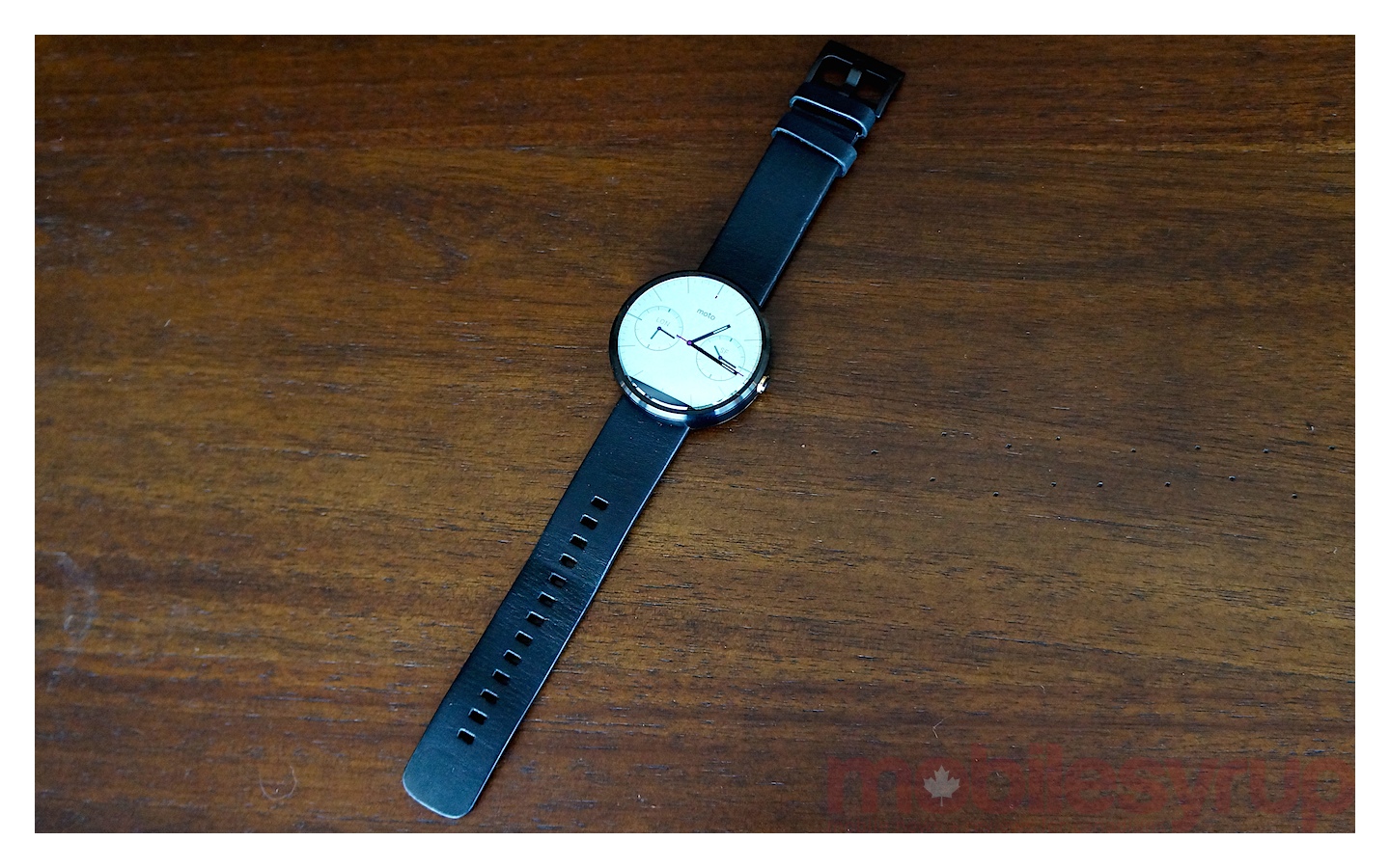 If you’re already unsure as to whether you should be spending a couple of hundred dollars on a smartwatch, you’re likely not an early adopter and should probably wait until the market matures. If you’ve already decided you’re definitely buying an Android Wear device today, the Moto 360 is a cut above the rest.
MobileSyrup may earn a commission from purchases made via our links, which helps fund the journalism we provide free on our website. These links do not influence our editorial content. Support us here.

