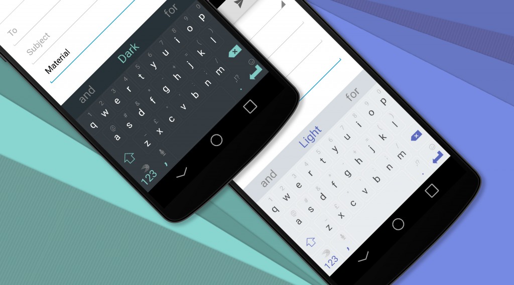
With the release of Android 5.0 Lollipop just around the corner, SwiftKey is eager to ensure its keyboard is in line with the Material Design aesthetic.
This week, Scott Weiss, SwiftKey’s VP of design, took to the company’s blog to unveil two new themes for SwiftKey users. These themes are virtually identical save for the fact that one is light and one is dark. They bring the SwiftKey keyboard a little bit closer to the Android 5.0 keyboard in style.
Some Android users might actually prefer the SwiftKey aesthetic over the stock keyboard that is included with Android 5.0. Though the size of the keys remain the same, they are no longer on any lines of demarcation between one key and the next on the Google keyboard. Typing is still comfortable, but users may find this ‘keyboard without borders’ somewhat jarring.
In contrast, the new SwiftKey Material Design keyboards have very faint lines to differentiate between each key as well as secondary characters (accessible via long press) noted on each key.
The new themes are available to SwiftKey users via the SwiftKey store as an in-app purchase.
[source]SwiftKey[/source]
MobileSyrup may earn a commission from purchases made via our links, which helps fund the journalism we provide free on our website. These links do not influence our editorial content. Support us here.


