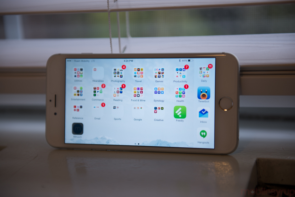
Think about the you from two years ago. You may have had a different hairstyle, or slightly more weight around the hips (thanks, Fitbit!) or a different job, but chances are you didn’t think you needed a big phone. You had a tablet for those big-screen tasks, and likely enjoyed the fact that your phone fit comfortably in your pocket, and was so usable with one hand.
Oh, how times have changed. Human hands have not changed, but the market for big phones certainly has. And after years of insisting its diminutive screens were the perfect blend of size and function, Apple has acquiesced to market pressure and produced two larger devices.
But whereas the iPhone 6 comes in under the one-handed usage threshold, the iPhone 6 Plus is massive, even compared to the largest Android smartphones. Whether you consider size an inherent advantage will be up to personal taste, but Apple has included a couple of other benefits designed to set the iPhone 6 Plus apart from the regular iPhone 6. These include a higher-resolution 1080p display, making it the highest-density device in Apple’s arsenal; a considerably larger battery, with two-day battery life; and optical image stabilization, facilitating better low-light photos.
Do these advantages boost the iPhone 6 Plus beyond merely being a big iPhone? And when compared to the Galaxy Note 4, a fourth-generation device from a manufacturer that is much more comfortable in the big-phone space, does the 6 Plus hold up? Let’s find out.
Specs
- iOS 8.1
- 5.5-inch 1920×1080 pixel S-RGB calibrated IPS LCD display, 401ppi pixel density
- 1.4Ghz dual-core A8 SoC, PowerVR
- LTE (Bands 1, 2, 3, 4, 5, 7, 8, 13, 17, 18, 19, 20, 25, 26, 28, 29)
- 1.4Ghz dual-core A8 SoC, M8 co-processor, quad-core PowerVR GX6450 GPU
- 1GB RAM / 16, 64, 128GB storage options (no microSD)
- 8MP rear camera w/ 1.5 micron pixels, f/2.2 lens, dual-LED flash
- 1080p video capture @ 60fps, 720p @ 240fps
- 1.2MP front-facing camera
- WiFi (b/g/n/ac @ 433Mbps), Bluetooth 4.0, A-GPS, NFC (for payments only)
- Barometer, gyroscope, Touch ID fingerprint sensor
- 158.1 x 77.8 x 7.1 mm
- 172 grams
- 2915mAh battery
Design & Display
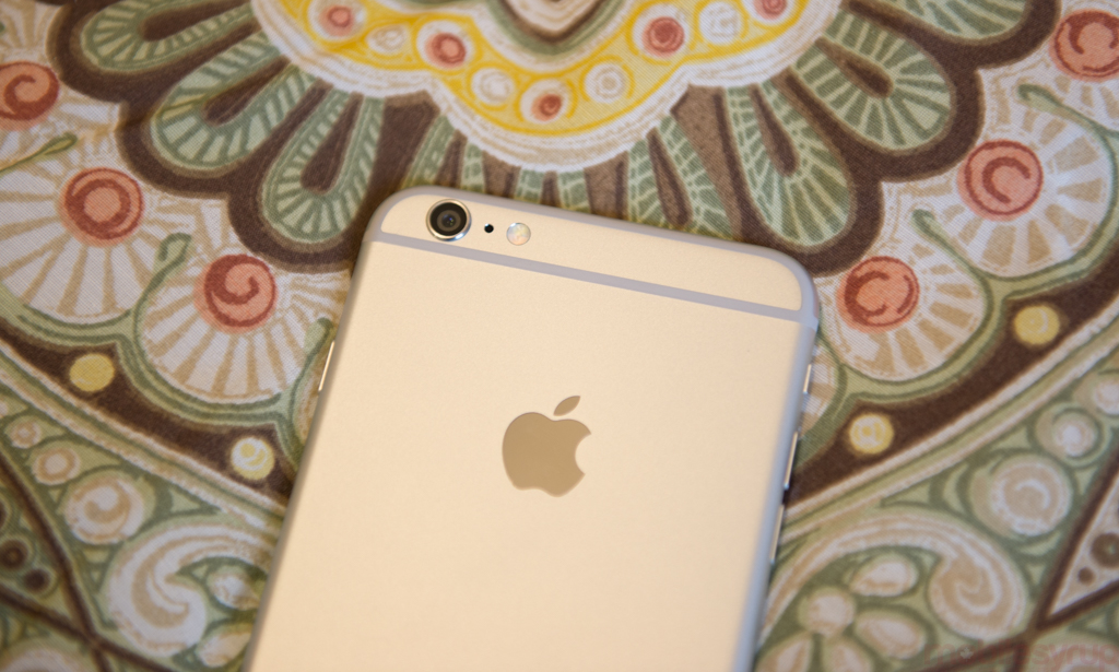
Calling the iPhone 6 Plus a “very big iPhone 6” does a disservice to its solid construction. First, I have to get this out of the way: after a month of near-daily use, the phone has not bent a millimetre (yes, I checked using a precision level).
Not only is the iPhone 6 Plus taller, wider and slightly thicker than the iPhone 6 (though still thinner than the iPhone 5 series), at 172 grams it’s considerably denser. It’s a big chunk of aluminum, up there with the iPad Air series in terms of solidity. But the problem with an all-aluminum build, and something Samsung got right with the Note 4, is that metal is slippery, and the iPhone 6 Plus is remarkably so.
Perhaps more than any other product on the market, the iPhone 6 Plus is a two-handed device. Unlike Samsung and Huawei, which both employ Android’s extensibility to create a suite of one hand-optimized apps (some more successfully than others), the iPhone 6 Plus is too wide to safely wrap one’s hand around the back and successfully reach the opposite side of the screen with the thumb.
The phone’s width is problematic when trying to activate the system-wide back gesture, which is a single swipe from the edge of the left side of the screen, without one’s left hand. It’s just too far for the right thumb to travel.
Indeed, the iPhone 6’s one-handedness actually preferences left-handed users, who comprise under 5% of the human population.
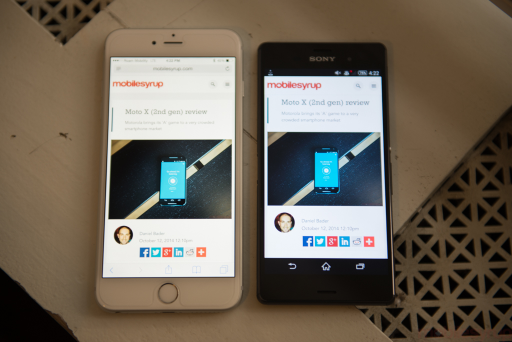
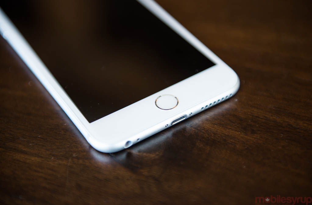
Many Android manufacturers quickly realized that in order to make large phones more comfortable they’d need to cut down on the vertical dimensions of their phablets. As a result, the extra space above and below the screen has shrunk considerably in proportion to the display size in recent years. Unfortunately, Apple’s design model cannot support this, since it requires the use of a rounded physical home button (with Touch ID, now more than ever) with symmetrically-optimized bezels. In other words, the iPhone 6 Plus had to be huge in order to maintain the iPhone archetype.
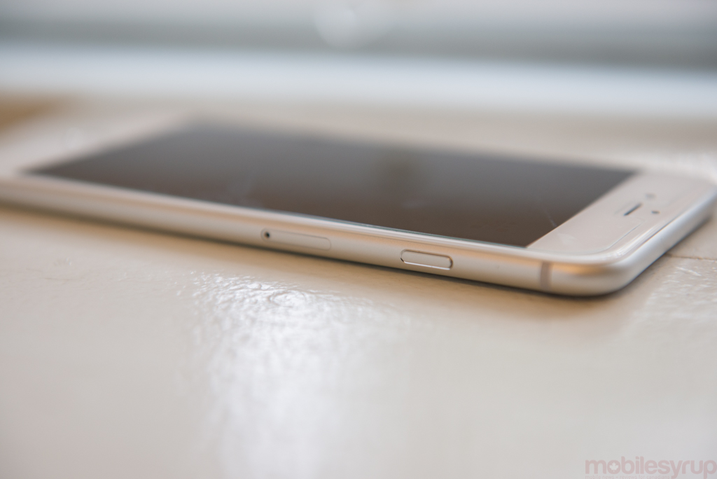
With a repositioned power button on the right side, the ergonomics open themselves up to yet another design concern: pressing the power button often triggers a press of the volume button, since they’re located at the same heights on either side of the device, and the middle finger and index rest nearby.
Apple clearly understood this design flaw, since it preferences the volume button over the power each time, but it becomes annoying when trying to turn off the screen after setting up one’s music only to accidentally adjust the song’s volume. These are small annoyances, but one’s absent from previous iPhones.
The larger size comes with its own benefits, too. The 5.5-inch screen not only renders considerably more content (when apps are sized correctly by developers) than the iPhone 6, but makes the same content more enjoyable. For example, I never felt comfortable reading a book or watching long videos on the iPhone 5s because the screen felt too cramped; in my month of use, the iPhone 6 Plus has largely replaced my iPad mini 2 as my ereader and on-the-go Netflix watcher.
The screen is delightful, and certainly better than many other 1080p displays on the market today. It’s bright and colour-accurate, with incredible viewing angles and unparalleled touch responsiveness. At 401 pixels per inch, it’s certainly not the sharpest on the market — even compared to other 1080p Android flagships like the HTC One M8 and Samsung Galaxy S5 — but Apple’s never been one to tout pixel density (well, not since it debuted the Retina Display in 2010).
By all other metrics — mine, and those of a respected scientist — the iPhone 6 Plus has a very nice display. It has considerably higher brightness than the Samsung Galaxy Note 4, and slightly better viewing angles than the previous best-in-class HTC One M8, but the screen’s best trait is its colour accuracy. It’s a testament to the care Apple takes with its out-of-the-factory settings that the 6 Plus could be used as a reference for a colour corrector; for everyone else, it’s just good business practice. For the spec heads, the lack of a QHD resolution may be problematic, but the iPhone 6 Plus is easily the best screen Apple has ever produced, and that’s saying something.
 Perhaps more interesting is that the 1080p screen is actually rendered at 2208 x 1242. Briefly — and this article explains it much better than I can — because 1080p is not actually a derivative of Apple’s points grid, the iPhone 6 Plus renders a higher resolution and then downsamples to 1920 x 1080.
Why does it do this? Because Apple’s goal is to make it easier for developers to create apps where the assets, the icons and links and things you touch, are big enough to see without squinting but small enough to make a tangible difference over the iPhone 6.
In other words, the iPhone 6 Plus is not only considerably sharper than the iPhone 6’s screen, but like any bigger screen should, it fits more on it — all while keeping the 3x multiple alive so developers can create touch targets that resemble that of the iPhone 4/5/6. According to PaintCode, “The downscaling ratio is 1920 / 2208 = 1080 / 1242 = 20 / 23. That means every 23 pixels from the original render have to be mapped to 20 physical pixels. In other words the image is scaled down to approximately 87% of its original size.”
Because the pixel density is so high, most users will never notice this scaling at work, but taking a screenshot renders a 2208×1242 pixel image, and there is evidence if you look hard enough: horizontal lines shimmer slightly as you scroll through a vertical list, for example. What about movies coded at 1080p? It appears that Apple actually scales the content up to 1242p and then down again to 1080p. It’s a lot of wasted resources, but it doesn’t seem to affect performance. More than anything it’s strange, and perhaps the reason that it’s taken app developers so long to deliver great, differentiated iPhone 6 Plus experiences.
Performance
Like the iPhone 6, the 6 Plus runs a dual-core A8 chip with a quad-core PowerVR chip, along with 1GB of RAM. It’s an incredibly fast chip, faster than any quad-core Snapdragon on a clock-for-clock basis, currently available — though it appears that the Logan-based Tegra K1 in the Nexus 9 could be faster.
The iPhone continues to defy the speeds and feeds mantra, year after year, especially since on paper the quad-core 2.7Ghz Snapdragon 805-powered Galaxy Note 4 would appear to be superior. It isn’t, at least not in daily use. Despite running at 1.4Ghz on just two cores, the iPhone 6 Plus’s A8 chip uses a newer ARM’s new 64-bit ARMv8 design that, when paired with compatible software, ends up doing more per clock cycle, at slower speeds, than Qualcomm’s Krait-based Snapdragon chips. Those advantages are likely to diminish early next year with the release of Qualcomm’s Cortex A57-based Snapdragon 810 SoC, but for now the only real test of Apple’s dominance is the NVIDIA Tegra K1, which is unlikely to be included in a phone due to its lack of integrated LTE.
On the GPU side, the A8’s quad-core PowerVR GX6450 doesn’t command the same lead over the Snapdragon 805’s Adreno 420, but it’s a very fast chip nonetheless. As games continue to slowly funnel into the Play Store optimized for Apple’s Metal framework, as well as games that support newer versions of OpenGL ES, iPhone gaming still sits a notch above Android. The gap is closing, and Lollipop’s Android Extension Pack (AEP) should narrow it further, but there are still distinct advantages, both to consumers and developers, to creating games on iOS.
The one piece of the puzzle that continues to frustrate me, and a host of other iPhone users, is the low RAM count on the iPhone. With the revelation that the iPad Air 2 has 2GB of RAM (and an extra CPU core), it’s appears power consumption is still the major bottleneck for adding more memory. While the iPhone 6 Plus certainly has ample battery capacity to spare, adding an additional GB may have been too negative an effect on advertised battery life, not to mention Apple’s profit margins.
The low RAM count rarely affects performance, as app developers are limited by the amount they can use, but using Safari and only having the ability to store a single tab in memory before it is purged is frustrating. For everything else — and I mean that — the 1GB of RAM is just not an issue.
iOS does not treat RAM the same way Android does, so doing apples-to-apples comparisons on memory count is not productive. While we have yet to see how Lollipop works on the Nexus 6, my preliminary findings on the Nexus 5 show that Google has fixed many of the performance “stutters” — scrolling, swiping and the like — that affected previous versions of Android. But iOS has always, since day one, been a “real-time” operating system, giving the program in the foreground higher priority than anything happening behind the scenes.
Android, on the other hand, allows apps and services to run unchecked (or at least, less checked) in the background, opening itself up to performance degradation. Lollipop seems to fix most of those issues, but iOS still has an advantage in the performance department for the moment.
For more on iPhone 6 Plus performance, read our iPhone 6 review.
Software
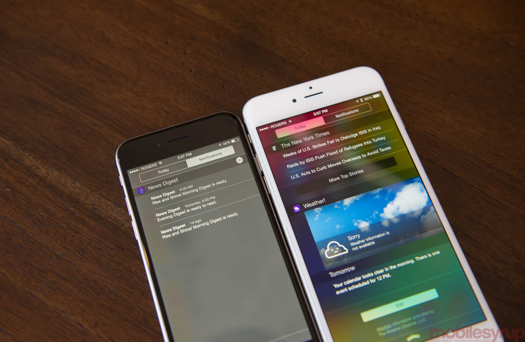
On the one hand, software on the iPhone 6 Plus is identical to the iPhone 6 and most iPhones before it. On the other hand, the increased physical screen space and extra display “points” allow developers to create custom experiences. It is ostensibly a slightly more restricted version of the iPad.
There are two reasons this review arrives so long after the release of the iPhone 6 Plus: one, there were just too many phones released around that time; but more importantly, I knew that the iPhone 6 Plus experience would be considerably different in late October than late September. That’s because an app that hasn’t explicitly been updated to take advantage of the iPhone 6 Plus screen resolution and density looks terrible: it is almost comically blown up, the Comic Sans equivalent of app design. It’s a considerably worse experience, to me at least, than the transition from the iPhone 4s to the iPhone 5, which added two black bars at the top and bottom of the screen.
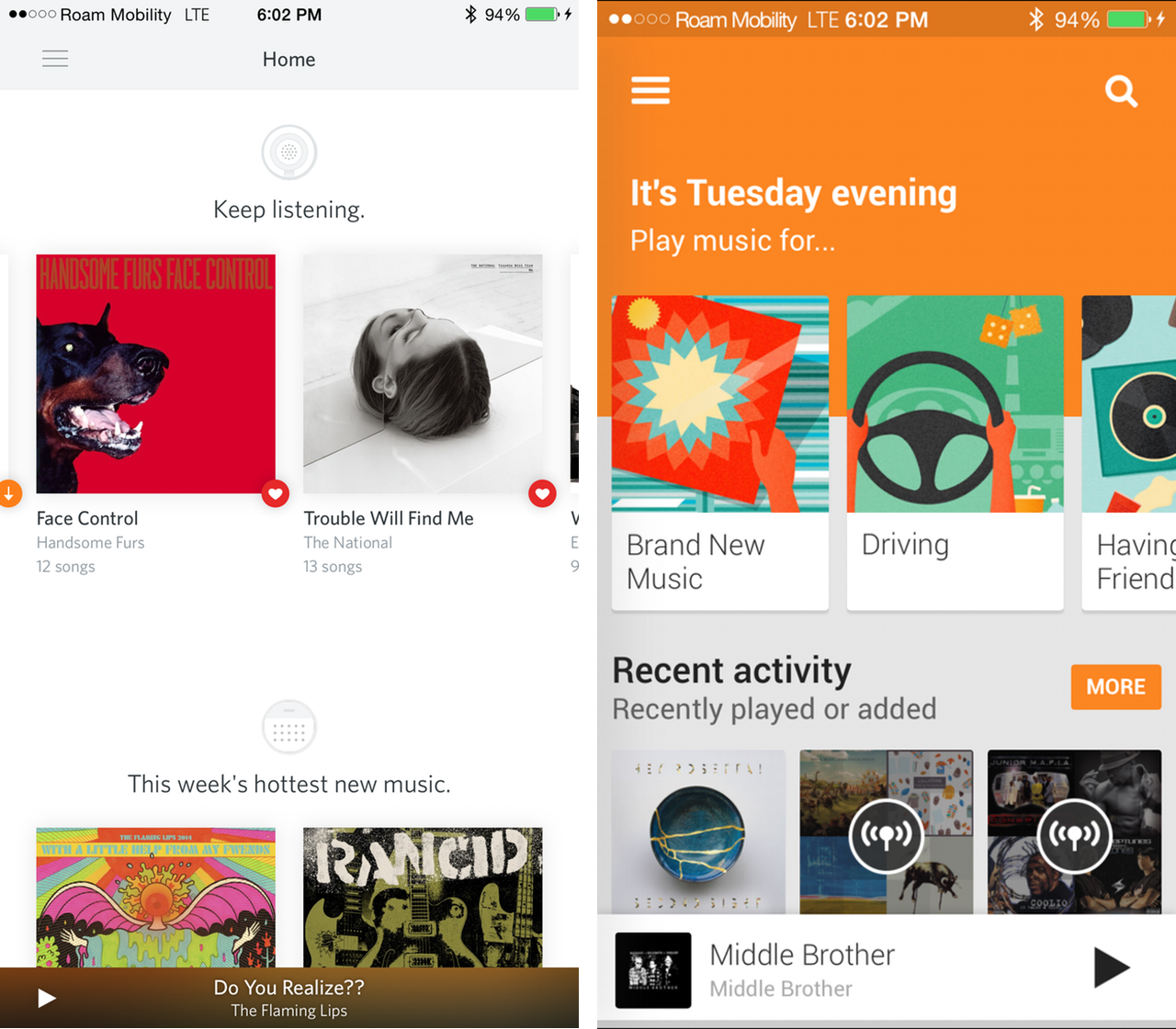
As of October 28th, three quarters of the apps I use daily have been updated to support the iPhone 6 Plus, and the difference is enormous. There’s a spaciousness to these applications that has been absent on previous generations of iPhone. This allows developers to experiment with different layouts, yes, but also to show more content, which is key. Everything is just a little bit sharper, too, owing to that higher pixel density, but being able to read more text horizontally and vertically is a godsend to consolidators like me who want to carry a single device for every purpose.
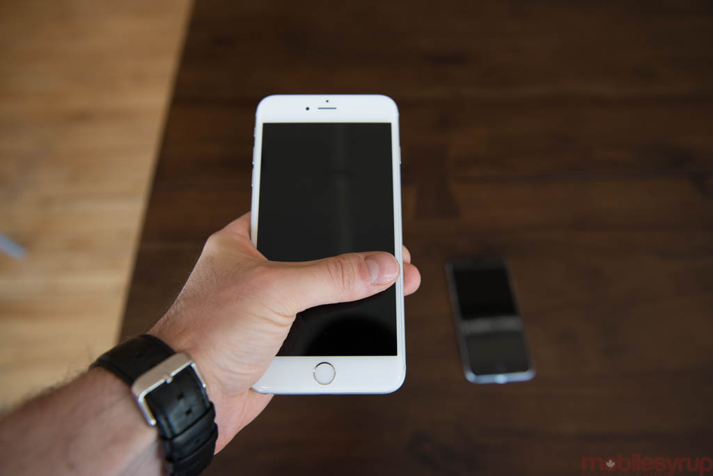
As I stated in the introduction, I have taken to using the iPhone 6 Plus, like I did with Android phablets previously, as de facto laptop replacements. I write articles, read books, watch movies and perform the majority of my correspondence on the phone, negating the need for a smaller (or even larger) device.

Comparing the density of information between apps on the iPhone 5s and iPhone 6 Plus shows a remarkable difference. It’s not just that the 6 Plus has a larger display; developers that have worked within Apple’s new scalable app design guidelines can create two-pane experiences in portrait and, more commonly, landscape, that display content more intelligently.
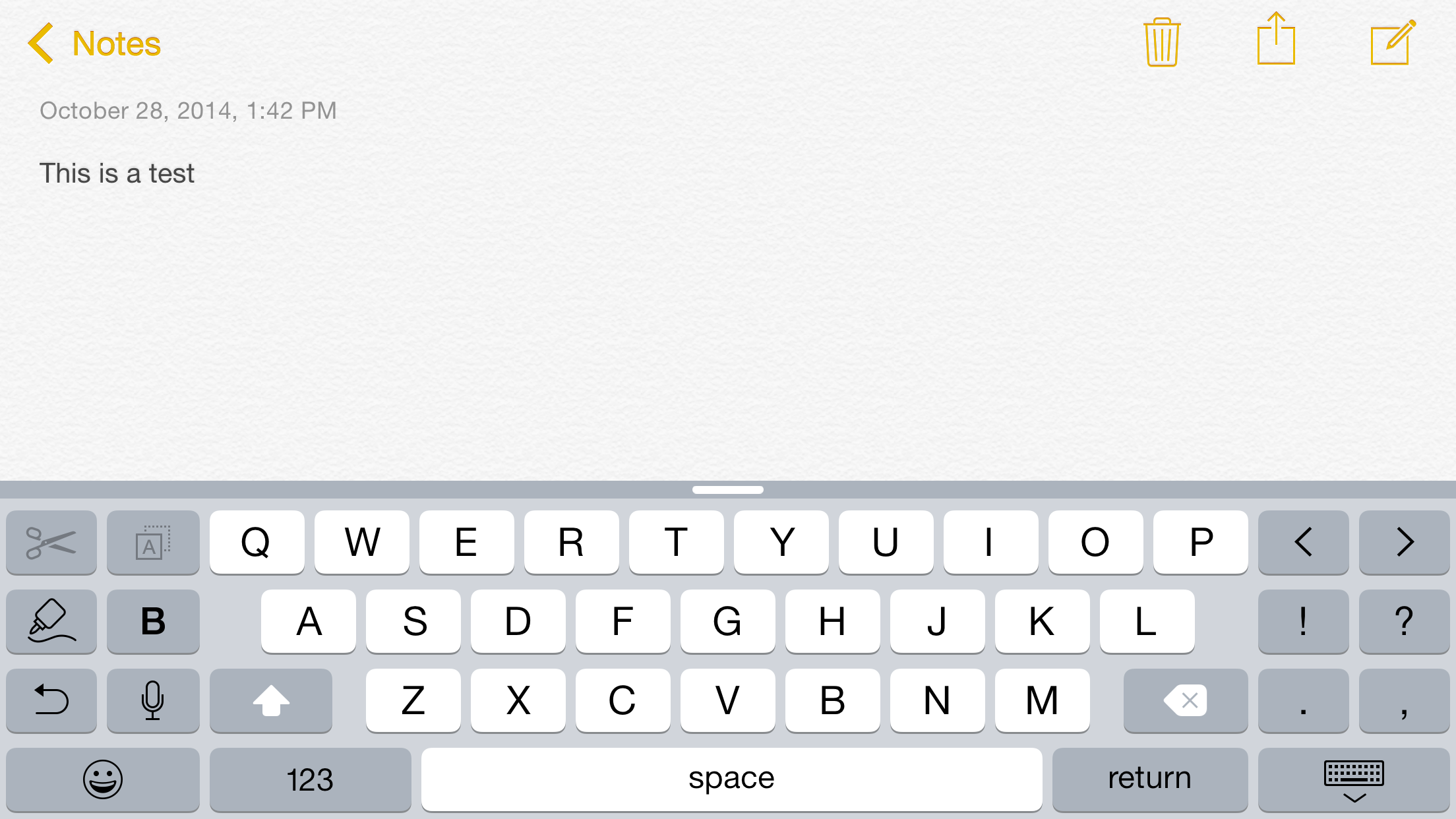
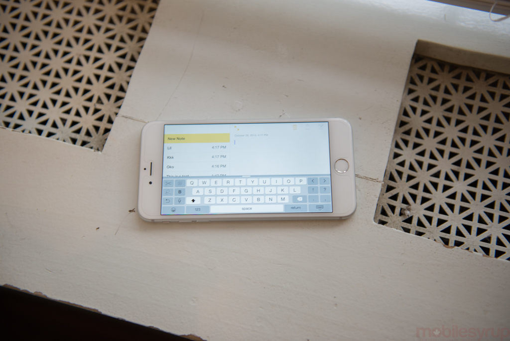
Trouble is, in my experience, using the iPhone 6 Plus in landscape mode is just not that useful, or enjoyable. While some of Apple’s apps have been updated to support landscape — Mail, Notes, Reminders — few third-party apps have gained the same. And while typing in landscape on the iPhone 5 series was fine, the additional symbols added to the sides of the 6 Plus landscape keyboard are both superfluous and distracting.
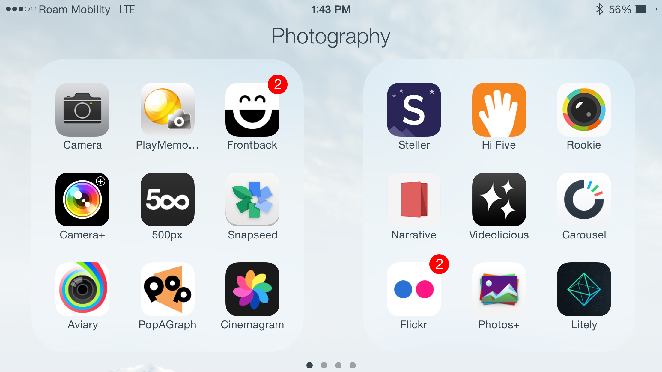
Finally, though iOS 8.1 has resolved many of the springboard crashes the iPhone 6 Plus experienced when it was first released, the phone still freaks out too often (especially when in landscape), booting the user back to the home screen. Most app developers have cleared away the cobwebs from their iOS 7-era apps, but too many are stuck without iPhone 6 Plus resolution optimizations.
Camera
The 8MP shooter on the rear of the iPhone 6 Plus is very good, perhaps one of the best overall smartphone cameras in the world. While it lacks the outright resolution of the Samsung Galaxy Note 4 or Sony Xperia Z3, Apple does some amazing things with the pixels it uses.
Camera performance is roughly identical to the iPhone 6, and I won’t rehash that here, the main difference between the two is the addition of optical image stabilization (OIS), which moves the camera module in the opposite centrifugal direction to the hand’s motion in an effort to physically (and not digitally) stabilize the sensor. It’s amazing for keeping the shutter open longer in low-light situations, but isn’t great for taking photos of moving targets. Because the camera keeps the shutter open longer moving subjects merely look brighter, not less blurry.
I found the difference between the two cameras almost indistinguishable in 95% of situations, but the odd night landscape shot proved the 6 Plus the better of the two.
Physically, one has to weigh the advantage of having a larger viewfinder with the fact that the iPhone 6 Plus is a little more awkward to use. Its sheer size makes it difficult to reach the shutter or volume buttons (which act as the same) with an outstretched finger, necessitating the need for a balancing second hand.
Personally, I’d choose OIS over one-handed usage any day, but to most people, the iPhone 6 Plus will not be a dramatically better camera.
Battery Life
The iPhone 6 Plus is the second longest-lasting phone I’ve ever tested next to the Huawei Ascend Mate, which has a battery capacity almost 30% larger. Apple has combined its power-sipping A8 chip, built on a brand new TSMC 20nm process, with a 2915mAh battery to enable two-day battery life on the 6 Plus.
In our video looping test, which regulates the screen to 200nits and loops a video while the phone is connected to WiFi, the 6 Plus lasted over 14 hours. That’s three hours longer than the Note 4, which has a 385mAh larger (though removable) battery cell.
In normal, subjective use tests, my results were even better. There wasn’t a single day where the 6 Plus died before bedtime, and most days the device still had over half its supply left. Say what you will about iPhone battery life in the past, the 6 Plus is a different beast altogether.
Connectivity
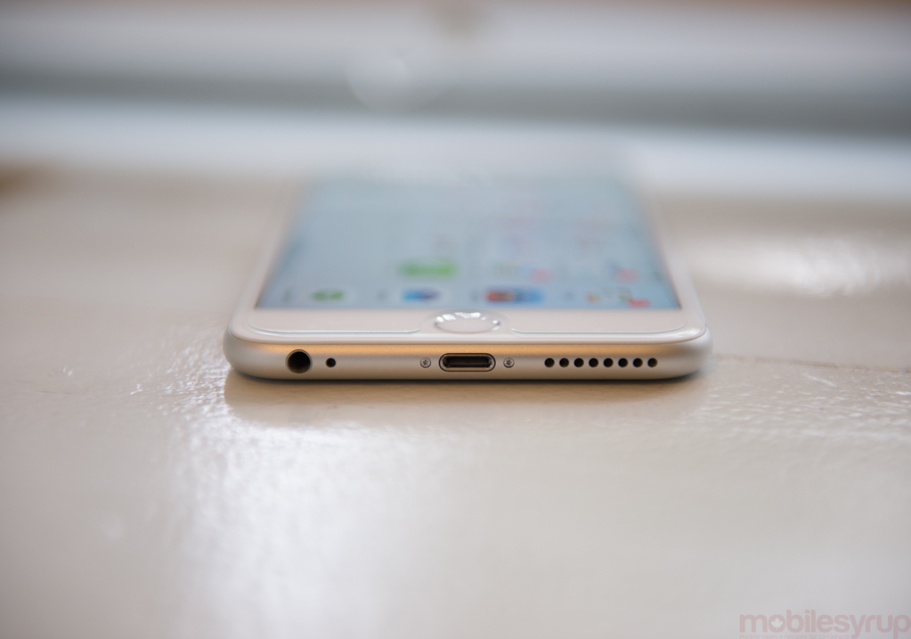
The iPhone 6 looks a bit ridiculous making held up to the face, but it does make excellent-sounding phone calls. Using the same headpiece, speaker, amplifier and sound chip as the iPhone 6, I noticed no differences in the overall quality — though the mono speaker, located on the bottom, was slightly louder at maximum volume due to a slightly bigger cage.
I used an unlocked iPhone 6 Plus on Rogers and TELUS in Toronto, and on Roam Mobility in New York City, and achieved excellent LTE speeds on all three.
Competition
The iPhone 6 Plus stands alone, a position Apple enjoys. It’s not singularly elegant like the iPhone 6 or stark like the 5s, but sits at the end of a category, a giant among equals (or an equal among giants).
Its most obvious immediate competitor is the Samsung Galaxy Note 4, and for phablet users desiring extensibility I’d recommend the Galaxy over the iPhone. It’s just more flexible, and makes better use of the screen size in terms of one handed specific features. Its S Pen is also very useful. The iPhone’s Reachability feature, which involves double-tapping the home button to lower the top of the screen by half, is the only software concession made by Apple for one-handed usage, and it’s not enough.
It’s nearly impossible for an average-sized person to reach the opposite edge of the screen, vertically or horizontally, without shifting the device awkwardly (a feat made more difficult due to the slickness of the aluminum) in one hand or reinforcing it with another. Samsung sacrifices elegance for utility with its one-handed features, but that will lead to some people actually using them.
Other devices, like the LG G3 or OnePlus One, have the same sized display, but are considerably more compact (and the latter much cheaper). They’re better choices for Android users looking to trade up in screen size without using a massive device.
The iPhone 6 Plus is also the most expensive smartphone on the market. Starting at $375 on a 2-year plan for the entry-level 16GB model and rising to nearly $600 for the 128GB version, the phone must be bought with considerable deliberation, and is really an upgrade for iPhone users looking for a tablet experience on a smartphone.
The iPhone 6, as a result, is going to be a better choice for the majority of smartphone buyers, but I can see lovers of large phones — an increasing number of smartphone users in general — choosing the iPhone 6 Plus for its superior camera and unparalleled battery life. The higher screen resolution will be a bonus.
Conclusion
The iPhone 6 Plus is a great smartphone, but not a good choice for everyone. It’s size will turn off some, its price many others, but those who do invest in the 5.5-inch giant will experience the finest app ecosystem on a screen size previously reserved for the tablet crowd.
With improved battery life over the iPhone 6 and a camera experience unmatched by any Android, BlackBerry or Windows Phone device, the choice of whether you buy an iPhone 6 Plus comes down to whether it fits your pocket — and your budget.
MobileSyrup may earn a commission from purchases made via our links, which helps fund the journalism we provide free on our website. These links do not influence our editorial content. Support us here.

