Great innovations in smartphones come in dribs and drabs.
Multitouch, which debuted on the iPhone, is likely the single biggest determinator of how we interact with our small screens. But the proliferation of higher-density displays, ultra-fast wireless, and the cloud ecosystems on which we daily rely, all play a huge part, too.
The emergence of curved displays, a precursor to bendable chassis, may not seem on the surface like an equitable advancement compared to those above, but it may play a vital role in the future of smartphone development.
Samsung’s Galaxy Note Edge was as surprising an announcement as they come, swept underneath the rising tide of rumours relating to the Note 4 back in late summer. Admittedly not a mainstream product, the Note Edge is the latest in Samsung’s prolific experimentation streak, but one the company believes has true marketability to a certain subset of smartphone early adopters.
As it arrives in Canada, we take the Note Edge to task: does its curved screen offer any tangible benefits over the equivalent flat piece of metal and glass; and is it fundamentally a good smartphone in spite of what appears to be a gimmick?
Specs
- Android 4.4.4 KitKat
- 5.6-inch 2560×1600 pixel curved Super AMOLED display
- 2.7Ghz quad-core Snapdragon 805 SoC
- 3GB RAM / 32GB internal storage (plus microSD)
- 16MP rear camera with optical image stabilization
- 3.7MP F1.9 front-facing camera
- 4K video capture @ 30fps
- WiFi (a/b/g/ac), Bluetooth 4.1, A-GPS, GLONASS
- S Pen
- 3,000mAh removable battery
- 151.3 x 82.4 x 8.3 mm
- 174 grams
- LTE 300Mbps / 50Mbps
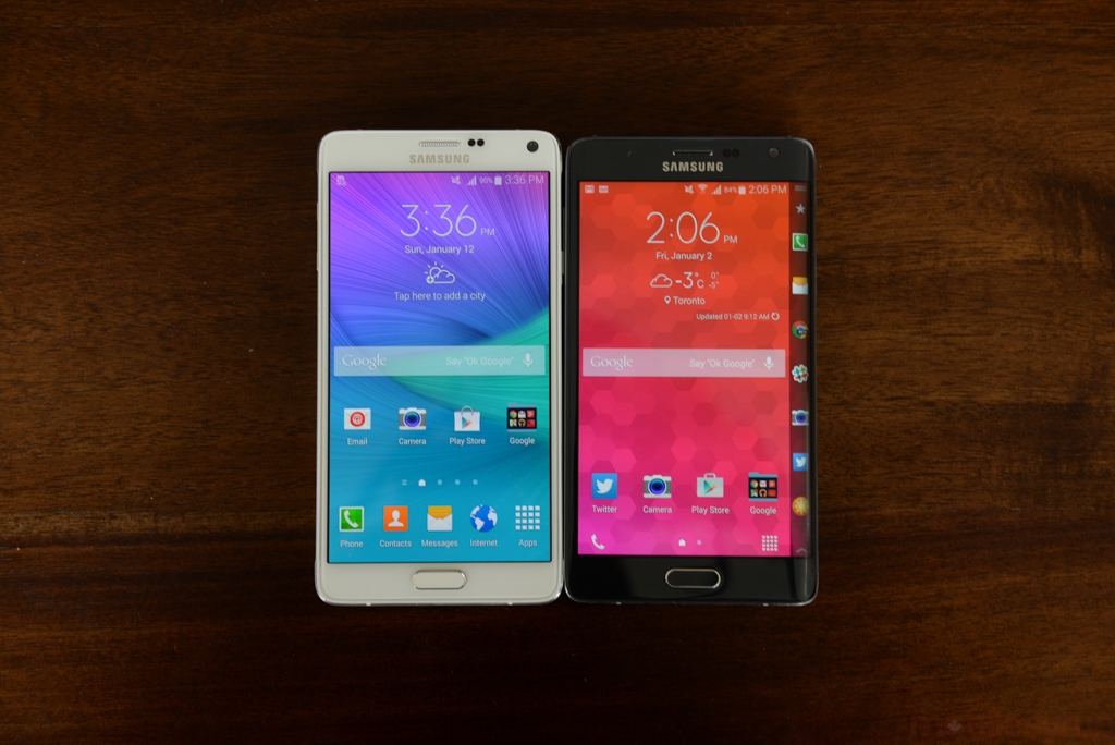
The Edge is, fundamentally, a phablet reminiscent of all devices in Samsung’s Galaxy Note series. It’s big — wider than most smartphones — and offers a near-identical tactile experience to the Note 4.
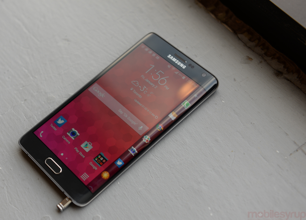
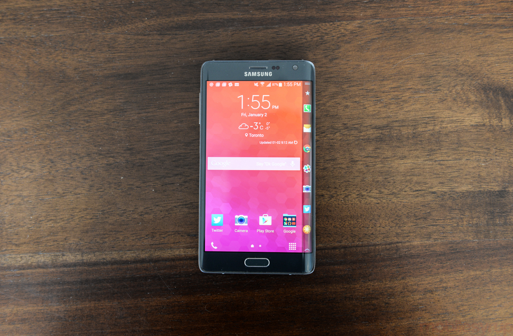
Though it lacks the outward metal appearance of the its namesake (it does feature a metal frame, though), it feels similarly sturdy, resting on a hard plastic frame that omits the chrome outline of previous Galaxys. The 5.6-inch display is bright, spacious and dense, with 2560 x 1440 “regular” pixels and an extra vertical line of 160 dots that comprise the titular edge panel. Like the Note 4’s display there is little to complain about here: Samsung’s latest-generation Super AMOLED technology is without peer in the industry, with perfect contract, vivacious but not oversaturated colours and viewing angles indistinguishable from the best LCD on the market.
The interesting thing about the edge screen is that there isn’t a border per se; the delineation of the two areas is fluid, with the edge screen encroaching on to the main one when activated, and then slinking off to the side when not. It’s a subtle but effective use of perspective, and something I don’t know Samsung would have been able to pull off a couple of years ago.
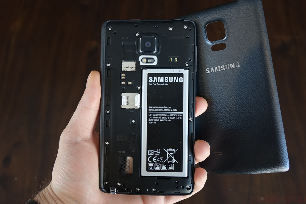
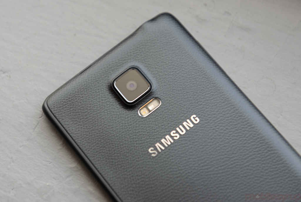
Like other Galaxy products, the Edge has a replaceable back cover and battery, but moves the power button to the top of the frame to account for the sloping glass. That glass is remarkable, a continuation of moulding processes that began with Nokia’s Lumia series and showed up more recently on the iPhone 6. The Note Edge’s curvature is not solely aesthetic, but slopes with the underlying panel.
But the purpose of the Edge as a product rests on the usefulness of the edge as a concern, and right now that concern is limited. Not only is the functionality only optimized for ride-handers, but the array of tools, from a sports score ticker to a virtual ruler, don’t seem to mesh with the “future of phones” conceit.
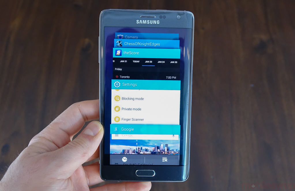
The edge does many more things, and we’ll get to those in a moment, but let’s talk about how it works. In regular use, the edge is “resting,” where that portion of the screen is blacked out, not consuming any battery. With the swipe of a finger, the region alights, revealing the default panel, a list of favourite apps in a vertical scroll. Tapping on one of the apps brings it to the fore. The same task can be accomplished from the dedicated multitasking toggle next to the home button, but this just accomplishes it faster.
In a similar vein, the edge will display incoming notifications, freeing up the top of the screen to display more of an app.
It turns out the edge, and by association the Edge as a product, duplicates a lot of functionality that Google defaults to the notification panel and the back/home/multitasking combo.
In daily use, it wasn’t difficult convincing myself to tap on the right side of a screen instead of the top, but I rarely felt such rudimentary shifts in behaviour were particularly noteworthy on their own.
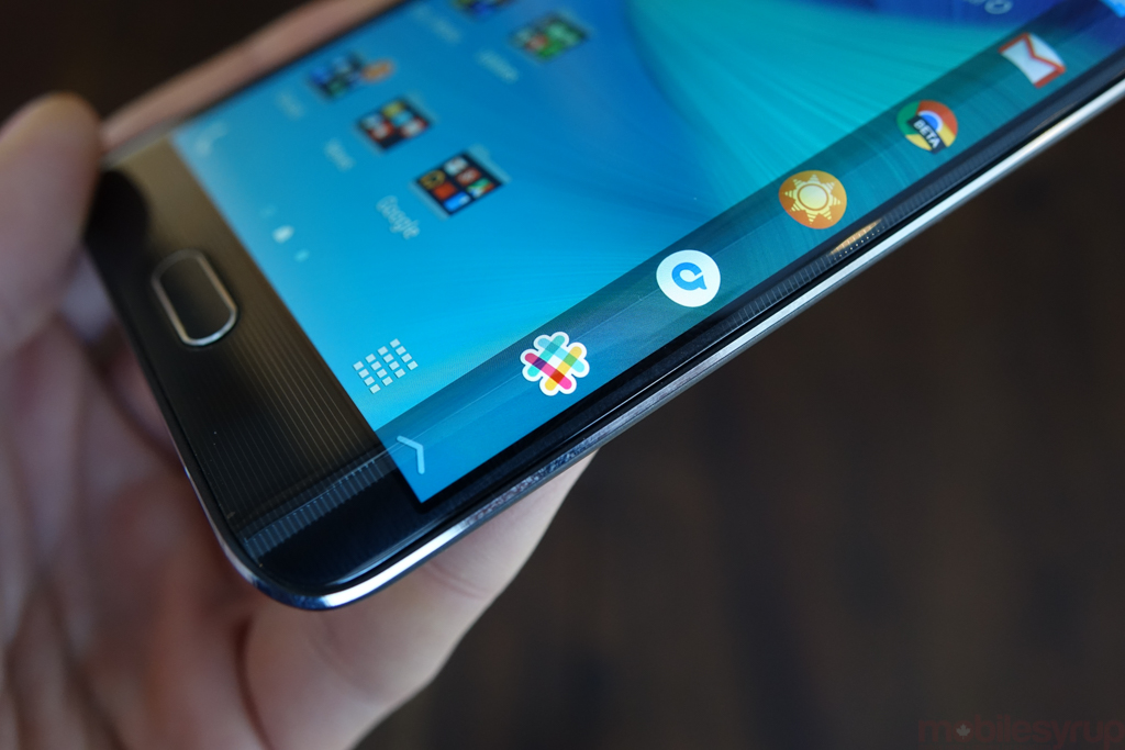
It’s in the secondary functions that the edge display gets interesting. Swiping left or right on the panels themselves cycles through the custom list of tools: a Yahoo-powered news ticker; a Twitter trending topics summary; a shortcut for the Edge’s S Note functionality. There’s more, too. Samsung has tucked away a number of single-serving widgets like the aforementioned ruler, along with a quick voice memo function. It was really useful, for example, to set a timer while waiting for my tea to steep while still being able to use my phone for other things.
With the Note Edge, Samsung continues the consolidation of rudimentary Android functions into a single spot. This isn’t a bad thing, it just undersells the potential of the feature. Instead of swiping down from the top of the display to receive and interact with notifications, or instead of tapping the multitasking button to cycle between open processes, you touch the right side of the display. At the moment, it’s simply a bigger screen, sectioned into two parts.
Where Samsung does get it right is when the edge display is used to convey information in ways that a typical notification bar, the way it is handled by Android, wouldn’t work. This is Samsung taking what’s already great about the OS’s extensibility, improving on it.
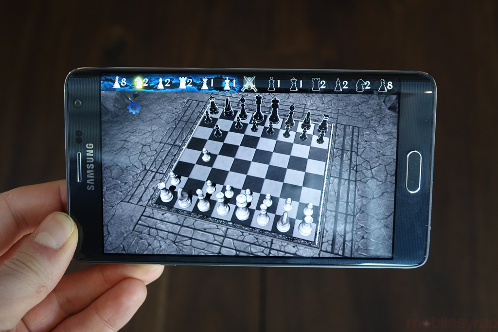
Samsung has released an SDK for the edge screen, a piece of software developers can use to take advantage of the side panel, but there are woefully few useful available. The beauty of such a model, though, is that like adding S Pen functionality to an existing app, a developer merely needs to add the necessary hooks to the Play Store version of its software. CNN, for example, updated its app in late 2014 with support for a dedicated Edge Panel, with breaking news stories scrolling across the screen.
To understand the purpose of the edge screen, and the Note Edge, one has to look back at what Samsung has been doing with and to Android since the original Note back in 2011. With a bigger screen came more space, and the introduction of Multi Window taught Android users that multitasking, even on a sandboxed experience, is possible. The Note Edge takes that philosophy one step further, allowing users to not only see more content — think of the edge screen as a notification panel replacement — but to multitask more quickly.
For most people — most right-handed people, rather — the interaction is seamless. Other than the relocation of the power button to accommodate the slope, the Note Edge feels exactly what one would expect from a modern Samsung device.
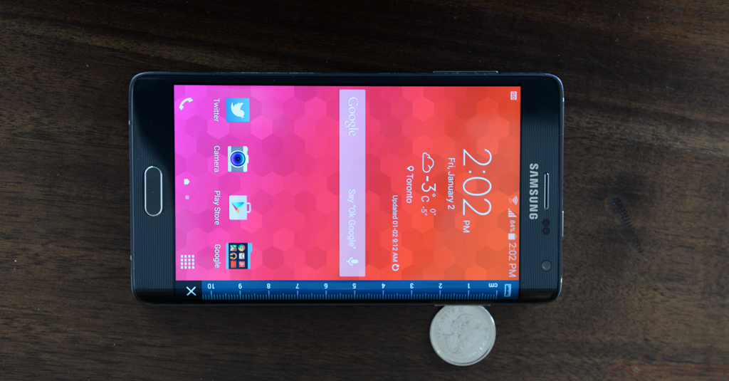
Lefties, while given the option to flip the Note Edge, are left with a half-baked hack solution. Samsung has optimized the screen for left-handers via software, but doing so puts the home button at the top of the device. Adding optional software buttons would have solved this issue, but Samsung likely didn’t see a need to completely re-engineer the product for a very small percentage of the population.
Looking over (or past) the edge reveals a device very much grounded in Samsung circa late 2014. The device runs practically the same internals as the Note 4, with a Snapdragon 805 processor, 3GB of RAM, 32GB of storage and a 16MP rear camera with OIS. Being a Note, the S Pen is accessible from the bottom right, and the same Air Command-optimize features are here, too.
Running Android 4.4.4 KitKat, the software feels fluid and fast: this is definitely Samsung’s best iteration of TouchWIZ to date, and if it foreshadows a less heavy-handed approach to the company’s Android design sensibilities, we’re all for it.
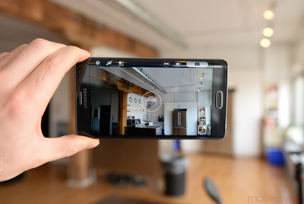
The device’s camera, in particular, should be given special attention. While we found the Note 4’s built-in optical image stabilization to pale next to Apple’s iPhone 6 Plus implementation, the 16MP sensor is large enough, and the lens quick enough, to capture some fantastic photos. Samsung relocates the camera’s controls to the edge, freeing up the main screen for the viewfinder. While useful on the surface, the shutter button ends up being too far away to comfortably take a photo in one hand.
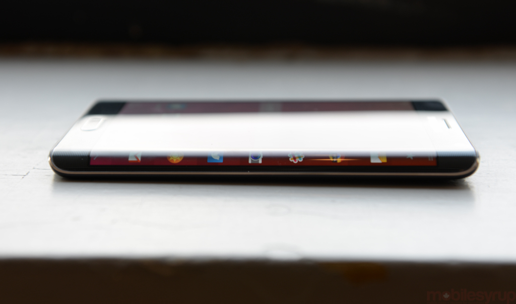
This summarizes the edge screen’s duality: it is both practical and superfluous, useful but aggravating. That Samsung seems to want to put it to use wherever is can is laudable, but some things, like the relocation of the camera functions, should have been left well alone.
Elsewhere, the phone works like any other: its 3,000mAh battery, around 7% smaller than the Note 4’s, had no problem lasting a full day, and the slightly smaller 5.6-inch screen never felt it due to the extra horizontal girth. Forced to choose between the two — and given that I am not a leftie — I’d choose the Edge, largely because its benefits outweigh its awkwardness by a considerably margin. The Note 4 was, and is, a solid Android device, one of the best on the market, and the Note Edge builds on that foundation.
The Edge does have one particular improvement over the Note 4, and most other devices currently available in Canada: it is the first to be optimized for Cat-6 LTE, which means it is theoretically capable of hitting speeds of 300Mbps. It does with by combining Qualcomm’s new baseband with optimizations for the Canadian carrier market, with Rogers being the first to use carrier aggregation to achieve speeds of 225Mbps in some regions.
The Galaxy Note Edge may be a niche product, one that fetches a hefty premium over even the most expensive Samsung flagships before it, but for the early adopter looking to inherit the latest and greatest technology, it certainly stands out. Unfortunately, due to the delay in bringing it to Canada, it may quickly be overshadowed not only by Samsung’s latest Galaxy S model, but many others looking for validation in the never-ending spec race.
The Note Edge will be available from Bell and Rogers starting February 18th for $400.
TL;DR
→The Samsung Galaxy Note Edge is a beautifully designed niche, like a hand-carved chair or designer pen. It’s expensive and feels it, but the added utility from the edge display is actually put to good use, most of the time.
It’s a better phone than the Note 4, but it’s not a better choice for most people.←
Pros
- Beautiful screen
- Excellent ergonomics for a big phone
- Legitimately useful use cases for the edge display
- Excellent camera
- Good performance
Cons
- Expensive — really expensive
- Update to Android 5.0 Lollipop may be a long time coming
- Camera has poor lowlight performance
- Software finicky in places
MobileSyrup may earn a commission from purchases made via our links, which helps fund the journalism we provide free on our website. These links do not influence our editorial content. Support us here.


