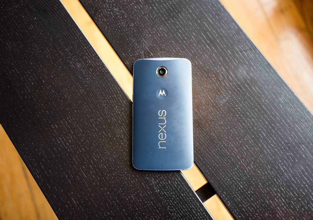
Remember that song in Grease that talked about summer flings? The one sung by Sandy and … the guy John Travolta played? If they could rewrite that tune with lyrics that better matched the winter weather we’ve had here in Toronto, it would be the ringtone on my Nexus 6.
When you receive a phone for review, you often only have a few weeks with the device before you have to give it back. Even if it is a longer term loan, your review is written and published before you’ve had the chance to really use the phone in the same way the average user does. You know the camera is decent, but the great low-light results you got while camping in Northern Ontario don’t make it to the review. Or, worse, you realise after a couple of months that the phone tends to crash when you run certain apps.
We’ve already reviewed the Nexus 6. Daniel wrote an awesome review on the phone when it came out. But how does Daniel’s brief affair compare to my long term commitment to the device? I started using the Nexus 6 in mid-December. Two months on, my feelings on the phone are vastly different compared to that initial impression.
It’s so easy to fall in love with any phone outside of the context of real life. When you’re not worrying about how it fits in with your everyday life, you fall into the trap of not being biased enough. Because you’re so busy wondering if the phone is right for anyone, you hardly spare a thought of whether it’s right for you.
After a few months of use, here’s what I think of the Nexus 6.
What I Stand By
The Screen
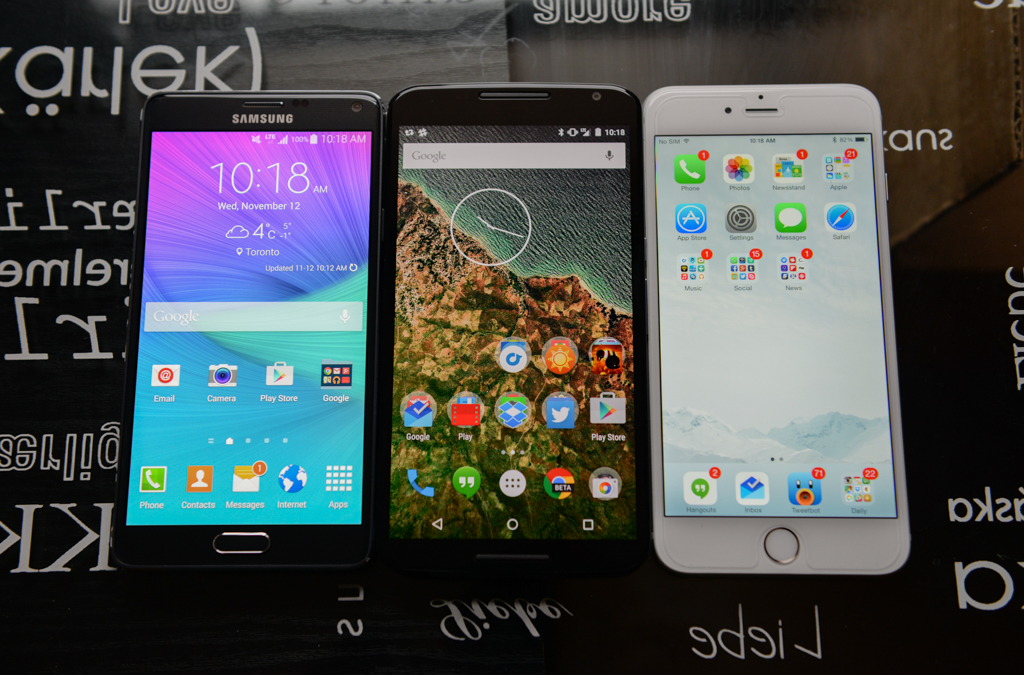
It goes without saying that this phone is huge. This hefty size accommodates the 5.95-inch QHD display Google and Motorola decided to use for the first Nexus phablet, and while Daniel notes in his review that the viewing angles are good but not great and that the colours are not totally accurate, I barely noticed these issues with the screen. The truth is most casual users won’t notice or care about either of those things.
Even if you were the type to care about that stuff, the Nexus 6 so big, you’re required to hold the phone with two hands while you use it. Two-handed operation means the phone is less like to be used at an angle. It’s going to be right in front of you. The colour inaccuracies were a bit more obvious, but they never posed a problem. Two month on, I’m as happy with the Nexus 6’s display as I was the day I got it.
The UI
Lollipop is not without its problems (and I’ll get to those), but as a die-hard Android fan, visually, Lollipop is what I have been waiting for. The animations, colour palette and general navigation are the best Android has ever seen. There’s also a few nifty features, like battery saver mode, lock-screen notifications, and the new app switcher that go a long way towards easing some of my past grievances with Android.
The Camera
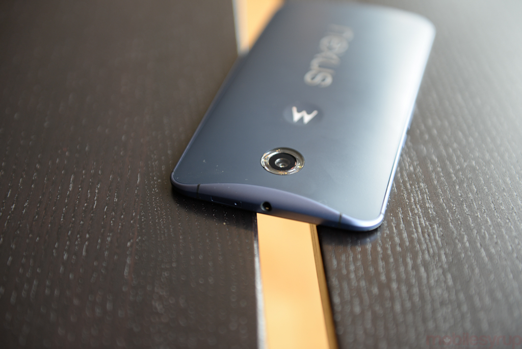
The camera on the Nexus 6 is not the best out there, but it is heaps better than the rubbish I dealt with in the Nexus 5. Google is known for screwing with the cameras in its devices, so I was pleasantly surprised by the camera in the Nexus 6. I switched from the HTC One M8, which has a tendency to take very orange photos, so I’m extremely happy with Google’s latest.
In terms of picture quality, the only area where the Nexus 6 ever outright failed me was in very dark settings when I didn’t want to use the flash. Indoor shots are, for the most part, good, and outdoor photos in daylight are excellent nearly every time. HDR+ goes a long way toward making sure that quality carriers through no matter the weather or time of day.
For general usability, the camera is a little bit sluggish in its processing and stability has occasionally been an issue. For instance, there have been a couple of instances where the the camera insisted it was still processing a photo in the background after I exited an app. It didn’t do any harm. I could still take photos and view them, but that stupid taskbar icon and notification on my lock screen wouldn’t go away until I restarted. These are problems, but I have yet to run into a scenario where I missed a shot or my camera didn’t launch quickly enough.
Messenger
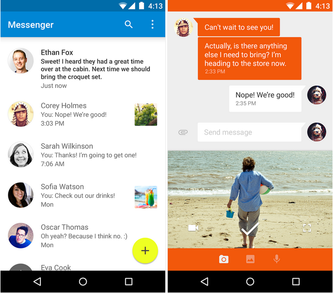
When Google merged my SMS and Hangouts messages, I was kind of confused but was willing to roll with it. If Google figured this was the future, then I was more than happy to get on board. After about a week, I had made up my mind: I hated the merged SMS and Hangouts situation. Especially as there were times when it would only send texts with my Google Voice number, so I would get responses from friends like, “What is this number?” and, “Are you a drug dealer? Is this a burner phone?” Finally, with the Nexus 6 and Lollipop, we have a dedicated SMS app once more. I can also customize the colour palette to make Daniel’s theme all pink. Awesome.
What I Can’t Stand
The Size
I wanted to love the size of the Nexus 6, but after a couple of months, it’s obvious my eyes and heart are much bigger than my hands. I knew going into this relationship that my Nexus 6 wouldn’t let me text while I was holding something in my other hand. I knew that I would have to use both hands anytime I typed, but I didn’t realise how cumbersome that would be.
It’s fine that women’s jeans don’t have pockets big enough for this phone, because (as many women are all too aware) that dream went out the window somewhere around the Nokia 8210 era. Women’s clothing simply doesn’t prioritize storage the same way men’s fashion does. I encounter pockets only big enough for a book of matches, pockets that are stitched closed, and pockets that turn out to be decorative seams all the time.
The problem is that this phone feels heavy. Beyond needing to hold the device with two hands, I found myself having to alter my behaviour to maintain comfort. I browse in bed a lot and usually lay on my side. I would have to use my pillow to stablize the phone to browse with one hand. What’s more, even holding the phone with one hand while I looked at directions or scrolled through tweets (a one-handed activity), I would end up with a painful mark on my pinky finger from where the phone was resting in my hand.
Lollipop
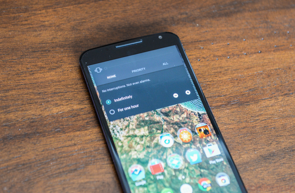
Oh, Lollipop. Lollipop has some great features, but there’s a lot of stuff that just makes me scratch my head and wonder if it’s supposed to be there or if its a bug that will be fixed in a future update. So many people have complained about the lack of a silent option that also turns off vibration alerts and I am right there with them. Google’s profiles for alerts (All, Priority and None) require customization to be really useful and ‘None’ might as well be called “Funeral” because that is literally the only instance in which I would want the alarms I purposely set on my phone to not go off as planned.
I also noticed something from day one when shooting video. If you want to edit a video, dream on. Google recently ditched the gallery app in favour of the Photos app that connects directly to your G+ auto upload. While the option exists to edit photos from within this app, this option is unavailable for video. You can look at it, but you can’t do anything to it. Even if you flip to the on-device folder within this app, the little pencil remains frustratingly opaque. This becomes even more annoying when you shoot a video in portrait and try to share via Vine or Instagram. These services flip the video on its side, and there’s no way to fix it.
The Battery
There is literally no excuse for this one. Lollipop is supposed to bring better battery performance (thanks to Project Volta) and I know some people have had issues with battery drain when upgrading older devices to Lollipop, but the Nexus 6 was built for Lollipop. And it has a huge 3,220mAh battery. So why did I find myself having to plug the phone in around 10pm. We’re doing more with our phones than ever. I keep Bluetooth on to facilitate the connection with my Moto 360, and I often cast a Netflix episode to my TV. And yet still, these are all things I did with the HTC One M8 and its 2600 mAh battery. And I am charging just as much now as I was then.
The Power Button and Volume rocker
I am all too aware of the fact that newly-placed volume rockers take some getting used to. If your last phone had its power button up top and now it’s on the side, it’s going to take a while for your muscle memory to adjust for that. Two months on, the hardware buttons on the Nexus 6 are still driving me crazy.
The volume rocker is longer but very close to the power button. Logically, I understand that the top button is lock screen, and anything below that serves a different function entirely. And yet still I can’t count the number of times I locked the display when trying to turn up my music, nearly deafened myself when trying to turn down my music, or accidentally pressed any of the above when trying to put the phone back in my bag after hitting play or skip track on my music. I wish they were further up on the phone.
Conclusion
This kills me. As a phablet apologist, I so want to love the Nexus 6. But looking at the list above, you’ll see that anything on my pros list can easily be found in another device. Google might be able to fix the Lollipop issues in Android 5.1, but it can’t make the device smaller, or fix my ineptness when it comes to those damn buttons.
The bottom line is that this phone is too big. If it were half an inch smaller, I imagine the issues with weight and the balance of the phone in my hand wouldn’t be so apparent. I also know that if Google had even attempted a half-assed one-handed mode for this phone, I would have enabled it.
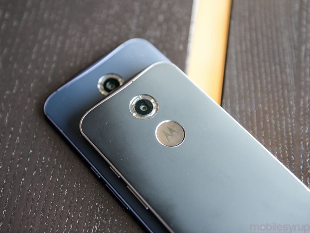
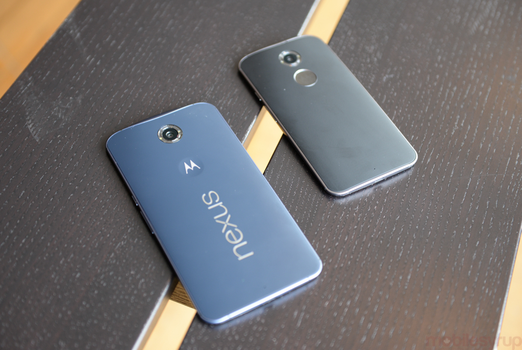
All of this leaves me so confused as to who thought six inches was the right size for a phablet. The first Nexus phablet, to boot. Even as someone who consumes almost 100% of her media on her phone, the unwieldy size of the Nexus 6 takes more away from my mobile experience than its gloriously roomy display adds. Maybe the Moto X is a better fit.
Read more: Nexus 6 review
MobileSyrup may earn a commission from purchases made via our links, which helps fund the journalism we provide free on our website. These links do not influence our editorial content. Support us here.


