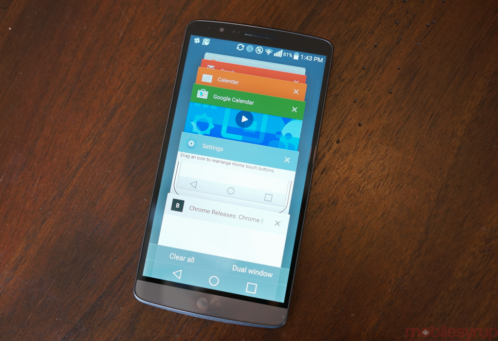
What is an Android update anymore? Most companies have already established an aesthetic, a particular divergent design that harnesses, but often distracts from, the austere beauty of stock Android. If you consider the software found on a Nexus device to be the Platonic ideal of modern Android, both in design and performance, then you may be disappointed with updates like that of Android 5.0 for the LG G3.
But if you consider OEM skins to be the substance built upon the foundations of Android as an open source behemoth, Lollipop for the LG G3 will be exactly what you want, and more.
Author’s Note: This review was done on Build LRX21Y, pre-release software that is subject to change. I’ve been told by LG that it’s pretty close to complete — it has a build date of late January, and the public release is expected in mid-March — but improvements are still forthcoming. It’s also important to note that the G3 has already received a public update in the US on multiple carriers, so what the hell, LG Canada?
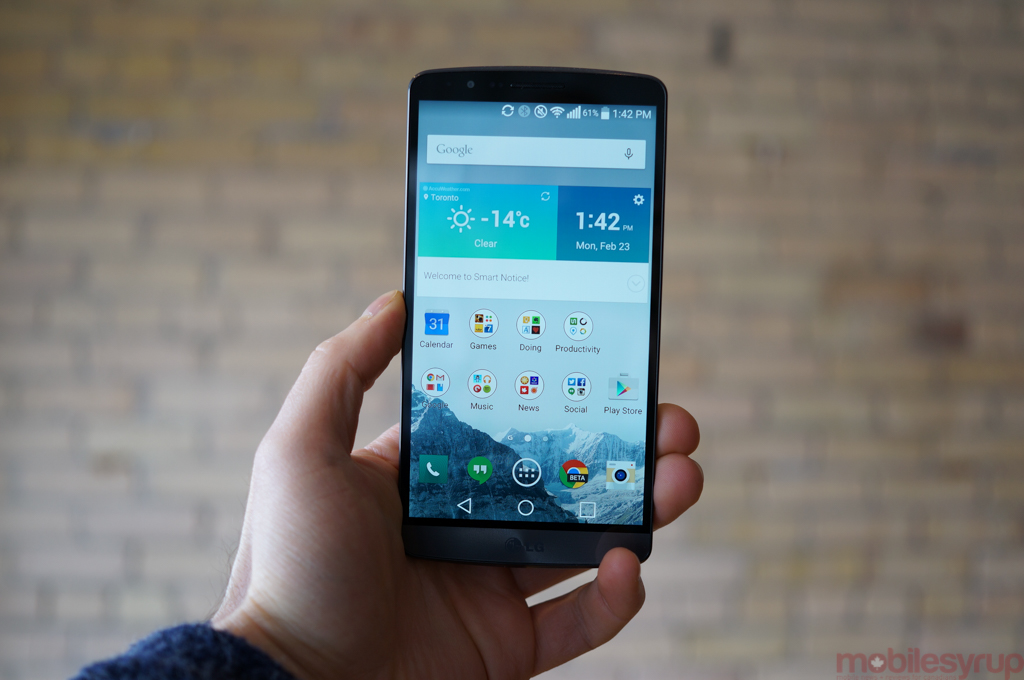
At its core LG’s Lollipop update takes the road other OEMs have established: a design set back in the previous generation, with a few small visual changes to highlight the improvements made by Google in the latest version.
Because LG thoroughly revamped its UI back when the G3 was released last August, it was unlikely the company would mess too much with what it considers a pretty good thing. The thing is, though, the Android 4.4.2 build released alongside the G3 was a disaster by a thousand bugs. Though a competent visual refresh that integrated trendy elements of flatter icons and an expansive colour palette, LG took it upon itself to mimic elements of Android 4.4 KitKat that Google was doing decidedly better.
These features, like the questionably useful Smart Notice, have been relegated to the background in an attempt to expose the natural foundations of Android 5.0 Lollipop.
But six months after its release, how does the LG G3 hold up, and what does the impending Android 5.0 add to the equation?
The Device
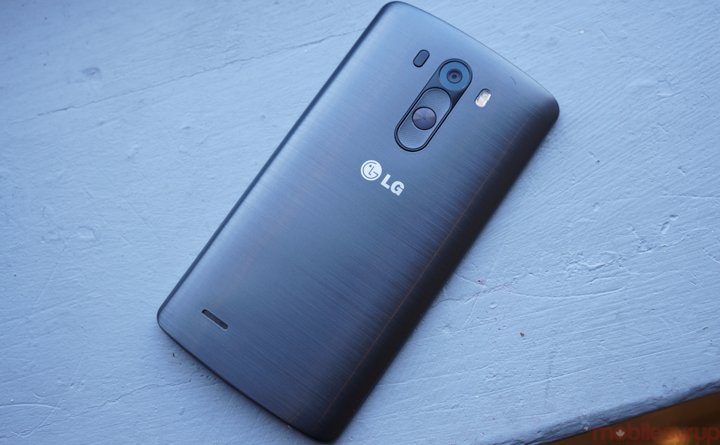
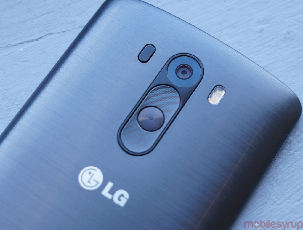
The LG G3 was, and still is, a very good Android device. At the time of its release, it became clear that the Korean chaebol was not planning to deviate from its established hardware design, relegating the power and volume buttons to the phone’s rear in order to keep the sides thinner. For novices, there was an adjustment period, but those familiar with the G2 and G Flex eased into the change.
While the landscape of mid-2014 Android flagships didn’t offer much by way of innovation, the G3 failed to impress relative to its 2013 predecessor. Its larger screen was beset by a sharpening problem that still grates the eyes, and the camera, despite an improved image stabilization module, was little improved. Worst of all, the higher-resolution display severely hampered battery life, resulting in a washed-down version of an upgrade.
Not all was doom and gloom, though: the G2 set the bar pretty high, and the G3’s excellent ergonomics made it one of the better devices of the time. With almost no bezels around the screen itself, and a comfortable, high-quality plastic chassis, it was hard to overly criticize the company for the phone’s design — unless, of course, those rear buttons just don’t make sense to you. I like them, and still today find them relatively easy to use.
And the performance was excellent, with remarkably smooth navigation, fast load times and nary a stutter to speak of.
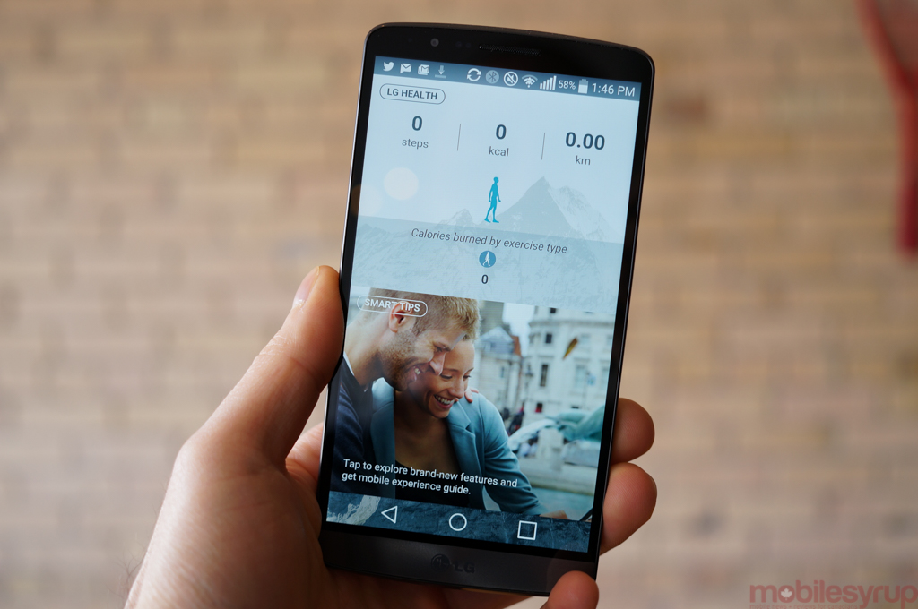
The Software
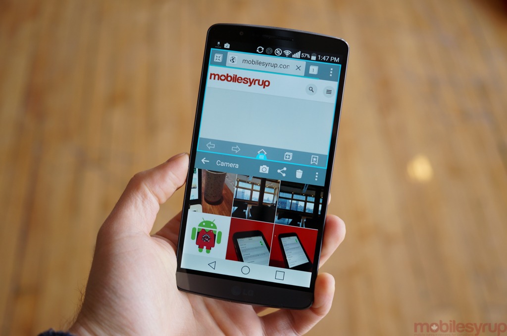
The G3 had good, if not great, hardware, but the real showstopper was the tremendously buggy software that shipped with the device. Running Android 4.4.2 KitKat, LG proved once again that, despite improvements in the design department it really doesn’t know how to thoughtfully modify Android. Not only were there features that duplicated, and failed to improve on, functionality of stock Android, but LG hampered itself by often trying to emulate Samsung’s better-implemented Android features. For example, LG supports things like Smart Stay and Dual Window that just feel more fleshed out on the Galaxy S5.
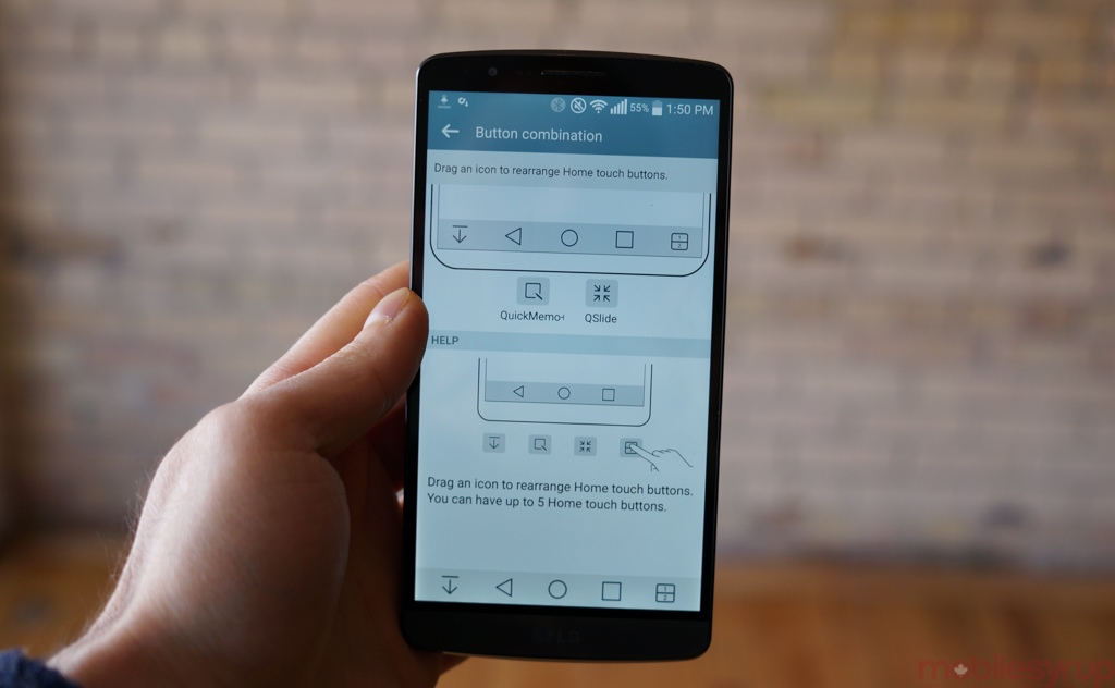
There were some truly useful additions to LG’s software repertoire, though. The ability to add additional navigation buttons to the G3’s bottom row appealed to the enthusiasts, and LG’s excellent Clip Tray allowed users to copy more than one piece of information to later paste.
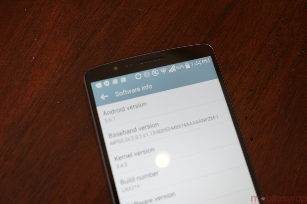
As it stands…
This sets up the LG G3 today. A great phone hampered by a few lingering software issues and some nagging hardware decisions that, unfortunately, are not going anywhere.
I was given a pre-release version of Android 5.0.1 Lollipop to play with prior to the public Canadian release, and I thought it a good time to reevaluate the G3 in its entirety six months after its release. A device that was announced in late April, LG only brought it to Canada on August 1st.
LG G3 users will notice a few things off the bat when upgrading to Lollipop: a new set of virtual buttons, akin to but slightly larger than those of stock Android. Why LG decided to limit the space between the austere white lines and the border is one of many questions I am left with for the design team, but there you go. While not concerning on its own, it’s one of those “Why mess with it?” design changes that irk me so much about LG’s Android strategy.
First, the good stuff. The fundamentals of Android 5.0 Lollipop are all here: LG’s first-party apps have been thoughtfully redesigned, and are no longer an affront to the eyes. They are still simple, yes, but none will make you wretch, an improvement over KitKat.
Things feel fast, and app loading time has seen considerable improvement. I enjoyed loading up all my favourite apps and having them feel like they were being run on a brand new phone.
LG has also considerably scaled back many of the “me-too” features from KitKat. Gone is the three-finger-swipe-multitasking combination that made no sense, while Smart Notice has been relegated to a widget that no longer gets in your way all the time. LG is still pushing its QSlide applications, but they can be easily disabled and hidden from the notification shade.
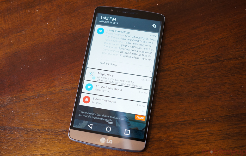
Speaking of which, this is where things get a little hairy. As we know, Lollipop thoroughly messes with the idea of notifications, and LG just reproduces some of Android 5.0’s worst tendencies. For example, while on KitKat it was easy to expand a notification by swiping down on the individual cell, it’s only possible to do that once the user had expanded the entire shade by pulling all of the notifications down beyond their initial placement. This means that, say, you only want to expand the notification of an incoming email — you can’t until you pull down the whole string first.
LG also hasn’t seemed to figure out the font size of the text in these cells. Because the company uses a different font than stock Android, much of the text doesn’t leave enough padding between it and the bottom of a cell, making it look unfinished and amateurish. These are things you notice immediately after coming from the pristineness of a Nexus 6.
One also can’t expand notifications on the lock screen, no matter what you do. This is one of my favourite Lollipop features, and it echoes LG’s inability to perceive consumer needs. Perhaps it’s an innocent oversight, and will be changed in a future update, but considering the frequency at which we’ve seen updates to the G3, if it does come standard on this build, we’re unlikely to ever see it change down the line.
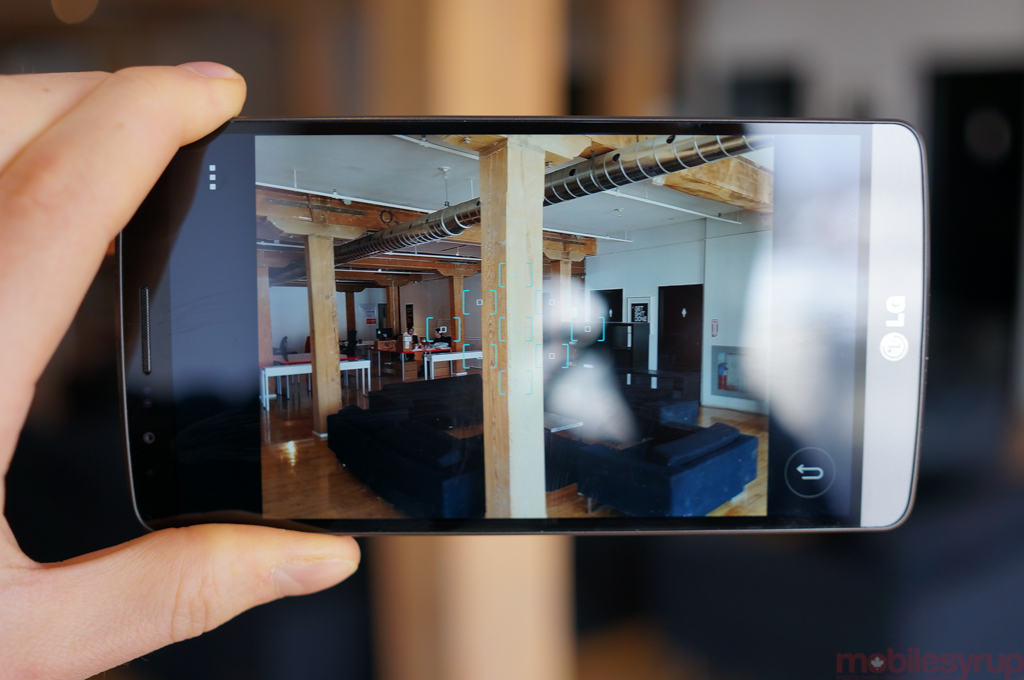
LG hasn’t mucked with much else here: the camera interface is identical to its predecessor, and performance is as fast and reliable as before. So too is the battery life, which hasn’t greatly improved despite the presence of Google’s much-hyped Project Volta (which is, admittedly, app-contingent).
One thing LG has improved is the relative stability of the OS itself, likely a side effect of Lollipop’s transition from Dalvik to Android Runtime, and the updated software development tools that target the new Android SDK.
All this is to say LG’s G3 holds up pretty well in some respects and fares poorly in others, despite the presence of Android 5.0 Lollipop. The hardware still feels modern, and the performance top of the heap, but LG needlessly messes with the Android experience in exasperating ways.
Let’s hope with the G4 and beyond, the company wakes up to the needs of its core user base.
MobileSyrup may earn a commission from purchases made via our links, which helps fund the journalism we provide free on our website. These links do not influence our editorial content. Support us here.


