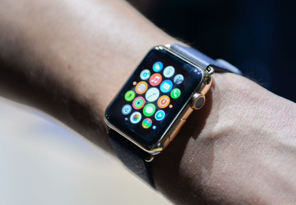
Let’s get this out of the way now: Apple is not interested in competing on price with the likes of Samsung, LG, Motorola or Pebble.
If you can wrap your head around the notion that the company believes, unlike the iPhone to the high-end Android market, the Apple Watch stands alone, then the $449 starting price, and mouth-watering $22,000 maximum Watch Edition price, make a bit more sense.
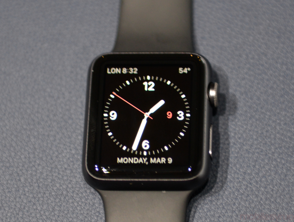
Over in San Francisco today, Apple made a big show of everything about the Apple Watch but its price, because the price just is. The Watch will be marketed as the manifestation of personality; which Watch calls to you? Of course, price is a major factor, and at $1299 for the model many would consider the “standard issue” Apple Watch — the 42mm Stainless Steel case with Link Bracelet — it’s some four times the cost of the equivalent wearable from Samsung or Motorola.
Apple made a big show of everything about the Apple Watch but its price
At its core, though, the $449 Apple Watch Sport does the same thing, computationally and functionally, as the high-end Edition model, but the former does so in an unabashedly accessible way. In many ways, the iPhone has spoiled Apple’s ability to charge more for a mobile product; in North America especially, customers purchase devices with hefty subsidies in exchange for guaranteed monthly revenue.
Being a companion product, the Apple Watch requires an iPhone 5 or higher to function, limiting it to a “second step” acquisition. On the other hand, an install base of approximately 400-500 million iPhones capable of running the Apple Watch makes for an enormous potential buying audience.
Beyond Price
Do people need a wrist companion? What is the current value proposition of buying an Apple Watch? That’s what I wanted to explore today as I strapped both a $449 Sport with a green rubber band and $19,000 18-Carat Yellow Gold Edition with a Midnight Blue Classic Buckle. As a $5 Casio and a $250,000 Patek ultimately endeavour to tell the time, it’s the cumulative effect of using the Apple Watch that conveys its advantage over other smartwatches, many of which can do the same things.
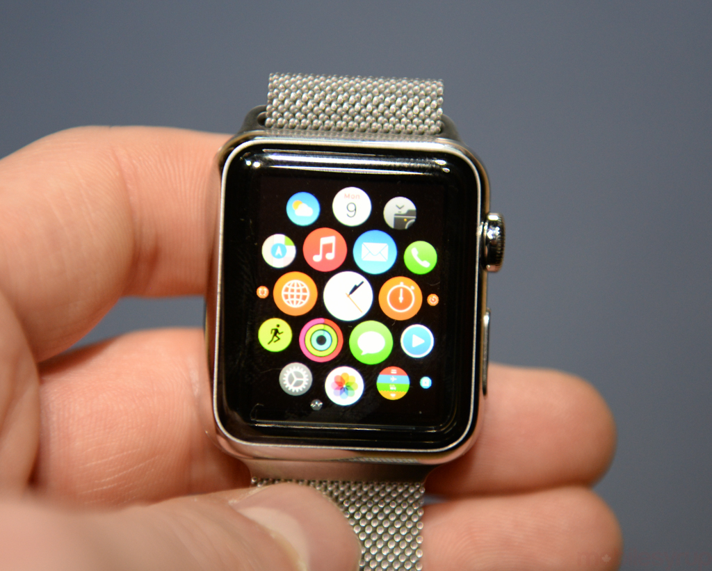
The touchscreen and Digital Crown are the team means of interaction, the former reserved for linear taps that can vary, through Apple’s new vocabulary, in force.
Users will be required to learn an entirely new way of navigating a digital interface, since what we’ve learned from years of tapping smartphones and tablets doesn’t translate here. I had a tough time getting used to what touch points required a light tap and a forceful poke.
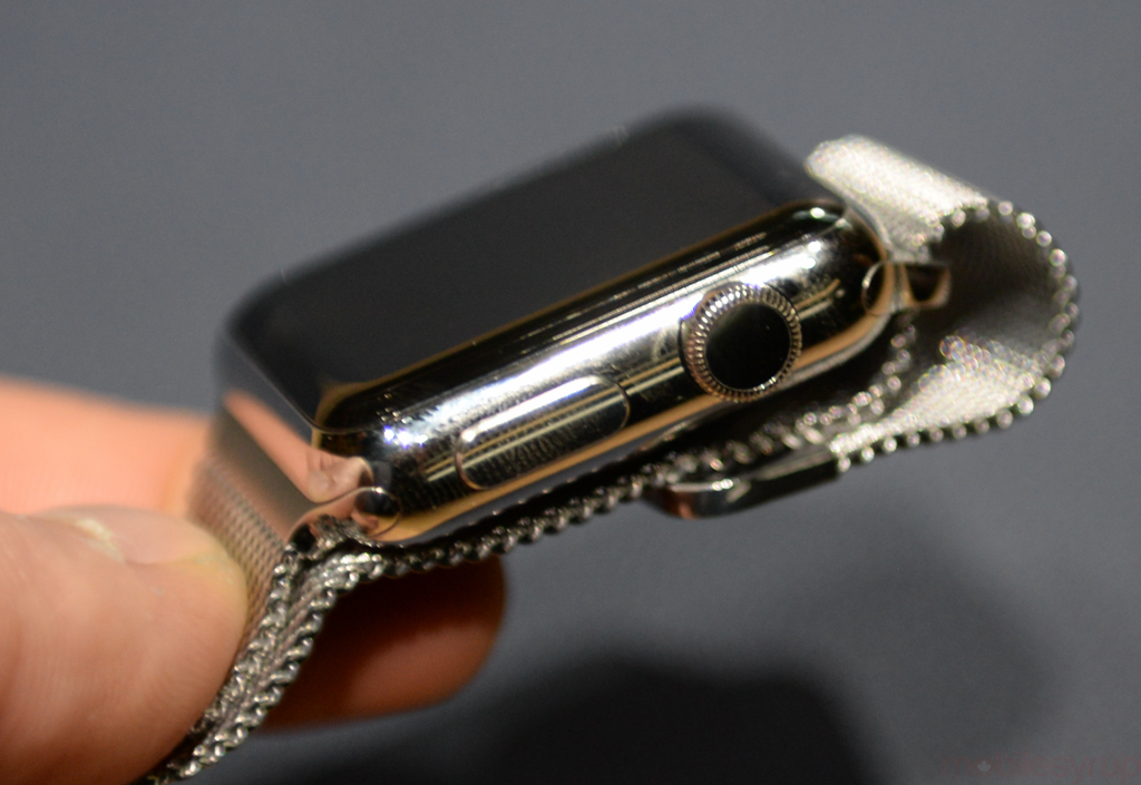
And then there’s the Digital Crown, which replaces the pinch-to-zoom feature of a smartphone while doubling as a way to quickly scroll through lists on the device itself. With a modicum of resistance, one doesn’t need to wrap his whole finger around the dial, but gently place it on the surface and rock it back and forth. Apple has clearly spent a lot of time experimenting with correct drag and weighting, because it feels about as good as it could given the space restraints.
I’m sure I echo others in saying that the combination of multi-stage taps and a rotating crown doesn’t feel particularly intuitive at first, especially since the Watch has so many nuances — swipe up to locate Glances; push in the Digital Crown to access the constellation of home screen apps — that its bound to require a significant education investment. The iPad, accessible to a three year-old, this isn’t.
Constellations
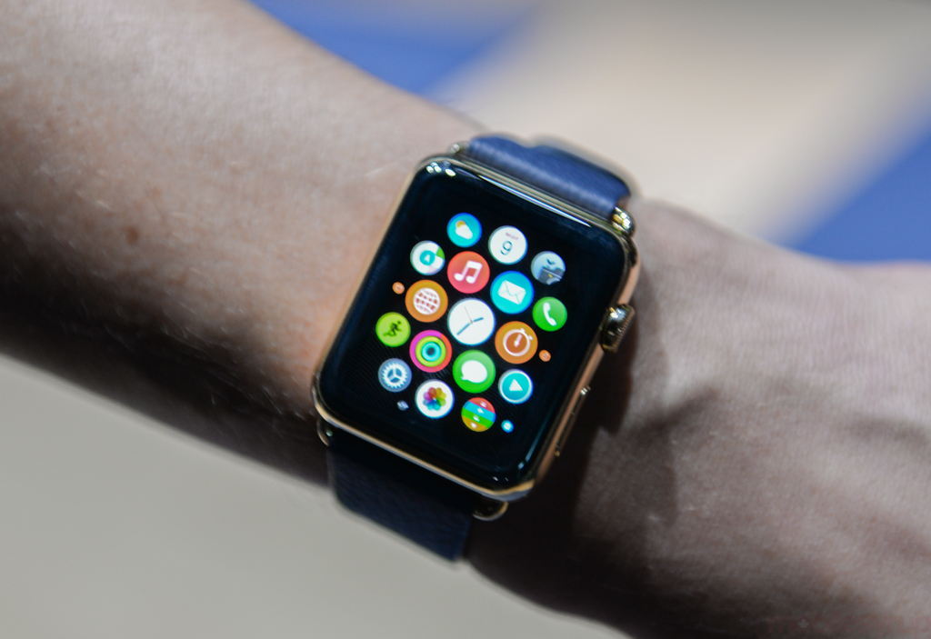
The Apple Watch is divided into several quadrants, each of which can analogous to the dynamic of “Home Screen, Notification Centre/Widgets, and Apps.” Like the iPhone’s lock screen, the default view is the watch face, nine of which will come preloaded with many colour options and add-on possibilities like weather and next calendar entry. The watch face is not interactive, but swiping up from the bottom reveals Glances, a list of apps installed on the iPhone that have a Watch equivalent.
It’s going to become quickly apparent which experiences are suitable to the watch, and which are not.
By default, Glances are populated by weather, stocks, news, calendar, activity and other examples of diminutive screens that come default on both the watch and the phone. But services like Instagram, Starbucks and others purport to add to this list, though you can control the apps that show up in the Glance screen. There are layers of granularity here.
Glances are simplistic in ways that apps are not; similar to widgets in the Notification Centre, Glances allow users to see short pieces of information in a hierarchical elevation: the watch face is the top, whereas the Glances are arrayed horizontally. You can’t get back to the main screen without either pressing the Digital Crown (which in this case acts as a home button) or scrolling back to the first Glance before swiping down.
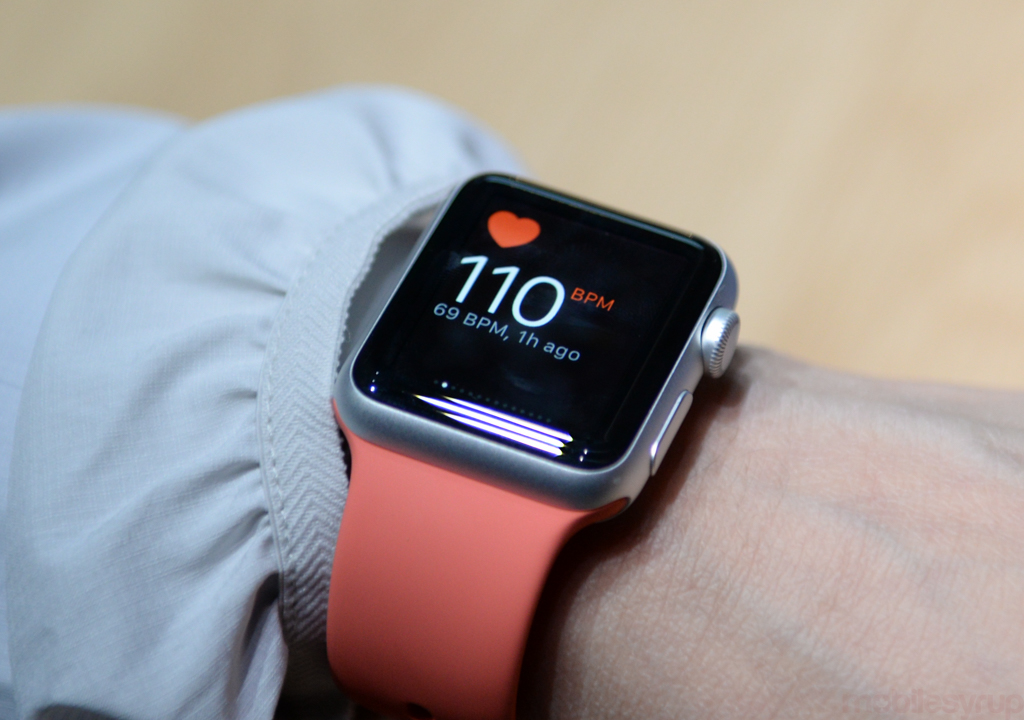
There are many small interaction paradigms in the Apple Watch that will not be familiar to the average iPhone user. Apple is taking for granted that the education process will convey itself succinctly enough, both in store and through mere trial and error, that users will be able to cut through the sheen to see the innovation beneath.
Like Android Wear users can return “home” by placing a palm over the screen, the Digital Crown acts as a de facto home button.
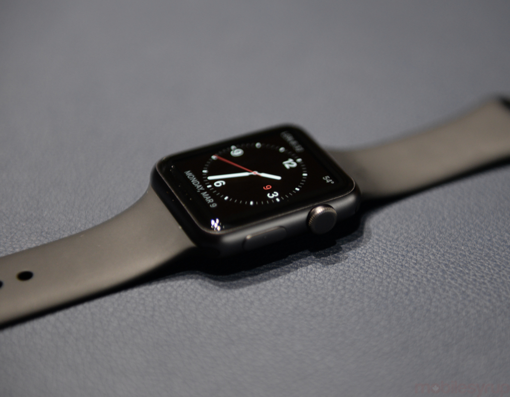
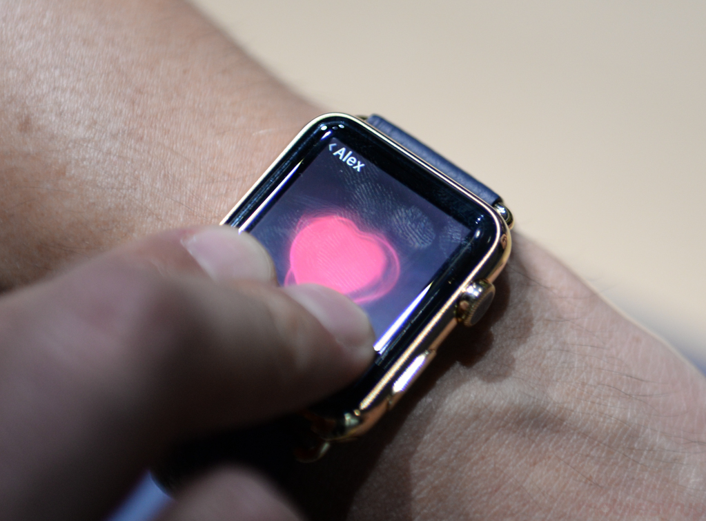
A second button rests under the Crown, and provides quick access to a list of favourite contacts for which there are several contact options. One can initiate a phone call, which relays the signal over Bluetooth from an iPhone to the watch’s speaker and microphone array, or send a text message using voice dictation. But the most intriguing aspect of this new interaction model is called Digital Touch, and this is where Apple takes the lead from its competitors. Traditional smartwatches have heretofore been entirely reliant on voice, an input method that lacks both privacy and nuance.
Digital Touch can be conveyed in three ways: with a series of taps that are reproduced on a contact’s Apple Watch; a facsimile of one’s heart beat, which is then sent and “played” using the Watch’s Taptic engine; and Sketches, a basic finger-based jot pad. Whether users are going to create their own languages using combinations of taps, or merely condescend to sending crude drawings to friends and family, remains to be seen, but Digital Touch is Apple working the possibilities of touch in new ways, and that’s to be commended.
App-oplexy
The part of the Apple Watch that remains a mystery, though less so, is the idea of apps. Though storage and compute limitations prevent apps from being stored on the watch itself, WatchKit allows developers to recreate that experience as thoughtfully as possible with the tools they have.
I tested out Instagram’s app, which allows users to scroll through miniature versions of their friends’ feeds, and it felt strange, intimate and ultimately superfluous. While the Apple Watch’s screen is vivid, and the S1 chip sufficiently fast, it’s going to become quickly apparent which experiences are suitable to the watch, and which are not.
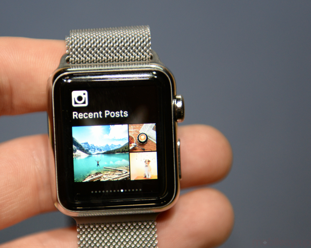
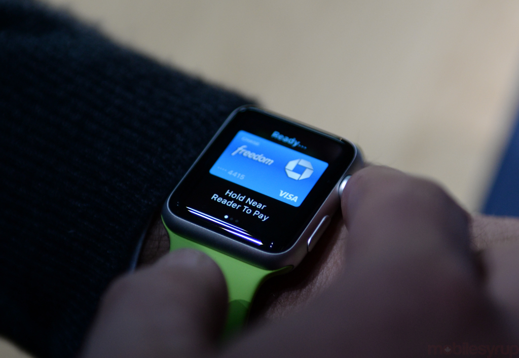
Some of the better app demos I saw were for outgoing interactions, such as the display of a Starbucks card, an airline boarding pass, or a digital version of a hotel room key. Apple is touting the Watch’s ability as a payment processor, similar to the iPhone 6, though Canadians will have to wait a bit longer to get Apple Pay.

Apple has already managed to get over 35 app developers on board, including Evernote, OpenTable, TripAdvisor, Shazam and more well-known brands already popular on iOS.
It appears that Apple has limited developers to a handful of features, many of which require little user input and almost always convey information unidirectionally. For example, it’s easy to book a table at a local restaurant on OpenTable, or to search for notes associated with nearby landmarks on Evernote, but it won’t be likely one can create much in the way of content using the watch.
Air Canada, Desjardins, Transit App, WestJet, theScore and the Globe and Mail are among the first Canadian developers vying for space on the home screen, and you can tell that many of them, from airlines to banks to transit and news organizations, are particularly well-suited for small, short bursts of unidirectional content.
Potential
The variation between potential sales figures for the Apple Watch — 15 to 40 million depending on the analyst — speaks to the divided impressions made by this new category of product.
Is the Watch, or the smartwatch in general, too early to really make a difference? Will Apple replace the body annually like it does the iPad and iPhone, even with versions as pricey as the Edition? And will those high-cost accessories retain their value, by virtue of the materials contained within?
There are a lot of unanswered questions lingering in the sweet spring air here in San Francisco, but Apple doesn’t seem to mind: it is confident, as it always is, that customers will line up for the wearable beginning April 24th. But a gust of common sense, and good old market seeding, has led to a two-week lead time, where customers can visit Apple Stores to learn about, try on, and figure out whether the product makes sense in their lives — from $449 to $22,000.
MobileSyrup may earn a commission from purchases made via our links, which helps fund the journalism we provide free on our website. These links do not influence our editorial content. Support us here.


