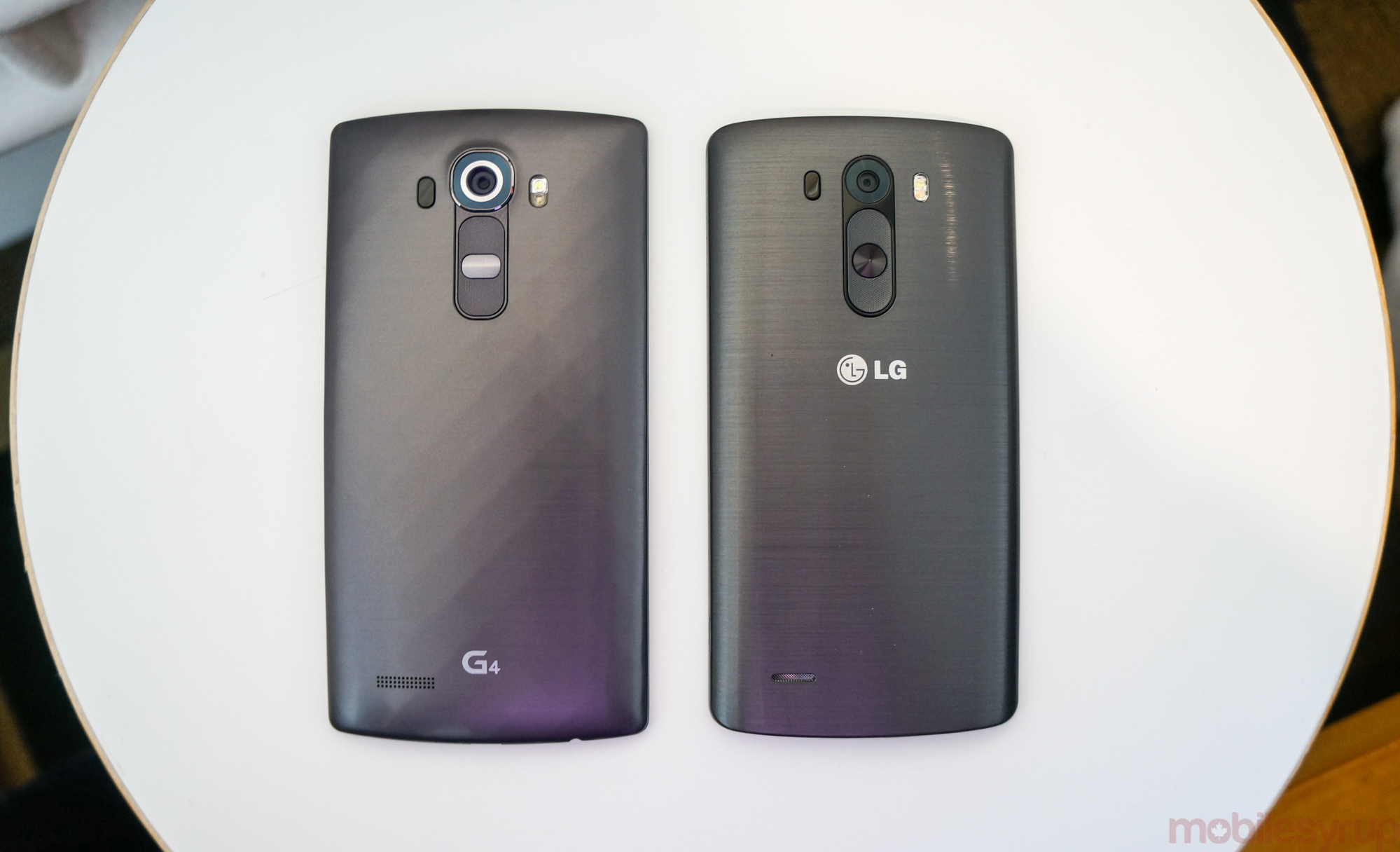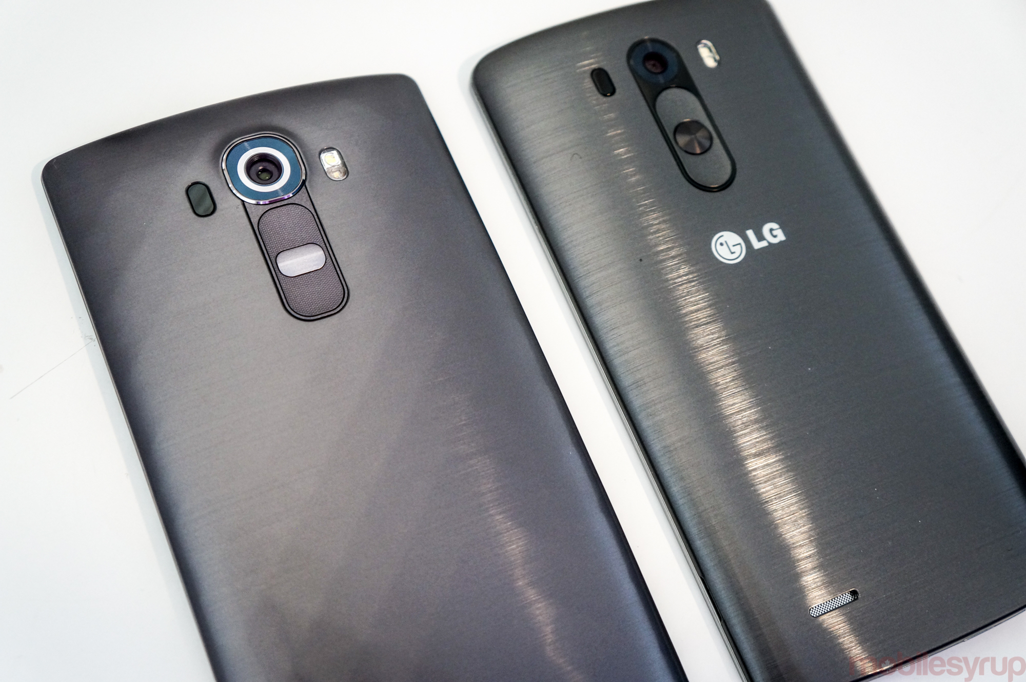
When LG unveiled its recent flagship, it became immediately apparent that its design was largely unchanged from its predecessor. The G4 is nothing is not familiar, but in that familiarity there are a number of subtle but important changes that one can only appreciate with a G3 next to it.
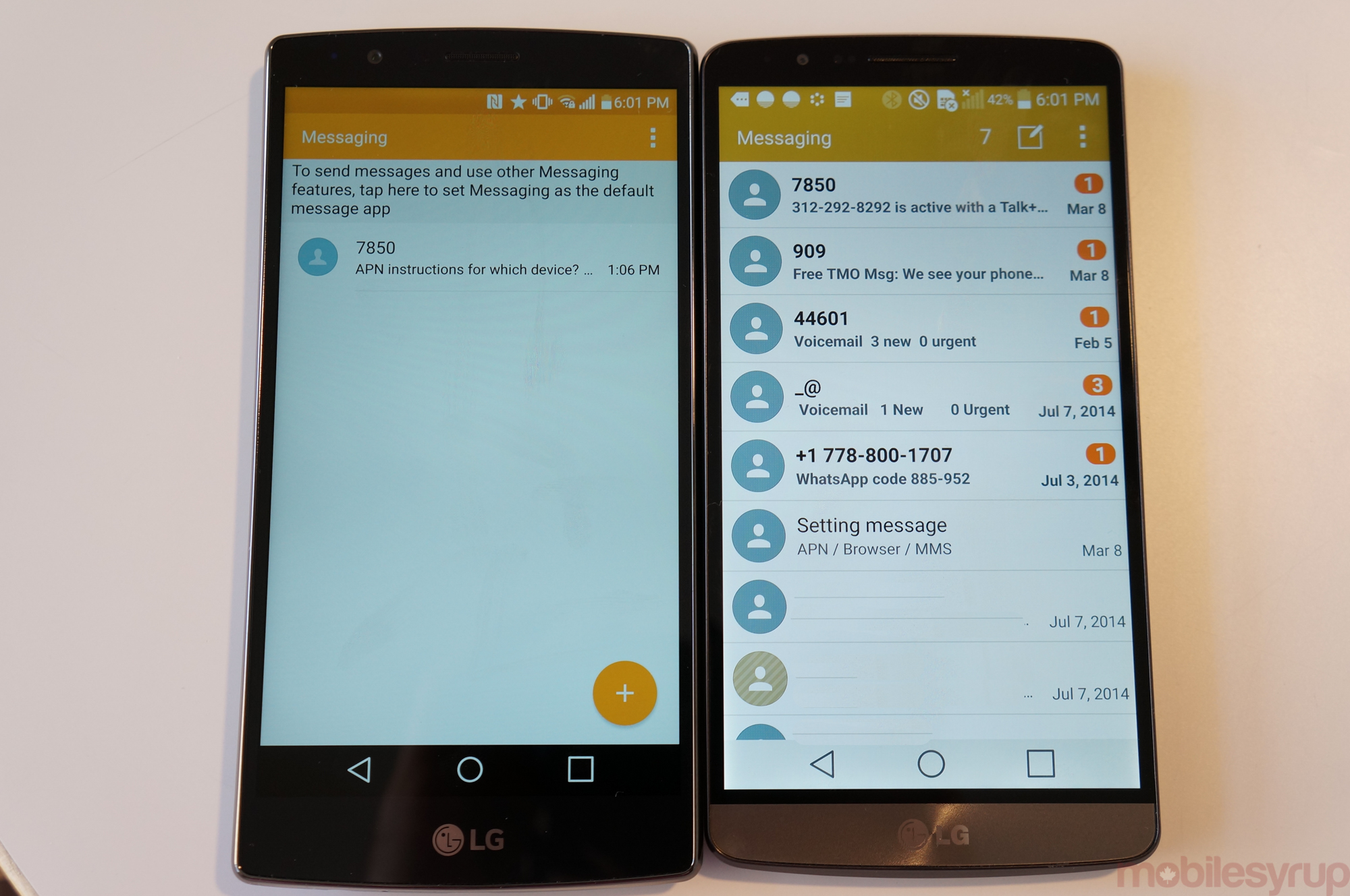
Secondly, the G4 also sports a newer, nicer and neater version of LG’s skin, built on top of Android 5.1. We’ve also shown you a number of changes to the software, which feels a lot more cohesive this time around. No more spelling mistakes; no more half-measures.
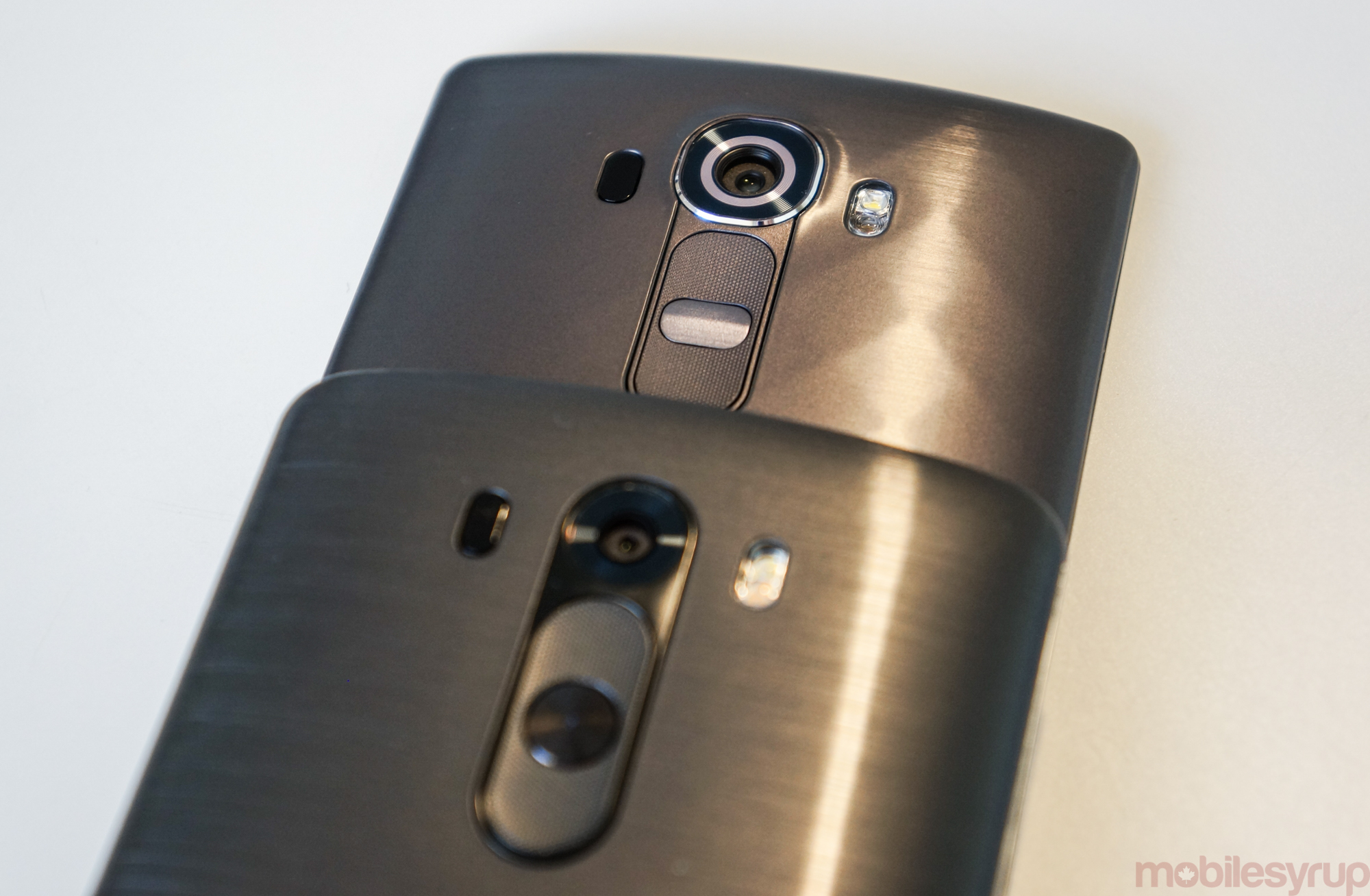
We’ll start from the back. The G4 is slightly taller than last year’s model, though if you look at the hero image it appears that most of that extra room comes from a slightly larger space below the screen. If this seems like a regression, LG assures us that that space is not wasted; it’s used for the updated screen controller, which is a huge improvement over the G3.
The volume and power button design is slightly changed, with a slightly more protruding, squared-off power button and volume buttons with a more pronounced texture.
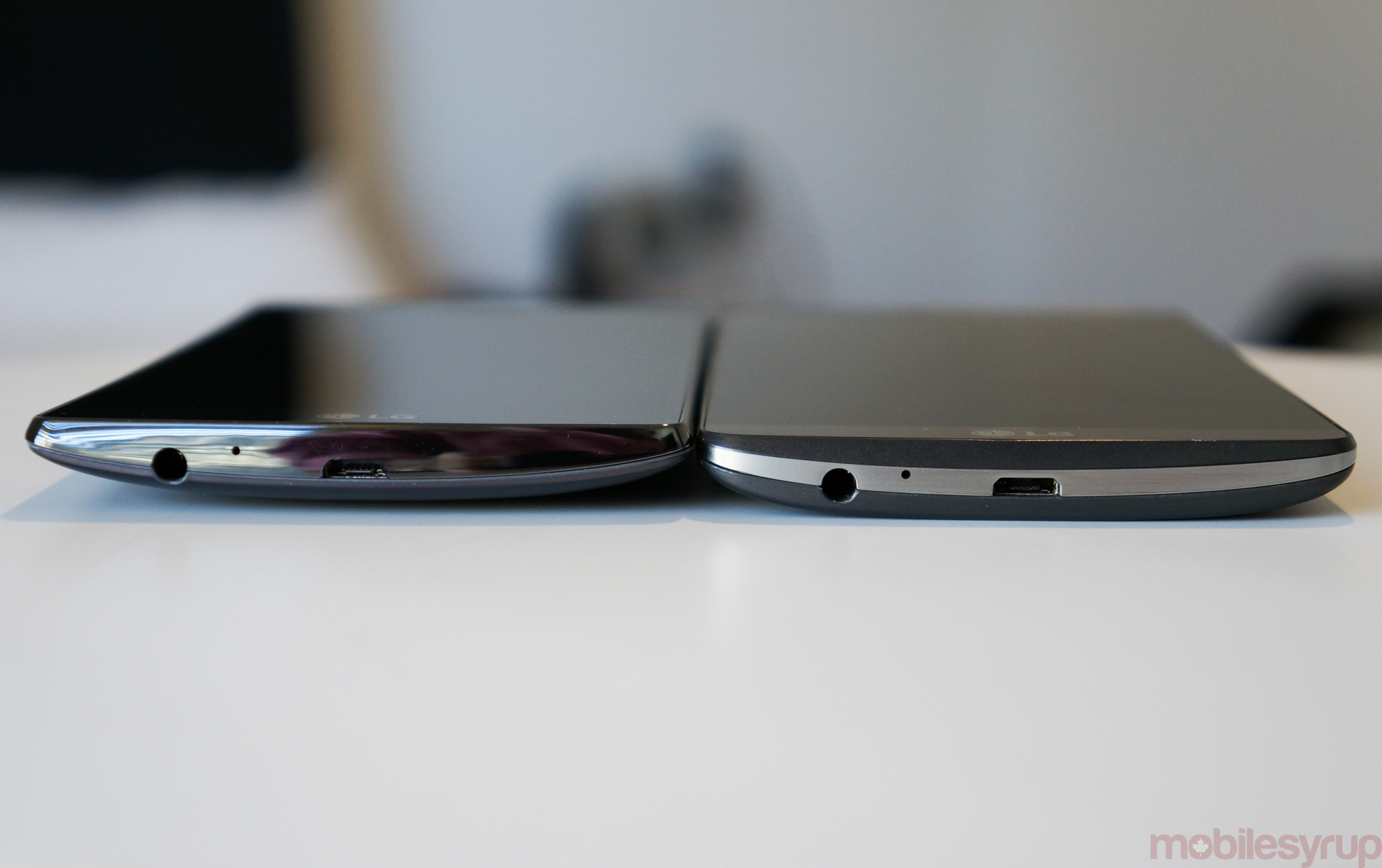
The tops and bottoms of the phones are largely identical, though the colour scheme on the G4 is darker, its side angled inwards towards the curved screen.
Here’s a good indication of just how curved the screen is. It’s subtle.
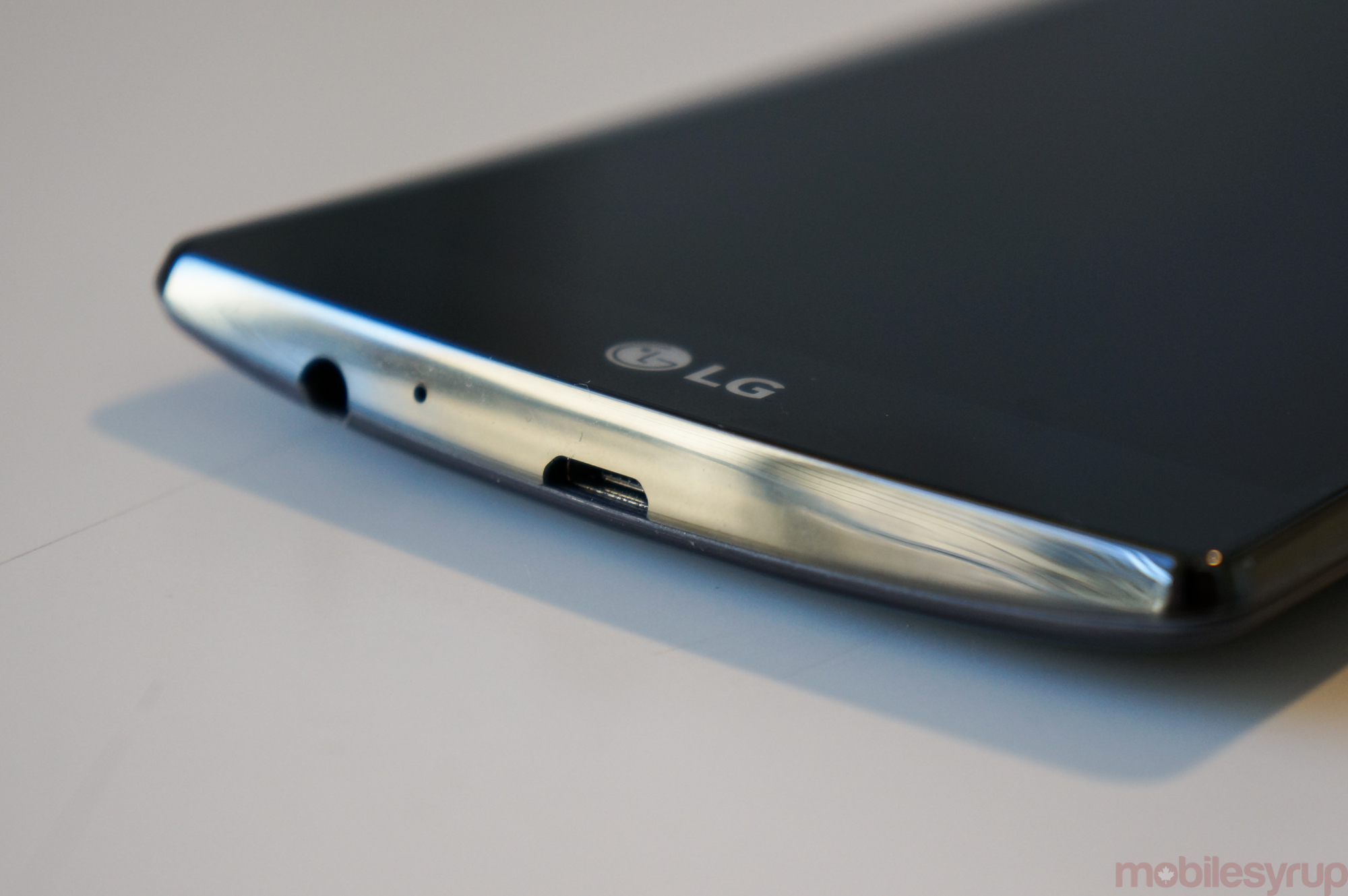
LG kept the microUSB and headphone jack in the same spot on the bottom of the G4, but in this photo you can see the angle a little more clearly.
The G4’s Ceramic Black battery cover has a diamond checkerboard pattern on the back which adds a modicum of grip while improving aesthetics. I think it looks a lot better.
Finally, the software on the G4 implements a number of more material-focused additions, including the replacement of the typical menu “new” button with the more modern floating action button. LG’s new skin is full of these more honest nods to Google’s material design guidelines, and the user experience benefits for it.
You can also see the G4’s display has a much more even white balance, with a higher average brightness setting. The company claims that despite having higher brightness, the G4’s Quantum Dot display is 20% more efficient than the G3’s QHD display.
With a much-improved camera and display on the docket, the G4 is more than a minor bump over the G3 despite similarities in design. We’ll be bringing you a full review in the very near future, so stay tuned.
MobileSyrup may earn a commission from purchases made via our links, which helps fund the journalism we provide free on our website. These links do not influence our editorial content. Support us here.

