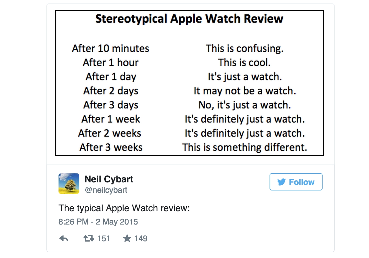
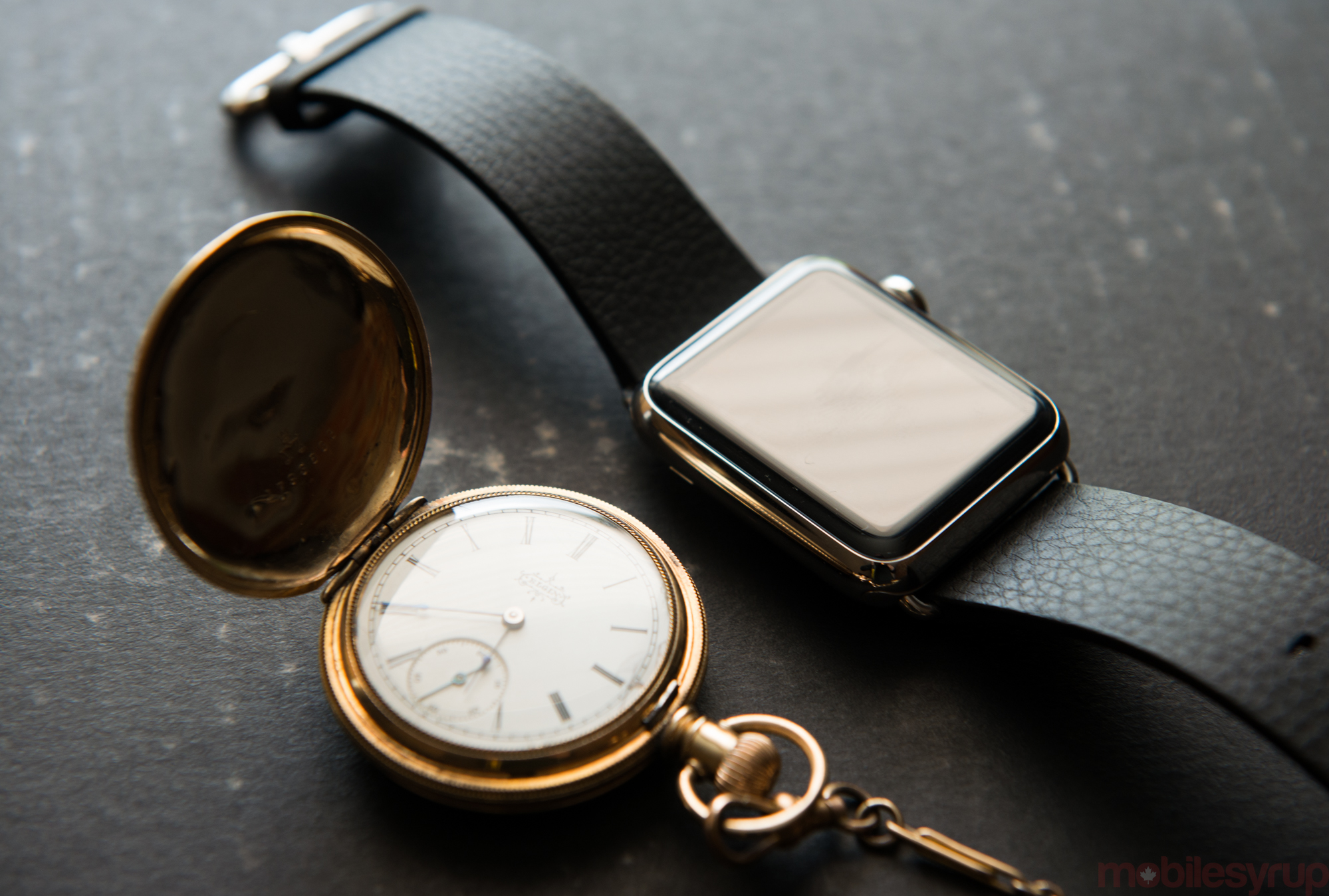
I have many reasons not to occupy my left wrist with something that vibrates and pings, something that does anything but tell the time. I have many reasons because I have many watches that were left to me when my father passed away in early 2014. He was an avid watch collector, and gave me a 1968 Omega Constellation for my 18th birthday, the same watch his father gave him when he turned 18. He asked me to do the same for my son on his 18th birthday, and despite knowing deep down for a number of reasons that’s unlikely to happen, I still want it to happen.
Like many people, my watch wearing has waxed and waned over the years. The Constellation has a kinetic quartz movement in it, so for a time I got in the habit of winding it 18 times before I went to sleep. That’s the same number that, in Hebrew, represents life. Chai. That number has deep meaning to me, and through the watch it reminds of me of father. Like most watch-as-heirlooms, its ontological purpose goes far beyond telling the time; it stands in for the person or the action, or, in some cases, the intended outcome yet to transpire.
This is the reality Apple faces with the Watch. Jony Ive once told a reporter that Apple designed the iPhone because the executive team hated the phones in their pockets; they approached the Watch instead out of reverence for horology as a practice, and watch-buying as a practical expense.
Like many of the company’s products, the Apple Watch is not the first smartwatch on the market, and while Apple passively rejects that nomenclature, the first version of the Watch is very much a piece of technology. But it’s a quite beautiful piece of engineering as well as a fine timepiece. Everything in the middle, from notifications to apps to Glances to Digital Touch, is where the waters are muddied – with potential, with confusion.
Sunday – Time and the universe
Sunday’s a pretty quiet day for me. I don’t wake up early, and I don’t make plans. I sometimes go to the gym, or if the weather’s nice I’ll take the bike out. It’s not stressful because my phone is largely idle.
So Sunday is a good place to begin with the Apple Watch.
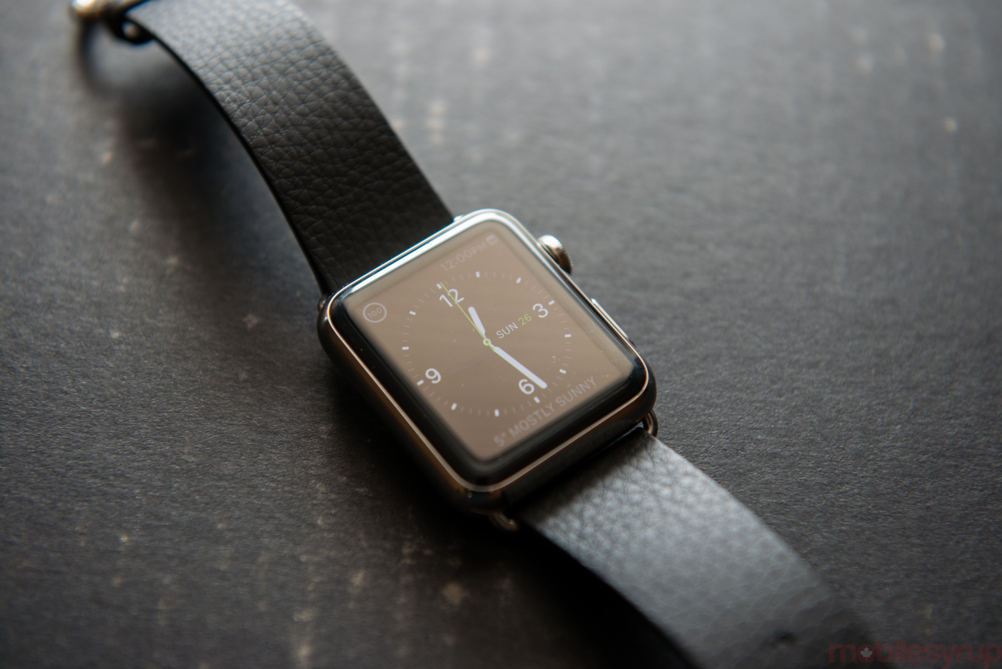
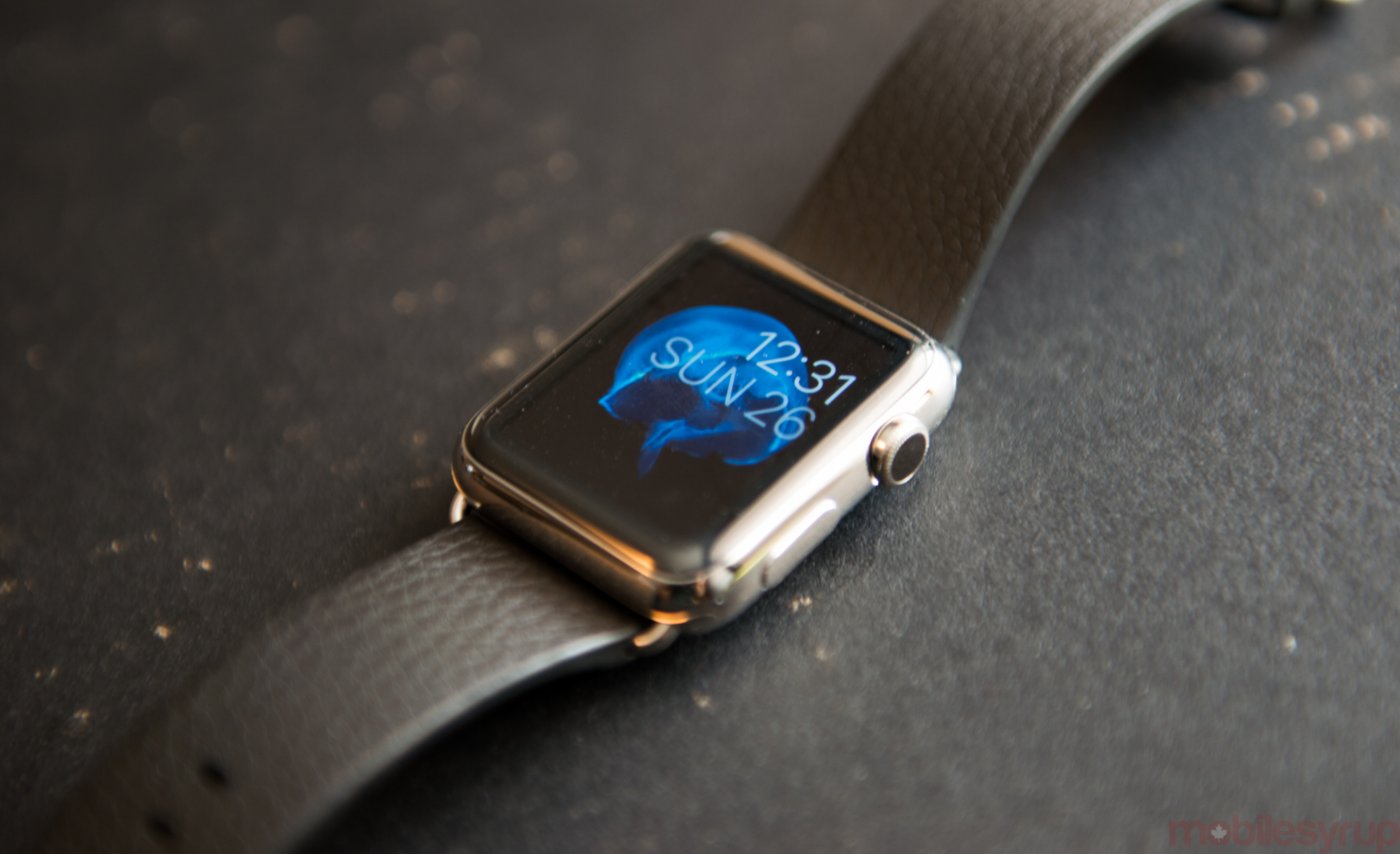
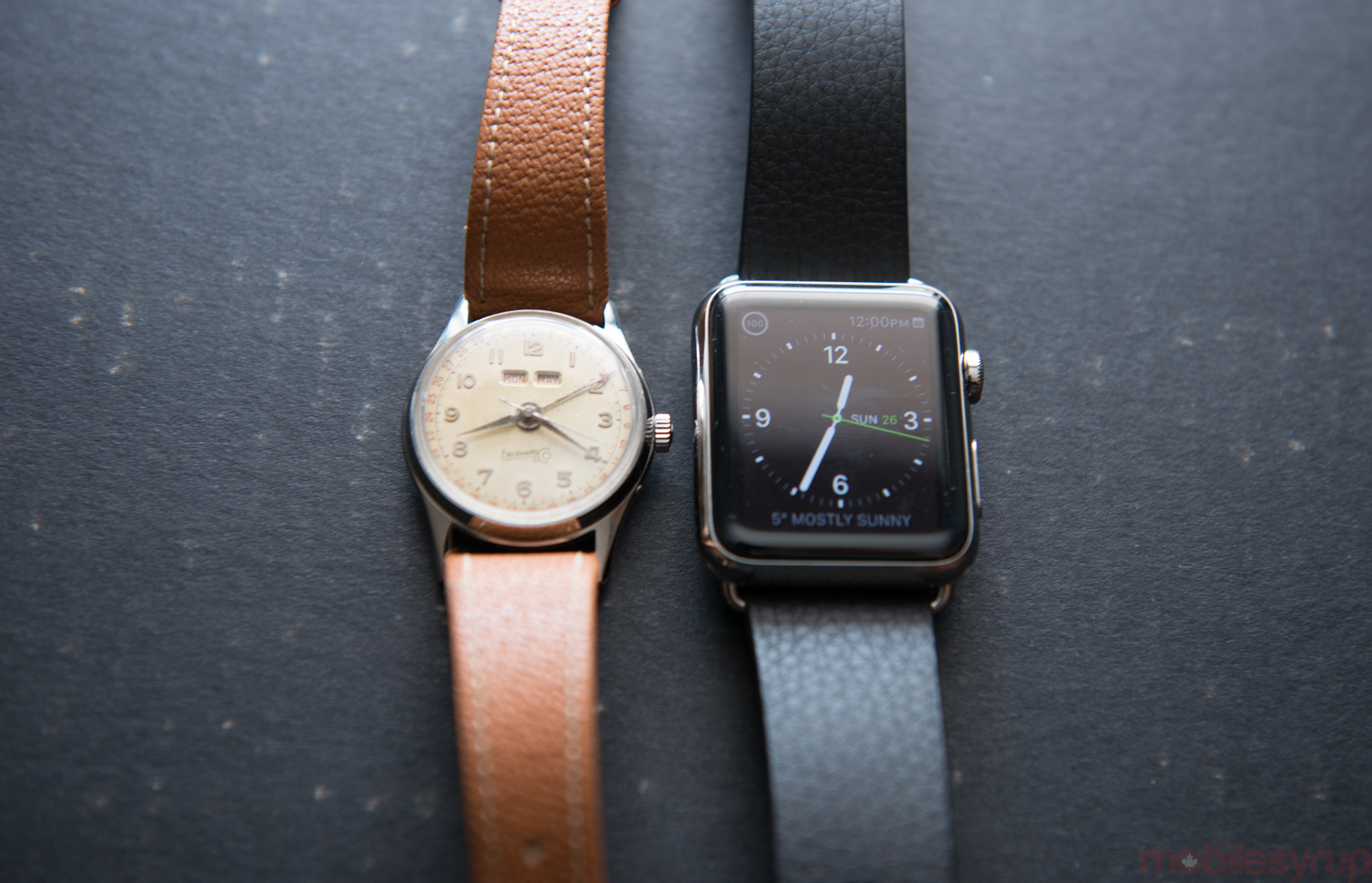
As a timepiece, the Apple Watch is both excellent and disappointing. There are ten watch faces to choose from, chosen with a Force Touch on the screen. Force Touch is the right-click equivalent of the Apple Watch, but instead of holding one’s finger longer it equates to applying ever-so-slightly more force to the display. Force Touch is one of several UI changes Apple loyalists will contend with; we’ll get to the others later on.
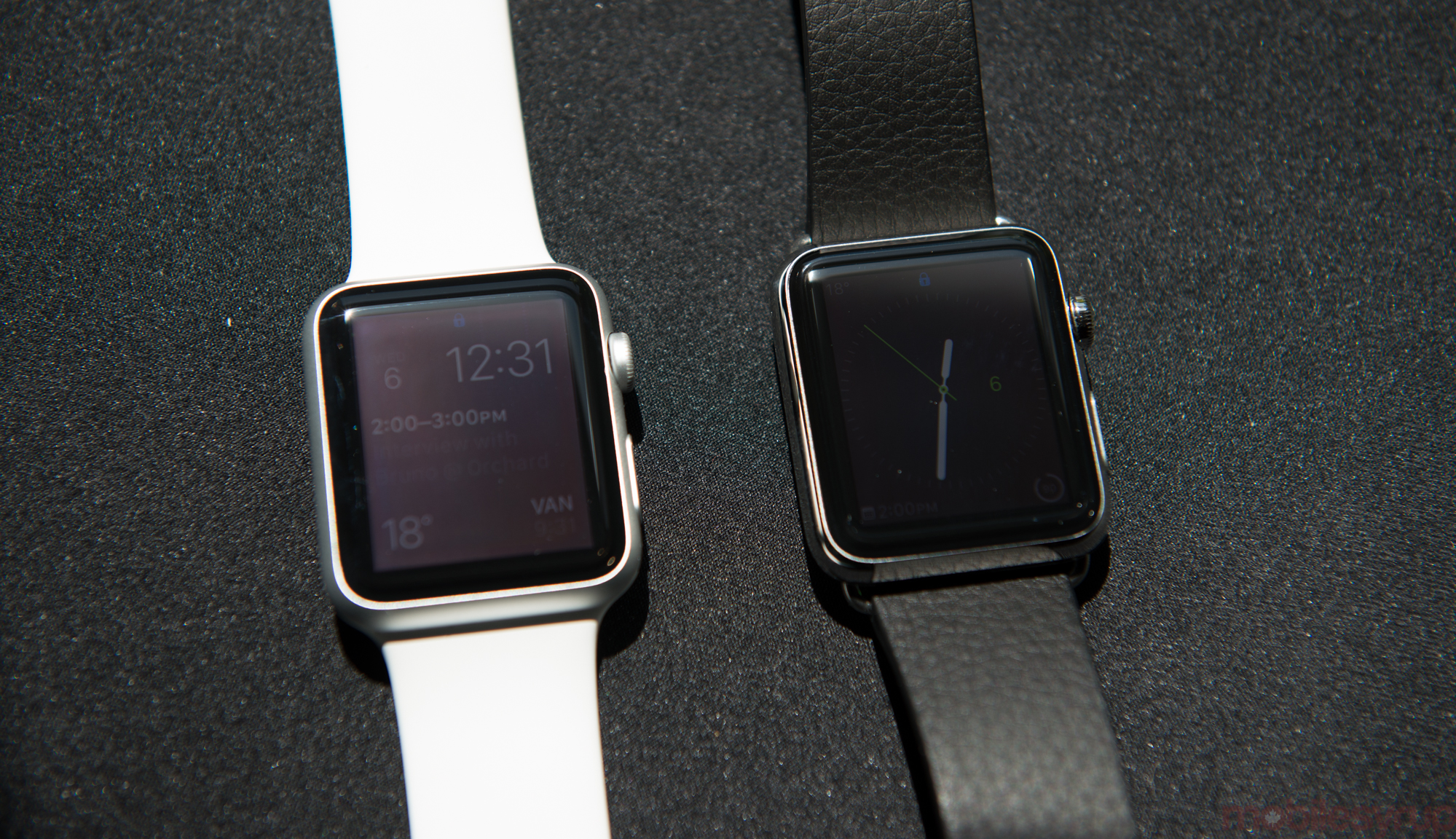
The Apple Watch comes in two sizes, 38mm and 42mm, and band sizes correspond to the case. If you and your wife buy Watches in different sizes to send each other disgustingly cute drawings or heart beats, the straps are not interchangeable.
The Watch itself comes in three cases, the aluminum Watch Sport version, the cheapest, followed by the stainless steel Apple Watch and the luxury-as-a-service Watch Edition. I spent time with two versions, the Watch Sport and Watch (also known as Collection), and came away with appropriately different qualitative experiences based on their materials. While the Sport is well-made, and certainly worth coveting, it was not without irony that the Watch I’d be more inclined to recommend to friends and family is the one is that few of them would even consider.
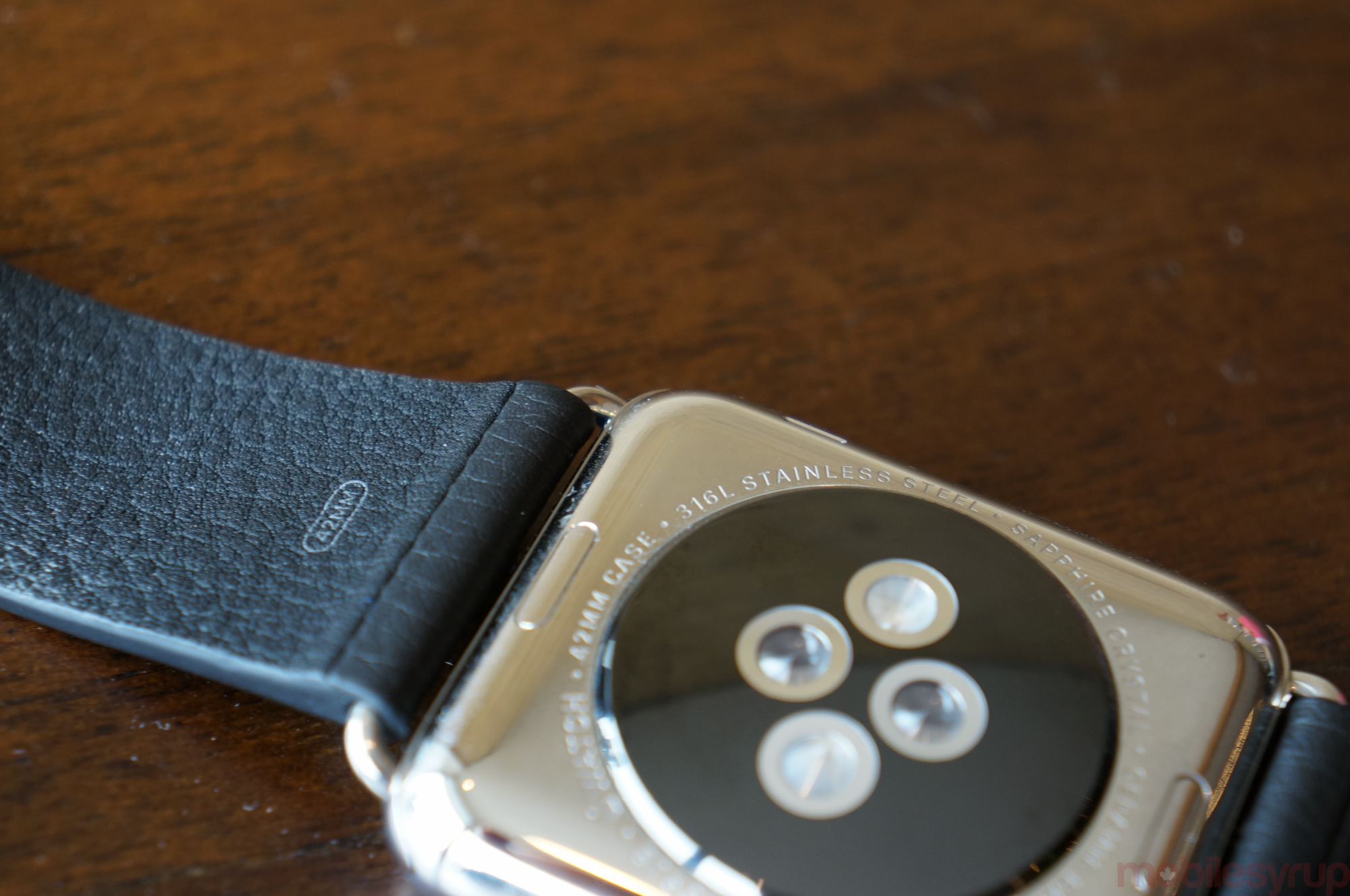
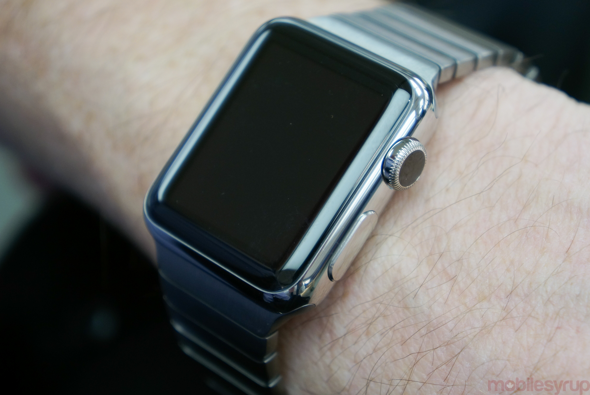
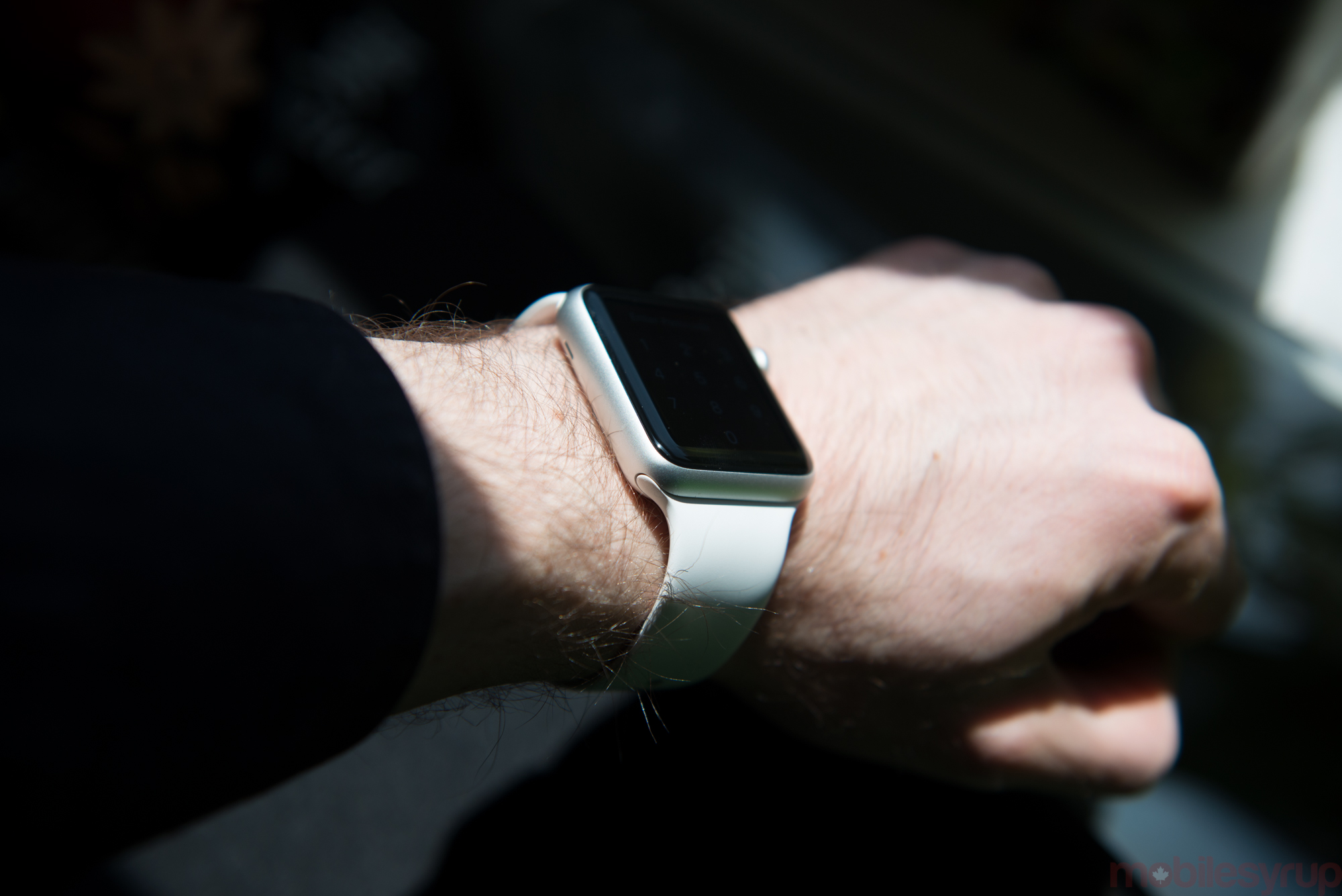
The stainless steel version looks beautiful (both in the regular shiny finish and matte Space Black variant) but also feels on my wrist more like a timepiece – something that I would feel proud to wear – than the Sport. The Sport feels like a gadget on my wrist; the Watch feels like a graduation present.
But the cases are just one part of the introduction story: Apple asked its early adopters to visit a retail store before purchasing for a very important reason, the bands. As the company has done with its iPhone cases, and the Smart Covers for its iPads, Watch bands are the cake topper, the way Apple intends to highly differentiate its product from the competition.
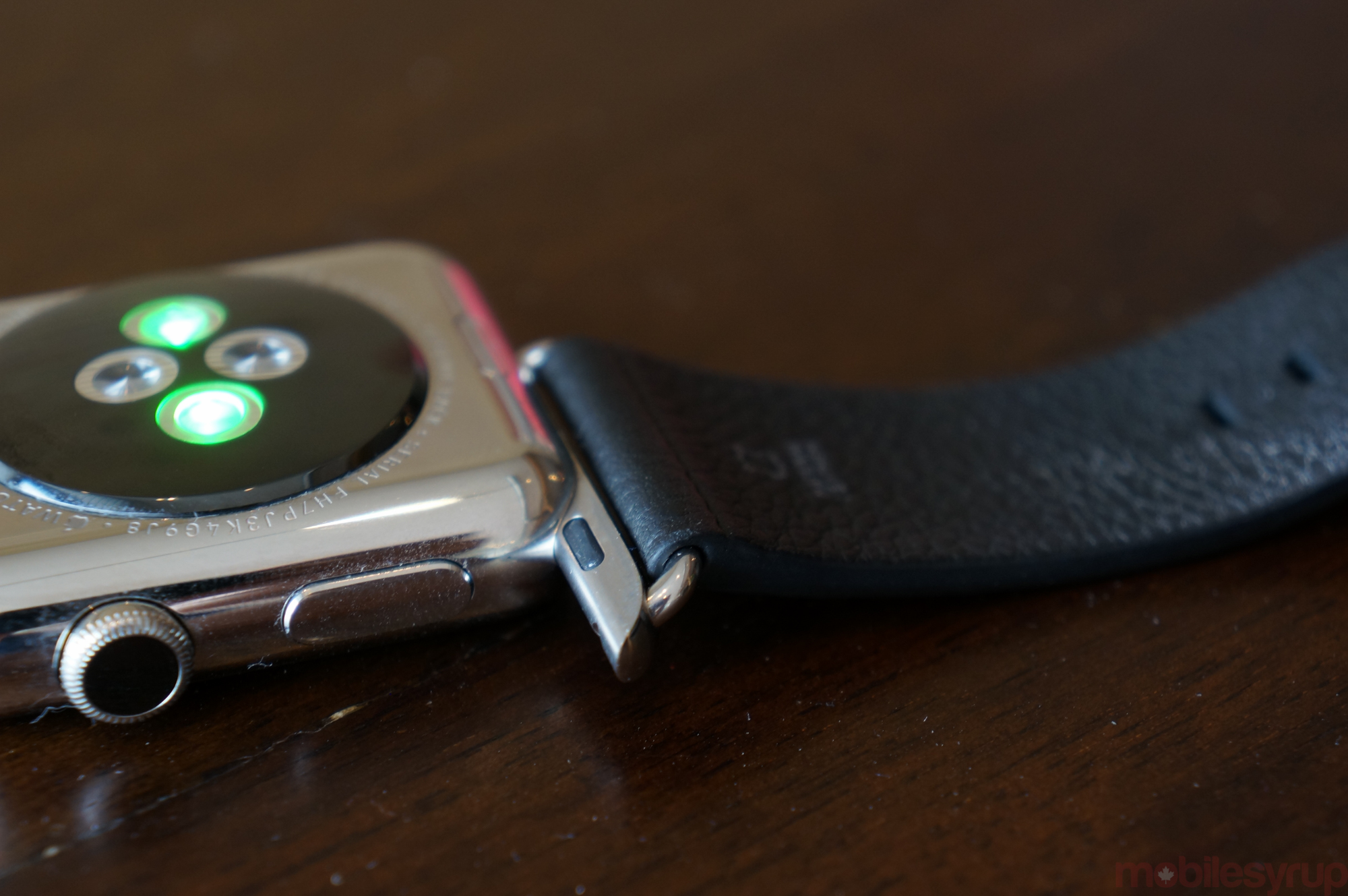
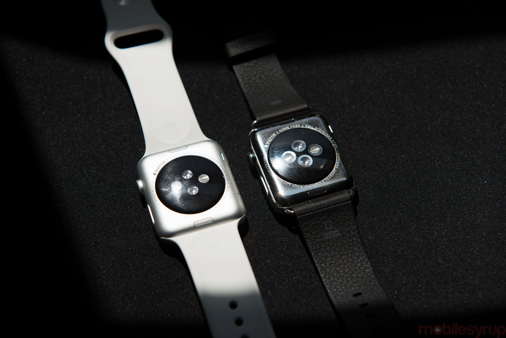
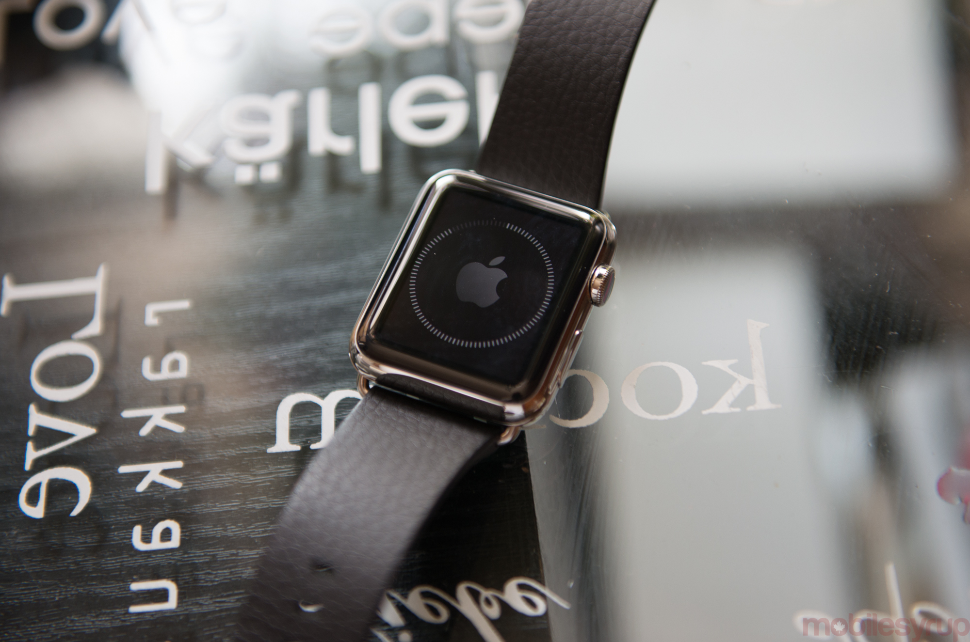
Before I get into the bands themselves, let’s talk about the replacement mechanism, because it’s a remarkable bit of engineering. There are two buttons on the rear casing of the Watch, which release three sets of lugs, the middle of which is lightly held with a magnet.
Each end of the band slides into place with an aeronautic precision; this is true of the $449 Sport or the $22,000 Edition. The bands themselves, as long as they’re the right size, are interchangeable between case types, though some, because of duelling metal types and finishes, don’t look great on the Sport.
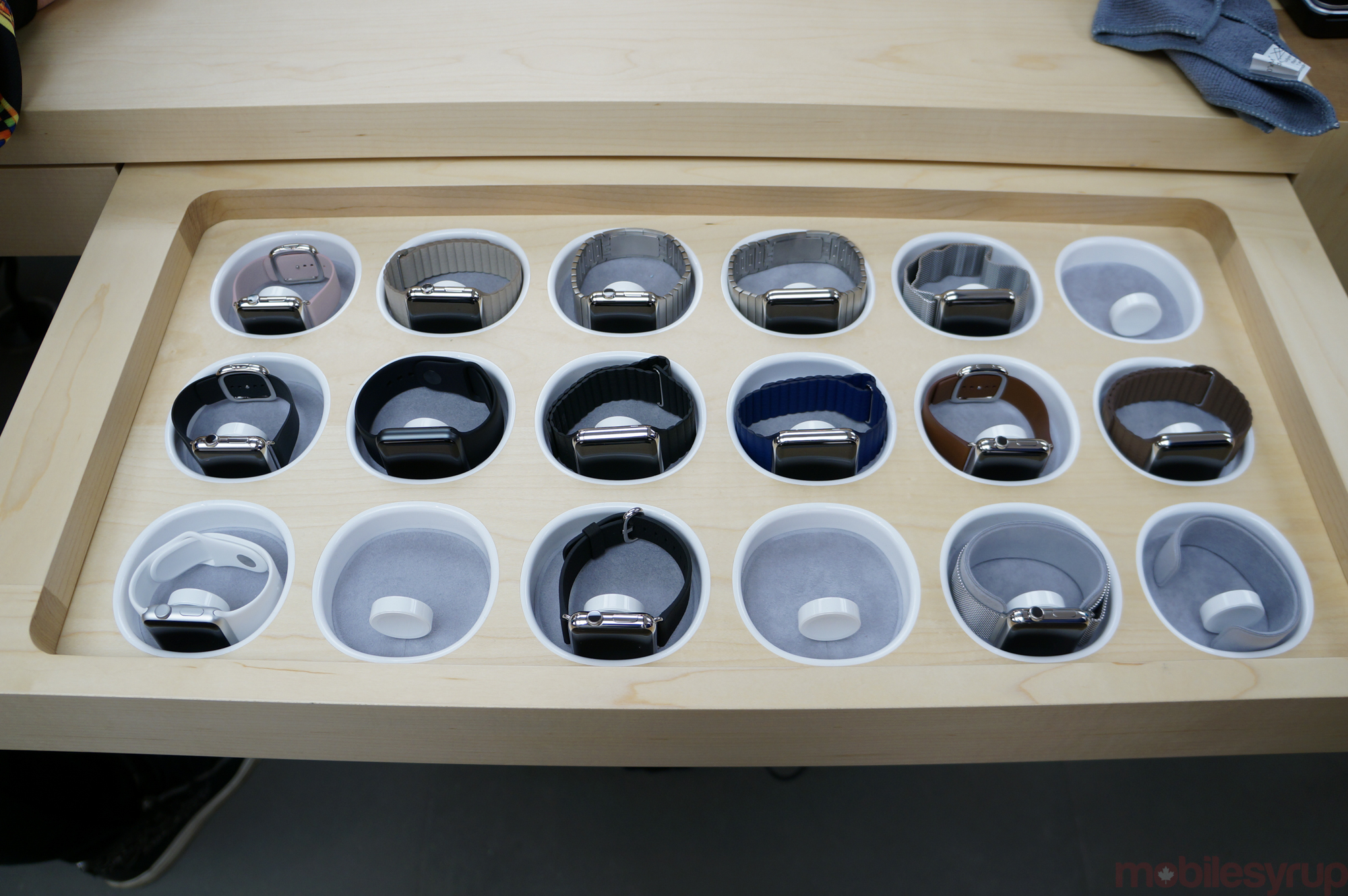
Apple is selling six band types, in a variety of colours, at a steep pricing curve. The base models of each case come with a sport band (lower-case ‘sport’), made from fluoroelastomer – a type of rubber. I scoffed at this pretentious-sounding name at first, but it isn’t just rubber, nor is it plastic.
The sport band is one of the most comfortable materials I’ve ever worn around my wrist, and though it lacks the expensive-feeling nature of leather or the “look-at-me” status of steel, it is both aesthetically pleasing and remarkably durable. At $69, it is not only the cheapest of the bands, but it is the only one appropriate for sweating, so I’d recommend buying one even if you’re only an occasional exerciser.
The Milanese Loop, Classic Leather Buckle, and Leather Loop all cost $199, and are interesting for a number of reasons. I prefer the Classic Buckle: the leather is beautifully-finished, and its stainless steel clasp is likely going to hold up well over time.
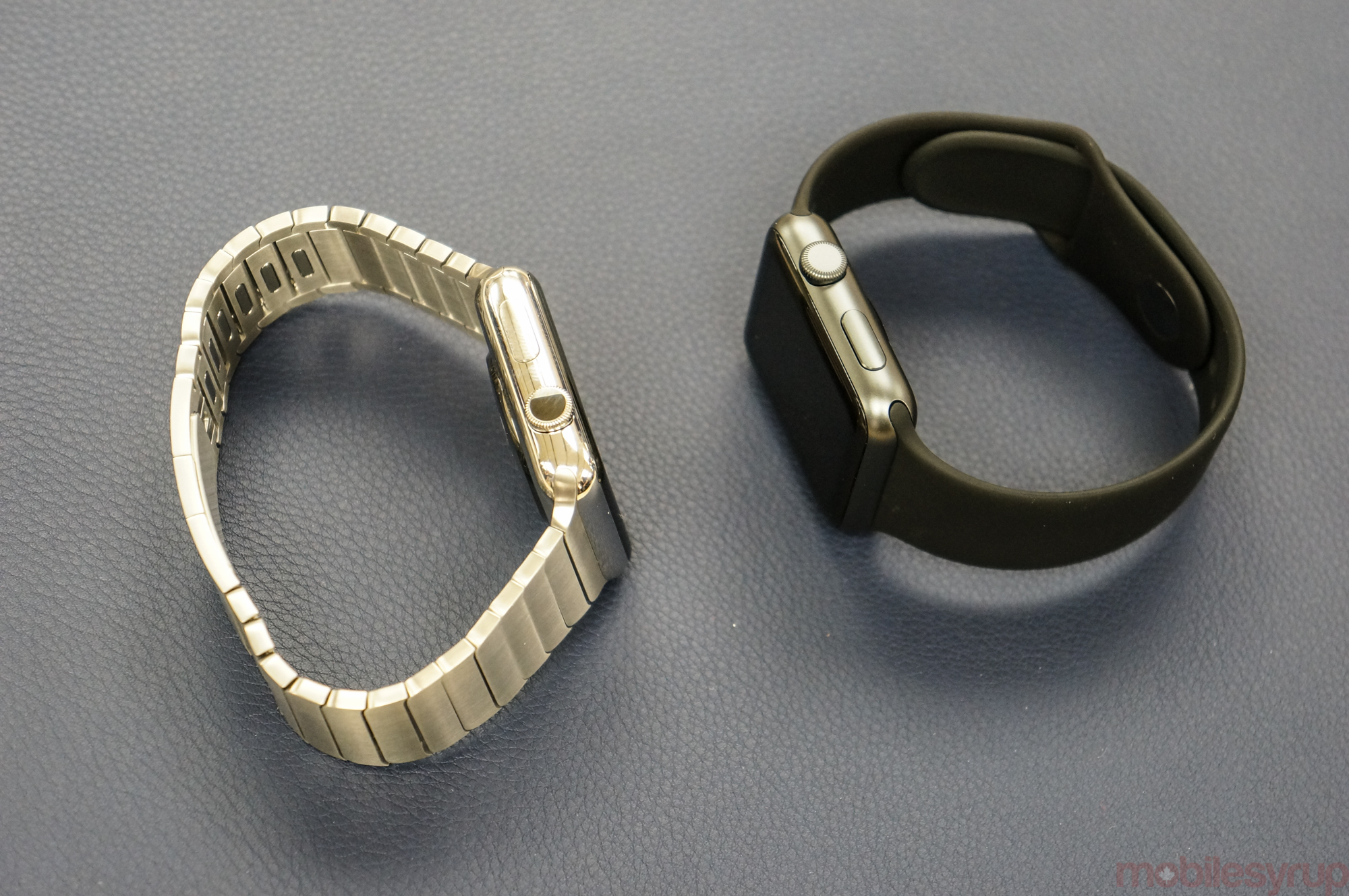
The $599 Link Bracelet is more expensive than the Watch Sport itself, but its description attempts to justify its high cost: “Crafted from the same 316L stainless steel alloy as the case, the Link Bracelet has more than 100 components. The machining process is so precise, it takes nearly nine hours to cut the links for a single strap. In part that’s because they aren’t simply a uniform size, but subtly increase in width as they approach the case. Once assembled, the links are brushed by hand to ensure that the texture follows the contours of the design. The custom butterfly closure folds neatly within the bracelet. And several links feature a simple release button, so you can add and remove links without any special tools.”
Workmanship is something Apple has never shied away from, but it’s clearer with the Watch that fashion – and personalized fashion, in particular – is a key component of its marketing drive. My guess is that most Apple fans, the ones looking more for utility than beauty, will buy the Apple Watch Sport with a black or white band.
But that isn’t the only addressable market here: Apple is going after the customer who wouldn’t scoff at spending $1,000 on a beautiful timepiece.
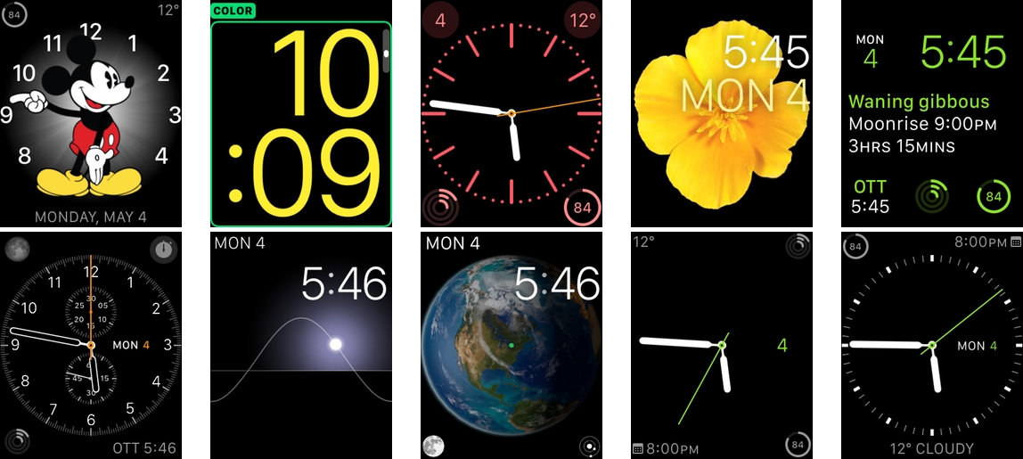
Coming back to that – timekeeping – the Watch’s ten faces comprise a decent approximation of what most people would want from a small screen. The five analog and five digital varieties are all variations on the same theme, but that doesn’t tell the whole story. Complications, a traditional horological term for accompaniments to a classic analog watch face, can be configured to display the date, temperature, moon cycle, sunrise/sunset times, upcoming appointments, alternate timezones, and more.
Knowing Apple’s desire to tightly control the user experience, not having third-party watch faces, as there are on Android Wear, is understandable, but scrolling through the current choices leaves me wanting more. The analog faces are lovely, and I’ve been able to configure them to suit my needs just fine, but the digital equivalents are severely lacking. ‘Modular’, a configurable digital face, is the only one that comes close to imitating the minimalism of ‘Simple’ on the analog side, for instance.
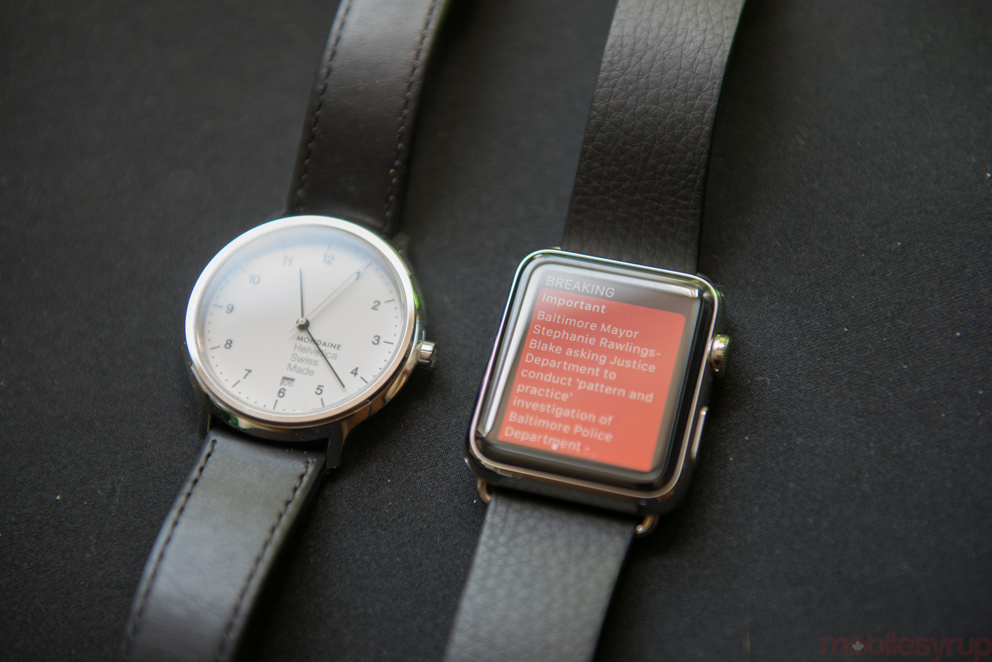
More watch faces are surely coming, and the current customization options are enough to satisfy most enthusiasts, but when I compare even the most austere, elegant configurations of the Apple Watch to my Mondaine Helevetica Nº1, for instance, I am left a bit underwhelmed.
Monday – Control
Let’s take some time on Monday to learn how to control the Apple Watch.
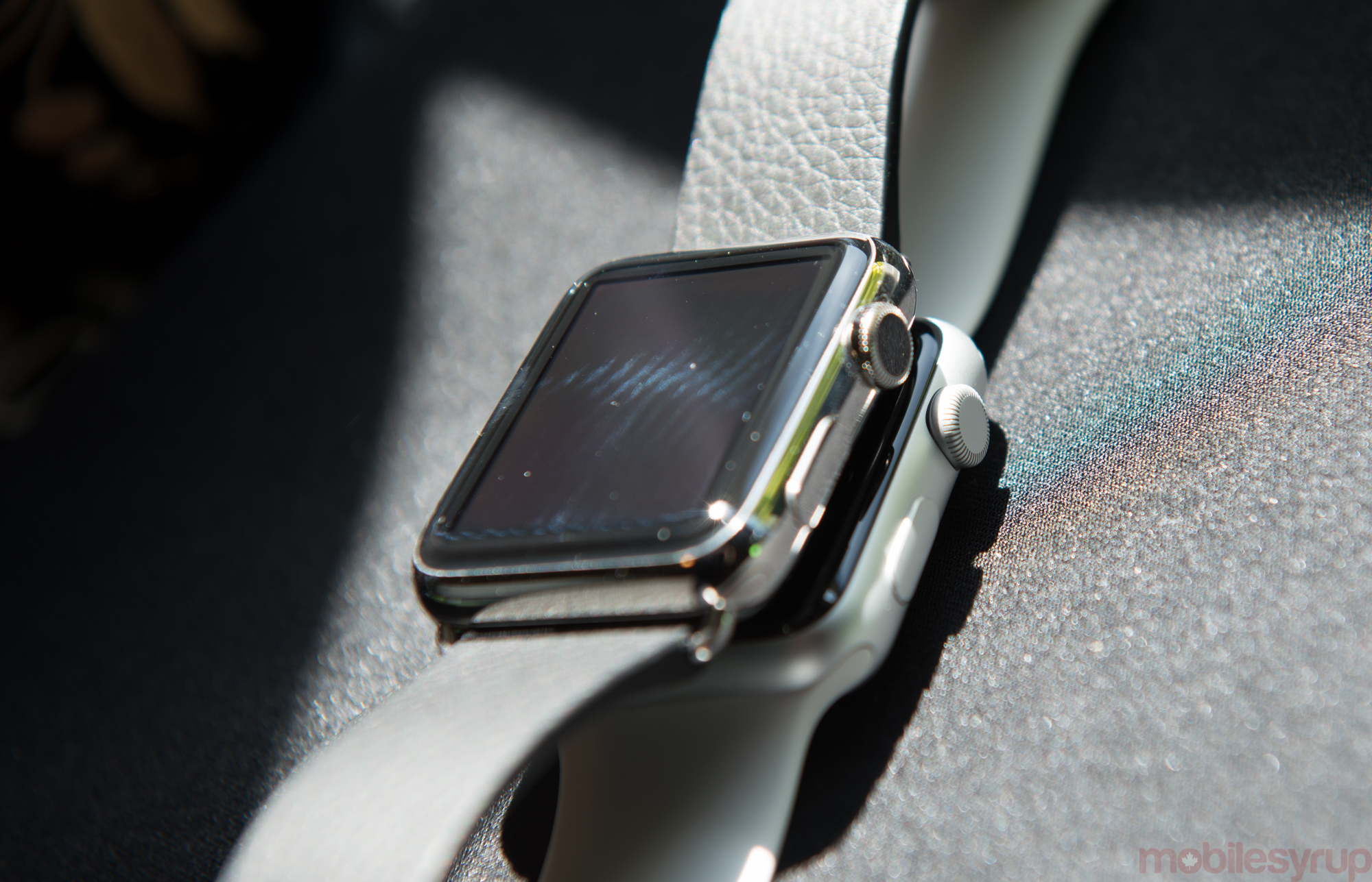
Apple Watch employs four main input methods that, at first, requires some acclimation. There’s the touchscreen, which on the 38mm Watch is 340×272 pixels and on the 42mm is 390×312 – both Retina-branded and generally higher-resolution than the competition – where you tap select 2x assets in the same way you would on a larger smartphone.
Then there’s Force Touch, which comprises a harder tap on the same touchscreen. Force Touch replaces the menu button on such a small screen, and while Apple could have educated better on its various merits, it becomes an invaluable and useful alternative to finding a menu on this small screen.
In fact, Force Touch becomes one of those features you wish your smartphone had; notifications pulled down from the top of the screen (while in the clock view) can be cleared with a Force Press, for example. Paired with the subtlety of the Taptic Engine, which places on your wrist truly mindful taps instead of generalized vibrations, the Watch becomes private, real-time notification centre of its own. At this point, aside from telling the time, that’s the device’s best feature, which is both a blessing and a curse.
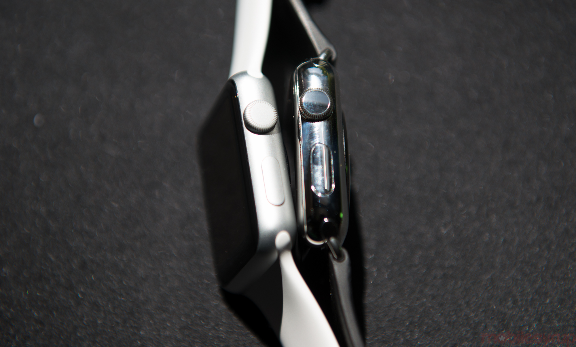
Apple made a lot of the Digital Crown when the Watch was revealed in September, and while it looks and feel similar to many crowns found on modern analog watches, its dual function as both navigator and button at once delights and confuses. It’s clear Apple spent a lot of time calibrating this little wheel: it has just the right amount of tension, and despite having different textures depending on the case, both the aluminum and stainless steel versions operate identically.
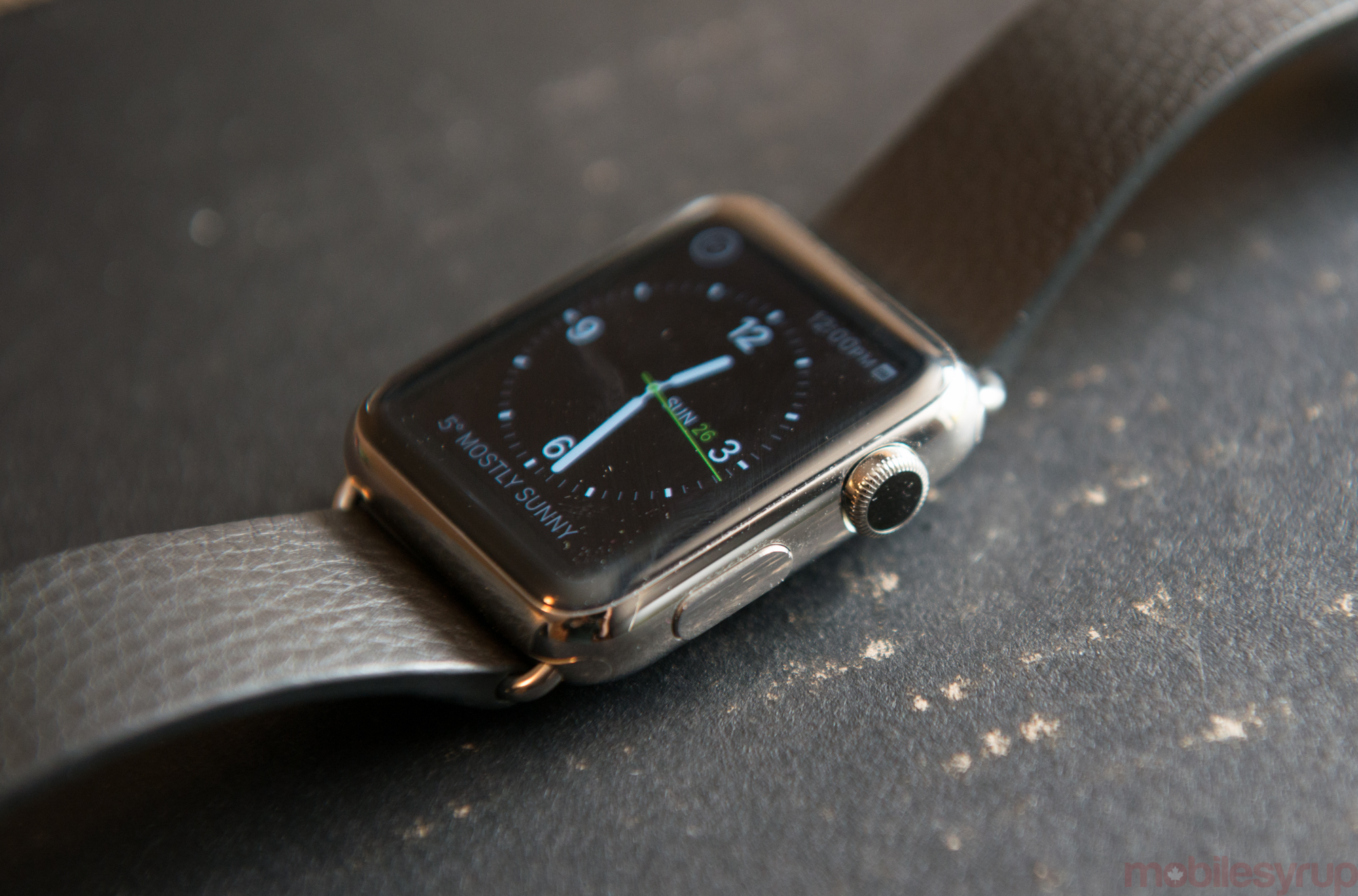
The idea behind the Digital Crown is to avoid covering the screen while navigating the device, and for the most part it works. Unfortunately, some apps – third party ones for the most part – do not employ it, relying solely on the touchscreen. Most others require the wheel for scrolling, but selection is done by tapping the display. Coupled with the fact that the Crown doubles as a button, not to select anything but to return to the clock display, there is a steep learning curve to using the Watch on a daily basis. It wasn’t long before I got the hang of it, but the Watch is not immediately user friendly.
In fact, the simplest interaction with the Watch is one that most iPhone users will be familiar with: Siri. Holding down the Digital Crown for a second activates Siri, and my goodness has she received an upgrade. A year ago or so, I compared Siri to Google Now in terms of speed, voice recognition and intelligence parsing. Then, she was far behind; today, she wins hands down in the first two categories. That the Watch is merely passing off much of the work to the phone and still managing to acquire information that fast is a testament to the new Siri backend.
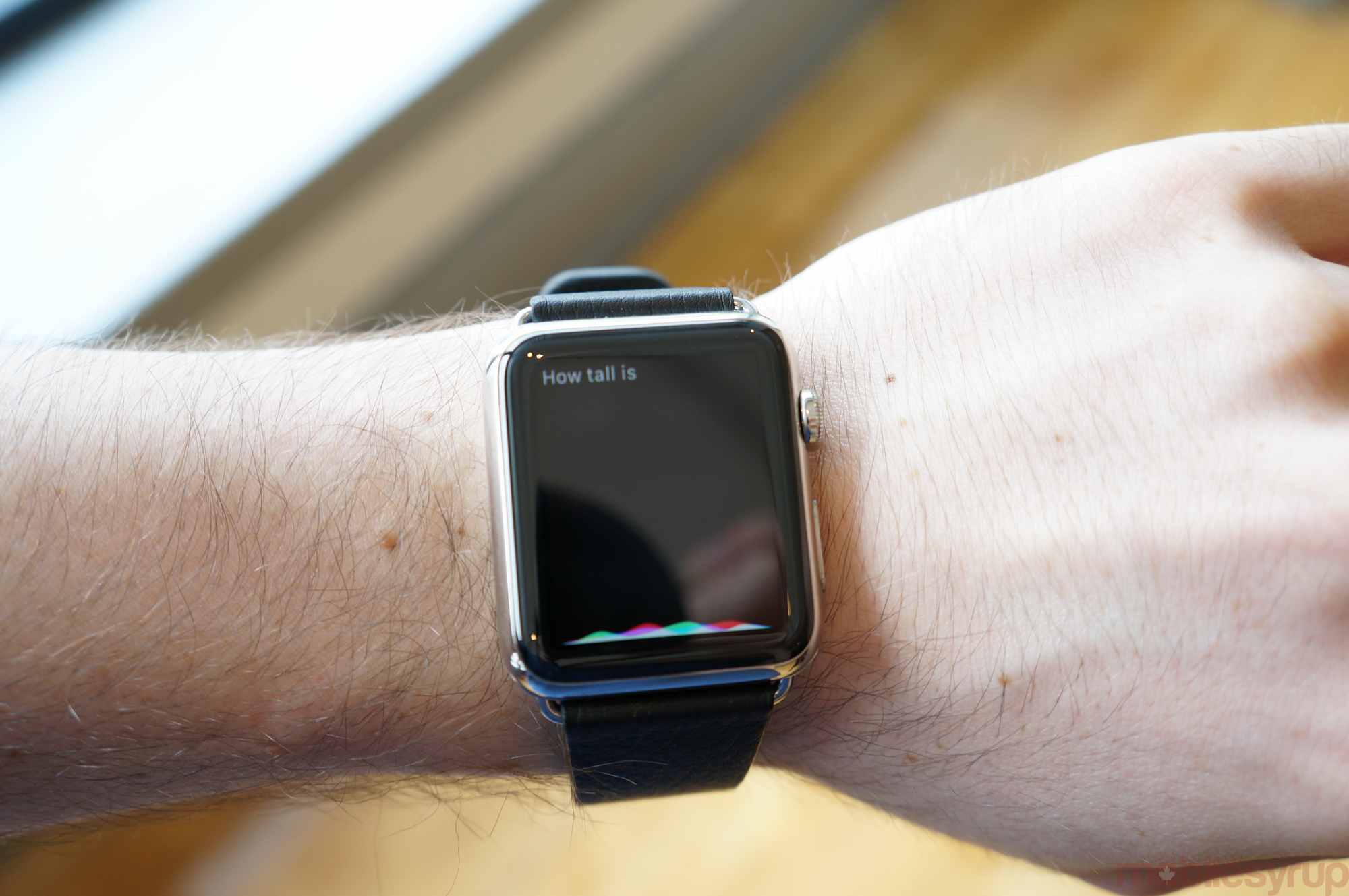
Siri is usually the best way to interact with the Watch when something needs to be performed quickly. Texting someone from scratch, for example, is a tedious process; searching using an app even more so. Siri lives on the phone, but she was made for the Watch.
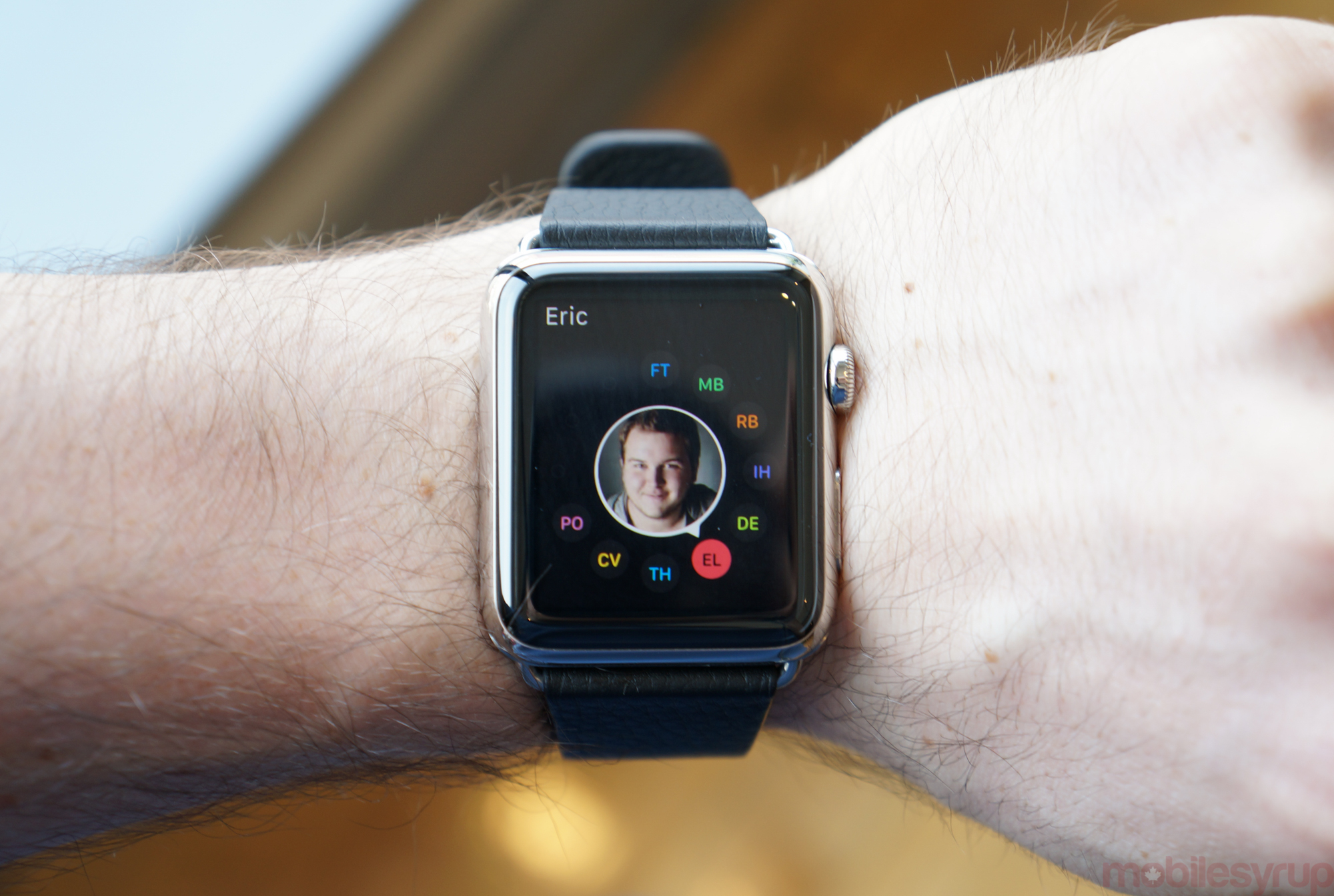
Finally, Digital Touch is one of those features that most people are quickly going to dismiss as asinine, and at first it was. But the longer I had my Watch, and the more people I added to my friends list with the timepiece, the more useful and interesting I found it.
By now, you’ve probably heard that you can send a heartbeat to another Watch user. But, like the infomercial says, Wait, there’s more! You can also sketch little drawings on your wrist, though the fatness of a digit makes it difficult to be precise; and you can tap out short message bursts, like codes.
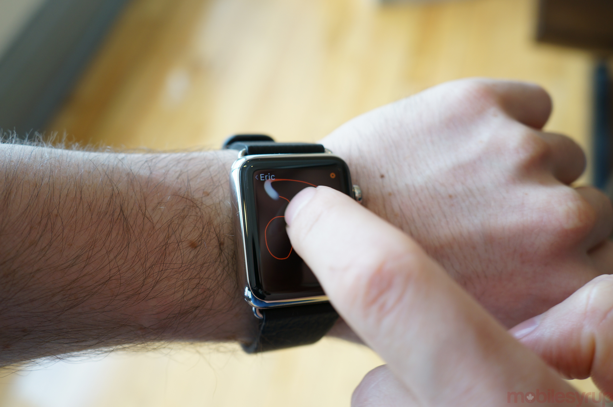
This is a cute feature that one day could be more. I found myself disappointed that Digital Touch messages, which are ephemeral, are sent in real-time, but are not received in the same way. The recipient has to “play” them like a message. That disconnect adds a small amount of friction to something as personal as a heartbeat or a drawing.
I have a few friends with Watches, and some politely send me hellos and heartbeats every couple of days – maybe that will wear off – while others send me crude dick pics and rude jokes. But if that isn’t an evolution of the instant message, from formal emails to quick texts to single-emoji iMessages to crudely-drawn dick pics, I don’t know what else to call it.
Tuesday – Going Places
On Tuesday, let’s go running.
The Apple Watch has a heart rate monitor that uses a technology called photoplethysmography to obtain an accurate heart rate reading. It does this by shining two green LEDs into the wrist and figuring out, based on how fast one’s blood is pumping, how much of that light is absorbed into the blood. It’s a similar technology to what’s found in the Fitbit Surge and Basis Peak, and slightly more advanced than what is found in most Android Wear devices.
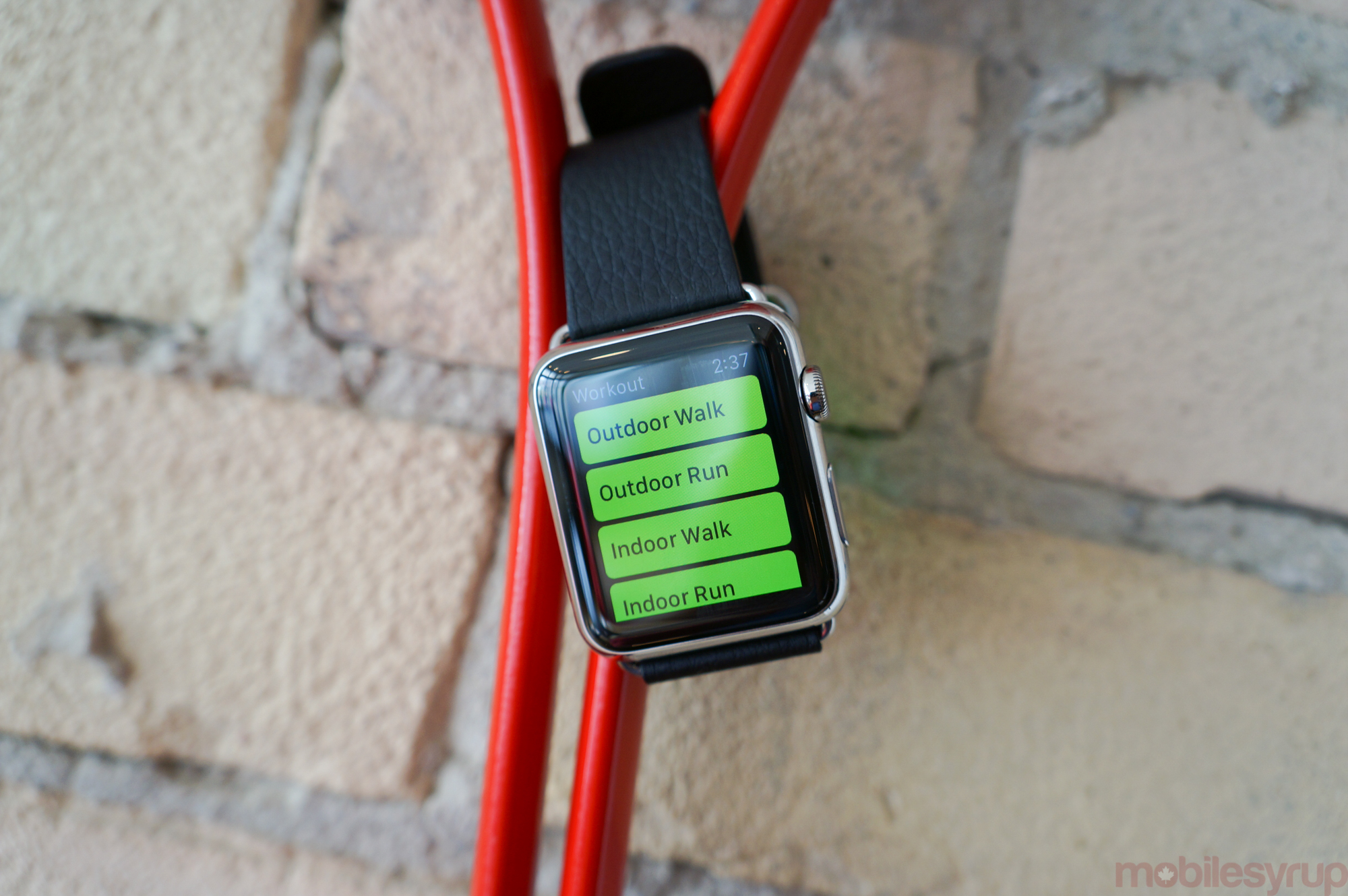
One of the Watch’s key features is exercise tracking, and it does this in both passive and active ways. The Activity app monitors movement throughout the day – steps taken, stairs climbed, calories burned – and conveys it to both the Watch and, in greater detail, the iPhone.
The Workout App is a bit more in-depth, and action needs to be taken to begin tracking one’s exercise. It is best for running and other step-based activities, but it can track cycling, elliptical, rowing and other sports, but it may not be properly calibrated for those. With an accelerometer and gyroscope embedded in the device, tracking is fairly reliable, but it lacks GPS, so exercising without an accompanying iPhone doesn’t give an accurate approximation of the road travelled.
Forgoing GPS probably has as much to do with battery consumption as space within the Watch case, but it’s a huge omission for hardcore athletes, especially those that look to Apple to replace their dedicated fitness tracking bands. It is also the first of many indications that the Watch is very much a first-generation Apple product. It would be absurd for Apple to continue to rely on the iPhone for accurate location fixing in future Watch generations, and I wouldn’t be surprised to see it added to Gen Two, either next year or in 2017.
The good thing about Watch OS, though, is that it is fairly smart. If you have a regular running route, for instance, Apple encourages you to take your phone with you to map it out a couple of times, and on subsequent occasions, based on the rhythm, cadence and time spent, the Workout app should be able to relatively accurately translate location.
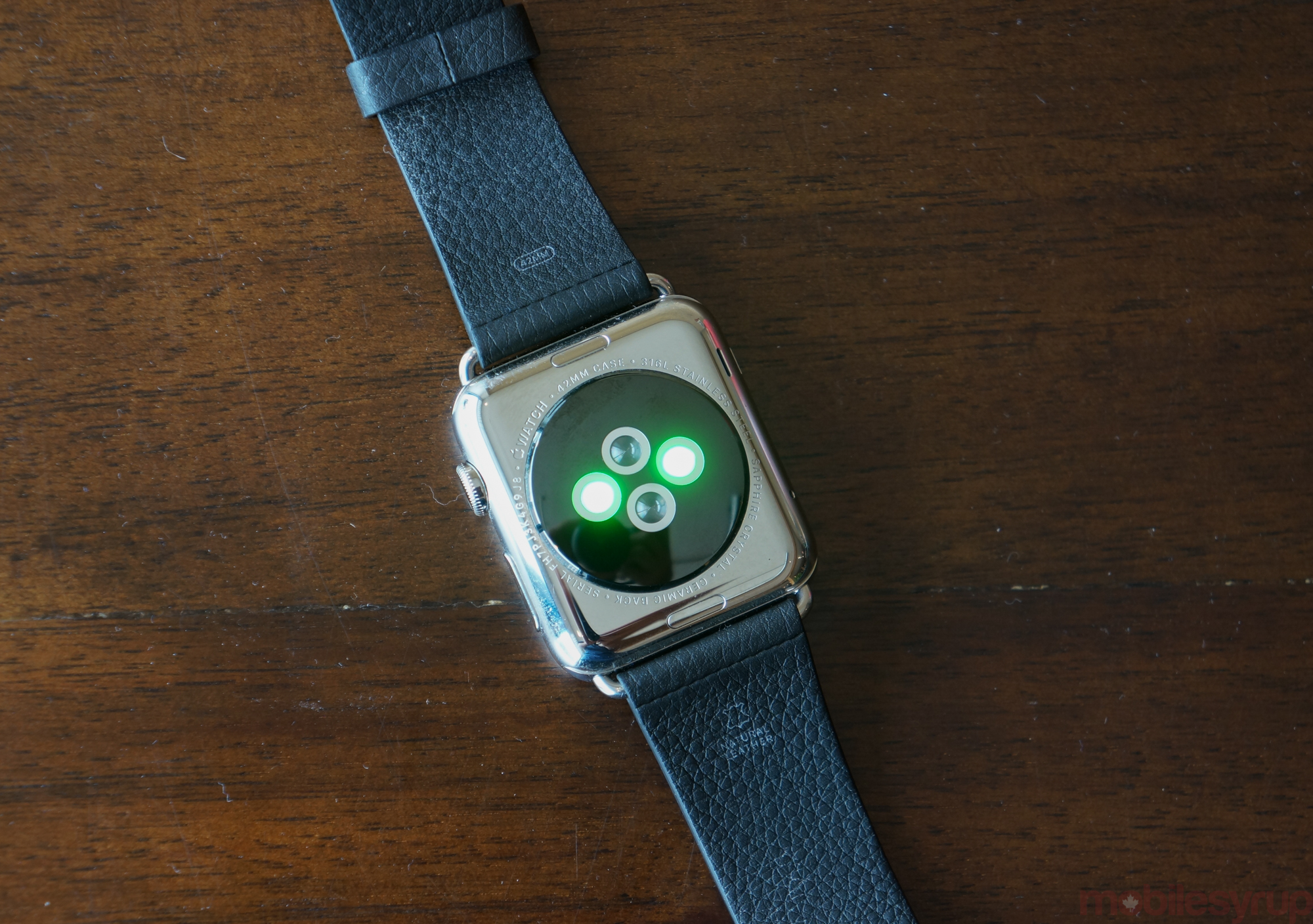
On the heart rate side, I tested the Apple Watch’s accuracy next to the Moto 360 and a dedicated chest monitor from Polar Mobile, and while the Watch was much better at taking a reading during a workout than the Motorola smartwatch, it lacked the precision and, more importantly, ramp-up speed of the Polar.
While photoplethysmography is likely the best cheapest option at the moment, Apple will likely iterate on this feature in future generations, adding sensors to make heart rate readings more accurate. That the Watch takes my pulse every 10 minutes is useful, sure, but at the moment, even afterwards on the phone, there isn’t much I can do with that data.
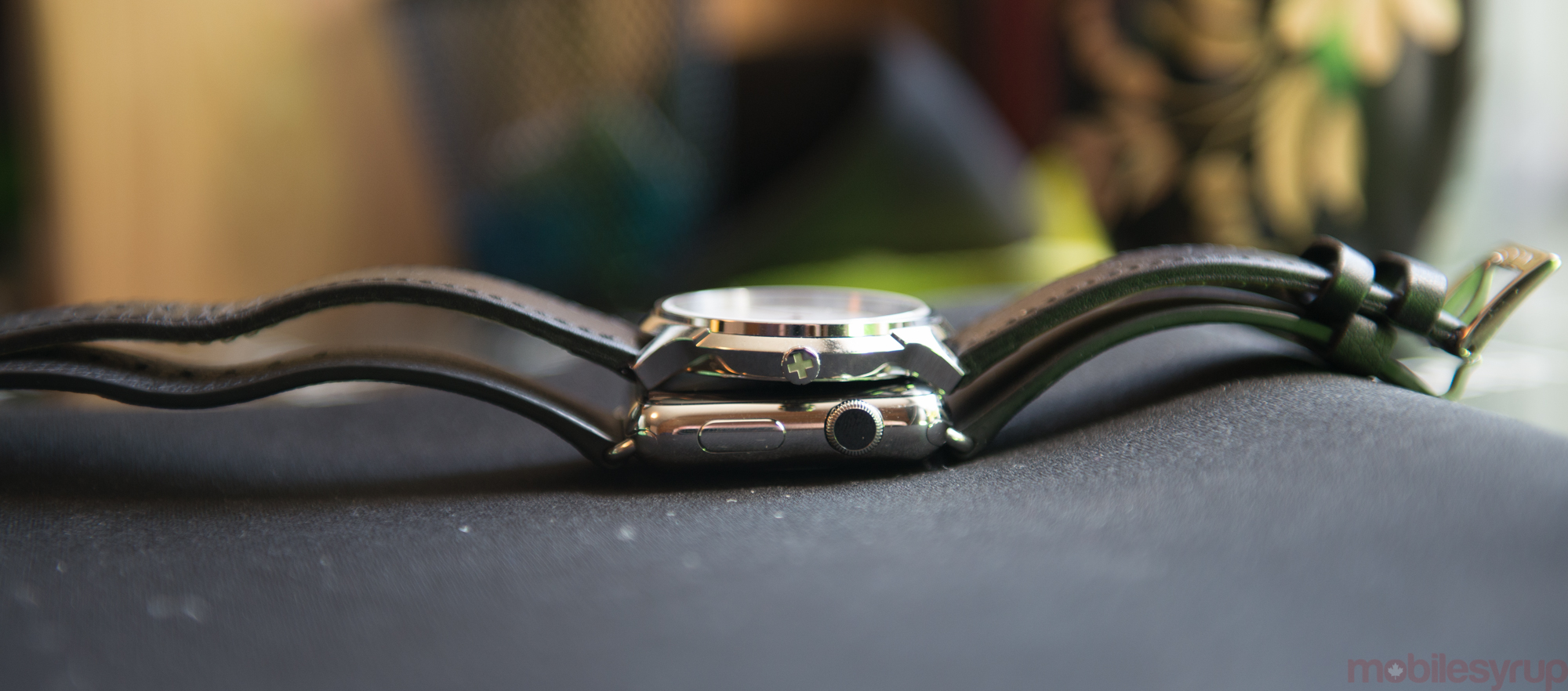
Apple also recommends that you don’t immerse the Watch in water — it has an IPX7 rating, and is “splash and water resistant but not waterproof,” according to the support notes. Many reviewers have done just that and the Watch has emerged unscathed, but Consumer Reports had one of its seven Watch Sport units fail after 30 minutes of immersion, so there’s always a chance.
I used both the Watch Sport and Watch in the rain, and while I was a bit more careful with the stainless steel version, mainly because of the leather strap, neither chassis showed any lasting damage after a brief soak from the sky.
Wednesday – Taking Charge
Wednesday night, after a long day, let’s charge the Watch.
Who wants to charge a watch every night? We already have too many gadgets to plug in, too many cords to wrangle.
The Apple Watch found itself on the receiving end of a lot of unnecessary criticism when Tim Cook explained that it would function for around 18 hours of mixed use. Already one of the most contentious parts of any product review, battery life is totally contingent on the way something is used; numbers, therefore are nothing more than a guideline.
I’m happy to report that my Apple Watch lasts almost two days of mixed use. But there’s that term again – what is mixed use for me is different from what it is for someone else.
See, I regulate my incoming notifications, not to preserve battery, but my sanity. The Watch’s OLED screen is relatively low-powered, but the Apple Watch’s S1 system on a chip (SoC) packs the processing equivalent of an A5 processor, which enables both the iPad 2, iPhone 4s, and the Apple TV. It may not be the top of the line anymore, but it’s also not a slouch. And because the Watch has far fewer pixels than an iPhone or iPad, the S1 is likely heavily underclocked.
I use the Watch the way Apple intends for people to do so, glancing at it every few minutes to check the time, or keeping the screen on for 10-20 seconds at a time while I scan through notifications, open apps, reply to text messages or update my Glances. While the prospect of third-party apps certainly intrigues me, I never intended to use a smartwatch – nor should anyone, if my opinion — to replace my phone. It simply can’t be done.
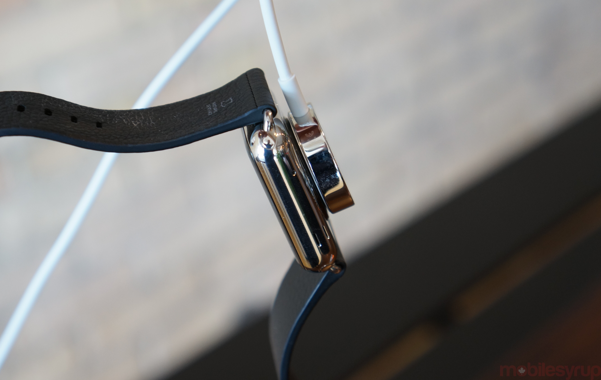
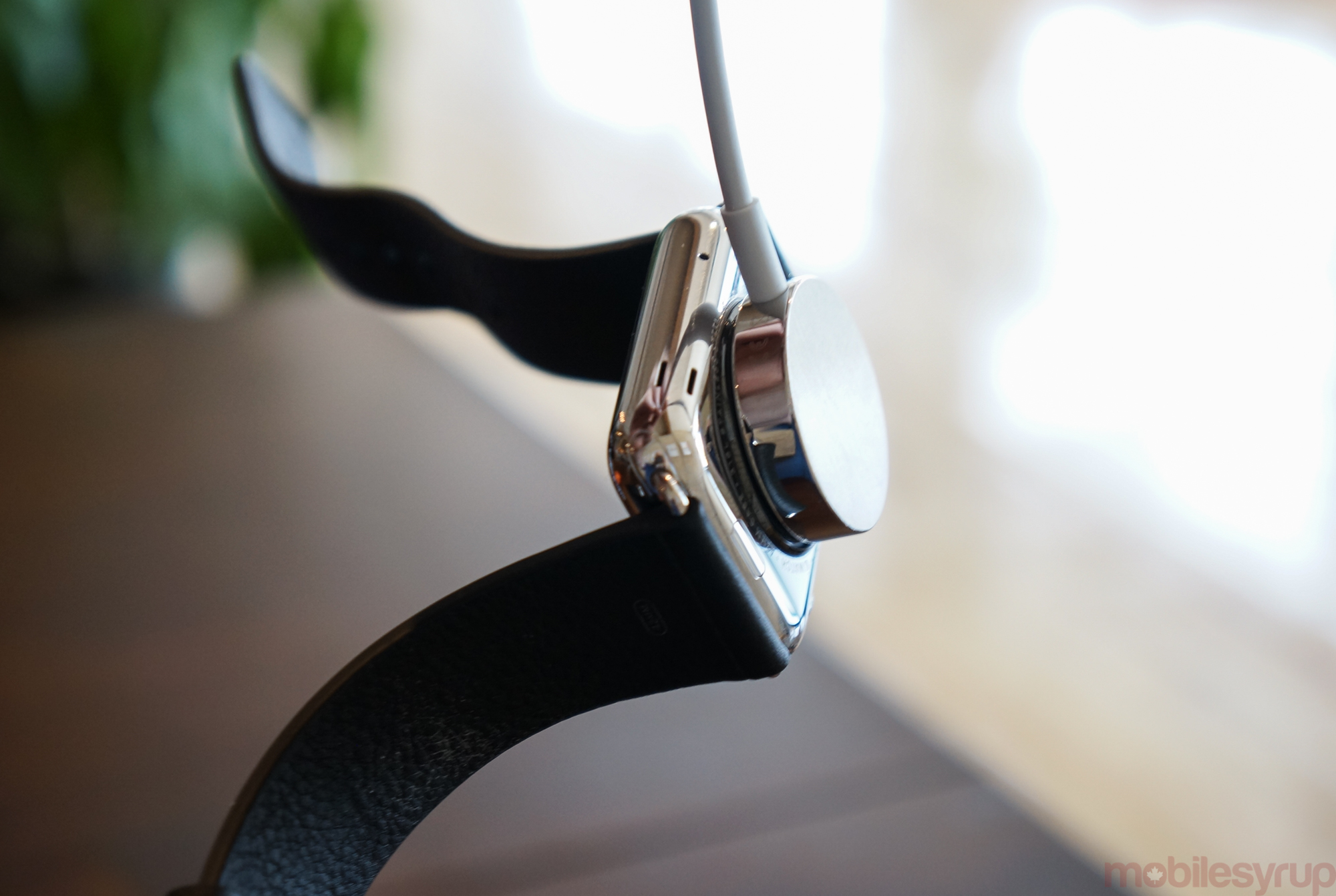
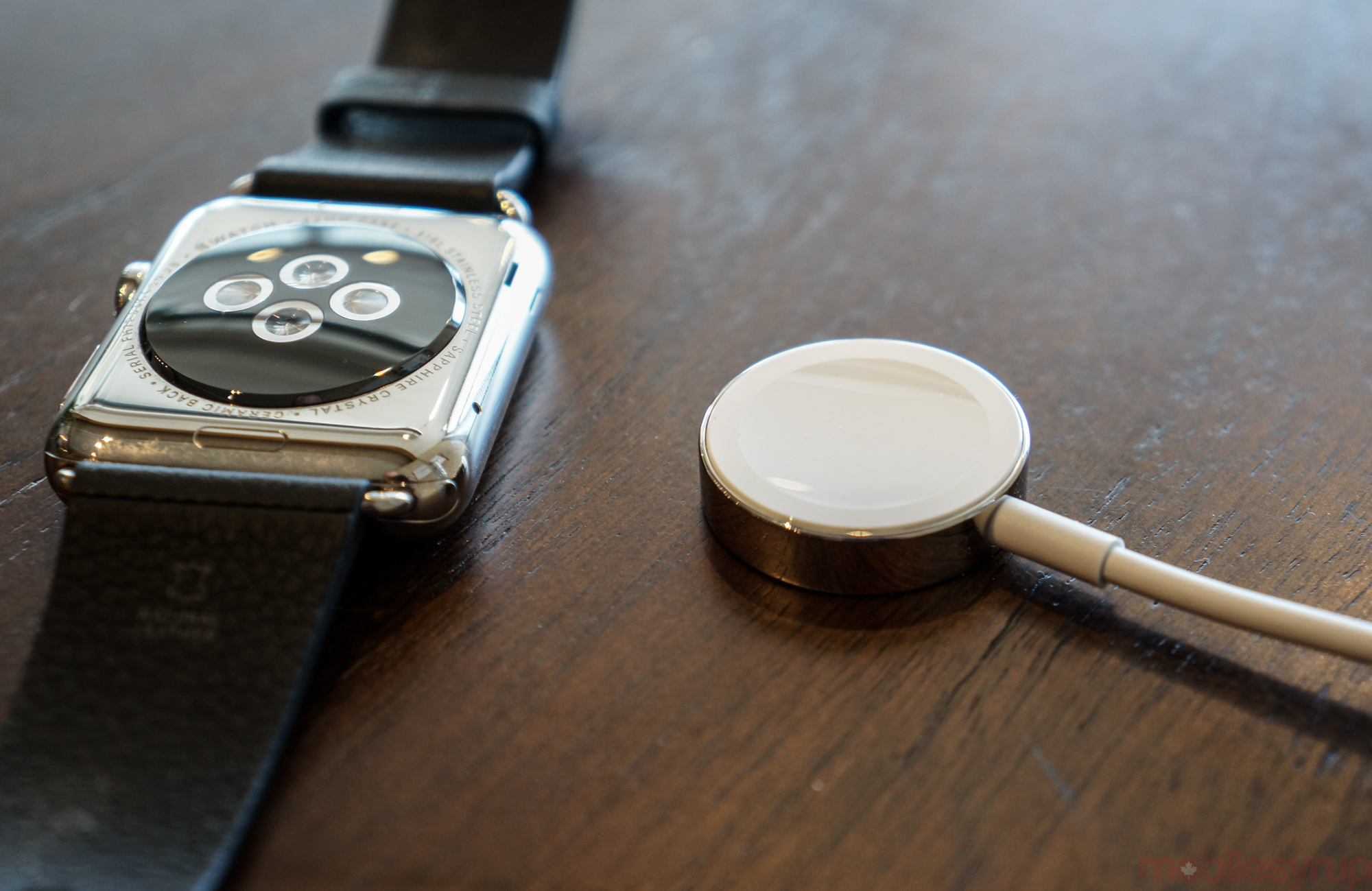
The Apple Watch charges using a rounded MagSafe adapter, which, though to keep the chassis fully sealed charges wirelessly, affixes magnetically to the underside of the case. The small concave groove on the adapter’s end fits perfectly into the slightly convex bulge of the undercarriage. It is with these tiny details that the Watch differentiates itself from the rest of today’s smart watch offerings.
It also charges quickly, going from zero to 100% in just over two hours.
My main issue with the Watch’s charging experience is that Apple didn’t include a stand or anything to accompany the two metre charging cable. The company clearly wants the device to sit beside your iPhone, but there is nothing aesthetically pleasing about the awkward angles at which the Watch sits while connected to the MagSafe. Third parties have already devised numerous ways to wrap the charging cable in beautifully-machined docks, but it would have been nice for Apple to include one of its own.
Thursday – Notification Nation
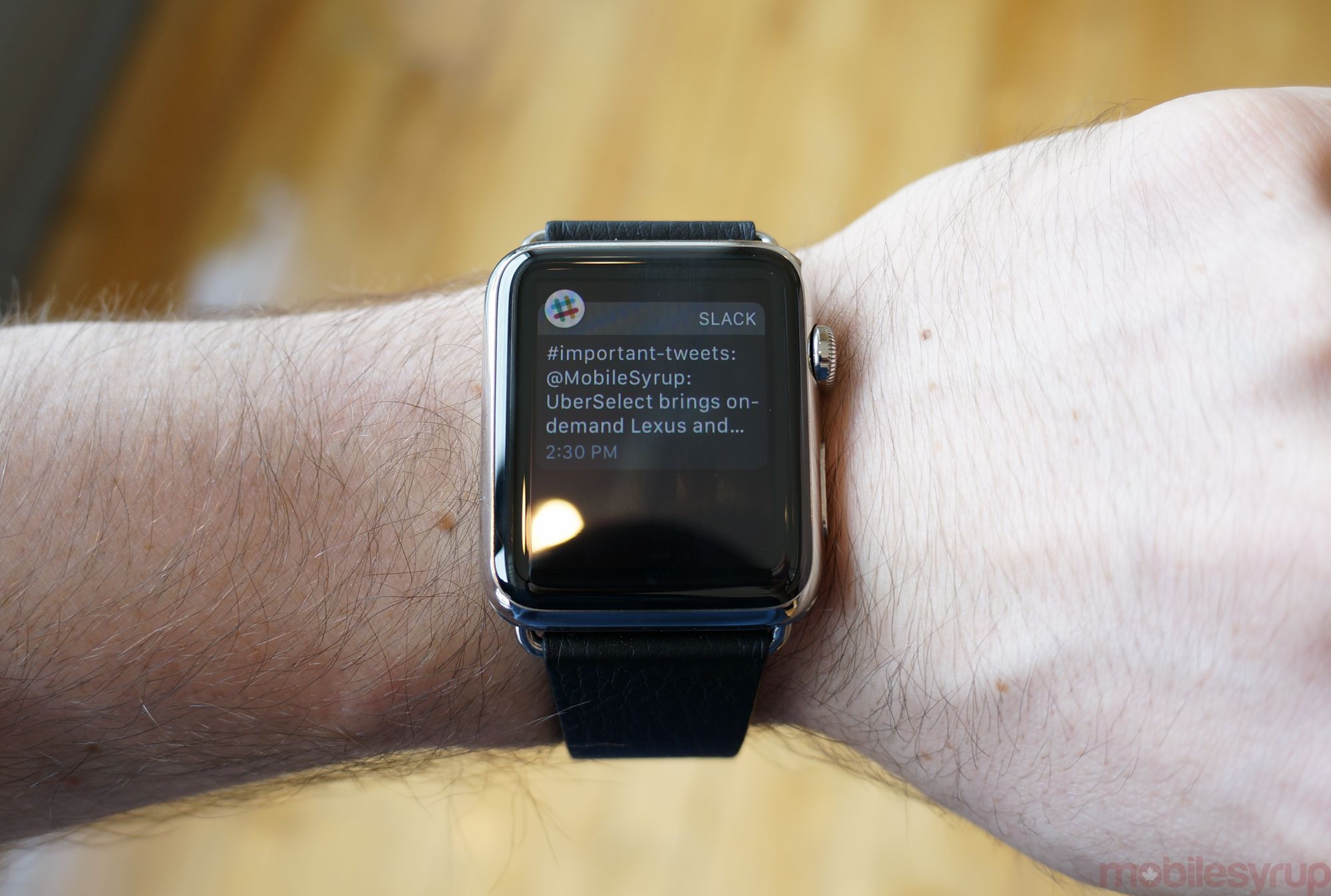
On Thursday, I have a bunch of meetings in the morning and a conference in the afternoon. Let’s dive into notifications.
One of the primary interaction models with the Apple Watch, and perhaps the most important, is with notifications.
By default, the Watch mirrors every notification from a connected iPhone, and for someone like me, who has nearly 200 apps installed, that’s problematic. It’s also emblematic of the kind of personalization necessary to get the Watch to work “just right.”
While I’m fairly parsimonious with which apps I let notify me on my phone, I’ve become downright dictatorial on the Watch, and that realization came from weeks of receiving messages about things I couldn’t, and shouldn’t, interact with from my wrist. Indeed, I’d even recommend leaving emails to the phone and narrowing the types of notifications to instant messages, Twitter DMs and breaking news alerts.
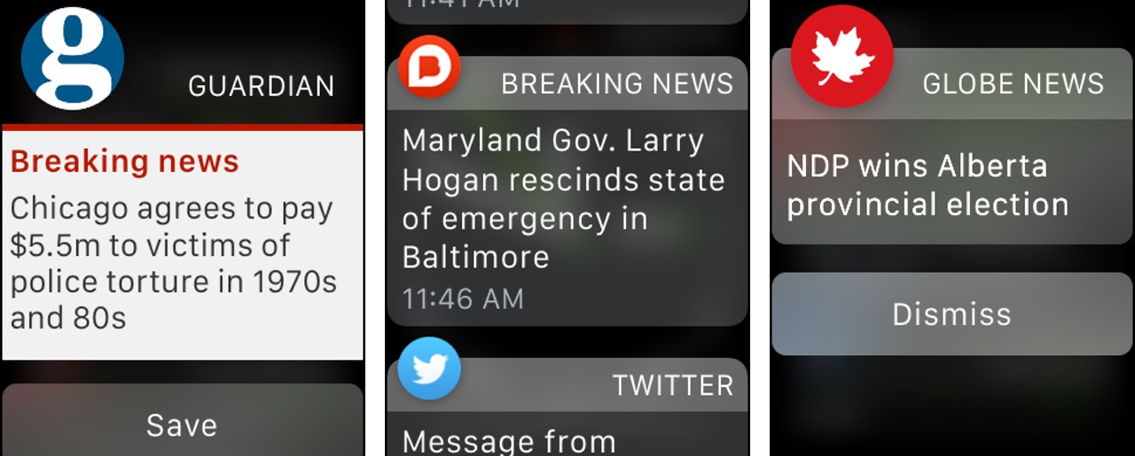
Apple’s handling of notifications is the best I’ve seen on any smartwatch, and really sets it apart from a Pebble or Android Wear device. First, notifications are sent to the active device, always preferring the wrist whenever possible. That means if you’ve set up an app to issue notifications to the Watch, it won’t mirror on the phone; but when the phone is on and in use, the notification will be sent only to the bigger screen, skipping the Watch completely.
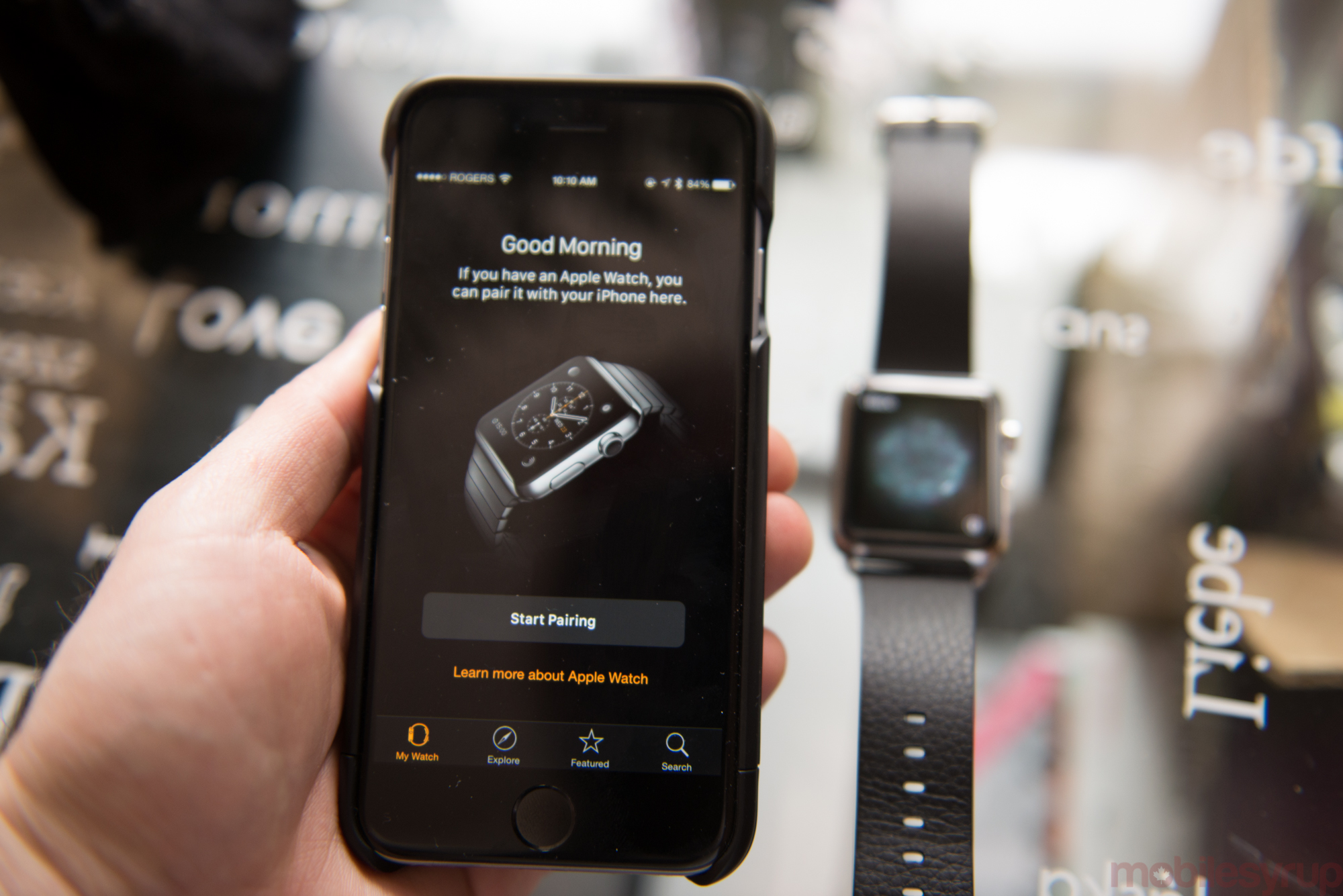
The Apple Watch app is where the magic happens, and while the granularity of specific features are not well-defined — per-address email notifications would be nice, for example — there’s still plenty to work with.
At the top level, users can allow or deny an app from forwarding notifications. If allowed, users can set, on a per-app basis, how an app notifies. Apple’s first-party apps get more leeway here: the Mail app, for example, can forward just emails from pre-set VIPs, or all emails from a certain account. The Calendar can be set to ignore incoming invitations, but show upcoming events. Third-party apps don’t get this level of control just yet, but many developers have started adding separate settings within their own iPhone apps to mete some control.
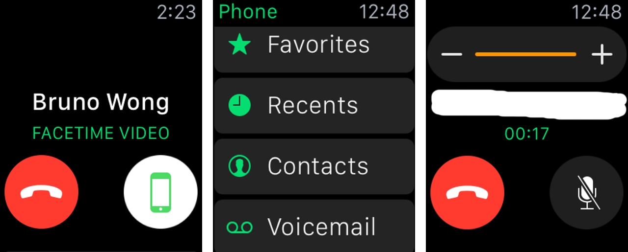
Some apps allow action to be taken directly from the notification, while others are merely unidirectional, informing the user without prompting for a response. My default third-party email client, Outlook, allows me to Archive, Delete, Schedule for Later or Mark as Read from my wrist, but I am unable to reply using even the barest of inputs.
Worse is that the reliance on the iPhone puts a strain on some of the resources available to the Watch. Apple has limited notifications to a set amount of text, so emails are cut off after a couple of lines, making it necessary to pull out one’s phone to finish the job. After turning off email notifications altogether, my Watch not only lasts longer through the day, but my workflow has improved considerably, since I trust that what is being sent to my wrist is directly actionable.
My main issue with notifications is that while they’re in many ways the primary purpose for using the Watch, much like any smartwatch, at the moment, most of my favourite instant messaging apps, like Google Hangouts and Facebook Messenger, don’t provide any way to reply. While Android Wear limits these interactions to voice – at least until the “emoji” update hits existing devices – it’s a better option than nothing at all. Especially since Siri on the Watch is so accurate, even in loud environments.
Friday – Glance This Way
On Friday, let’s discover the Apple Watch’s take on widgets.
Glances are another way to parse information quickly. Customizable from the Apple Watch app, most of Apple’s apps and many third-party equivalents come equipped with these single-screen snippets.
Accessible by swiping up from the clock screen, the problem with Glances right now is that they’re slow to load and often uninformative. As I wrote in a previous piece, I feel like they have the making of a platform for passive dissemination, similar to Google Now but not controlled from a central location, but right now Glances act as very slow, very stupid widgets.
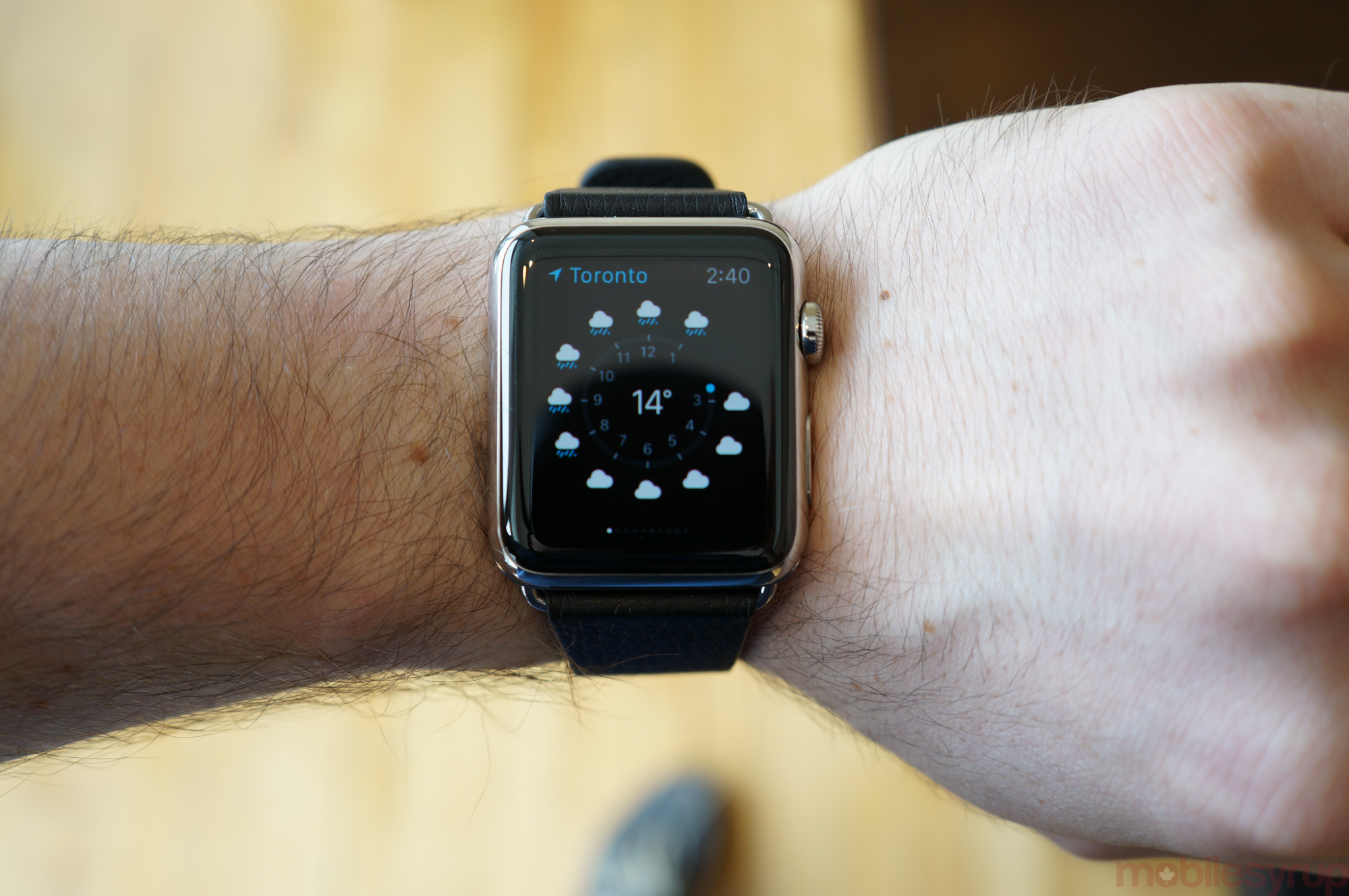
According to Apple’s developer guidelines, Glances can’t have any buttons or controls; they are merely app loading screens with a droplet of useful information. Tapping on the screen always enters the corresponding application. But Apple’s own Glances can and do have controls, and it’s easy to see how powerful these mini Control Centres will be once developers gain access to the same tools.
At the moment, the best Glances are the ones that load quickly and provide context. Transit App, for instance, uses the phone’s GPS to quickly locate you and provide departure times from the two closest transit stops. The New York Times provides a single headline from a top story, beckoning the user into the app with “+7 More Stories”.
Saturday – Application Nation
And here we get to Saturday, to the day of rest and relaxation. The day of apps. And there are, as of today, around 3,700 from which to choose.
Watch apps are extensions of their iPhone counterparts, and currently cannot work independently. The Watch app merely installs a frame from which to call data from the phone, and the phone then responds to requests over Bluetooth.
Whether it was because app developers didn’t have access to hardware or because Bluetooth is inherently slow, most Watch apps are excruciatingly slow to load. In fact, many of them fail to load before the Watch screen times out after six seconds, necessitating a press of the Digital Crown to reload the screen.
Many apps, once they do load, are useless, attempting to recreate a phone experience on the Watch. This is a bad idea.
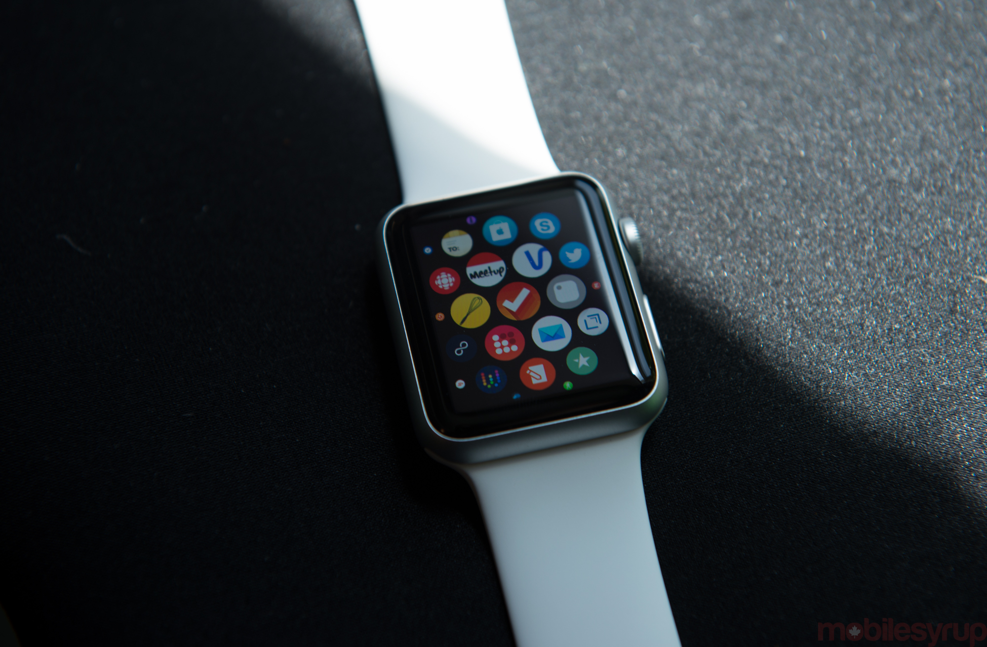
Apple has designed the app drawer like a constellation, a way to quickly dive into and out of experiences without alienating the core use case of telling the time. Not only does that explain why the app drawer is not the default view when you lift your wrist, but the time view is actually the central app within the constellation, always calling back to the Watch’s primary purpose.
The best apps right now are the ones that load quickly and provide immediate value. I once again point to Transit App and the New York Times, because they both do a good job fulfilling that need. The former loads a screen inspired by its iPhone app, but pares down the functionality to two or three important functions: “Take me home”, “Go to a favourite location,” or “Go in this direction, based on my GPS.”
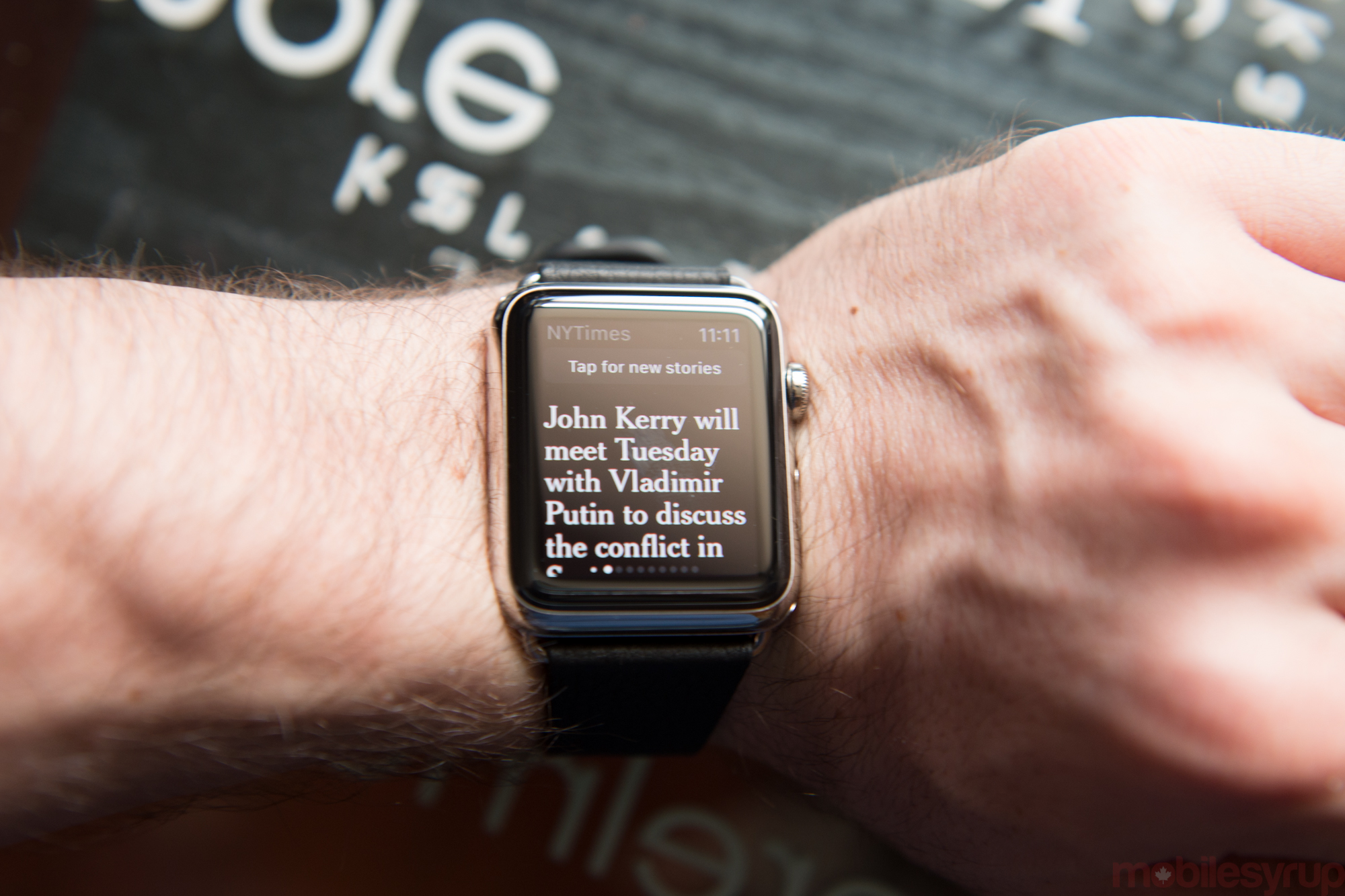
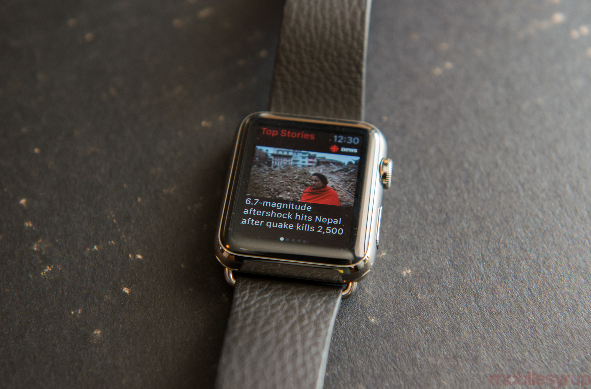
Conversely, the New York Times has assigned a dedicated editorial team to creating short stories specifically for the Watch. Skeptical at first, I’ve thoroughly enjoyed periodically checking the app and using Handoff to continue reading on my iPhone. The Globe and Mail, Circa, Guardian and others do this as well, but the NYTimes does it best.
Shazam, an app that feels tailor-made for a smartwatch, works beautifully on the Apple Watch. It loads quickly, scans accurately, and conveys song info in an intuitive way. And it’s an experience you can only get on an Apple Watch right now.
All third party apps are currently subject to the limitations of WatchKit, but Apple’s aren’t, and like Glances they show what the future of Watch apps will look like. Being able to make phone calls, for example, should be an absurd combination of anachronistic Dick Tracy-isms, but in the right context – and thanks to a decent speaker and very good microphones – the feature works.
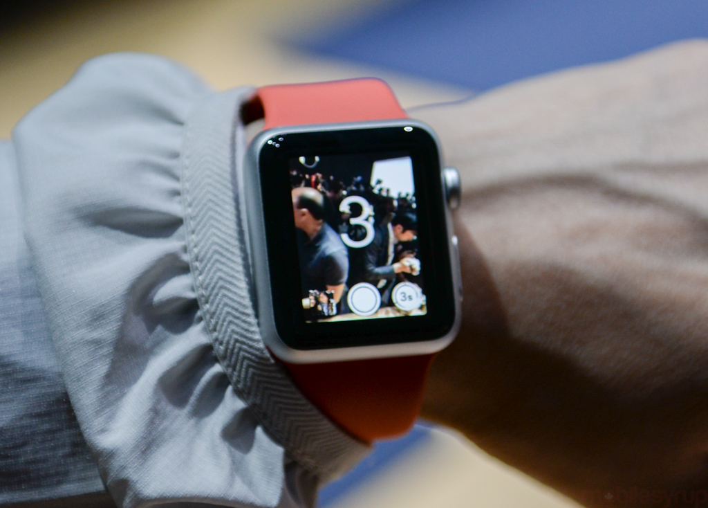
The remote camera feature also works incredibly well, and with a tripod or stand can actually be used to correctly frame and capture a group photo. Here, Apple’s implementation may not be original – Android Wear supports it, too, as does Samsung’s Gear series – but it is by far the best, owing to a higher-density screen and cleaner user interface.
—
The Apple Watch app situation is far from ideal. Apple made the mistake of marketing the wearable as having several thousand mature, capable app experiences ready for use on day one, but the reality is that only a handful are truly useful, and many developers rushing to add Watch compatibility did so not because it added value, but because they wanted to be among the developers featured in Apple’s redesigned App Store.
The speed at which these apps load also necessitated a change in how I interact with them. Instead of opening the app and waiting the duration, I set my wrist back down, perform another action or two – move my glass, unlock my door – and come back to it. It’s clearly not Apple’s intended interaction method, but it works in this context, if you’re satisfied fitting the glance, the content, into whatever else you’re doing. And because the Watch, or any smartwatch, is by definition a primary receptor but a secondary interactor, this workflow suits me well.
The Week With Apple Watch
The Apple Watch is the best smart wearable currently available, and that is with acknowledging, not ignoring, its faults. And there are many faults.
It’s the hardware that does it for me. There’s a precision and craftsmanship to even the least expensive Watch that isn’t present on any other smart wearable. The Moto 360 comes close, but it’s a sliding scale. And despite the various issues with first-party apps, the Watch feels like it is more of a platform than Android Wear or Pebble, even at this early juncture. Just look at the number of developers already falling over themselves to create Watch apps; Apple has loyalty of developers in ways that Google never will.
In truth, both the Apple Watch and Android Wear are barely competing; both require smartphones of their respective platform to function, and while Android may be a bit further along in the process of untethering, the Apple Watch is less a smart wearable than an iPhone companion. That’s fine, because it does a great job at it.
More importantly, the Watch is a stunning timepiece, something that I feel comfortable wearing to any event. Apple’s investment in bands as a platform means that, hopefully, as the Watch gets thinner, the straps will still fit. And as the software gets better, hopefully the first generation version won’t get left behind.
That’s really my only lingering concern; at $199 or so, I wouldn’t be so nervous to buy a first-generation product and see it off into obsolescence in a couple of years. But Canadians investing $449 to $519 for the entry-level Watch Sport, or $699 to $779 for the equivalent Apple Watch want to know that their investment is going to last – just like that 1968 Omega Constellation, just like that heirloom.
Pros
- Beautifully designed
- High-quality, high-density OLED display
- Digital Crown is an awesome way to scroll on a smartwatch
- Excellent strap selection
- Aluminum on Watch Sport feels high quality
- Stainless steel on Watch finished beautifully
- Taptic Engine feels more organic than regular vibration engine
- Developer support unparalleled
- Excellent battery life
- Digital Touch features fun and easy to learn
- Actionable notifications work very well
- Some third-party apps well-designed and extremely useful
- Nicely-designed analog watch faces with plenty of customization
Cons
- Entry-level unit expensive
- Some third-party apps useless
- WatchKit feels unfinished and too limited
- Glances often slow to load
- Screen timeout too quick, not customizable
- Digital watch faces too limited, no third-party alternatives
- Complications are not accessible to developers
MobileSyrup may earn a commission from purchases made via our links, which helps fund the journalism we provide free on our website. These links do not influence our editorial content. Support us here.


