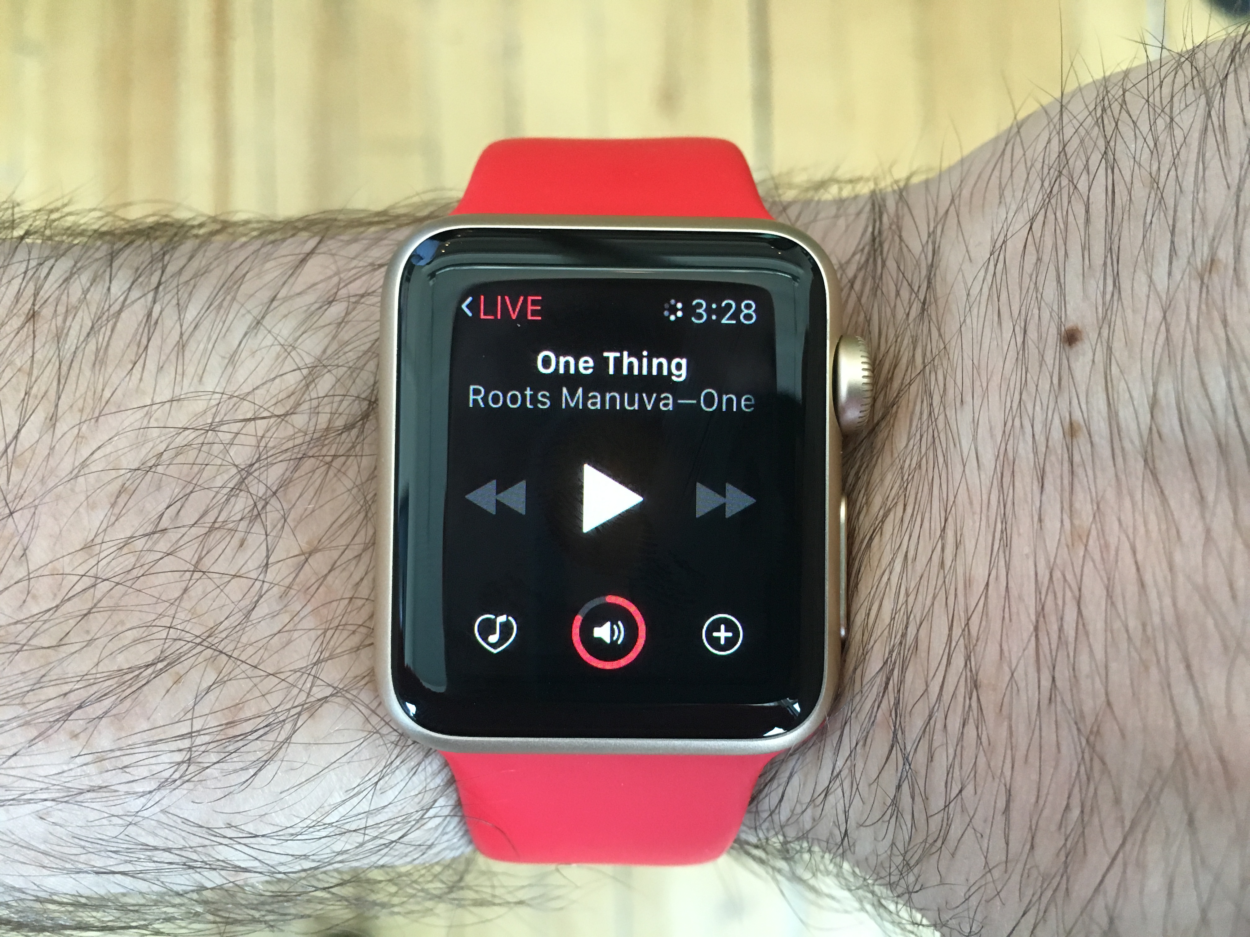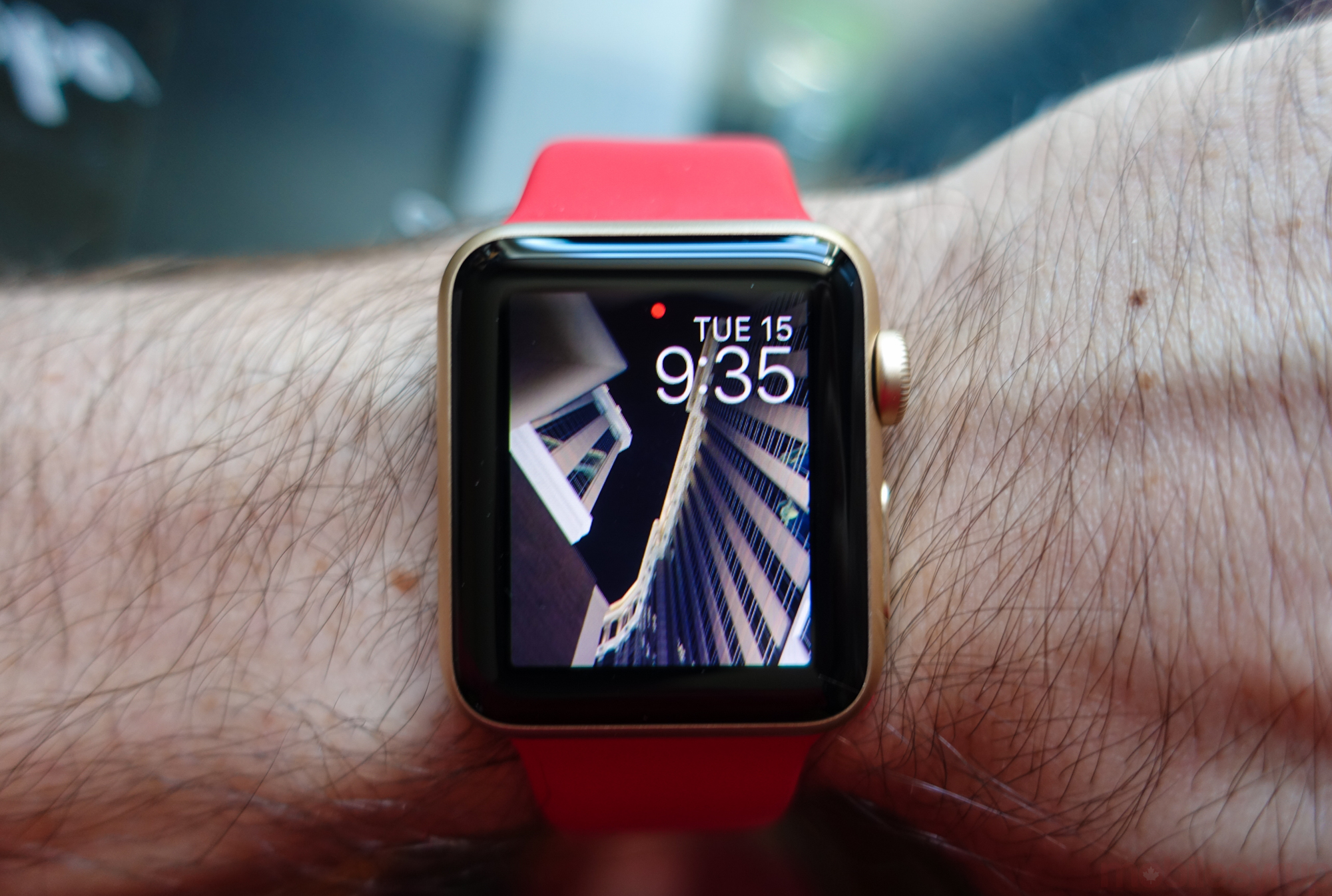
Wearables don’t typically last long on my wrist. Be it a Fitbit or Pebble, after wearing one a dozen times I’ll forget to bring it with me when leaving the house, and that watch or health monitor will stay in my office until it runs out of batteries. Neither the context gleaned from the health data, nor the impenetrable user experience, keeps me enthralled enough to keep wearing it.
With the Apple Watch that hasn’t happened. Every time I have an iPhone in my pocket I have an Apple Watch on my wrist. And it’s because Apple made truly thoughtful decisions about how one tends to, and should, use a smart wearable.
But the Apple Watch had a lot of problems from day one, especially when it came to its growing app ecosystem. Performance was slow, if the app decided to open at all, and developers hadn’t quite grasped the best way to build for the burgeoning watchOS platform.
With watchOS 2, available today, Apple has tackled two of the Watch’s main limitations directly, native apps and third-party complications, while filing down some of the rougher edges that shipped with version one. What it doesn’t do is make the Apple Watch, or any smartwatch, indispensable. But if you’ve been holding off buying an Apple Watch for one reason or another, this update should make you reconsider.
The new bands
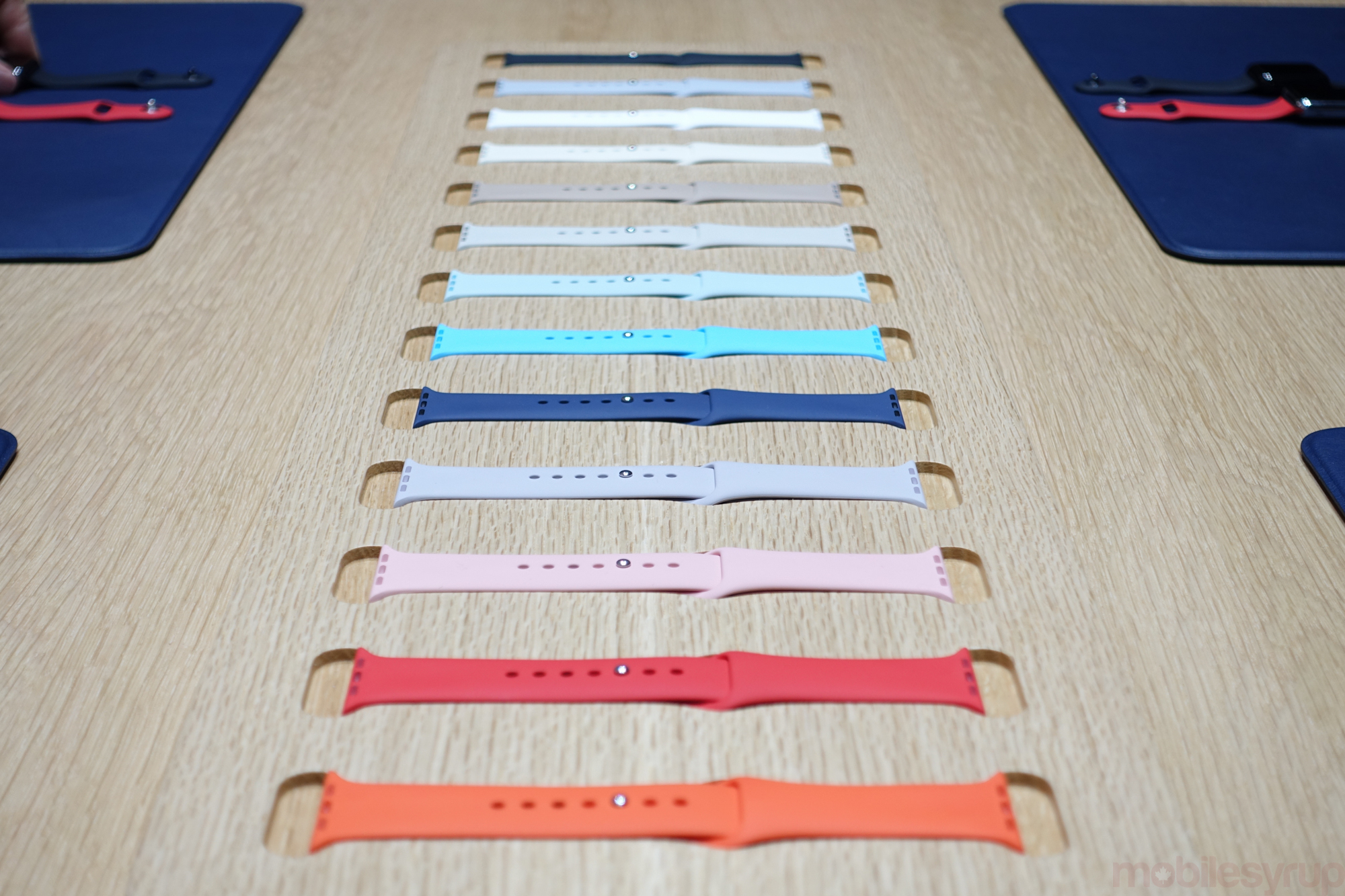
watchOS 2 isn’t Apple’s sole announcement to do with its wearable; the company unveiled two new case colours, gold and rose gold, along with myriad fluoroelastomer straps and a couple of new combinations of case and strap in the regular Apple Watch line.
It’s unusual for Apple to release new accessories, especially of this number and variety, mid-way through a release cycle, but it appears that the Watch may last more than a year in its current form. The new case colours, while feminine, are not overtly aimed at women, and after wearing the 38mm gold Watch Sport with a Product Red sport strap I became enamoured with the subtlety of its anodization. It’s not what I would choose to wear every day, but being the first yellow gold watch, or any piece of jewelry, I’ve ever worn, I was surprised by how tasteful it looked.
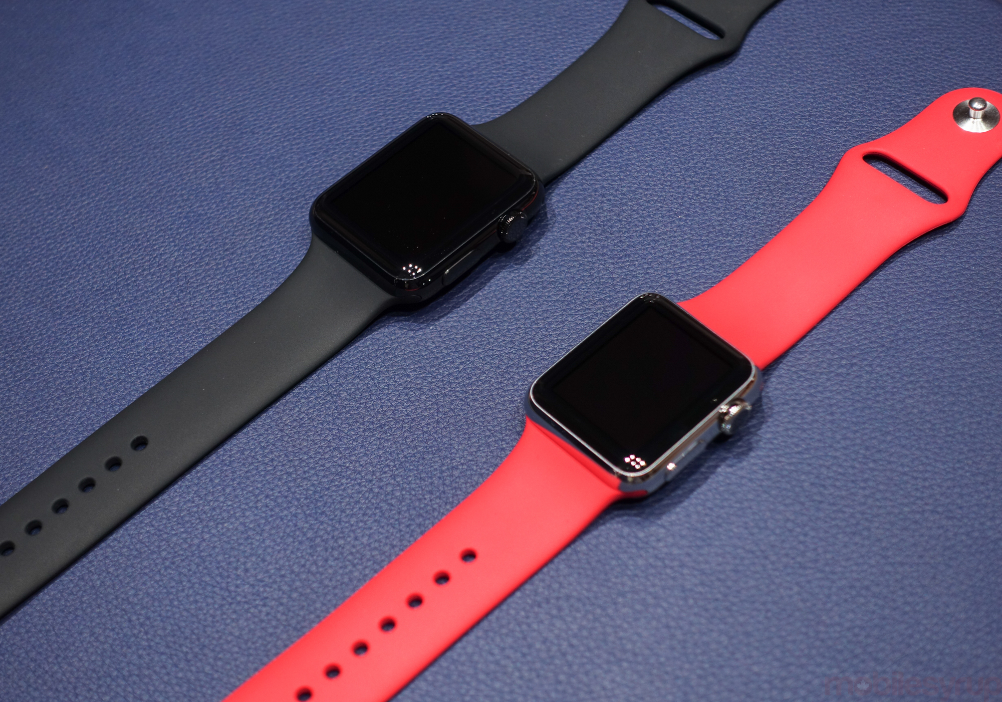
A piece of wearable technology succeeds only when it can blend in with its surroundings. By giving Watch users an abundance of choice Apple has not only created an ecosystem of aspirational intent — there’s always one more band or style to complete the proverbial set — but expanded the palette of what a smartwatch looks like. Other OEMs like Motorola have attempted to do the same thing, but Apple boasts a much more mature network of retail distribution, advertising and celebrity support. Those elements can’t be overstated when it comes to something as personal as a watch, even if it is “just” a piece of technology.
Over the past few months, I’ve met a number of Apple Watch users whose love for the product is matched only by their overt criticism of its various parts. What they love is its completeness: despite being a new product and a brand new operating system, its various facets fit together so well. From the multitudinous physical manifestations of the watch itself to the customization of the software, and the apps that inevitably came and failed to impress, they (and I) are impressed by Apple’s sheer ambition with the product.
And with watchOS 2, Apple fills in its biggest blanks yet.
Native apps and third-party complications
Likely the most public misstep of the Watch’s initial six months, that it didn’t support native apps and third-party complications meant it didn’t live up to its promise as a secondary conduit for data-rich experiences. In lieu of an iPhone, the Watch should suffice, in small doses and for modest lengths. But because the iPhone held all of the actual assets, conveying them to the Watch over Bluetooth whenever an app was launched, its very existence — indeed, whether the app would load at all — was at the mercy of a wireless standard Apple did not control.
Developers released apps for the Watch, and they watched them be discarded by users frustrated with long load times, poor designs and inconsistent experiences. Over time, the latter two points were largely fixed as companies realized what people wanted and didn’t want from a small touchscreen with a scroll wheel. But the long load times remained, often causing the screen to time out and go black before the app even loaded.
Two things happened to mend this issue in the past three months: Apple released iOS 9 in beta, and it began working with developers on optimizing app loading times. This all came before watchOS 2 was widely distributed, but it helped developers learn which assets to push in order to avoid the maligned infinite spinning cog.
Even before watchOS 2 was released, and prior to getting my hands on the first native experience on Apple Watch, app loading times declined to the point where they weren’t an issue. A couple of seconds at most. While it was little reported, likely because most users had disregarded the software floating in the deep black constellation, it prepped users for what was to come.
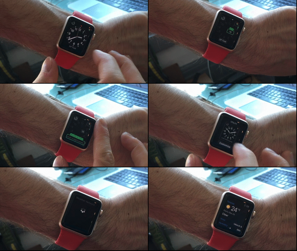
I only had a chance to use one native app prior to watchOS 2’s public launch, but what I saw was encouraging. Pelmorex sent me a version of The Weather Network to test, and after installing the update the app launched in under a second on my Watch running watchOS 2 Gold Master. Not only that, but it the screen was responsive almost immediately after loading, something that was not the case in the original release.
This may not seem like an awfully big deal, but it is: once a considerable number of apps have been updated to native, living on the Watch’s 4GB of space, users may actually choose to open the wearable equivalent instead of pulling out their iPhones. Time-sensitive apps like Transit and Outlook may be worth perusing.
Third-party complications have even more potential in that regard. Again, the only one I was able to try was The Weather Network’s, which mimicked Apple’s own Weather complication almost entirely, but in a year being able to launch apps from the watch face is going to be one of those table stakes features one won’t remember being able to live without.
New watch faces
A lot of people expected custom watch faces with watchOS 2. Instead, Apple gave them three new ones, all centred around the idea of images.
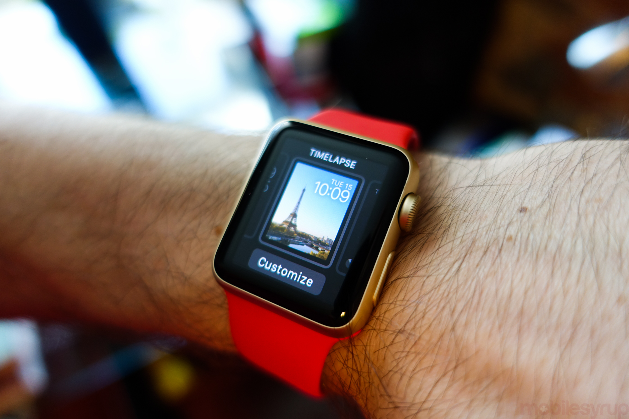
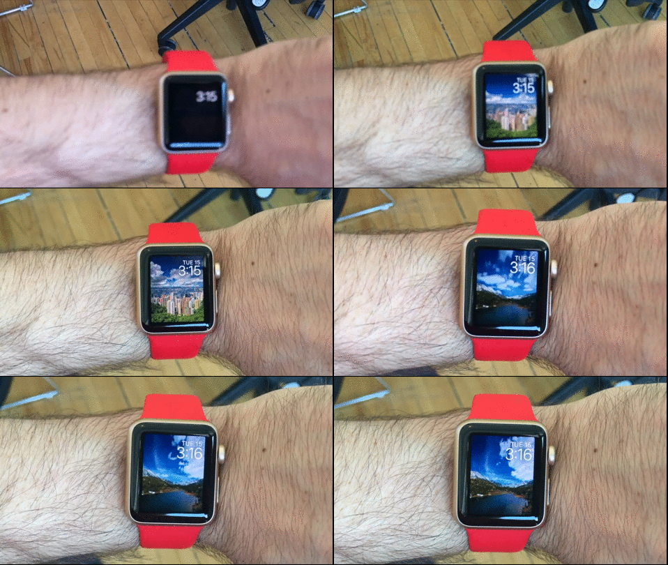
The new Time-Lapse face is notable for how it highlights the Watch’s stunning AMOLED display, the screen’s small size makes the admittedly picturesque cityscapes all look a bit homogenous. Better is Mack Lake, with its snow-capped mountains and turquoise blue water.
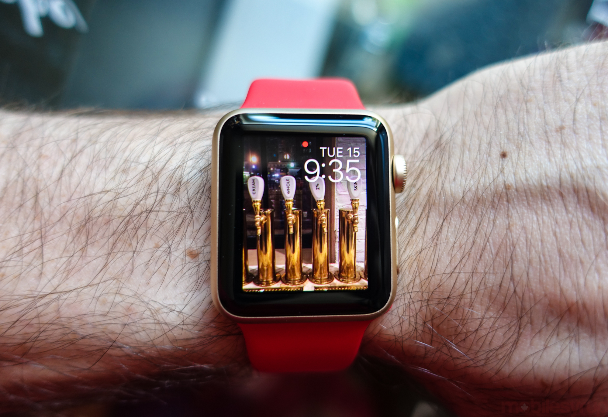
Photo and Photo Album, consisting of a single image or multiple images synced from the iPhone, are similarly free of information — Apple doesn’t want complications blocking your favourite pictures — but they’re much more desirable to me, personally. The ability to have a different image show up each time I raise my wrist is something I love about Android Wear’s flexible custom watch faces, so having an equivalent here, albeit one that is heavily restricted in its functionality, is appreciated.
What watchOS 2’s three new faces prove is that Apple is willing to meet its user base most of the way, but consistently chooses not to give its users the benefit of the doubt when it comes to marrying design and function. And based on most custom watch faces on Android Wear and Pebble, I don’t blame them.
Time Machine
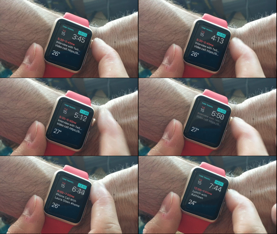
A seemingly obvious feature, Time Machine utilizes the previously unexplored UX combination of the watch face and the Digital Crown to move through the minutes and hours in a day.
For watch faces with lots of time-sensitive complications such as weather and calendar entries, Time Machine is useful for glancing at the future, or recalling the past, without having to open an app. Simple and easy, but not particularly notable.
Transit in Maps
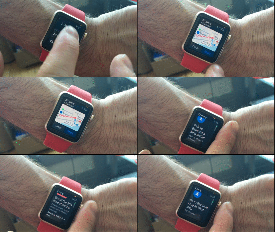
Along with receiving notifications, checking the weather and accessing Siri, the action for which I use Apple Watch most is looking up transit information. I always seem to be two minutes away from the next streetcar or bus, and the Watch’s native Maps app has been tantalizingly close to being useful to someone like me.
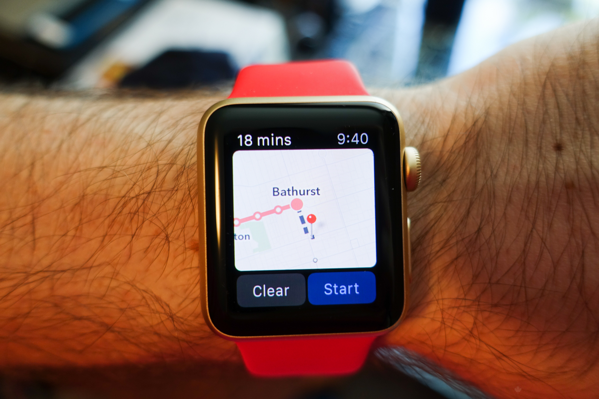
With watchOS 2 and iOS 9, transit directions meets an improved version of Maps for Watch to provide transit directions that are brilliantly laid out, quick-loading, and accurate. I roamed Toronto for a week using Apple Maps as my primary mode of transit reference, and it didn’t once let me down.
The New Messenger
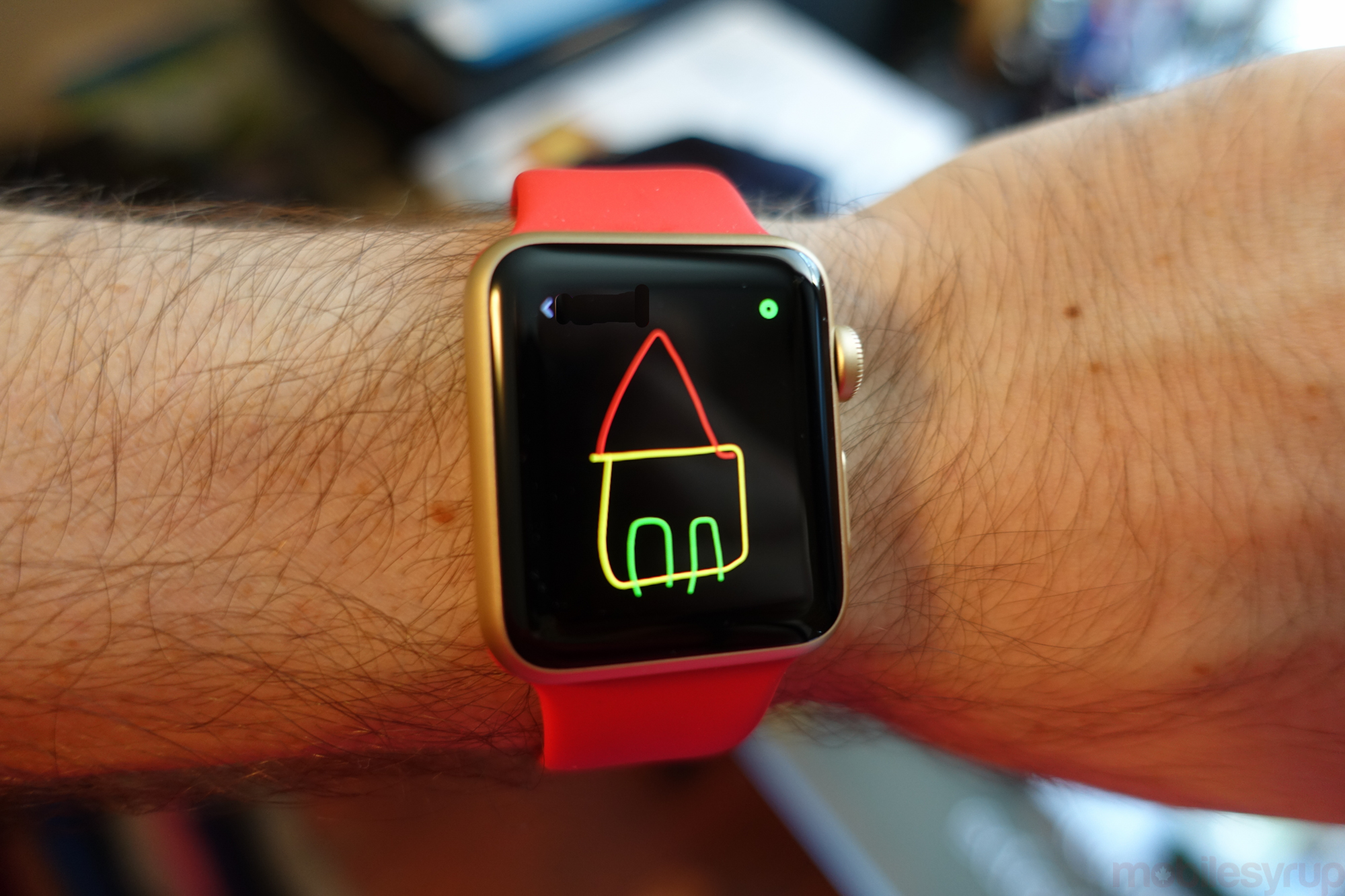
I don’t think scrawling little doodles to one’s friends using the Apple Watch’s micro-display is ever going to replace iMessage or Facebook Messenger, but I do think there’s room for the feature to grow into a bit of a playful platform.
watchOS 2 brings that closer to a reality with the ability to add new friends from the Watch itself, and to send those aforementioned doodles in more than one colour. This innocuous-sounding improvement actually does a number of things to improve the Digital Touch experience: it opens up the possibilities of colour-based codes to senders and receivers, and it gives users more time to think through their visual prose.
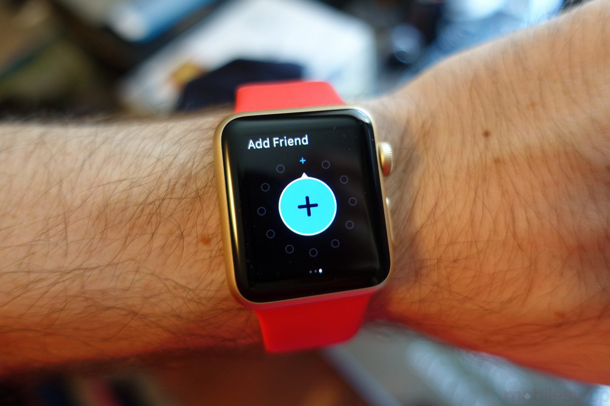
The ephemeral nature of Digital Touches is still present, but with an expanded palette and an expanded list of friends (some of whom are new Watch owners), I may actually use the feature more than once a week.
Core Siri
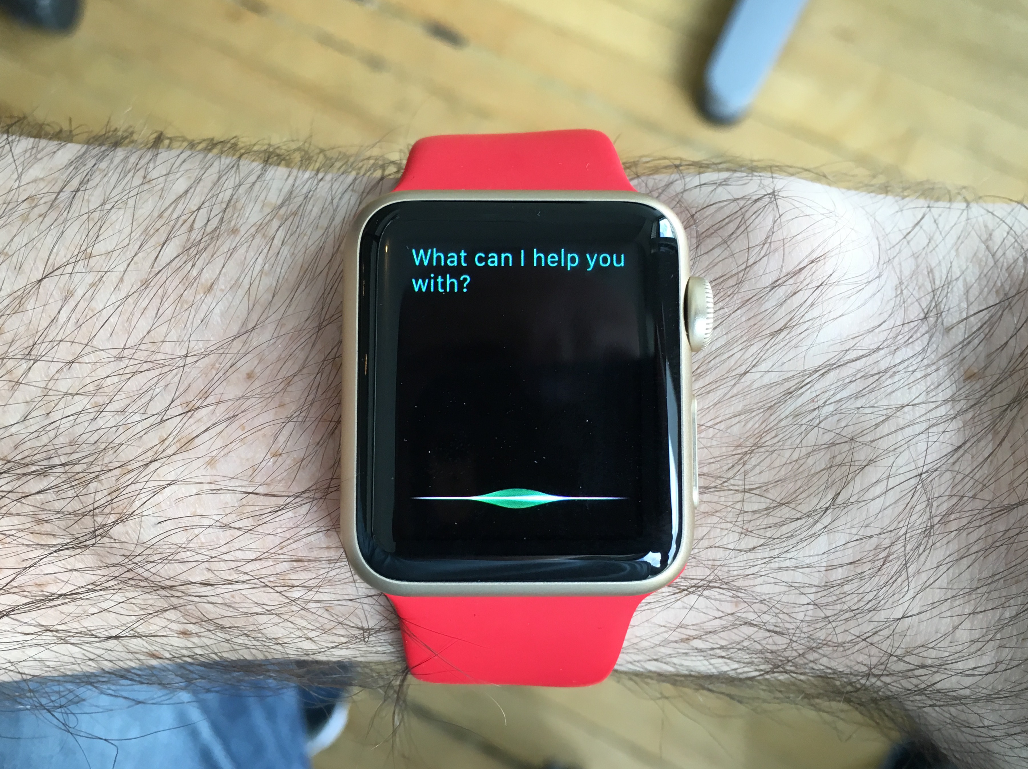
Likely the biggest change to the Apple Watch with watchOS 2 comes from improvements made to Siri. It’s not always intuitive tapping, scrolling or using the Digital Crown when a few words will suffice, and Apple’s voice assistant, which was already quite fast on the Watch, is now worth chatting with every day.
Part of it is that Siri is more intelligent — she has more plugs into watchOS and iOS 9 — but perhaps more important is that her understanding of syntax, and its accompanying processing speed, has been hugely improved. To date this has been a core advantage of Microsoft’s Cortana over Apple’s counterpart, but Siri appears to be learning very quickly how to decipher the meandering phrasing of an average Canadian.
These days I, and many others I’m sure, ask Siri about the Blue Jays score. I’ve taken to phrasing it, “What’s the Jays score,” which for some time was interpreted as “What’s the J score,” as I tend to swallow my “S’s”. A few days of training has taught the Watch and Siri to assume I mean “Jays” every time. It’s not SkyNet, but there’s some learning happening in this machine.
Siri and Watch are intertwined; you can’t use it to its fullest potential without her. And while there are situations where talking Dick Tracy-style at your wrist is going to be construed the wrong way, the microphone is sensitive enough to pick up even the lightest of phrases in the loudest of environments. It’s not always perfect, but it’s clear that Apple has invested more into Siri’s infrastructure in the past year than it did in the three years following its 2011 announcement.
FaceTime Audio
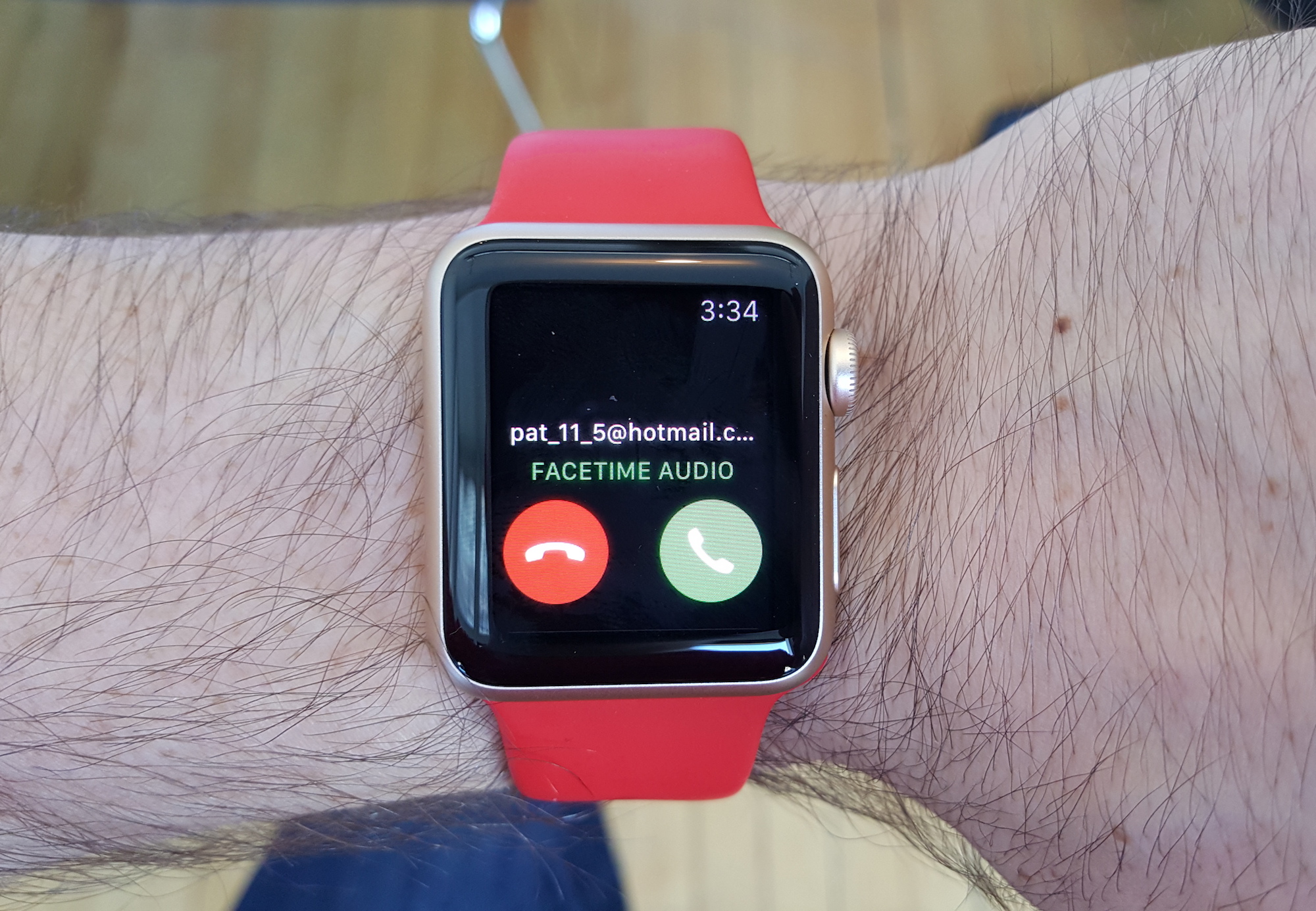
Answering a phone call on the Watch may never be a particularly common feature — the speaker is pretty weak, and in public areas it takes that 60’s spy motif a little too far — but I’ve often found it useful when running around the apartment, phone nearby but not on me, while cleaning or doing the dishes.
With watchOS 2, FaceTime Audio calls are now routed through the Watch, but the crummy call quality of a 3G call routed through a Bluetooth signal has now given way to wider-band VoIP transferred over Bluetooth or WiFi if the associated iPhone is connected to a known WiFi network. And while taking a FaceTime Audio call on the Watch does allay the aesthetic concerns of looking like a doofus, the improved clarity is a significant reason why I think more people will be likely to accept these types of calls on their Watch going forward.
Nightstand Mode
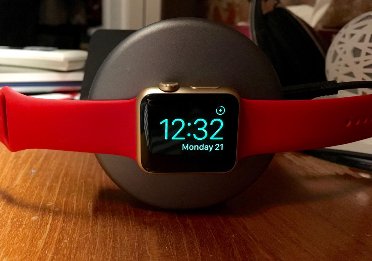
A small but appreciated feature of watchOS 2 is Nightstand Mode, which is automatically triggered when the Watch is plugged in and laid on its side.
The beauty of Nightstand Mode is in its simplicity: unlike other smartwatches like the Moto 360, which shine brightly the entire night when charging, the Apple Watch’s OLED screen stays off until around an hour before your alarm is set to go off, at which time its brightness creeps up. At any time throughout the night you can merely tap the Apple Watch to turn on its screen to check the time.
The Watch Today
Apple Watch is still an accessory for iPhone users. With watchOS 2 it hasn’t become more independent, or at least not demonstrably so, but that’s the point. Whenever someone looks at my wrist and asks me, “Is that an Apple Watch? (Yup) Should I buy one?” I say, well, I really like it. I really, really like it.
What follows is a series of questions about what I do with it. Where is its value derived? I say that the key ingredient is notifications, which are better on the Apple Watch than any other smartwatch to date. I say that the Glances are interesting but need work, and if they’re technical I explain how watchOS 2 supports native apps and should make loading Glances much faster. I say that the Watch looks like a real watch, and feels really comfortable to wear all day. That the battery always lasts the day, and sometimes two, even on the 38 millimetre version with a smaller battery.
I tell them that it’s not cheap, and that there are cheaper options out there like the Pebble Time and Moto 360. But I also say that if you’re an avid iPhone user you’re probably going to want to spend the extra hundred dollars or so on the Apple Watch, because watchOS will be improved lock-step with the iPhone. And because once smartwatches graduate past the notification triage workflows for which today they’re so ably tuned, the Apple Watch will continue to be the best choice for iPhone users, since Apple develops both.
I tell them and I’ll tell you: Apple Watch isn’t for everyone, but it quickly becomes indispensable for those that have one.
watchOS 2 is available today for the Apple Watch. To update, go to the Apple Watch app on your iPhone, tap General and Software Update.
MobileSyrup may earn a commission from purchases made via our links, which helps fund the journalism we provide free on our website. These links do not influence our editorial content. Support us here.

