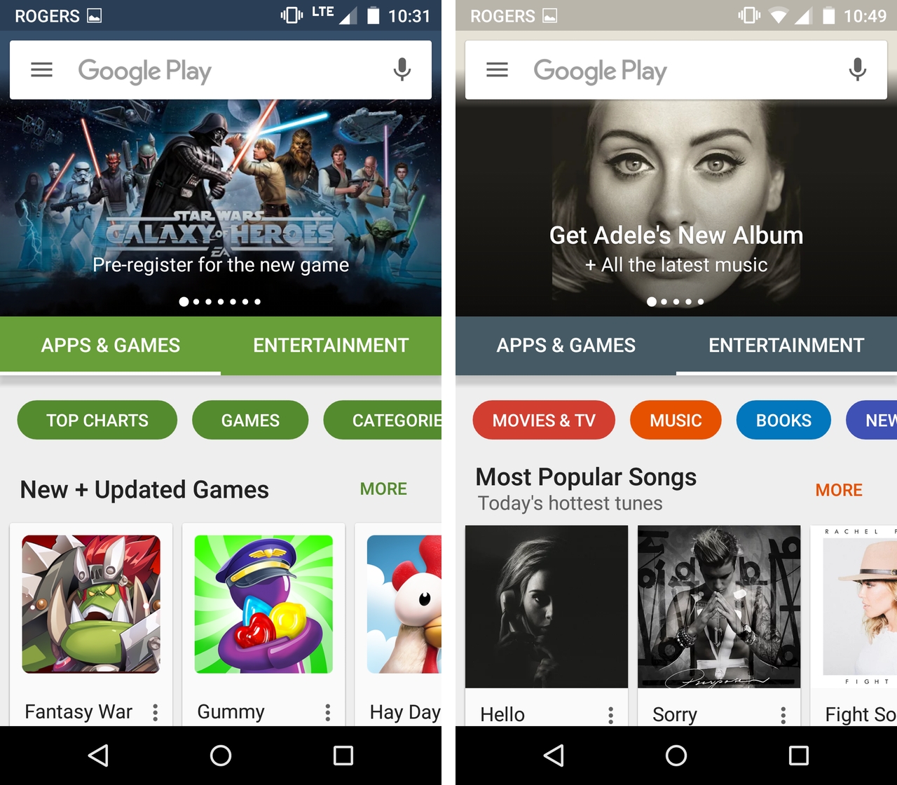
It was partway through last month that we first got a sneak peak at the new Google Play Store interface. Without much fanfare, Google has begun granting more Android users access to the redesigned app marketplace.
Like so many Google launches, this one is a gradual rollout. My colleague Daniel Bader was able to start poking around the redesign late last week, while I only gained access to it early this morning.
In any case, once you have access to the redesign you’ll be greeted by a new intro screen that explains how it’s easier to switch between browsing through apps, games and entertainment downloads like movies, music and e-books. In practice, Google has accomplished this by adding two tabs on the Play Store’s launch screen that let the user switch between those two sections of its online marketplace — the slide out menu also allows the user to accomplish this same feat even faster and from any section of the store.
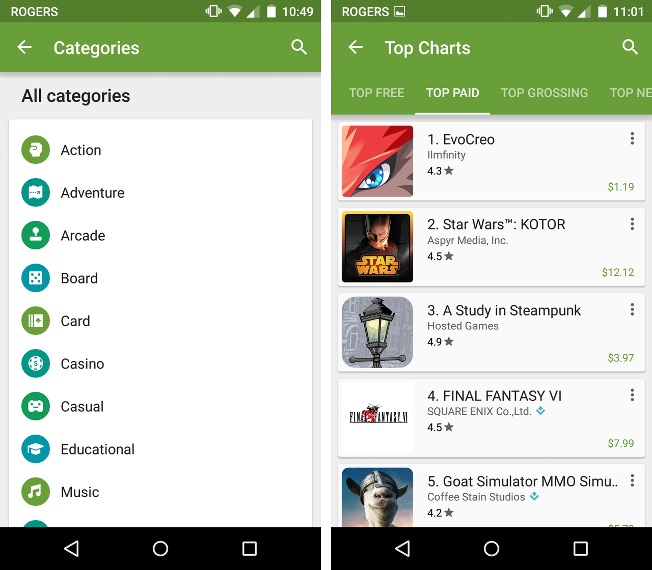
The more useful addition here are new floating buttons that let the user dig deep into different categories of apps and genres of music, movies and books (anyone that has used Bandcamp’s excellent mobile app will be at home with this new interface). As seen in the screenshot above, it’s possible to navigate a specific section of the Play Store, hit the categories button and then look at the top charts for that specific subcategory of apps or games.
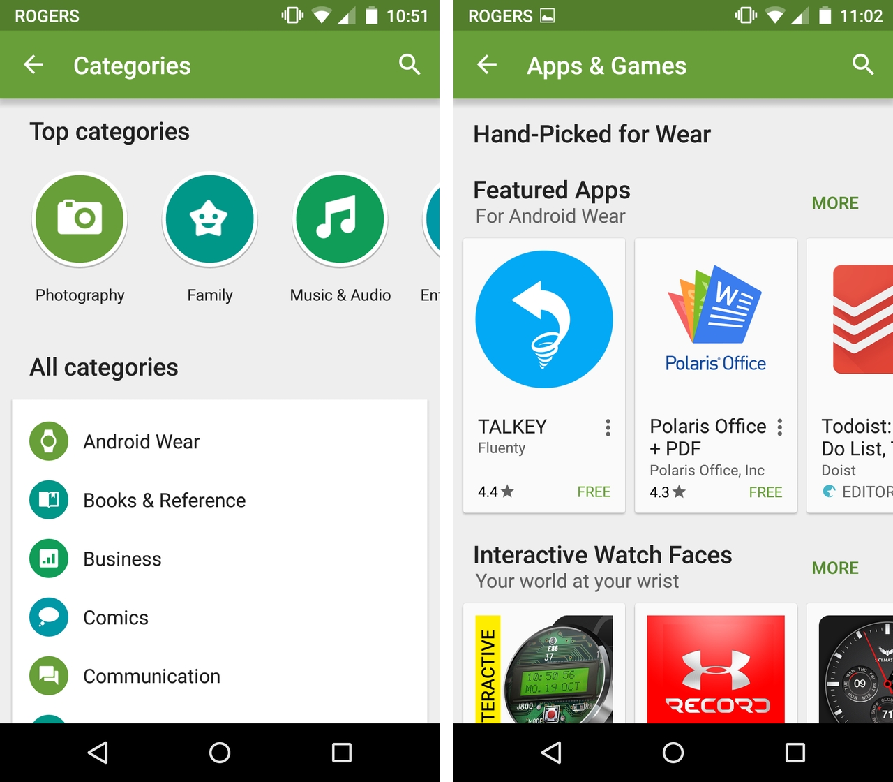
This functionality is well presented in the redesign — the alternating blue and green icons are a nice touch — though, from my point of view there’s one major issue with the current implementation. Digging through the Play Store in the way I talk about above will lead you to a different set of screens depending on what type of apps you’re interested in downloading.
Look through the RPG section as I did in the screenshot above and you’ll be led to that subcategory’s top charts. By contrast, do the same for one of the top categories and you’re presented with a more curated selection of apps — with the option to then take a look at the top charts for that specific category.
Personally, I’ve rarely found a list of an app store’s top paid apps useful for discovering new things to download; Google’s continued reticence to add more human curation to its app marketplace is both a shame and a wasted opportunity.
In fact, I think that’s how you can summarize this redesign: overall, the new interface is nice and easy on the eyes, though it does little to solve the Play Store’s longstanding discoverability issues.
MobileSyrup may earn a commission from purchases made via our links, which helps fund the journalism we provide free on our website. These links do not influence our editorial content. Support us here.


