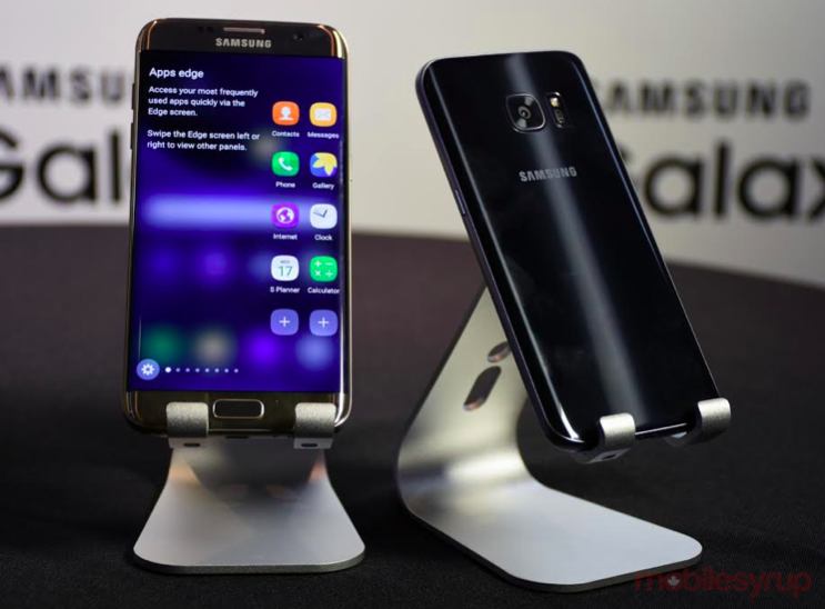
And then there were two.
Contrary to some rumours suggesting Samsung would be releasing a triad of new smartphones, the company has narrowed it down to a duo in the Galaxy S7 and Galaxy S7 edge.
Video S7 and S7 edge hands-on by Patrick O’Rourke
Coinciding with its now predictable launch schedule for new devices at Mobile World Congress in Barcelona, the Galaxy S7 and S7 edge will be the new flagships, borrowing heavily from their predecessors. Rethinking the design of the vaunted Galaxy S line culminated in a glass-and-metal combination that put the Galaxy S6 and S6 edge in premium territory. No longer would there be snarky put-downs about plastic and shoddy durability, which seemed to be the prevailing mantra.
With that, it is perhaps unsurprising that Samsung didn’t mess with what was a more palatable and luxurious look. It also clearly believes in the edged display. Having doubled down last year with two models (three, if you count the Galaxy Note Edge), the extra $100 it cost to swipe from those edges seemed a hefty price to pay, given the limited functionality provided.
These are, among others, reasons to conclude that Samsung took a highly incremental approach throughout with the Galaxy S7 and S7 edge — from the design language on the outside, the bits and pieces under the hood and the software layout users will look at. Nothing seems to have been left to chance. And yet, specific improvements in key areas may prove to reap significant rewards.
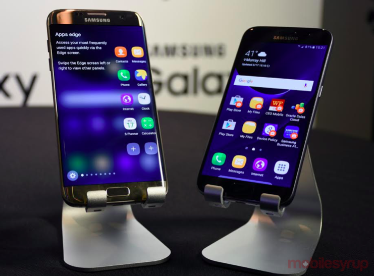
Galaxy S7
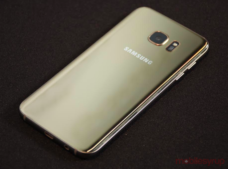
Samsung smartly opted not to go all-in on edged displays by continuing the traditional mainstream design inherent in the Galaxy S7. The materials are unchanged, too. The metal frame still shimmers, maintaining the durable feel that was so welcome last year. The glass back is also, well, back again, and is an unapologetic fingerprint magnet, much like it was prior.
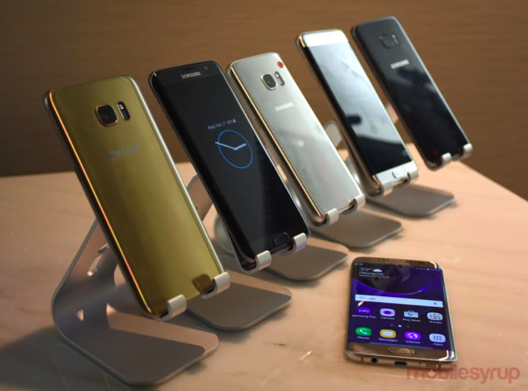
Colours have also become chromatic tones in every which way. Curiously, Samsung has abandoned both white and the iconic blue that have each anchored the Galaxy S line from the beginning. Instead, gold, silver and matte black are the new schemes the company is going with.
While an Exynos processor is slated for other markets, Samsung is going back to Qualcomm and its Snapdragon 820 chip for the Galaxy S7 and S7 edge. Going fully in-house last year made headlines, with Samsung reportedly concerned over the Snapdragon 810’s penchant for overheating. Though only the U.S. was confirmed at the outset, it is all but assured that Canada will get the same treatment.
No benchmarks or clock speeds were provided, other than the company’s claims that the CPU is 30% faster and the GPU gets a 64% bump in performance as well. Indeed, gaming appears to be a thing for Samsung this time around. Developers will have access to the Vulkan API, while users will have a dedicated game launcher accessible from any game being played. Interestingly, framerate throttling, from 60fps to 30fps, will also be elective as a means to save some battery life. The company claims the difference will be negligible, but I suspect more serious gamers will tend to disagree. There will also be an option to record gameplay directly, including a “do not disturb” function so that incoming calls appear as overlay notifications instead of pausing and taking over from the game.
The Galaxy S7 uses the same exact Quad HD display as last year, including the 5.1-inch size, so nothing really changes there.
The company may fall back in favour with some users with the return of the microSD card slot that was so unceremoniously dumped last year. Officially, it can support up to 200GB cards, which are currently available in the market today, but the real number is much higher, going up to 1TB or 2TB.
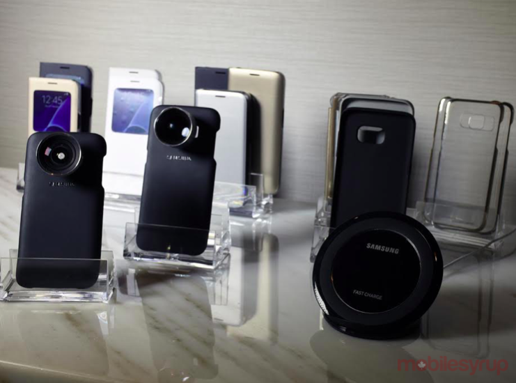
The back of the device maintains the wireless charging support for both Qi and PMA standards, as their predecessors did last year. This includes faster wireless charging, too. Wired Fast Charging continues on as well, though the Galaxy S7’s battery cause is helped by having a larger 3,000mAh battery inside. The bottom sees a return of the microUSB charging port, rather than a move to USB-C, as some might have expected. The wait-and-see approach essentially boils down to Samsung wanting to see the new standard gain more traction before diving in.
The protruding rear camera has been lowered significantly on both devices, as much as 0.46mm, enabling it to lay flatter. The fingerprint sensor on the home button was never mentioned, but it is basically the same.
The design UI on both devices shows virtually no sign of change, or at least the company held back from showing anything if it did nip and tuck anything. It felt very swift and responsive, which is a good sign. One addition of note is the Always-On Display that maintains a consistent widget while the screen is off to present the time or other contextual information.
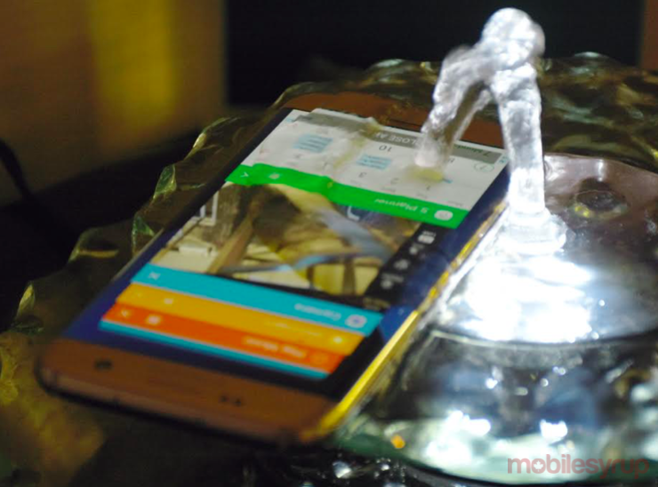
With an IP-68 rating, both phones have water resistance, but not necessarily submersion — at least not for a long time. Samsung is cautious on this point, only noting they are dust and water resistance, up to five feet for 30 minutes.
And lastly, both phones are compatible with the Gear VR headset.
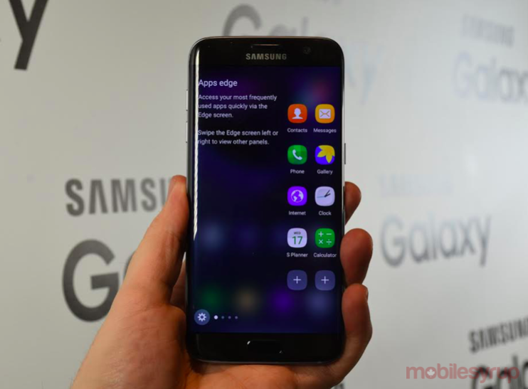
Galaxy S7 edge
In taking the edge display to the next level, Samsung had to bring something new to the table that would complement, or better yet, enhance the pittance that was already there. To do this, the company has approached it from two distinct angles.
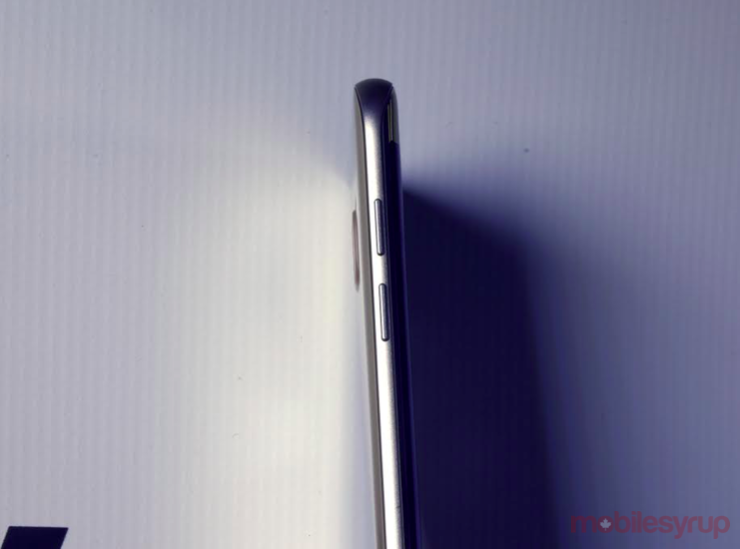
Trimming the body to make it 3mm slimmer than the Galaxy S6 edge+ may seem like a paltry number, but the difference is noticeable. Wielding it single-handed felt more natural, and the slight trim makes it a little bit easier to navigate the screen when only one hand is available. I would have to hold it over a testing period to see how much of a difference this really makes in the long run.
The edges on either side of the 5.5-inch qHD display are the same angle as before, and it’s unclear if there is any improvement in sensitivity. There were instances where I found it less responsive than I would have liked.
Edge UX gets a facelift with a bump up to 550 pixels from 260px last year. It’s fairly noticeable visually, but not necessarily a standout. Part of the reason for the additional pixels is how the menu layout protrudes further into the display.
The reason why is because there actually is a coherent menu system now. AppsEdge offers 10 shortcuts to any apps of your choice. PeopleEdge is essentially the same colour-coded contact shortlist that existed before. TasksEdge is the most interesting because it brings IF-style functionality to the edge screen. For example, with one tap, you can be taken to add a new contact instead of having to go through multiple steps to get there. Another is launching the camera and going straight to the front-facing camera for a selfie. For the moment, it seems that first-party apps will have this kind of access, but customizing tasks with third-party apps will be part of it, too.
News, sports scores and other panels also get extra real estate. Yahoo panels will be on by default, though others will be available and Samsung has indicated it will push for more from developers to make it more viable to consumers. The added space, particularly now that headlines are met with images, does make the edge display feel more inclusive, but it could all be moot if more sources aren’t added to widen the content pool.
Inside, the S7 edge has a 3,600mAh battery, a 20% increase in capacity. It’s not yet known how much of a difference that will make in real-world situations, but an improvement is all but assured if the Snapdragon 820 performs as advertised.
Camera
Since both phones have identical camera specs, they can be lumped together. Noting the demand for better low-light performance, Samsung will use a wider f/1.7 aperture lens that is helped by larger 1.4 micron pixels to bring in even more light for better shots in dim or night settings. Quantifying this, the company claims there is 25% more light coming through the lens, and that pixels are 56% larger than previously. It is, they say, the “first Dual Pixel Sensor 12MP in a smartphone camera.”
Going further on this point, the company noted that the Galaxy S5 was the first to use phase detection pixels, focusing technology derived from DSLR cameras, but every pixel ends up being a focus pixel on these two new Galaxys.
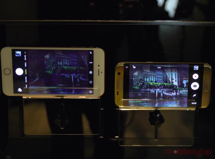
In a demo that pitted the Galaxy S7 edge against what was probably an iPhone 6s Plus, the S7 edge was able to illuminate a very dark scene and focus faster than Apple’s handset. An equally interesting comparison would have been to test it against the LG G4, which has a wide aperture and superb low-light credentials, but alas, this was the only comparison presented.
The same quick launch by double-tapping the home button continues on at the same 0.7-second speed.
Wrap Up
Samsung has played it safe with the Galaxy S7 and S7 edge. Having already altered the design philosophy and perception last year, there really wasn’t any need to go through another reinvention a mere 12 months later. By whittling down its offerings to a pair instead of a trio, it also draws a distinctive line that consumers can consider.
There was no need to make an edge handset at the same screen size as the mainstream S7. In fact, Edge UX benefits from the added screen real estate anyway, and those who want to go bigger than a 5.1-inch display will have the next Galaxy Note to opt for when that eventually launches later in the year.
Pricing hasn’t been revealed yet for Canada, but we will update that information once the dollar figures have been confirmed.
MobileSyrup may earn a commission from purchases made via our links, which helps fund the journalism we provide free on our website. These links do not influence our editorial content. Support us here.


