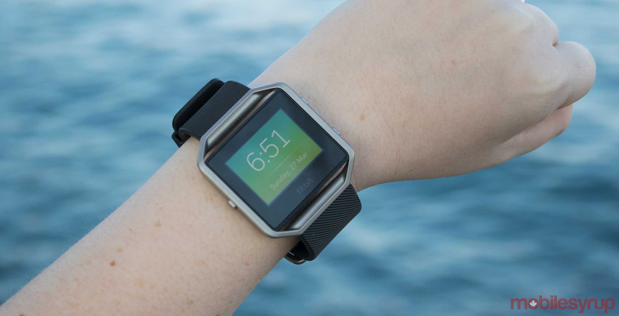
The Pros
- Always-on heart rate sensor
- Comfortable and light
The Cons
- Pricey compared to other Fitbit devices
- Looks like it was caught in a late 2000s tech time machine
When the Fitbit Blaze was first revealed at CES 2016, many industry observers thought it could end up being a viable Fitness-focused Apple Watch and Android Wear competitor, myself included. At the time, a wearable replicating the basic notification functionality of a smartwatch, but also featuring an always-on heart rate sensor and a focus on fitness, was an exciting possibility. “Could this be the Pebble of fitness devices?,” I naively thought to myself at the time.
While this might have been a view I adopted a few months ago, after spending the last few weeks with Fitbit’s “fitness smartwatch,” I can safely say it definitely isn’t in the same league as Apple’s wearable or most Android smartwatches.
Right off the top, it’s important to note Fitbit’s Blaze is disappointingly not actually a smartwatch in the traditional sense. What’s interesting is the Blaze is also capable of almost everything Fitbit’s Surge already is, only in a more watch-like package, leaving me to question who the company is trying to target with the device.
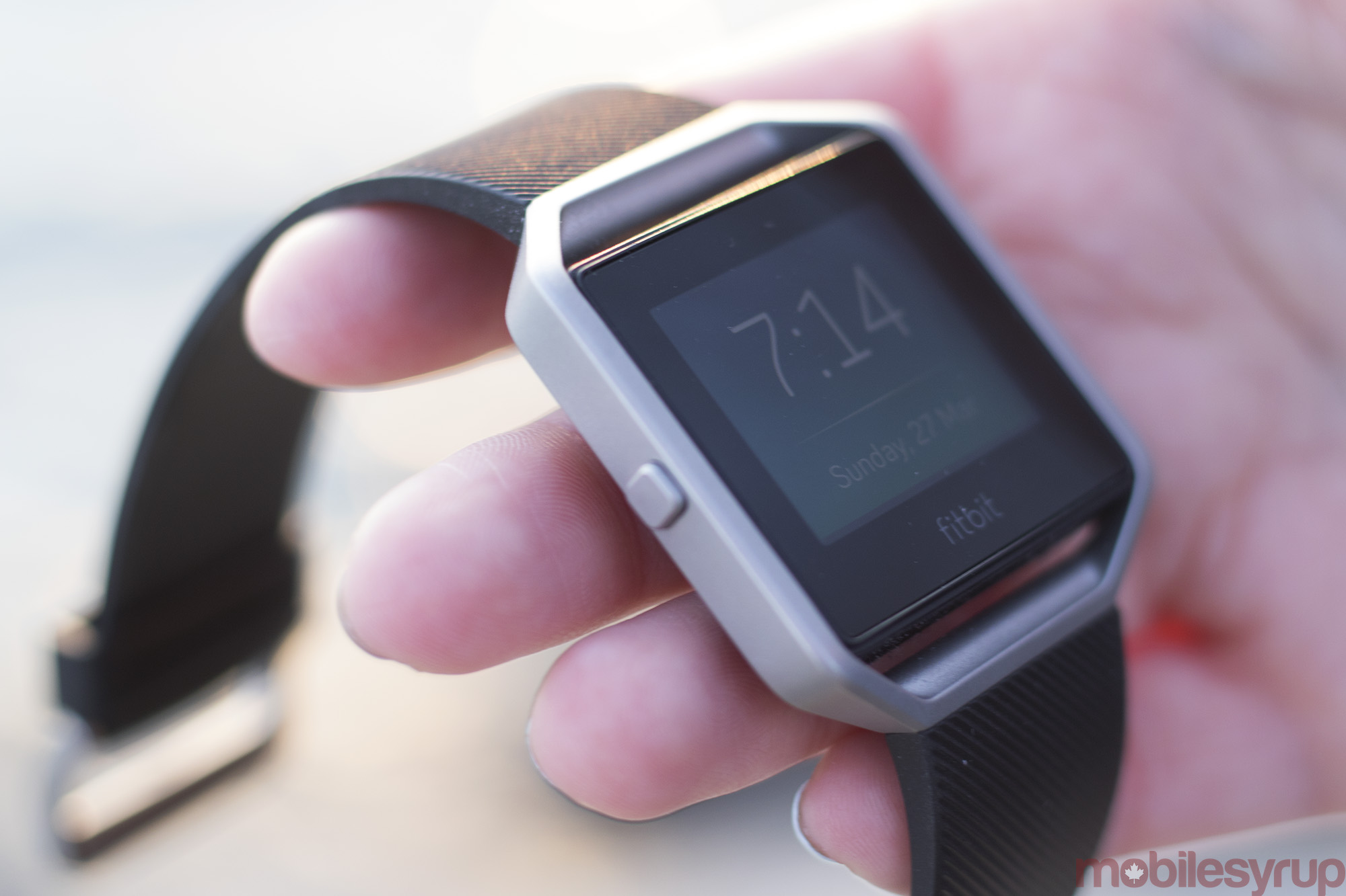
It operates like a smartwatch, allowing the wearer to easily tell the time and receive basic notifications such as calls and texts, but if you expect the device to be as feature-rich as the Apple Watch, or an Android Wear device, you’ll be very disappointed with Fitbit’s latest wearable. The Blaze’s proprietary operating system, compared to WatchOS, Android Wear and even Samsung’s Tizen, is severely limited.
The main question though, is whether or not the $250 Blaze brings enough fitness features to the table to appeal to those looking for a fitness-focused device that looks and operates more like a traditional watch.
Strange construction
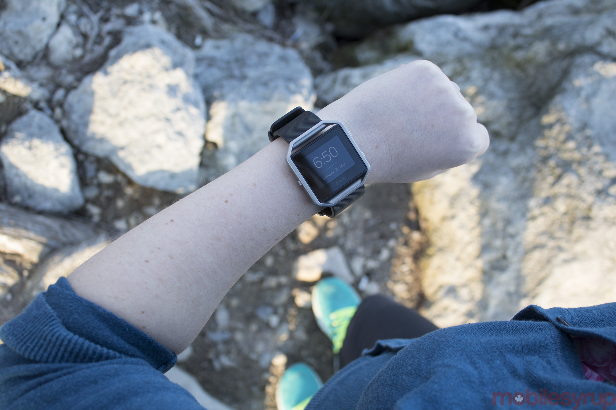
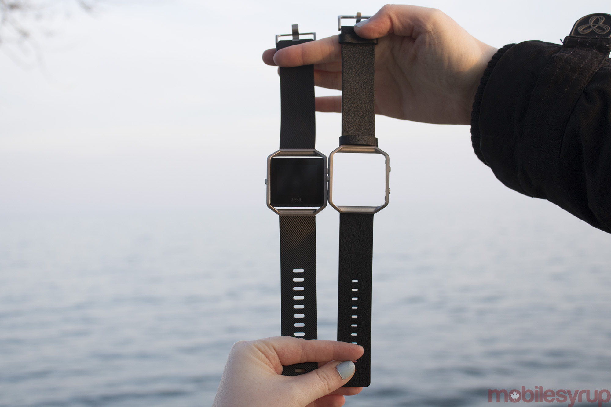
The Blaze is built of two distinct parts. The first is the wearable’s stainless steel frame and elastomer band, though a leather strap is also available at a $129 price point, as well as a metal link band at $179.
The second half of the device, which is actually the Blaze’s internal hardware, snaps in the strap’s frame, and consists of a black rectangle equipped with a colour touchscreen. The heart-rate monitor, which is always active, resulting in some of the most accurate fitness readings I’ve experienced in a wearable, is located on the back of the Blaze’s body (it flashes green). The Blaze also features three buttons on its sides for navigation.

Switching straps is simple and requires the Blaze’s black rectangular body to be popped out and then slid into the other strap’s stainless steel frame. While a unique concept, it’s unlikely many people will opt to purchase the Blaze’s leather strap given its expensive price tag. Also, leather/stainless and exercise aren’t exactly conducive, though Fitbit’s goal with this device is for users to be comfortable wearing it at all times, even when not exercising.
“The Blaze just doesn’t look very fashionable”
Strangely, the Blaze also needs to be popped out of its frame in order to charge, a design decision that’s bizarre. The Blaze then drops into a weird plastic charging frame shell. This setup is odd and led me to wonder why Fitbit opted for it in the first place. It’s worth pointing out, however, that the Blaze’s battery lasts approximately five days, so it’s likely you won’t be charging it very often anyway.
Ugly but surprisingly comfortable
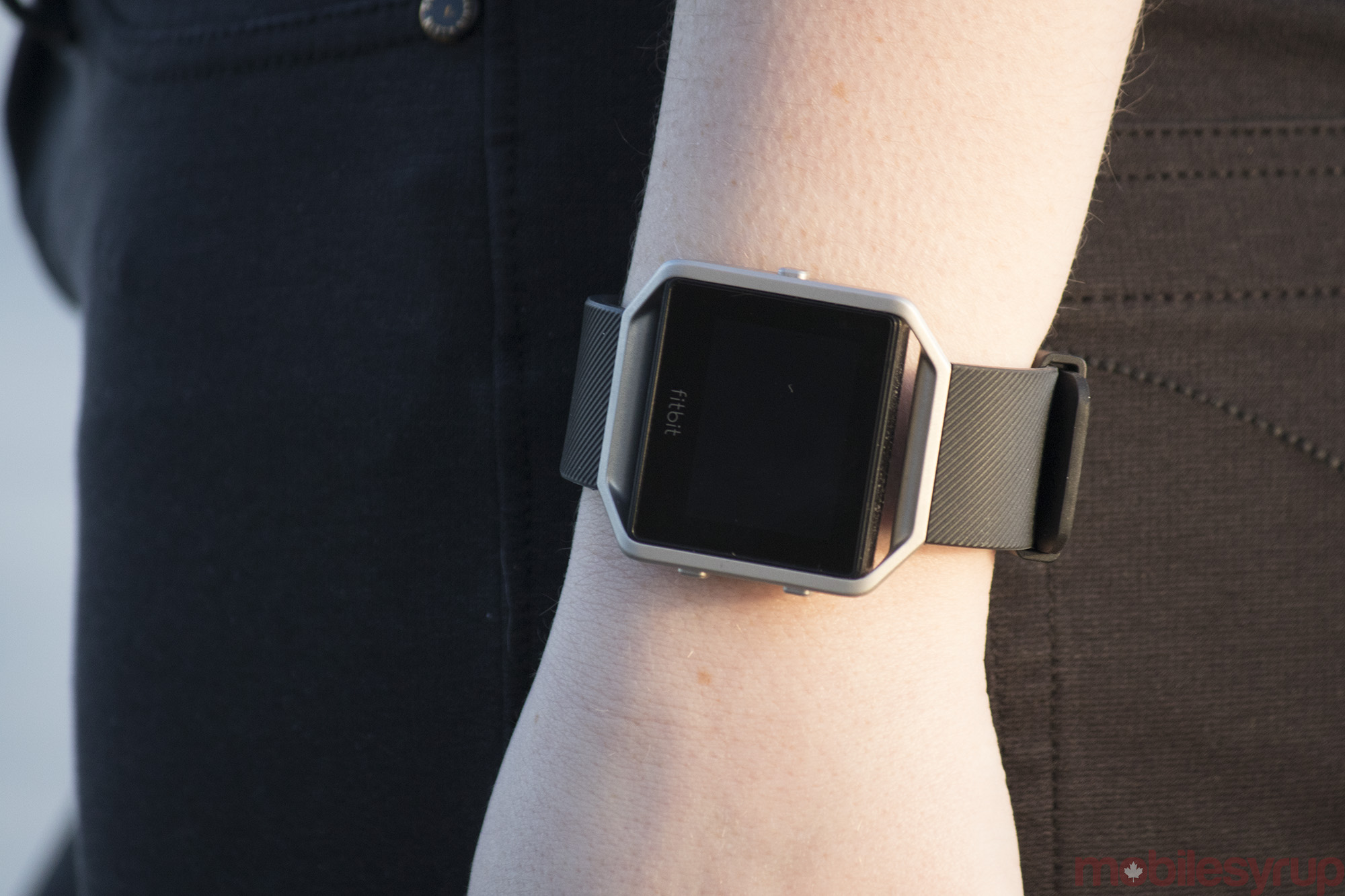
One of the main things that surprised me about the Blaze is how comfortable it is to wear, though it does lack the polish of a more premium wearable like the Moto 360 or Apple Watch.
The Fitbit Blaze’s elastomer and leather strap are comfortable to wear for extended periods of time, though the elastomer watch strap doesn’t feel as premium as the Apple Watch Sport Band.
What’s unfortunate is that the Blaze just doesn’t look very fashionable and in fact, feels quite cheap. It isn’t as sleek as the Moto 360 and lacks the high-end build quality of the Apple Watch. While the device is considerably cheaper than the above wearables, at a $250 price tag, I still expected more from the Blaze in terms of build quality.
The concept behind the Blaze, at least from my perspective, is a fitness-focused smartwatch someone would be happy to wear at all times. Unfortunately, largely due to its failure at coming across as stylish, the Blaze doesn’t accomplish this goal.
Nobody wants to wear a device in 2016 that looks like a tiny computer strapped to their wrist.
A barebones user interface
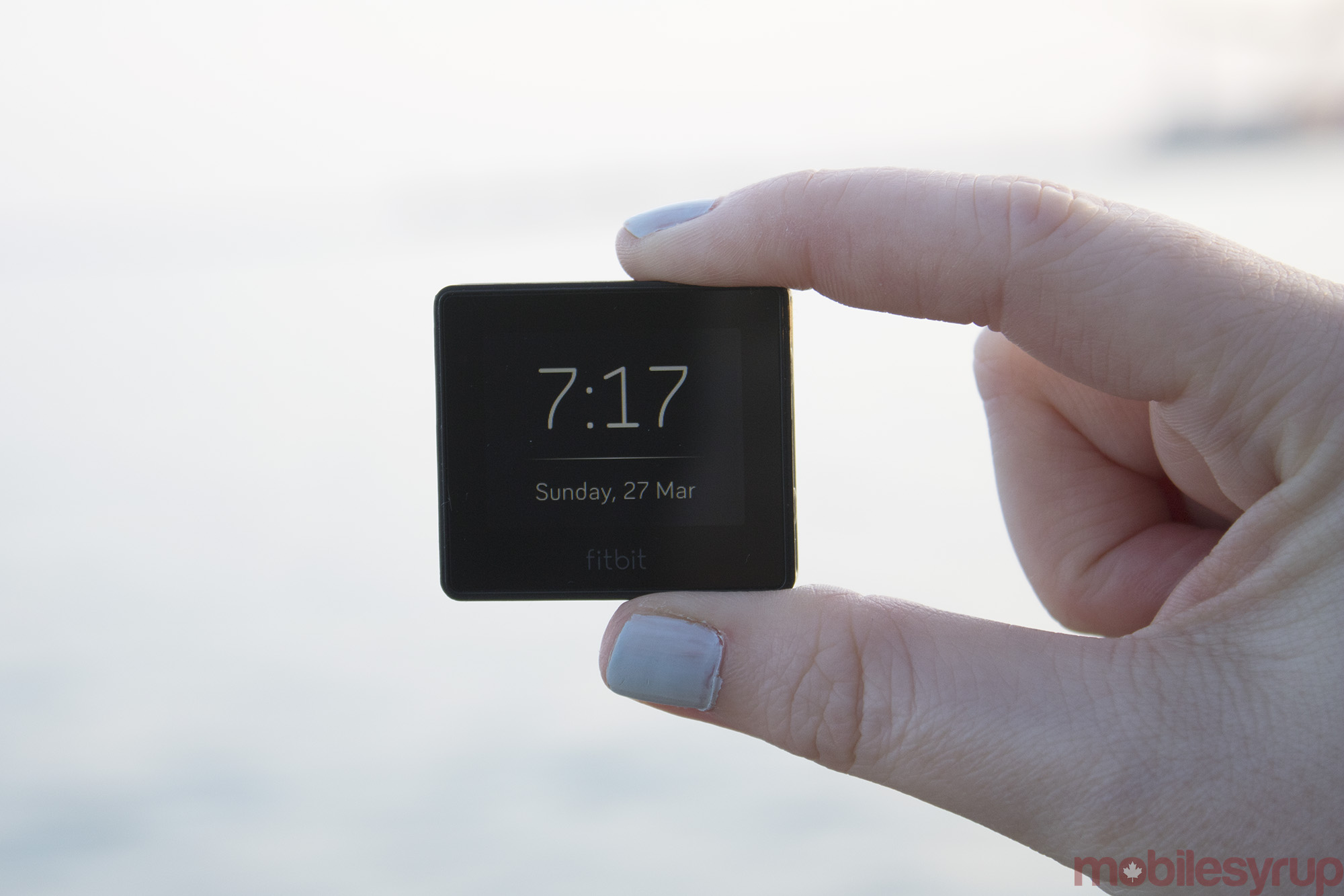
Unlike most Fitbits, the Blaze’s UI is comparably more feature rich. Its 1.25-inch colour screen and 240×180 resolution means that even though the Blaze can’t keep up with competing smartwatches, it does offer more functionality than other Fitbits on the market.
The Blaze’s home screen also acts as watch face. There are four to choose from, with the default version actually offering a considerable amount of information; it displays the time, date and a quick tap on the screen reveals daily distance walked and steps taken. A ring around the clock dial also easily shows how close you are to reaching Fitbit’s daily goal of 10,000 steps a day. Having all this information available directly on my wrist at a glance is great.
The Blaze’s other “apps” (which come pre-installed because it doesn’t feature an app ecosystem), include Today, Exercise, FitStar (a useful workout routine app), Timer, Alarms and Settings. Today shows off an easy to read summary of your daily progress, which includes steps climbed, calories burned and heart rate. Exercise is used to track more formal workouts such as running, biking, weightlifting or using an elliptical, amounting to 17 different exercises in total. There’s also a general workout option for any physical activity that doesn’t fall into the pre-created categories.
Other than these built-in applications, beyond tweaking the Blaze via settings, there isn’t really much to the wearable’s software offerings. It’s worth noting the Blaze is able to receive a limited set of notifications from your smartphone, including incoming texts and calls, though it’s worth noting I found that the Blaze annoyingly doesn’t stop vibrating after answering a call, and also vibrates while making an outgoing call. Fitbit says that this issue is related to the Bluetooth connecting between the device and my smartphone being delayed.
To make matters worse, only specific apps can be selected for notifications. This means that setting up Facebook, Twitter or email notifications from specific apps isn’t possible. Those more accustomed to standard smartwatches will be very disappointed in the Blaze’s notification functionality.
Who is it really for?
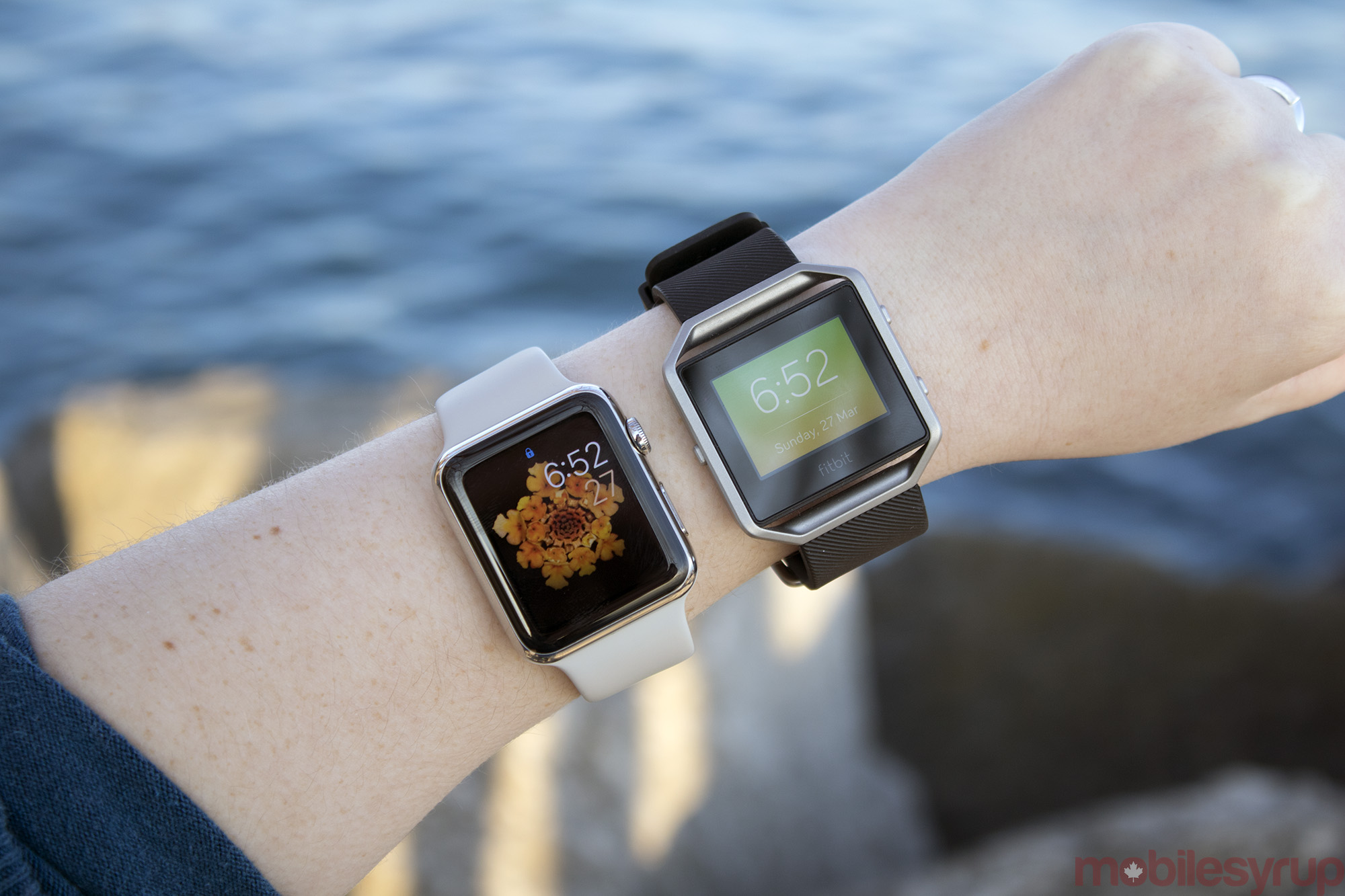
My biggest issue with the Blaze is I’m unsure of its target market. Because the wearable doesn’t feature the customization present in other smartwatches thanks to its proprietary operating system, those looking for an all-around fitness/smartwatch solution will be disappointed in how limited the Blaze’s core functionality is. Even if you are looking for a fitness focused wearable, opting for Fitbit’s Alta, which costs $169, or even the Charge at only $119, is likely a better option.
As someone who has grown accustomed to using a smartwatch on a daily basis, during my time with the Blaze, I found myself wanting to wear two watches at once — a move that would surely draw more than a few glances – to get the functionality the Blaze is missing.
Perhaps those who don’t mind the Blaze’s mid 90s Casio watch aesthetic will like its look, as well as its attempt at blending a fitness-focused wearable and a traditional smartwatch.
Who is it really for?
My biggest issue with the Blaze is I'm unsure of its target market. Because the wearable doesn’t feature the customization present in other smartwatches thanks to its proprietary operating system, those looking for an all-around fitness/smartwatch solution will be disappointed in how limited the Blaze’s core functionality is. Even if you are looking for a fitness focused wearable, opting for Fitbit’s Alta, which costs $169, or even the Charge at only $119, is likely a better option. As someone who has grown accustomed to using a smartwatch on a daily basis, during my time with the Blaze, I found myself wanting to wear two watches at once -- a move that would surely draw more than a few glances – to get the functionality the Blaze is missing. 5/10 Perhaps those who don’t mind the Blaze’s mid 90s Casio watch aesthetic will like its look, as well as its attempt at blending a fitness-focused wearable and a traditional smartwatch.
"My biggest issue with the Blaze is I'm unsure of its target market"
MobileSyrup may earn a commission from purchases made via our links, which helps fund the journalism we provide free on our website. These links do not influence our editorial content. Support us here.


