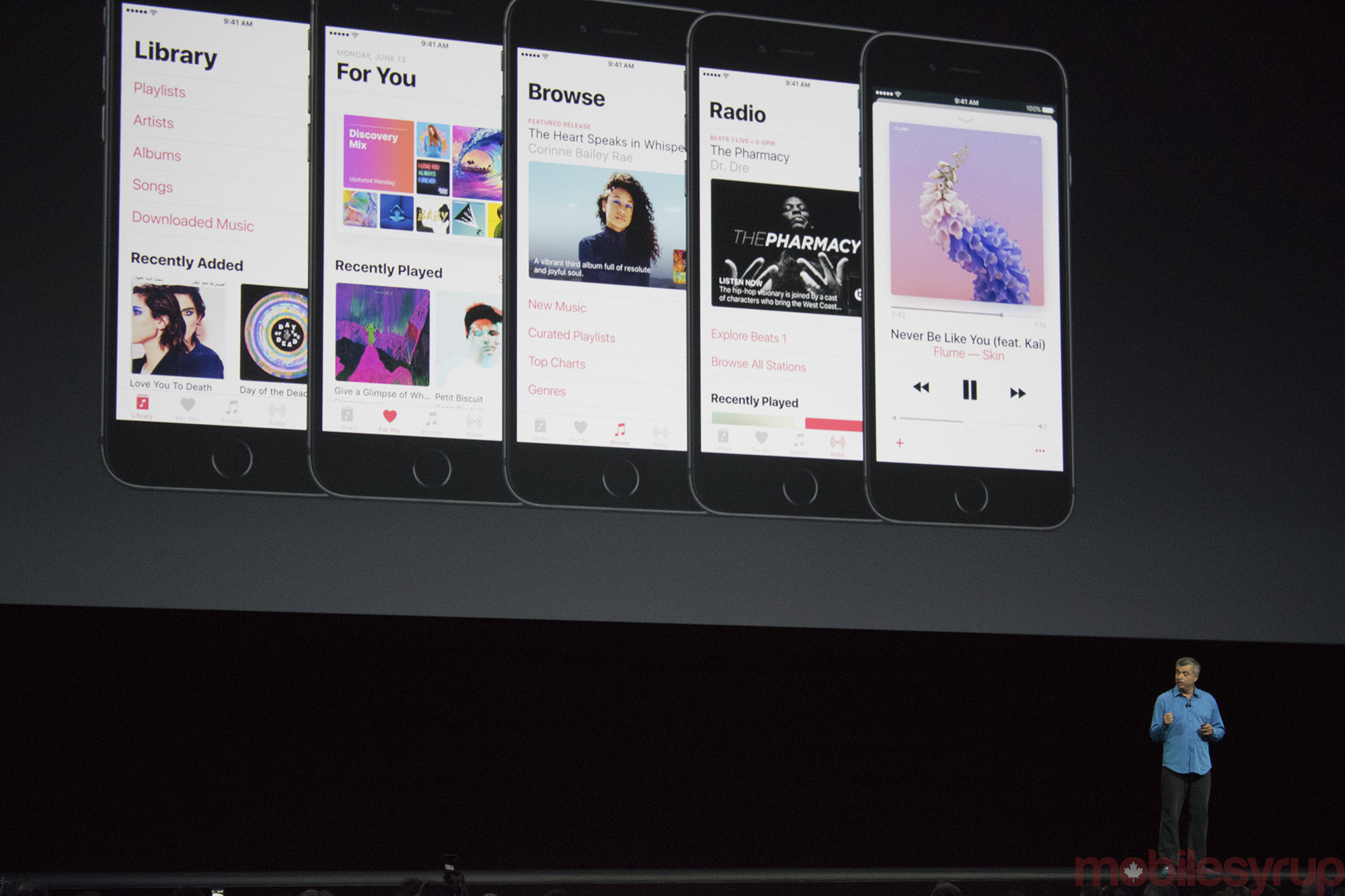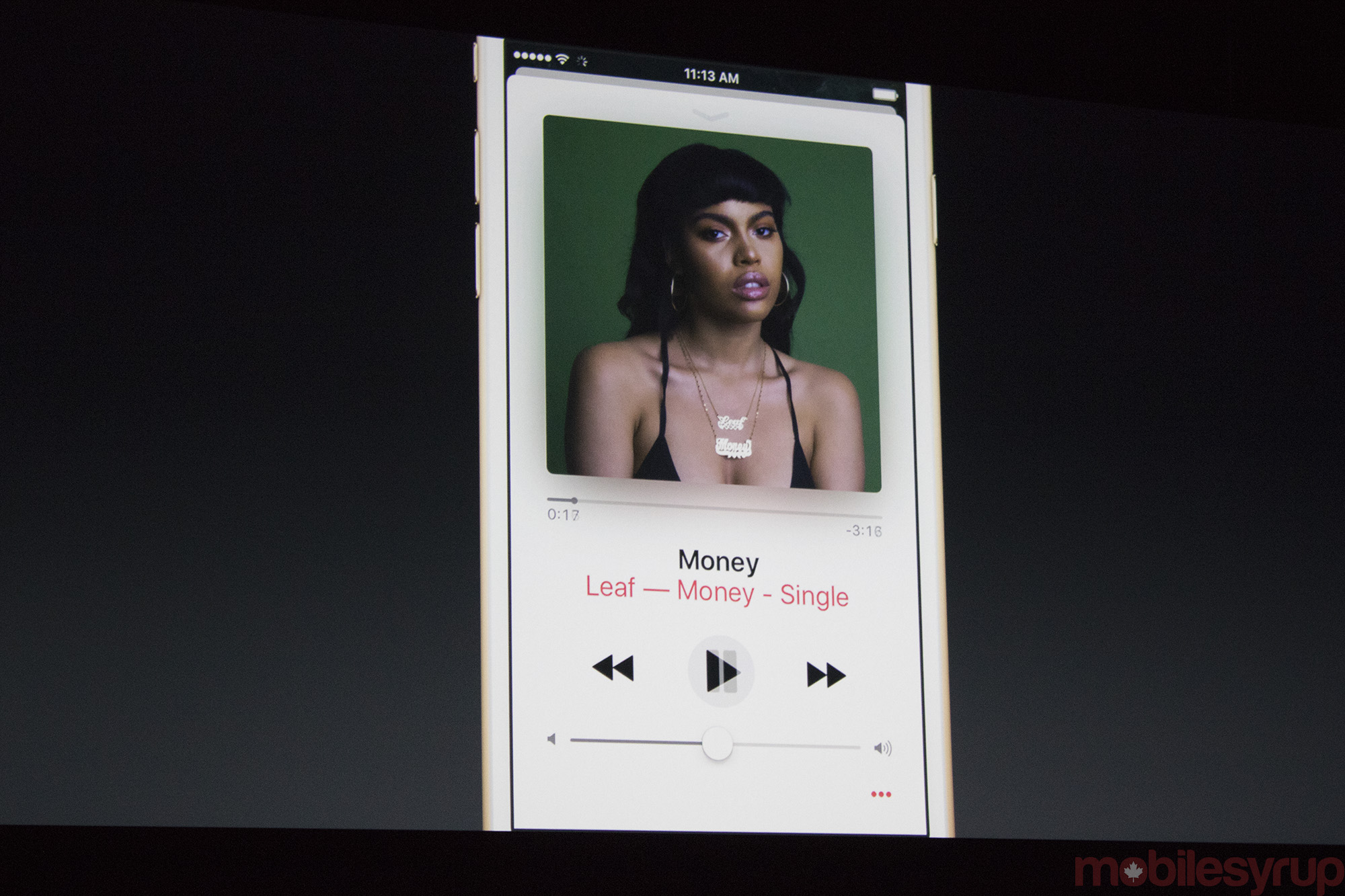
At its annual WWDC developer conference in San Francisco, California, Apple today showcased a new version of Apple Music, which it states now has 15 million paid subscribers.
The most significant enhancements to the app are the addition of lyrics, and a new recently played section, as well as the ability to easily follow specific artists via the platform.
Apple Music’s new user interface features a more monochromatic and simplistic design, with the tabs located at the bottom of the screen simplified from five to four.
The “New” and “Connect” tab are being cut, while “My Music” “Library” and “Radio” remain. “Browse” and “Search” are the two sections to the app being added. The former will allow users to discover new music, while the latter allows you to jump right in to a query.
The “For You” playlists, based on users’ unique musical preferences, are now curated on a daily basis. While Apple Music has been successful for Apple, many users have complained about the app’s convoluted design. It seems the music streaming app’s monochromatic aesthetic shift and new tabs, are a direct answer to these complaints.
Related reading: Apple announces Swift Playgrounds for iPad users at WWDC
MobileSyrup may earn a commission from purchases made via our links, which helps fund the journalism we provide free on our website. These links do not influence our editorial content. Support us here.


