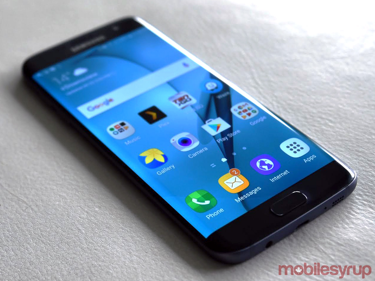
In 2016, Samsung made it clear it likes curves so much, it will basically bend its displays wherever it can. The Galaxy S7 Edge was the phone to set the tone early this year, and its unveiling at Mobile World Congress in Barcelona signaled a commitment to continue being edgy.
For a company that can be persistent in pushing its various visions to see what ultimately sticks, the curvy strategy appears to be a winner. In what ways is sometimes unclear, anecdotally speaking, since there are no real metrics measuring engagement, only sales figures to indicate the device’s popularity.
The Galaxy S7 Edge reared back into the spotlight — at least somewhat — because of the Galaxy Note 7 recall. Anytime one of your flagship handsets is considered unexploded ordinance and called out singularly on an airplane before takeoff, you have a public relations nightmare. These days, only Samsung and Apple (Bendgate, et al) could emerge from such a fiasco more or less unscathed. Time will tell.
No such issues have afflicted the S7 Edge, which continues to hum along as the ‘safe’ bet for Samsung and consumers who may prefer the device’s form factor.
The device
I’ve had a lot of time with the S7 Edge since it launched in Canada in March, and I took it as an opportunity to let the edged display grow on me, if it could. I like curves as much as the next guy, but the practicality of the edged display and the interface it harbours has always left me feeling like something is missing.
With the Galaxy S6 Edge last year, that missing element was obvious — the interface did next to nothing of any intrinsic value. Samsung poured much more into it this year, offering numerous shortcuts and contextual information, which I’ll get to a little further down.
What truly helped the company’s standing with this device was what could be viewed as a corrective approach; one that brought back the microSD card slot and water-resistance that was abandoned last year.
It also slightly curved the back edges, contouring the device on both sides for better handling. The glass back remained the same fingerprint magnet it has always been. Curiously, though, white and blue were abandoned in Canada, with black, silver and gold the preferred options instead.
With Samsung choosing to harmonize the chipset with the Note 7 by using the same Snapdragon 820 in both Canada and the United States, the S7 Edge was the opposite. Only the U.S. variant had Qualcomm’s chip, whereas all others used Samsung’s own Exynos 8890 octa-core processor. Whether there was a significant difference in performance wasn’t patently obvious to me.
Then there was the camera. A less protruding lens certainly helped, but it was the internals that were to make a difference. With a wide f/1.7 aperture lens and superb image sensor that included larger micron pixels, the S7 Edge was poised to become one of the shooters to beat. It has earned its keep in my books, offering some of the best composition I’ve seen in Auto mode to date.
The software

Samsung has wisely chosen to continue the process of dialing back its previous software excess and gimmicky nonsense, and focus on lessening TouchWiz’s impact on Android to make navigation that much easier. The settings probably benefit the most from that because the layout is simpler (though I prefer how it was done on the Note 7), save for the visual elements that make it appear different.
Of course, that wasn’t really the focus here. The edge interface was, and by stripping down on the other side, it rained an abundance of features to the edge to make it more of a general usability go-to. For me, at least, this required self-training and the will to try it, even when it didn’t seem necessary or prudent to do so.
That’s generally not a good start for any piece of software, but it isn’t even the biggest issue. Third-party support, or lack thereof, has been the gaping hole that keeps this interface from turning a corner to become something indispensable. Much of what’s available is driven by Samsung and its partnerships. There’s a decent level of choice, yet the pickings are still slim.
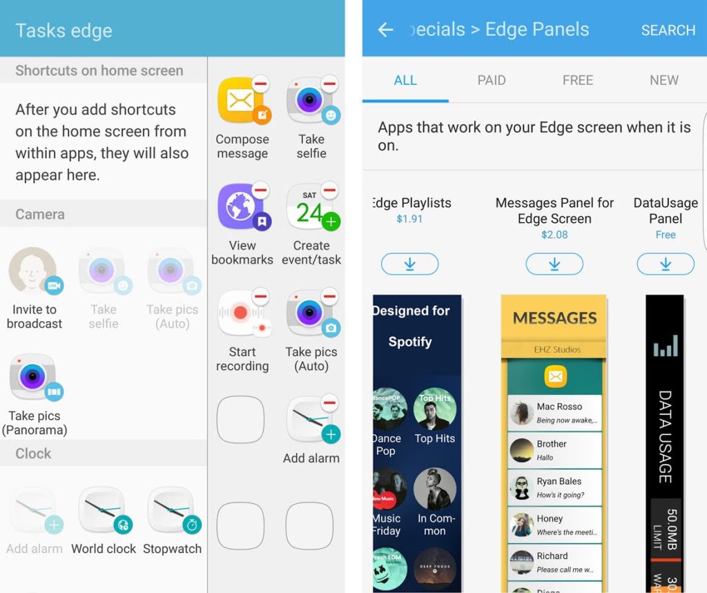
Take the Tasks Edge screen, for instance. In theory, it’s a sound idea — create shortcuts to specific app functions. Except, in practice, it’s limited to core apps and little else. The lack of support from others could be rationalized for any company that isn’t Samsung, but when you’re at the top of the heap, it’s logical to assume developers would want to play ball. Any sort of grace period for that is effectively over after six months on the market. Where are the cool task shortcuts for apps like Sonos, Gmail, Spotify or Instagram?
Instead, it’s the Edge Panels that make up most of the outside support, where some developers have been offering their own apps specifically tailored to the interface. Most cost something, ranging in price from $1 to $2, and include panels specific to popular apps, like WhatsApp, Spotify, SoundCloud, Facebook Messenger, Twitter, Netflix and TuneIn. It’s nice to see tools like these emerge, though it’s not clear how well they’re selling or how many are using them.
The always-on display that was first seen in Motorola’s devices, was on by default, displaying the date, battery level, time, and basic notification icons in plain white text on the black display. A low-powered way to constantly have contextual information at hand, I found it to be useful enough to never turn it off. It just would’ve been nice if more context could be added to the notifications with a simple tap.
The camera
The 12-megapixel rear camera would have seemed like a step backward with a lower megapixel count, but the truth was that this turned out to be a noticeable upgrade in many ways. Larger micron pixels and a wider f/1.7 aperture lens were a big one-two punch in letting in more light for better images in low-light and night situations. I’m a bigger fan of the Pro mode for the manual controls, but there are few smartphone cameras I’ve tested that can shoot this well in a variety of settings in Auto mode. In Pro mode, it only gets better.
It certainly doesn’t hurt that it takes seconds to launch the camera, focus on a subject and snap a photo. Double-pressing the home button launches it in only 0.7 seconds. Fast focusing seems almost immediate, and snapping a photo can be done with the camera icon or by pressing either of the volume buttons.
At the time of its launch, the S7 Edge obliterated the iPhone 6s in low-light performance. Now, with the iPhone 7 and 7 Plus having answered back, the fight has gotten more interesting. To me, the LG G4 was the best overall camera of 2015, but the S7 Edge has earned that crown so far, especially in Auto mode. Competition is fierce, though. The LG G5, HTC 10 and even some other emerging phones stepped up this year, and Apple is only the latest to do so.
The fact that the flat Galaxy S7 and Note 7 use the exact same camera means the performance of the S7 Edge is not exclusive to this one device. That’s all good for synergy from Samsung’s perspective, but it doesn’t make the camera the most distinctive feature here. That goes to the edged display.
As it stands…
There’s an irony about the S7 Edge in that it is probably more popular than its flatter sibling, yet is much harder to find a good case or screen protector for it. The curved glass already makes it more delicate. Forget a long drop shattering the screen, a short one of less than two feet on a hard surface is enough to crack it. That goes for the back of the device, too.
Fast Charging and wireless charging help lessen the impact of the battery drain, which is nice when dealing with a 3600mAh non-removable battery inside. Even six months later, the device can last for a full day, though standby life has taken a hit along the way. I could leave the phone alone for two days and it will be completely dead. Why, I’m not sure, because there shouldn’t be anything going on in the background.
Not that I’m shocked. One of Samsung’s shortcomings is that its batteries don’t always hold up extremely well over time when usage is regularly above moderate. I’ve generally found iPhones do a better job, though Apple does have the advantage of optimizing its own operating system and hardware.
For Samsung, this phone is part of a wider ecosystem it wants consumers to embrace. The new Gear VR headset is compatible with the S7 Edge, thanks to an adapter that works with the microUSB port. The S7 Edge works just fine with the camera, as it does with the Gear Fit2, Gear IconX and Gear S3 smartwatch.
At the time of launch, the S7 Edge was $1,100 outright. Today, it’s about $100 less through the carriers. Even on two-year contracts, the device is regularly $400 or more. Samsung is now selling it outright and unlocked for $850. By the time its successor comes next spring, headphone jacks may continue to disappear and USB-C could be further cemented as the next industry standard, making the S7 Edge feel older than it really is.
Related: Samsung Galaxy S7 and S7 edge review: An act of refinement
MobileSyrup may earn a commission from purchases made via our links, which helps fund the journalism we provide free on our website. These links do not influence our editorial content. Support us here.


