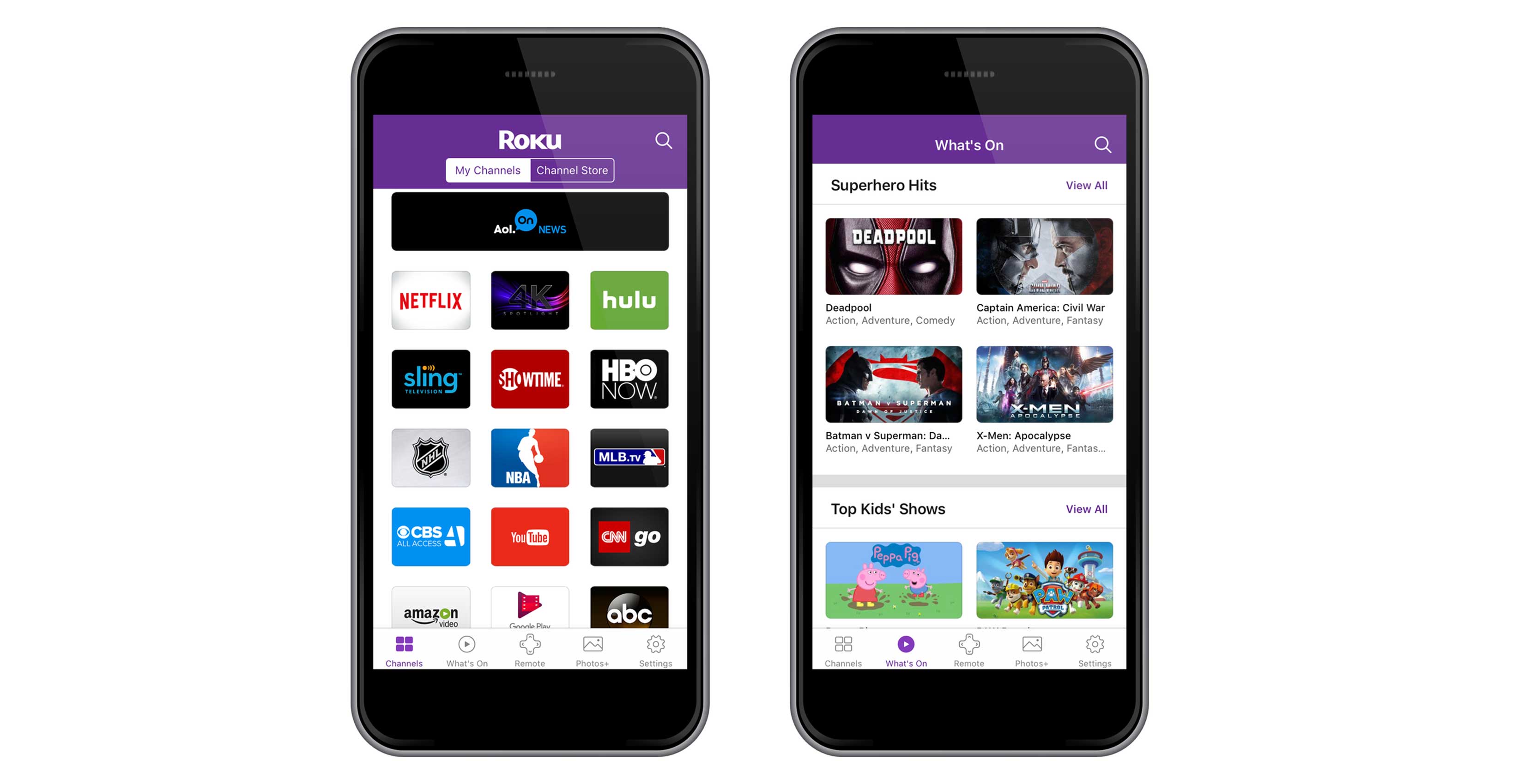
Roku has started rolling out its overhauled TV app today, revealing a new design, content discovery section and digital remote control.
The navigation buttons on the new app have moved to the bottom of the app, reading from left to right: Channels, What’s On, Remote, Photos+ and Settings. The home screen now features a list of channels that have been installed by the user and a button at the top of the app that allows users to toggle directly over to the channel store.
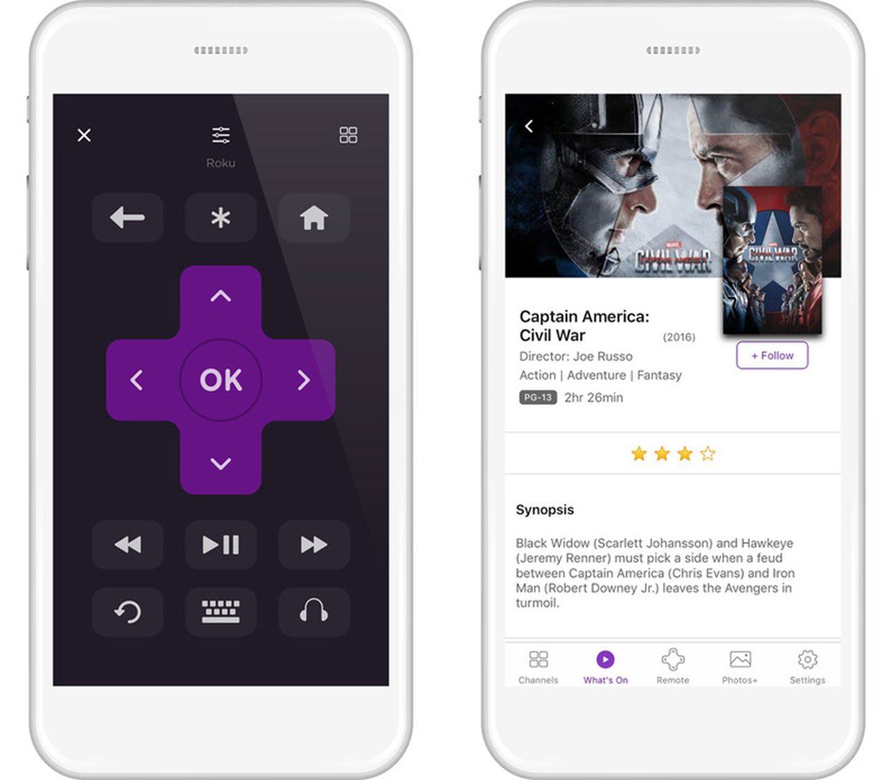
Once a channel is chosen, the app then transitions into a remote, which now resembles its physical counterpart more closely, is easier to use with one hand and features a new channels button at the top that will quickly transport users back to the familiar tiled list.

The new section for content discovery, ‘What’s On,’ provides users with a feed of curated lists and suggestions much like Netflix. It essentially replaces ‘My Feed,’ a tracker for users’ favourite shows and movies, which is now pushed to the bottom of the ‘What’s On’ screen.
Additionally, Photos+ lets users share music, photos or videos from their mobile libraries to Roku, as well as create customized content.
Roku version 4.0.0 is available for free on Google Play and the App Store.
[via]Tech Crunch[/via]
MobileSyrup may earn a commission from purchases made via our links, which helps fund the journalism we provide free on our website. These links do not influence our editorial content. Support us here.


