The Pros
- Large screen with good responsiveness
- CarPlay and Android Auto In-car
- Wi-Fi via LTE connection
The Cons
- No Siri Eyes Free via Bluetooth
- App integration not extensive
- Future updates unclear
When you’re an automaker known for safety, it stands to reason that you’re on the cutting edge to ensure it stays that way. Under that mantra, Volvo’s reputation for safer driving should extend to how it handles infotainment.
There is a distinction here, however. Features that focus on driver assistance and collision mitigation, like adaptive cruise control, large animal detection and run-off road technology, are inherently different from mobile integration.
That the automaker is aiming to achieve the ultimate safety status by 2020 — meaning no one in a new Volvo will be killed or seriously injured — is a pretty significant goal by any measure. The infotainment side of things doesn’t get the same notoriety, but it is a piece of the puzzle to hit that mark.
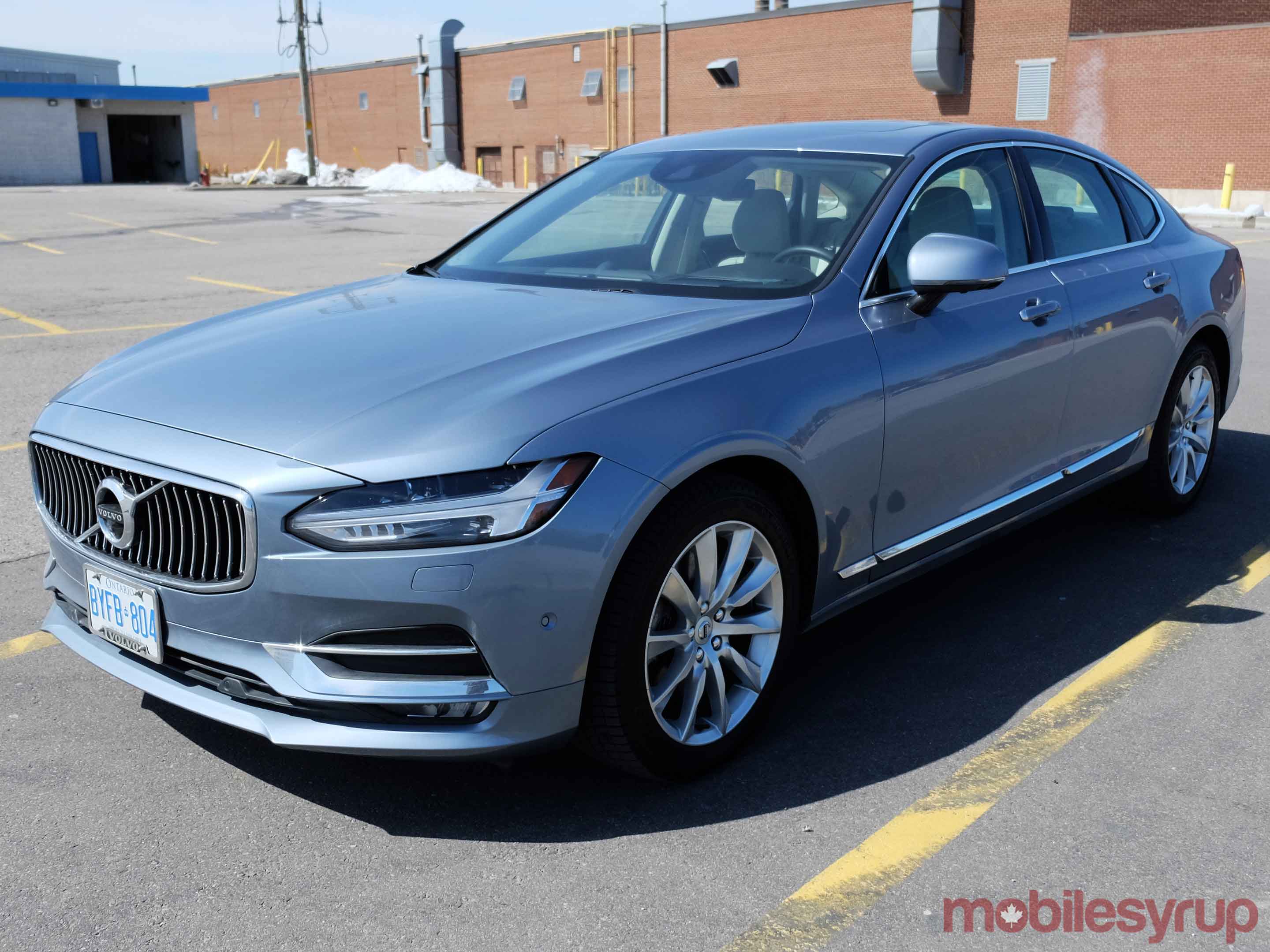
I took a Volvo S90 Luxury Sedan for a week to gauge how unified this whole setup is, and whether or not integration is on point or lagging behind.
The basics
It had been a while since I last tested Volvo’s infotainment system, which was decent, but needed a lot of work to better integrate phones and apps. The system now falls under the company’s Sensus platform.
Volvo was busy shoring up its future endeavours throughout 2016 by launching a new venture with Autoliv, and inking a $300 million USD deal with Uber to deploy driverless vehicles. On the infotainment side, it announced it was adding Skype for Business to its 90 Series cars.
There has been a concerted effort to modernize and innovate the infotainment features to better compete with the mixed bag of other automakers’ systems. It’s hard not to notice the 9.3-inch display on the dash, in part, because it’s in a portrait orientation. The capacitive touchscreen is also quite fluid, with swiping that strongly resembles the feeling of using a tablet.
A volume knob and basic playback controls are wise physical carryovers that complement a staunchly digital platform like this. The 12.3-inch digital instrument cluster in front of the steering wheel adds another contextual screen, and one that does more than just show the basic metrics of speed, RPM, gas and engine temperature.
Voice control falls under Volvo’s purview, but is helped by the inclusion of Apple’s CarPlay and Google’s Android Auto. One key difference is that Volvo’s own voice assistant is never subdued entirely by Siri or Google Now. Long pressing the voice button is required to trigger either of those. A single press always gets Volvo’s to chime in.
Rounding all this out is a solid Bowers and Wilkins sound system that is a $3,250 CAD add-on. Loud and clear, it was the kind of audio experience one would expect from a vehicle that starts at $63,000.
Layout and connections
Volvo covers the basics with the onboard connections. Two USB ports are nestled inside the centre console, where one (outlined in white) is specific to integrating into the Sensus system. A 12-volt socket and Aux-In jack for wired playback are also included. SiriusXM does come with the car, albeit on a limited trial, initially.
Bluetooth pairing is easy, and about five devices can be stored in total. The in-car LTE connection provides a Wi-Fi hotspot inside the cabin, except I wasn’t able to test it because the media fleet S90 I drove didn’t have a SIM inside.
Volvo Canada says that AT&T is the standard partner carrier, like it is with the other automakers offering LTE in the car. However, there is an option to forego that SIM and put in another from a Canadian carrier instead. The problem is it has to be unlocked and have a data plan. Technically, it may be possible to get a SIM with a data-only plan meant for a tablet. Since I wasn’t able to test any of it, I can’t say for sure. The advantage of the AT&T plan is there’s no roaming when driving into the United States.
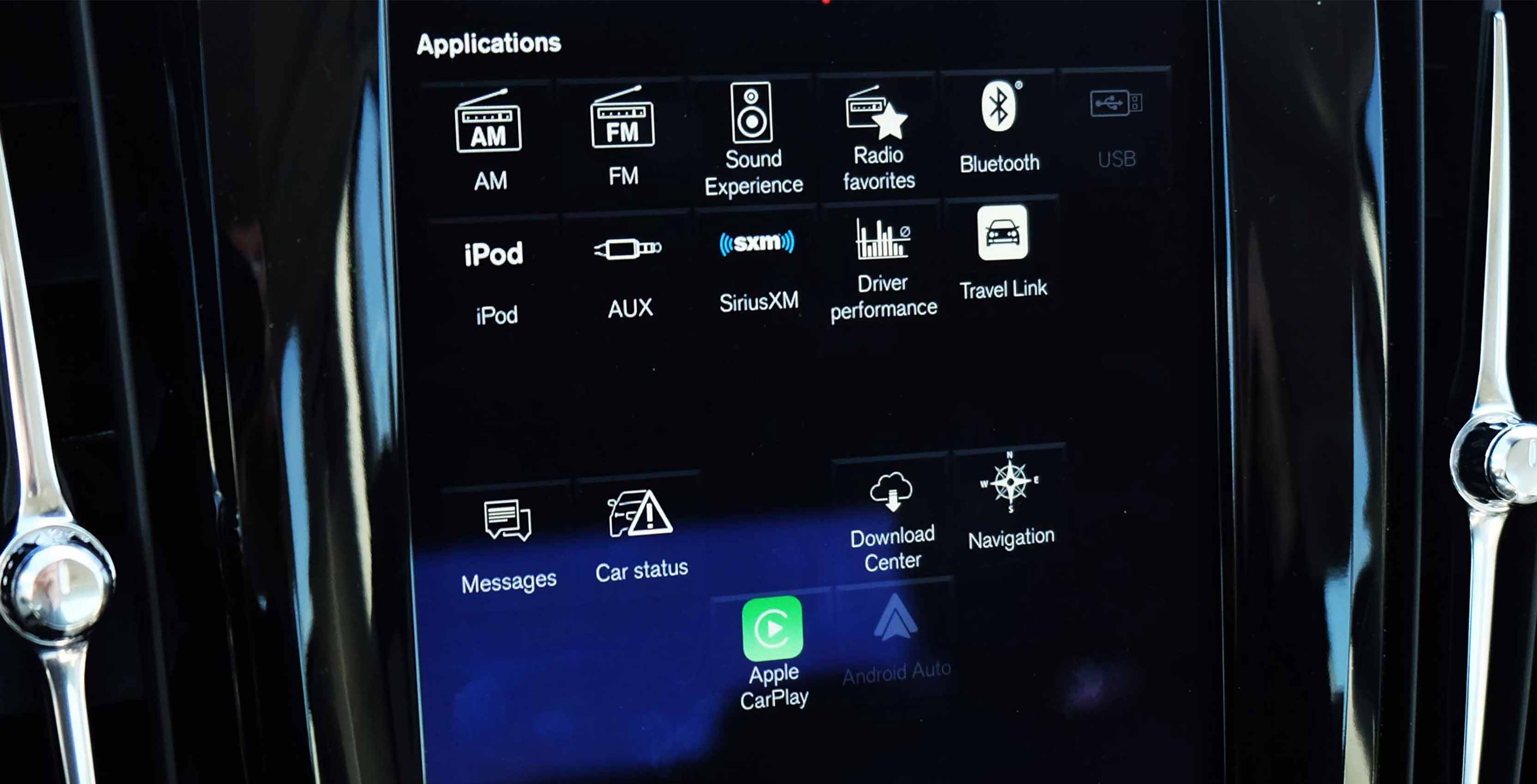
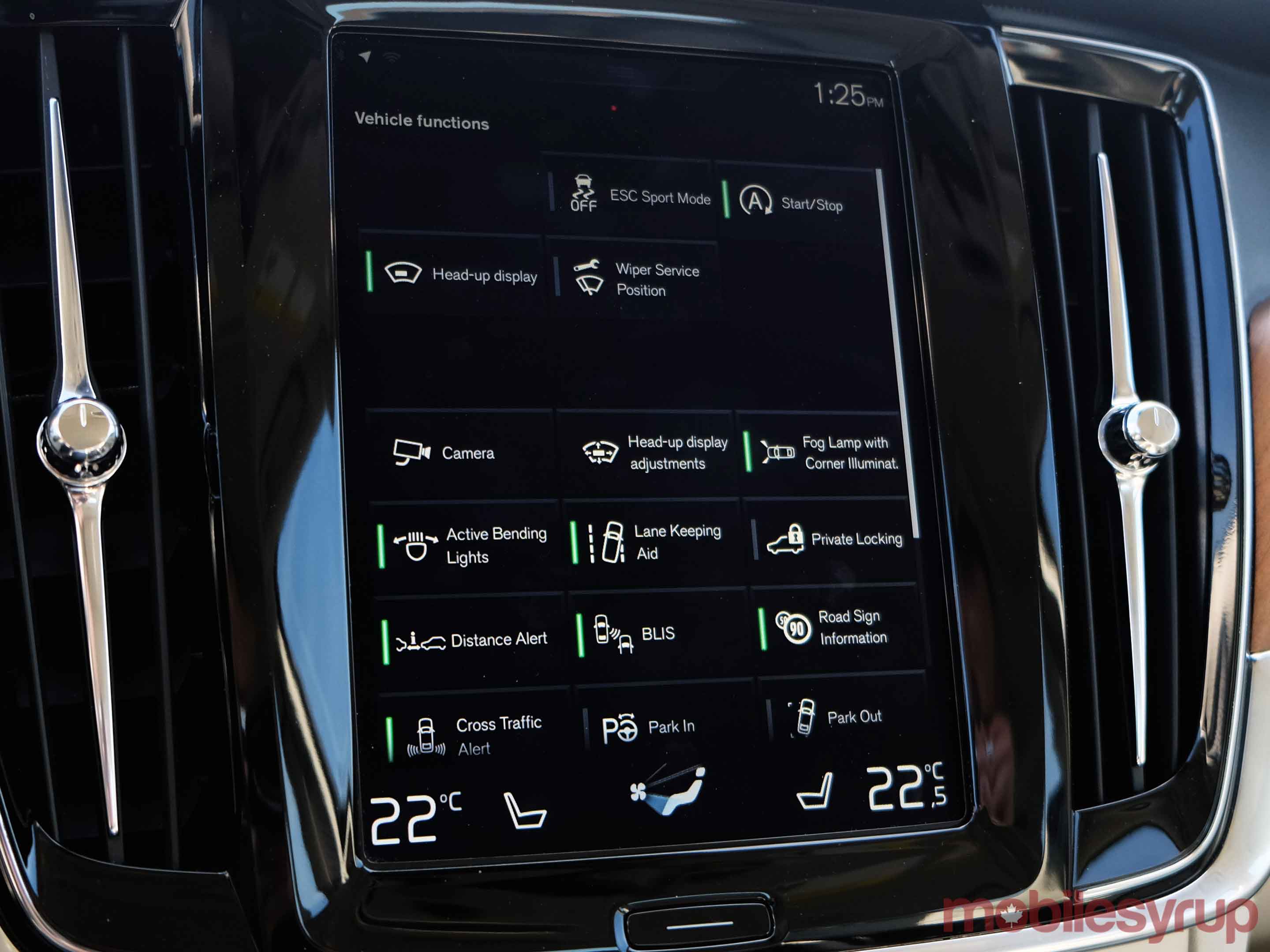
The large touchscreen dominates everything, especially in how integrated it is with the car’s various features. Swiping right from the home screen leads to a grid of the car’s functions, like the heads-up display (HUD) and Lane Keeping Aid, among others. Swiping left from the home screen leads to shortcuts for apps, media inputs and launchers for CarPlay or Android Auto.
Underneath, at all times, lay a shortcut to the car’s climate controls, with a slick presentation in tapping where the airflow should go, the intensity and the temperature.
The physical home button right under the display felt like it was influenced by Apple and Samsung, though the whole system made that impression. Swiping through menus isn’t especially common in current infotainment systems. Some automakers do it, whereas others rely on soft keys to cycle through menus.
Smartphone integration
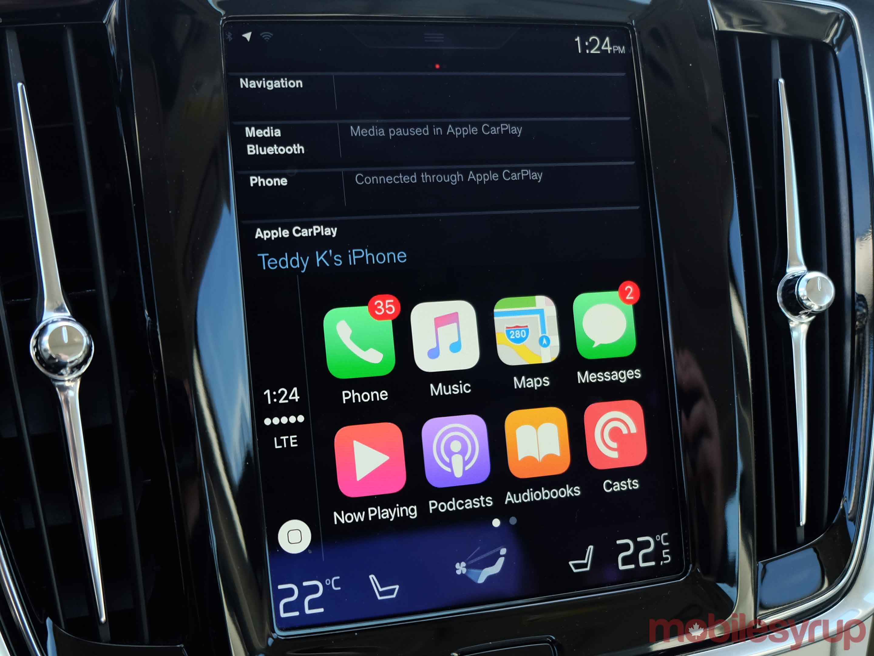
CarPlay and Android Auto largely dominate this part of the equation, and with good reason. Other than Bluetooth streaming for calls and audio, there is no dedicated app integration that I can point out here. Text messages will run through the system, even reading them aloud when prompted.
What’s surprising is that Siri Eyes Free isn’t embedded. In lieu of using CarPlay, long-pressing the voice button could trigger Siri when the iPhone is connected via Bluetooth. Many newer makes and models have it, but the S90 doesn’t. The only way to get Siri to work is to have CarPlay running, and even then, it runs concurrently with Volvo’s own voice platform.
There is some confusion in how app integration works. The Sensus web page notes Rdio as one of its partners, yet it was absorbed by Pandora 18 months ago. The TuneIn Radio app uses the old logo. None of these appeared in the system inside the S90, so I’m inclined to conclude the site needs updating. Yelp is another app included in there, but that speaks more to Volvo’s own navigation app.
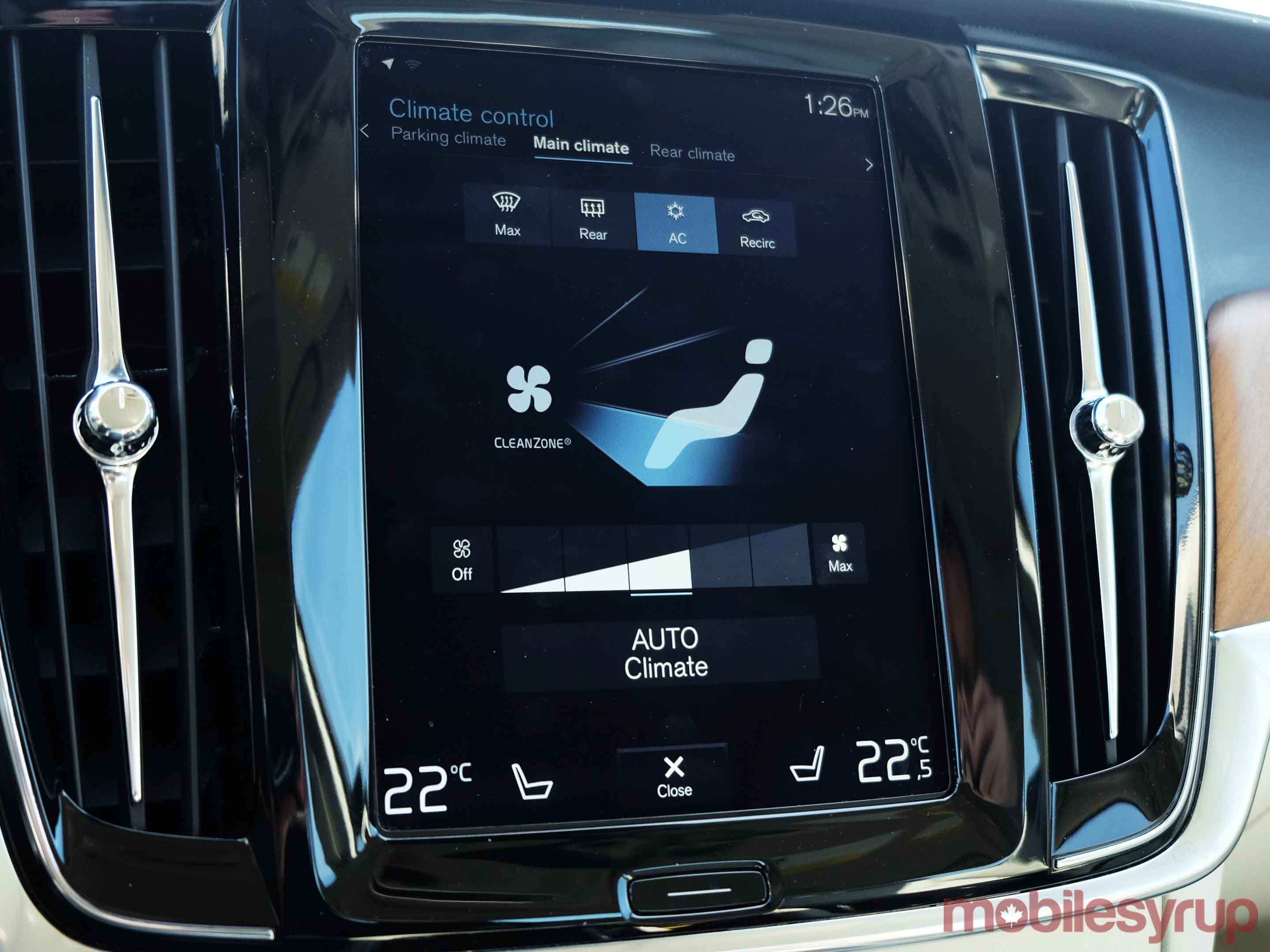
There is a good complementary process in bridging together CarPlay or Android Auto with the navigation app. The display is cut in half when either of those platforms are running. While it would’ve been great to have the top half show a map, it’s not possible. Instead, the navigation map can appear on the digital cluster in front of the steering wheel. Seeing the display cut like that wasn’t seemly, but that’s not really Volvo’s fault. Unless Apple changes the aspect ratio to accommodate different screen sizes, cutoffs or different orientations will continue. Android Auto is the same thing.
The Volvo On Call app for iOS and Android, including Apple Watch and Android Wear, is designed to be a support tool with distinct functionality. Assuming the S90 is outfitted with the telematics unit, it should enable remote start, climate control and sending navigation destinations to the car directly, among other features.
I didn’t get to test the app out much, and even when I did, it clearly needed some work. The layout is nice, except I couldn’t trigger any of the remote functions because the car didn’t have its own SIM.
Voice and phone calls
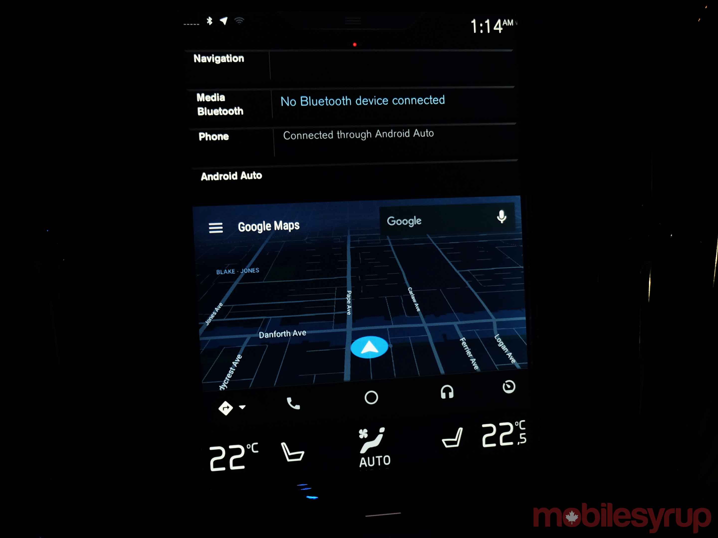
There was little to complain about here when calls could be made or taken with any of the voice platforms available. Accepting an incoming call was just as easy using Volvo’s system than it was through Siri or Google Now. Clarity was excellent, thanks to the Bowers and Wilkins stereo.
The built-in platform was also pretty good at interpreting commands and addresses. I didn’t struggle too much to get what I wanted, even if the vocabulary is limited. It’s not all that conversational, and commands are more limited compared to what Ford Sync 3 can do, for example. Having CarPlay or Android Auto does help add another layer, but I would hope Google will put Assistant into it to replace Now. The interpretive ability, coupled with the greater integration with third-party apps, is perfectly suited to a vehicle.
Wrap up
I could see how touch-based climate control could be divisive for some drivers. It’s a subjective point that makes sense on either side. Despite that, the screen and menu layout is among the best I’ve used. Integrating smart vehicle functions with media inputs and climate controls on a highly responsive large touchscreen worked well. The digital instrument cluster adding some context only helped the cause further.
Having in-car Wi-Fi, CarPlay and Android Auto doesn’t hurt, either. Sensus is a clear example of how far Volvo has come in a short time in offering something better in the cabin. How effective it will be in two or three years depends on how committed it is to updating or improving it. The auto industry’s record in that regard is already lackadaisical, as it is.
Nevertheless, it’s still a good sign from a brand that invested heavily in safety technologies. If it can do more to innovate on the infotainment side, Volvo may have a combination tough to match.
"Sensus is a clear example of how far Volvo has come in a short time in offering something better in the cabin." 7.5/10
MobileSyrup may earn a commission from purchases made via our links, which helps fund the journalism we provide free on our website. These links do not influence our editorial content. Support us here.

