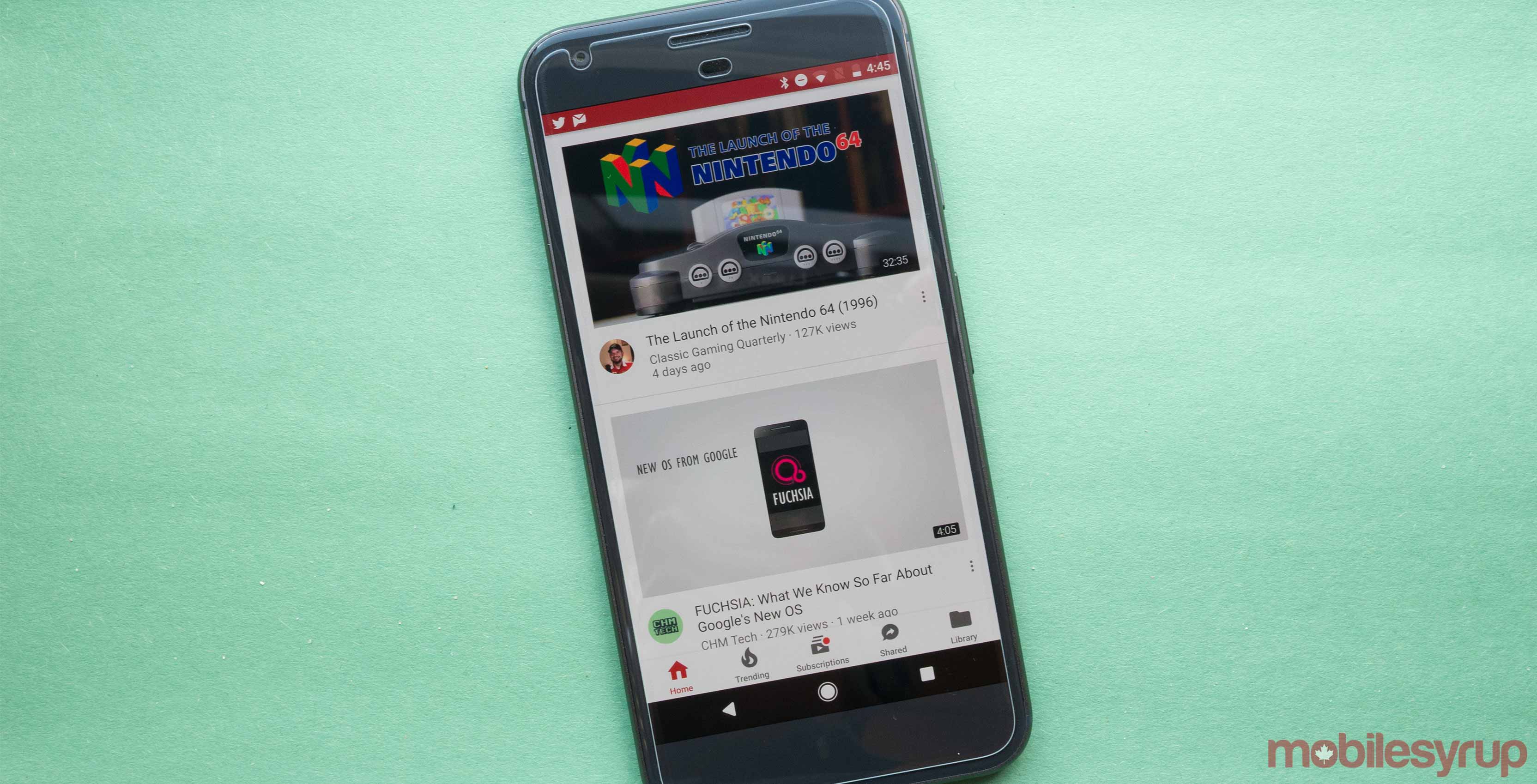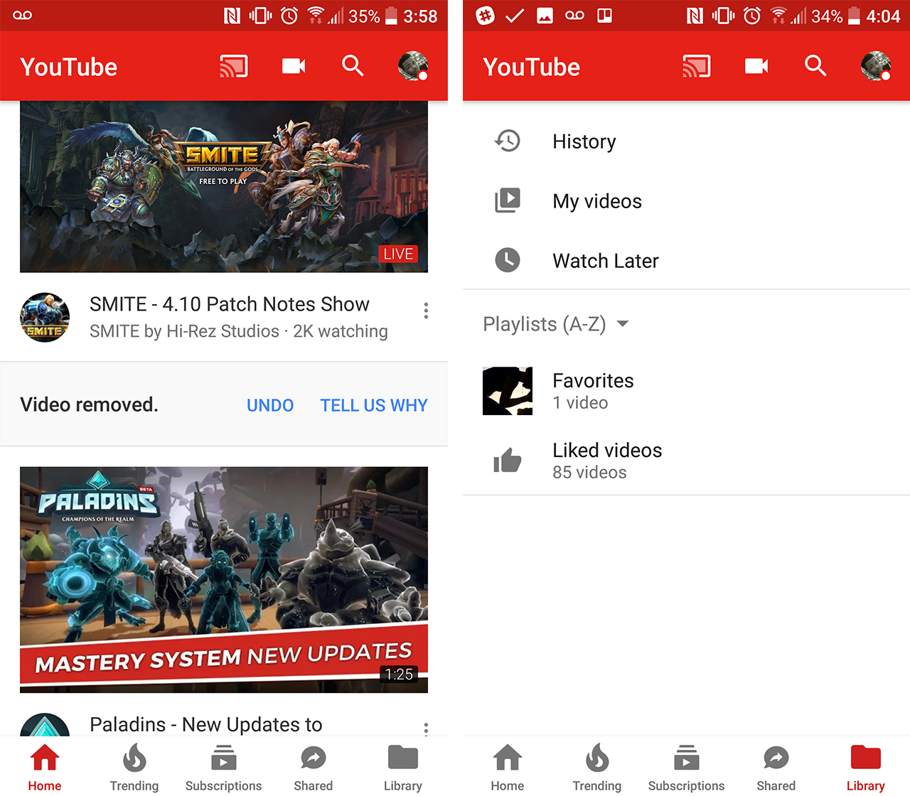
Some Android users may have noticed a slight change to the platform’s YouTube app. It’s not instantly recognizable but something may seem off; the placement of the navigation bar has been pushed to the bottom.
Included in the navigation bar is the ‘Home,’ ‘Trending,’ ‘Subscriptions,’ ‘Shared’ and ‘Library’ icons. Library is where users are able to locate their history, videos they’ve liked and videos they want to watch later, among other things.
The layout is similar to what the iOS version of the YouTube app looks like, though the iOS version features an activity icon used to track all the notifications in one spot.
The YouTube app also has a slight change in colour, with the navigation bar switching to white with highlighted tabs now turned red.
Additionally, the update adds new functionality that helps users keep their spot when searching for videos. The new UI allows users to navigate through tabs or even change apps and return to exactly the same spot under the subscription tab. The new update gives a new functionality that helps users not lose their spot when searching for a new video. Users can go through the tabs or even change apps and return to exactly the same spot under the subscription tab.
MobileSyrup may earn a commission from purchases made via our links, which helps fund the journalism we provide free on our website. These links do not influence our editorial content. Support us here.


