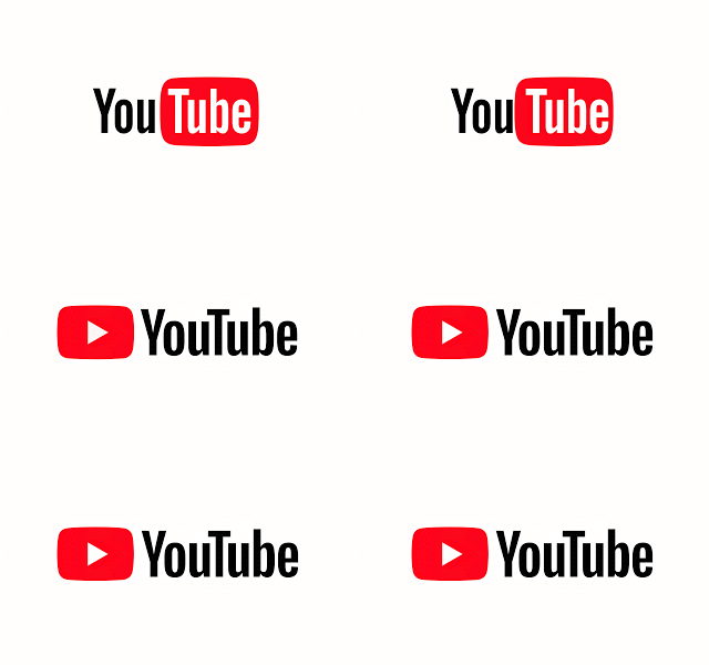
American video-sharing website YouTube has unveiled a brand new logo, a redesigned desktop website, and a redesigned mobile app.
The new YouTube logo eschews the old look, removing the ‘Tube’ in YouTube from the confines of its red screen. Now, the red screen — complete with a white YouTube play button — rests to the left of the company name.

YouTube has been working on adding features to its mobile app for some time now — including an in-app sharing function, but now, the company is bring certain desktop features — like slowing down or speeding up playback — to the mobile app as well.
According to an August 29th, 2017 blog post, the mobile app will also soon adapt the viewing window to match video format. Vertical videos, for example, will play without horizontal bars.
As for the desktop website, YouTube has been redesigned to fit more in line with Google’s Material Design philosophy.

“Our new look applies Material Design to YouTube and delivers a fresh, simple and intuitive user experience that lets content shine — because there’s nothing more important than the creators and videos we all love to watch,” reads an excerpt from the same media release.
The desktop site will also feature a brand new dark mode, “which turns the background dark while you watch for a more cinematic look.”
In spite of these changes, YouTube has reaffirmed its continued commitment to “[giving] people a voice and [showing] them the world – no matter what device they use.”
Source: YouTube
MobileSyrup may earn a commission from purchases made via our links, which helps fund the journalism we provide free on our website. These links do not influence our editorial content. Support us here.


