The Pros
- CarPlay and Android Auto
- Voice Command is decent
- In-car Wi-Fi hotspot
The Cons
- No Google Assistant via Bluetooth
- Third-party app integration non-existent
- No wireless charging
Chrysler has long been a fixture in the Canadian automotive market, offering vehicles at both the affordable and premium ends of the spectrum.
Uconnect is the infotainment system that traverses it all.
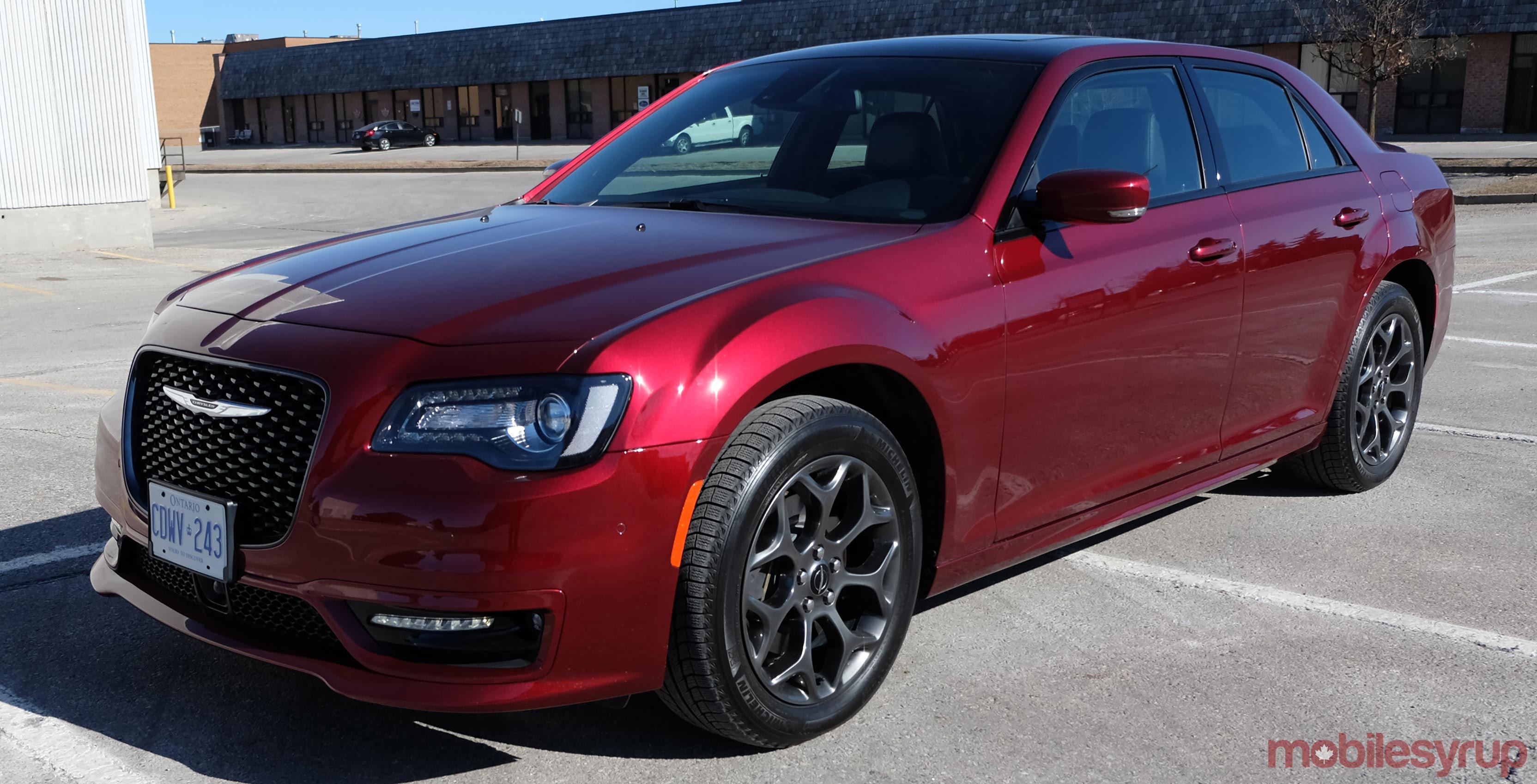
This also isn’t specific to one model, either. Uconnect works on Fiat, Jeep, Dodge and RAM vehicles, resulting in the footprint being fairly wide. I tested the latest version in a 2018 Chrysler 300S AWD with a BeatsAudio stereo inside.
Much of the infotainment package comes included from the factory, so it doesn’t incur an extra cost (though this may depend on the car model), and while it tries to squeeze in a fair amount in, there are still some key holes that should’ve been plugged.
The basics
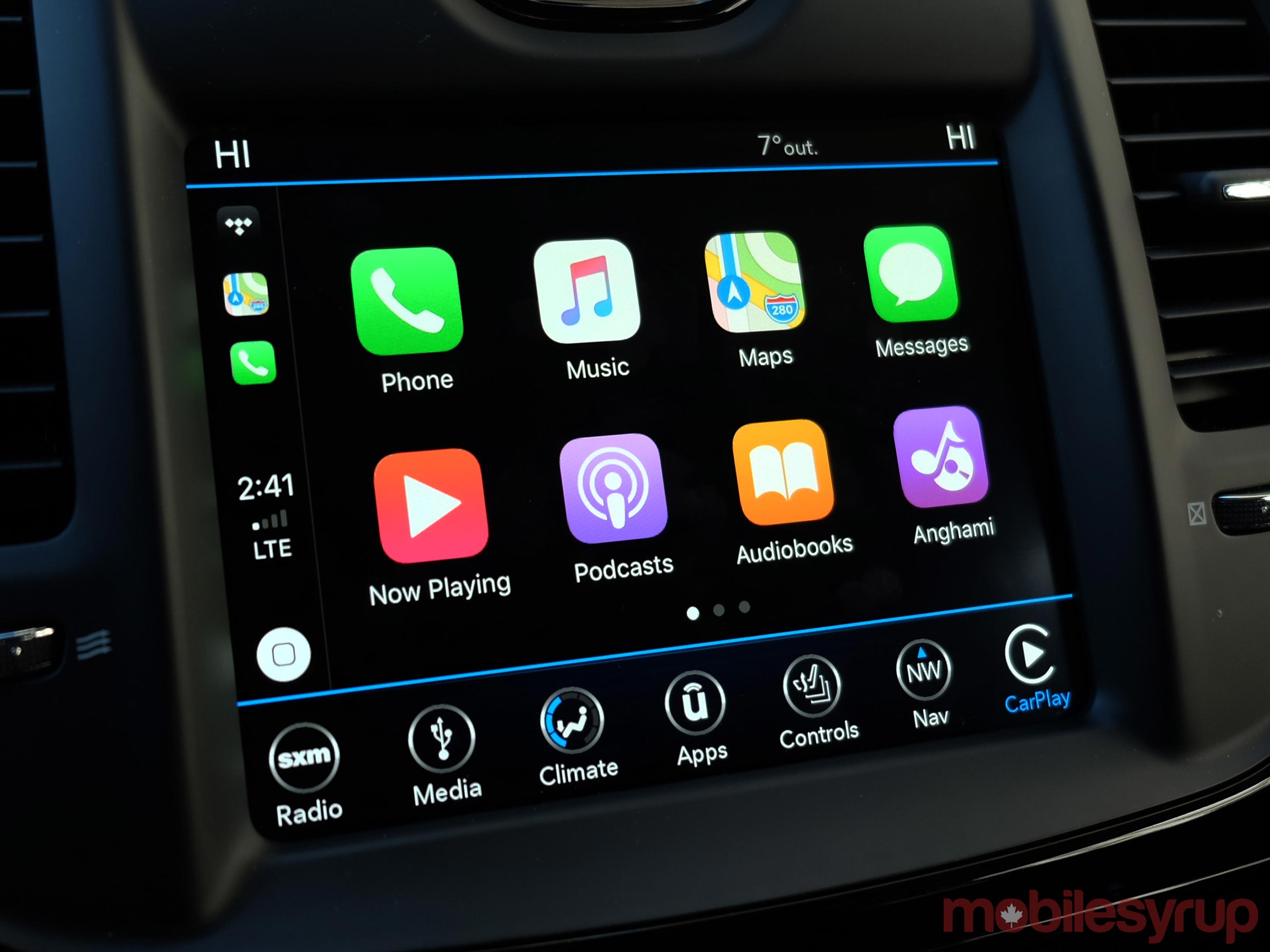
Uconnect is actually more aesthetically-pleasing than other infotainment designs I’ve seen. A clean interface, nice icons and slick layout help ingratiate users into diving right in when learning how to use it.
Naturally, an 8.4-inch display doesn’t hurt, and its responsiveness only helps further. The capacitive display makes swiping relatively effortless, and pinch-to-zoom for maps quicker than other screens I’ve tried.
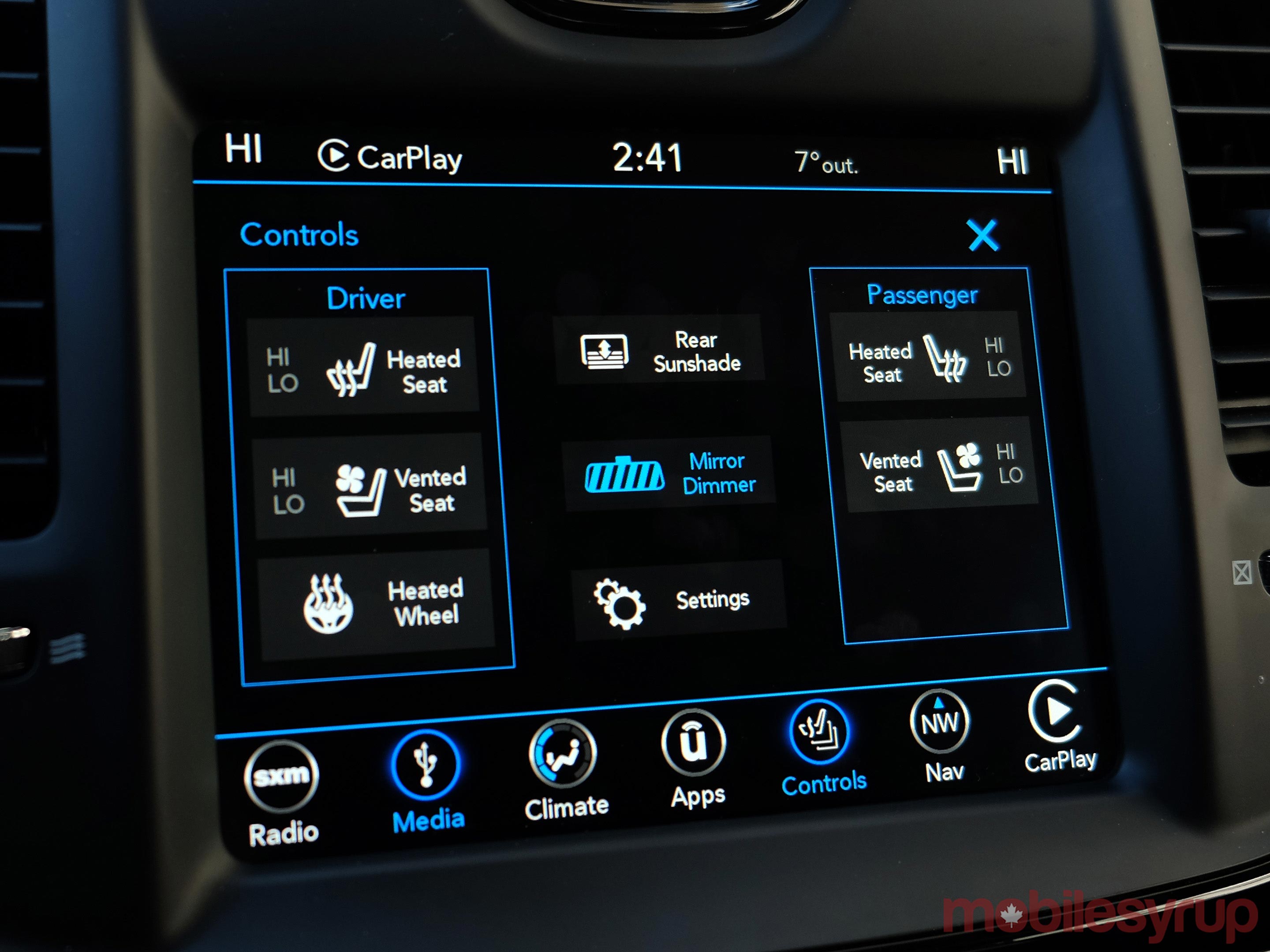
There’s also a mix of virtual and physical buttons that make the system fairly integrated. For example, there’s a volume knob and physical climate controls, yet there are soft keys onscreen for seat warmers and radio tuning.
While Apple CarPlay and Android Auto come standard, features like in-car navigation, SiriusXM and BeatsAudio cost extra. The in-car SIM enables communication between the Uconnect iOS and Android app, but only for the car’s owner. I wasn’t able to test out the app at all, unfortunately.
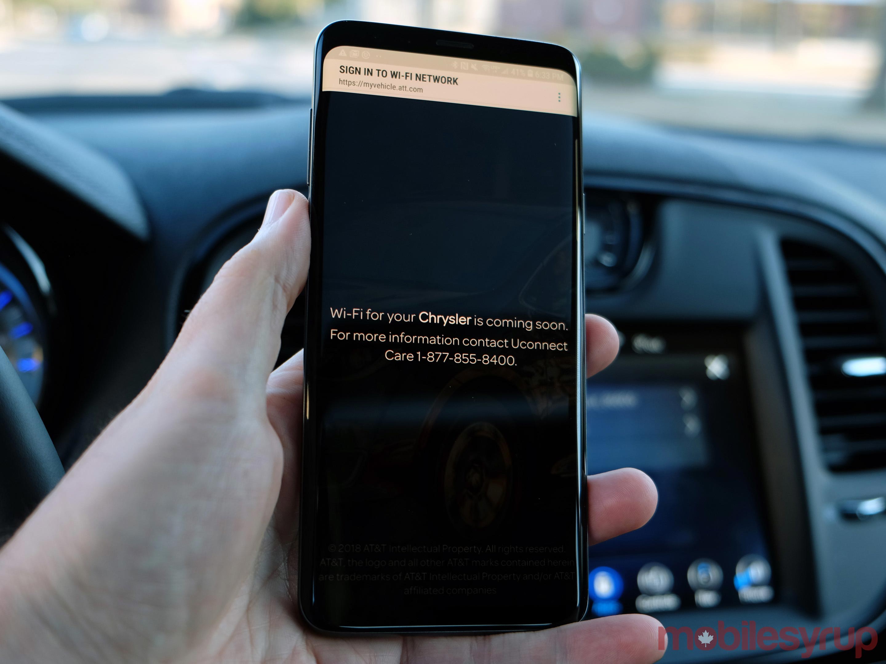
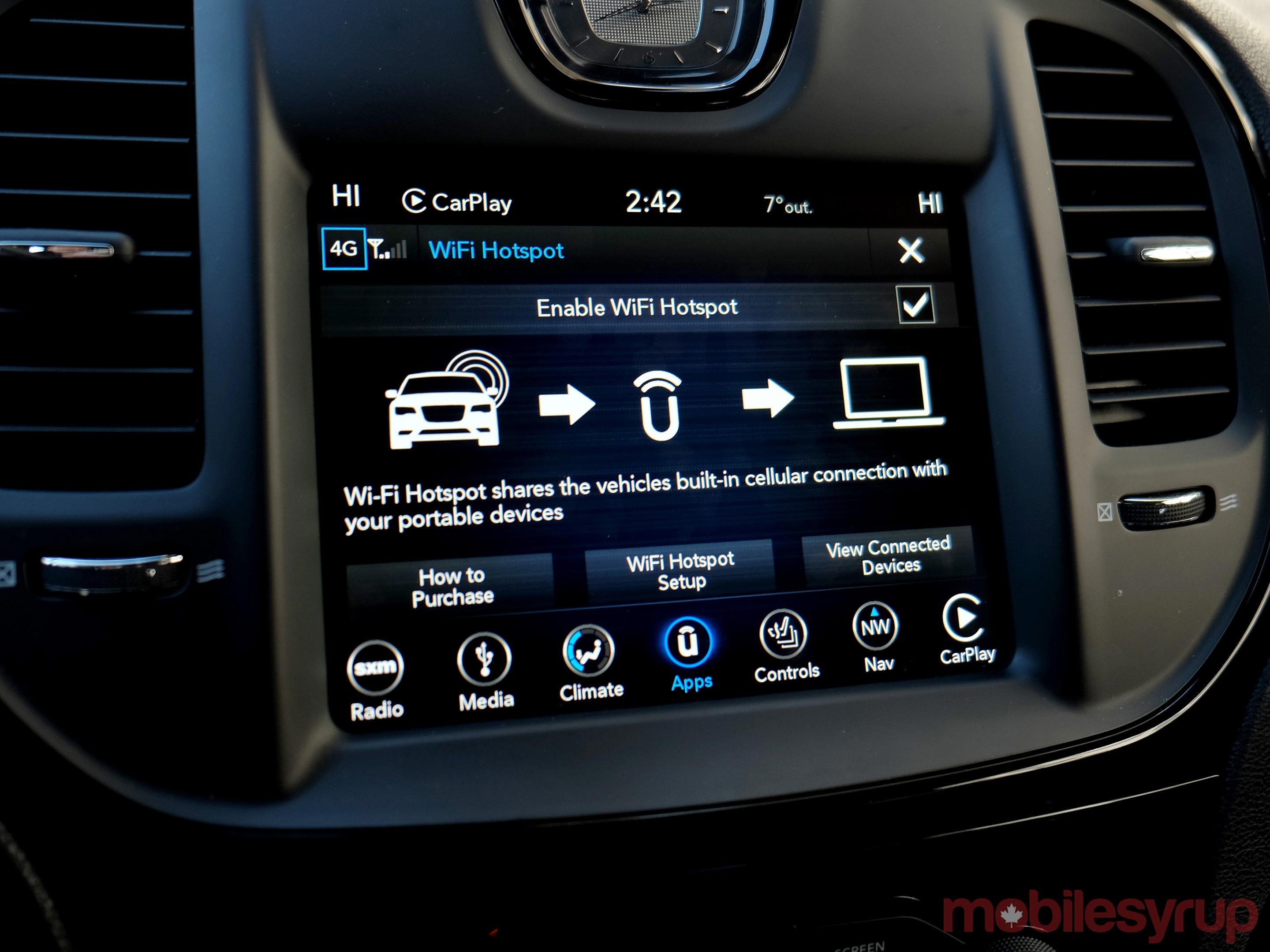
Additionally, the in-car SIM is capable of an in-car Wi-Fi hotspot. The feature wasn’t available during my testing, but has just been unlocked for drivers. It’s on the screen, and there’s a way to set it up with an SSID and password, with data plans offered through Chrysler’s deal with AT&T.
Connections and layout
I’m not sure why, but Chrysler chose to put both USB ports inside the centre console storage bin. I get that it’s a standard location for some charging ports, but the absence of any others on the dash makes for a strange layout, especially for a car that is $55,000 fully-loaded.
There’s no wireless charging pad, and the Aux-In port also sits inside the bin. Whether or not it’s a way to keep the phone as out of sight as possible is hard to know.
Bluetooth is standard, supporting Siri Eyes Free, but not Google Assistant. Uconnect’s Voice Command supersedes Siri, even when CarPlay is running, forcing drivers to long press the voice button to bring up that familiar ping to start talking.
Voice Command
Chrysler puts its own Voice Command platform first almost all the time. I was surprised that holding the home button on the CarPlay screen did nothing. Doing that always triggered Siri to life, but here, I could only do it by long pressing the voice button or saying “Hey Siri,” (with that setting turned on).
It’s the same scenario with Google Assistant. It wouldn’t work at all via Bluetooth, and in Android Auto, I would need to long press the voice button or say, “Hey Google,” to spring it to action.
Voice Command tries to cover the usual ground, be it calling, texting, destination, points of interest and accessing music stored on a phone or USB stick. It’s not bad, with a reasonable degree of comprehension, though isn’t a standout in a broader sense.
I did use it for calling more than I would have CarPlay or Android Auto, simply because the basic button press made it faster to actually call someone. For messaging, however, I opted to go with those platforms, unless I used Uconnect’s canned driving responses to tell people I would get back to them later.
Integrating web
Uconnect felt like something of a hybrid at times. I could control climate with the physical buttons, but also affect it through touch controls on the display. I could tune radio stations on the display, or use the knob instead.
Rather than redundancies, it’s a way to play it safe for drivers who prefer it one way or the other. Mind you, there are no physical buttons to navigate the system itself, as is often seen in other automakers’ systems.
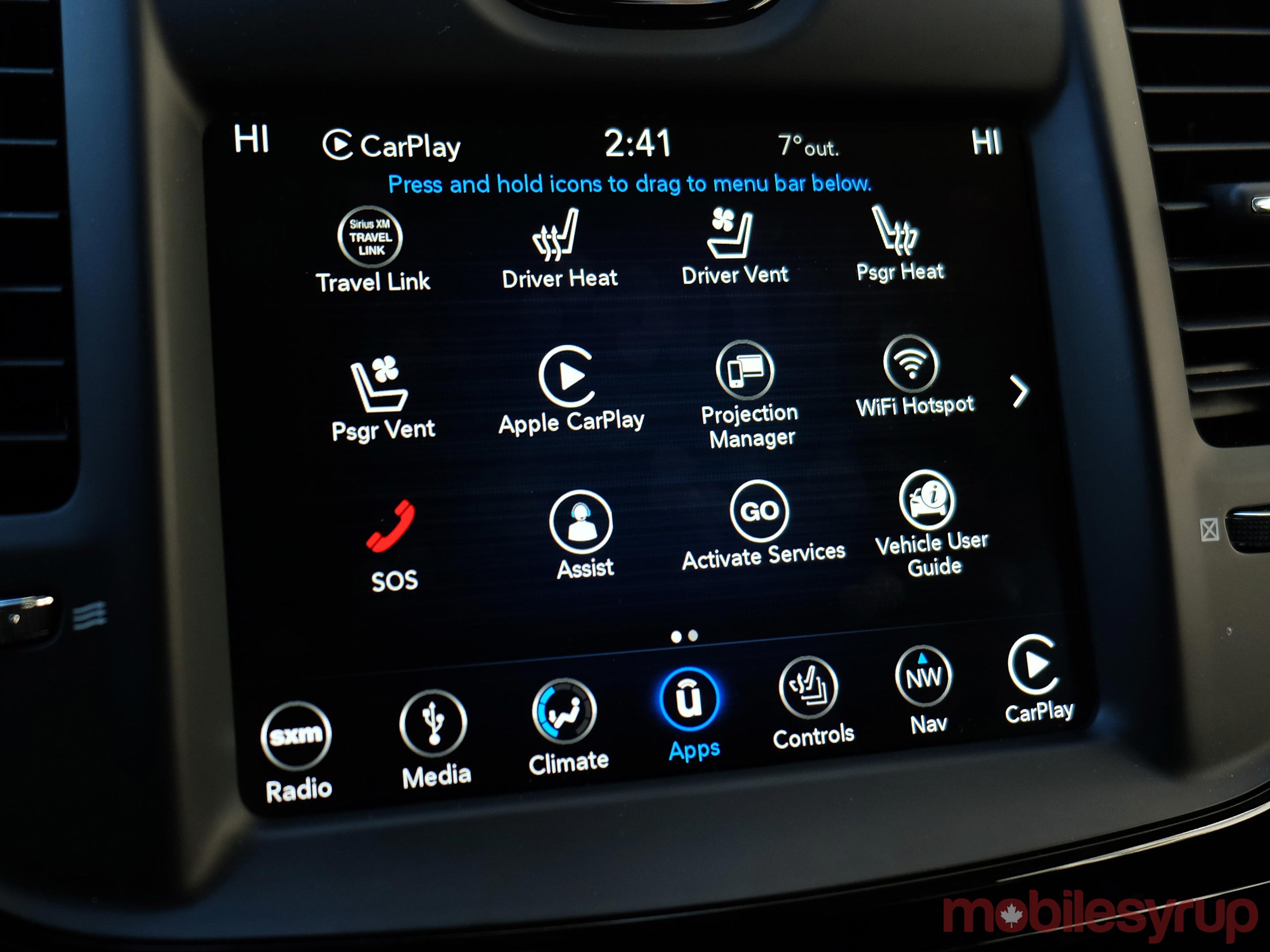
The ‘Apps’ section isn’t really a separate area relating to integrated apps, but rather a layout to the various features available. There was no distinct app integration that I could make use of, meaning there was no way for me to use Spotify or some other app an in integrative way.
SiriusXM is more prominent because it goes beyond just satellite radio. Travel Link opens up apps offering information on gas stations by fuel price, weather conditions, sports scores, weather and traffic. You can only get these things with a subscription, though would get one year free upon purchasing a vehicle.
I would argue that package would be less relevant with an in-car hotspot. If I had data I could leverage, I could simply ask for that information from my phone. Not that I couldn’t from my phone on its own, but reception tends to be better through the car’s antenna. Plus, roaming is a non-issue, given Chrysler gets its data from AT&T, like other automakers do.
CarPlay and Android Auto
Having both of these platforms enhances any infotainment system right out of the gate. There just isn’t anything comparable from an OEM that integrates as well as they do.
And with app support growing, the experience is improving. Tidal now works on both. WhatsApp works on both. Google Play Music works on both. Mixcloud, iHeartRadio — it goes on. SoundCloud, where are you? That’s one app that needs to get on both right away, as far as I’m concerned.
They translate well to a screen of this size, too. Whereas larger displays can share the real estate to show information for two separate things, this is essentially a canvas for each platform to do its thing.
Chrysler maintains the menu bar at the bottom, thus negating the need for an app icon to go back to Uconnect. I like this approach because it made it really easy to go to Uconnect for something specific and then over to CarPlay or Android Auto without any fuss.
I’m noticing this more with other automakers, presumably so that they don’t cede the entire infotainment experience to Apple and Google. When done seamlessly like this, it works well, and strengthens the sum instead of treating the whole thing like parts that don’t really work together.
Update 09/04/2018: Changes have been made to the review regarding in-car Wi-Fi.
MobileSyrup may earn a commission from purchases made via our links, which helps fund the journalism we provide free on our website. These links do not influence our editorial content. Support us here.

