Whether you like Google’s new all-white design or not, the company is pushing forward with it. But it may add a dark mode as well.
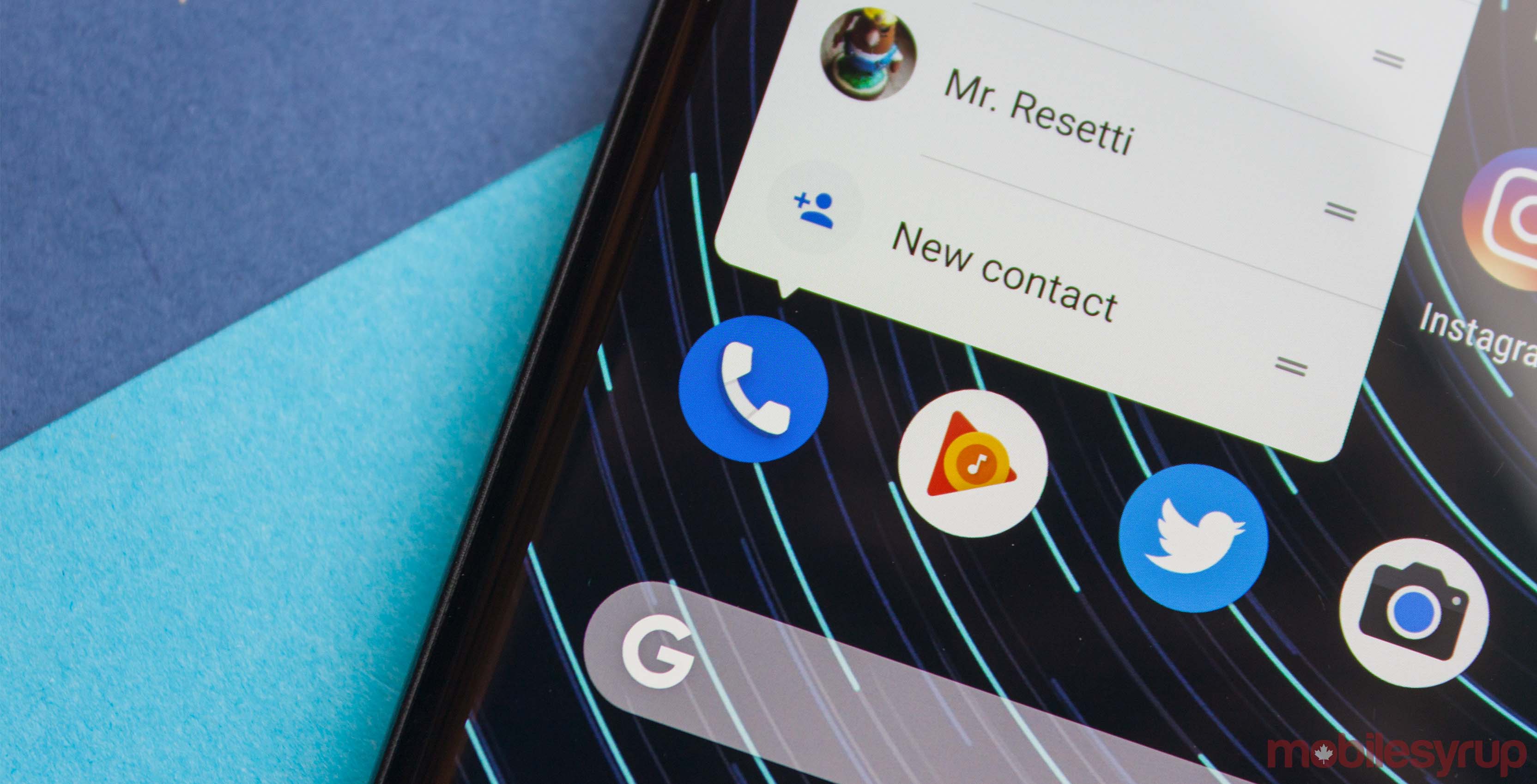
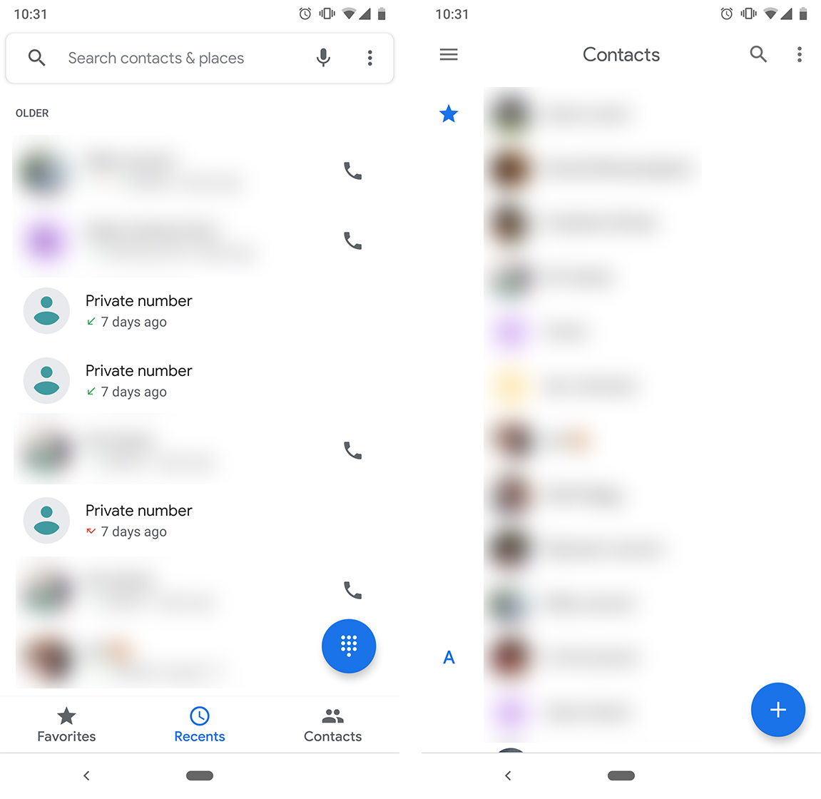
Google’s Phone app, Contacts and Android Messages all received an updated design. Gone are the fun colours and familiar blues, replaced with white.

It isn’t a bad design by any stretch. These apps sport a very modern, clean look. Personally, I love it.
What I don’t love is the searing bright white of my phone when I check it in a dark room.
Thankfully, Google added a dark mode to Messages to help with that problem. Furthermore, a recent update to the Play Store listing for the Phone app says dark mode is coming for it as well.

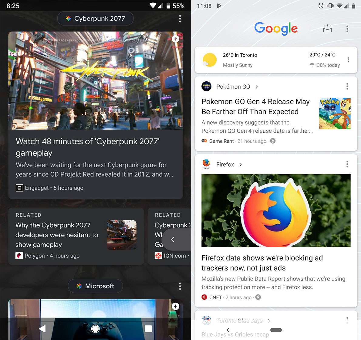
It appears Google’s testing dark mode in some other parts of Android as well. A recent Reddit post revealed a dark mode version of the Google Feed. It appears to be a server-side A/B test, as Reddit user ‘thelimkid’ wrote that their Google app was on version 8.15.15.21.arm64.
However, my Google app, which is part of the beta group, is running 8.18.11.21.arm64. It doesn’t feature the new Feed design and dark mode.

YouTube for Android also recently received a dark mode.
Hopefully, this spreads to Google’s other apps. Imagine Google News or Google Podcasts with dark modes.
Soon, we could be living in a dark Google world. My eyeballs will be grateful for it.
Image: Dark Google Feed image from Reddit user ‘Justananomaly.’
Source: Google Play, Reddit Via: Android Police
MobileSyrup may earn a commission from purchases made via our links, which helps fund the journalism we provide free on our website. These links do not influence our editorial content. Support us here.


