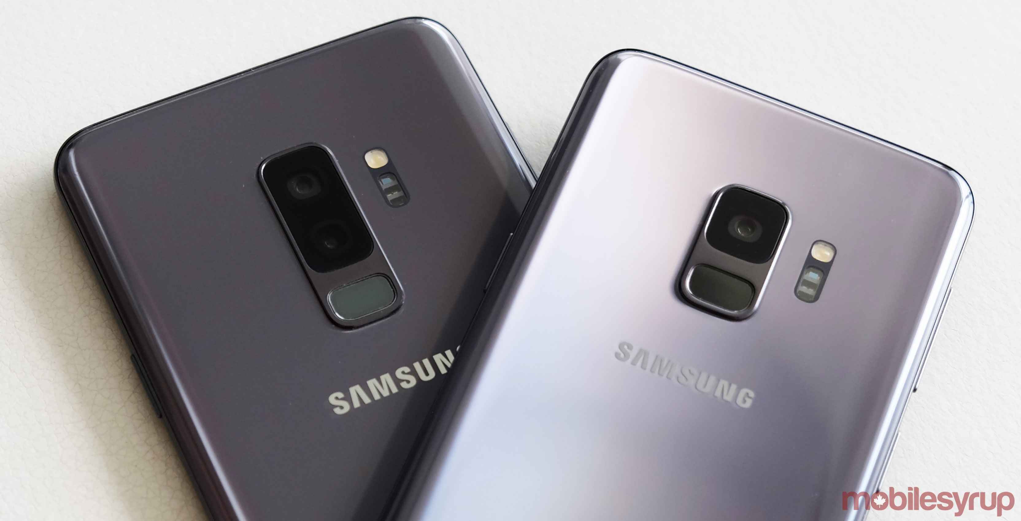
It’s been six months since Samsung first unveiled the Galaxy S9 and S9+ and both devices have carried forward the company’s iterative path with each successive launch.
It’s fitting that this review comes around the same time Samsung released the Galaxy Note 9. The two lines have become so intertwined, past differences are increasingly blurring into obvious similarities. What was once more of a binary choice is now coming down to a matter of taste.
These two devices were truly the biggest leap — not forward from a technology perspective, but rather toward what the Note line had been doing before. What the Note 8 got wrong, the Galaxy S9 and S9+ tried to fix. And that trend continued with the Note 9.
Despite that, there is plenty to like about this pair of devices. Months have passed, and its lower price only looks more attractive next to other expensive devices.
The device
It’s not surprising Samsung’s design philosophy maintains its attractiveness over time. Even the Galaxy S7 still looks good by today’s standards. The all-glass form factor has been done before, except that’s there’s an elegance to the S9/S9+ that is hard to deny. They’re pretty phones, and they still feel that way months later.
They’re also very delicate. Like the iPhone X, with its all-glass build, I found myself clutching both handsets the same way. A case certainly helps, but only a rugged one would give me real peace of mind. I’ve never been prone to accidentally dropping any phone, but it’s also that any contact or friction with other items, like in a pocket, that are a cause for concern. To me, when you have something elegant, you want to keep it that way.
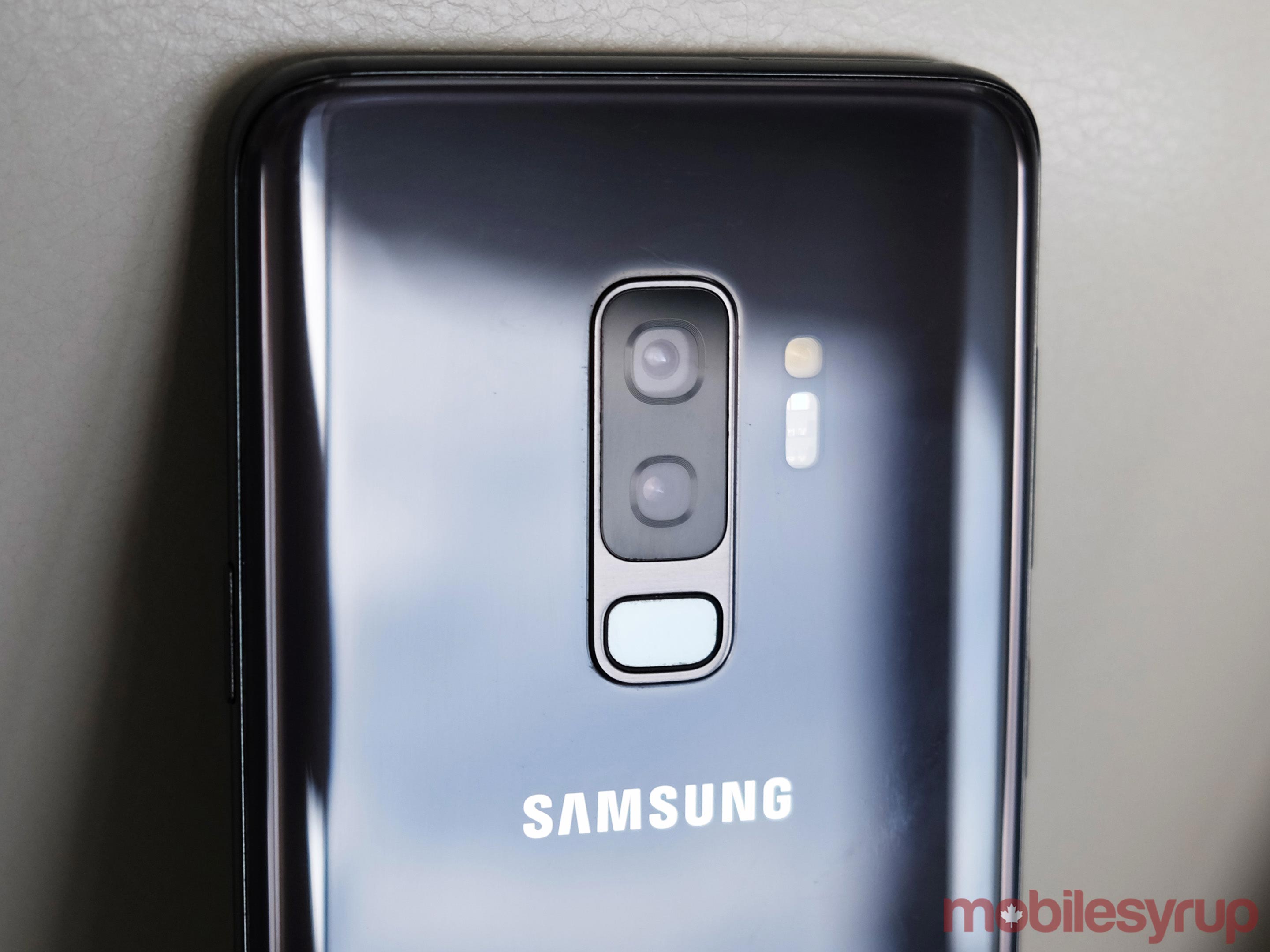
Functionally, both devices have some interesting caveats. Putting the fingerprint sensor under the camera lens is arguably the biggest one, simply because of how convenient it is being there. I prefer it over using the iris scanner or face recognition, though I do wish Samsung would’ve placed it closer to the middle of the device, especially with the larger S9+.
It contrasts with the curved display, which I find less and less useful. Samsung seems to agree because it’s done nothing of real consequence with it since 2016. Third-party developers have been lukewarm supporting it, though I readily admit there’s a surprising number of panels to download for the edge interface.
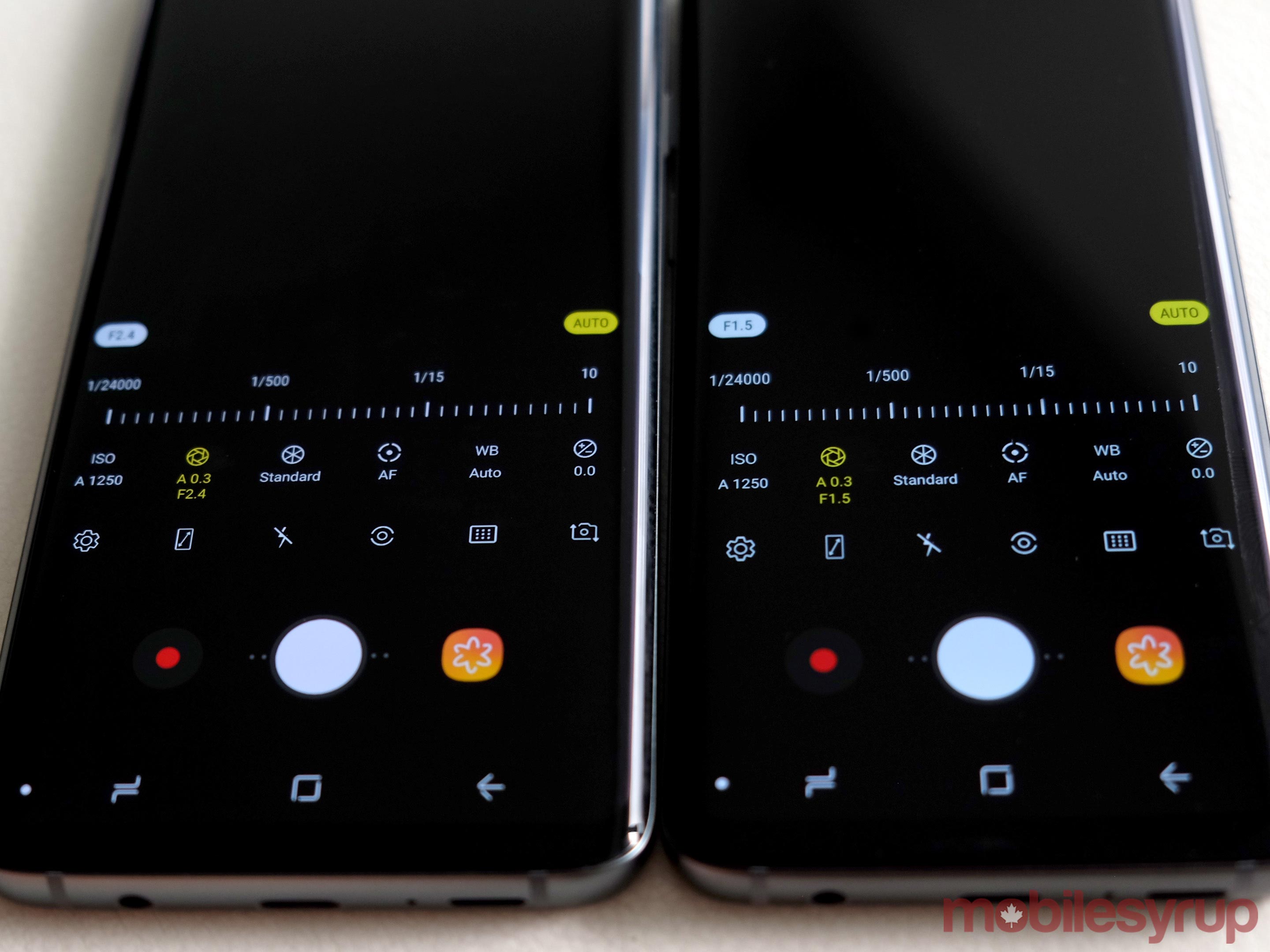
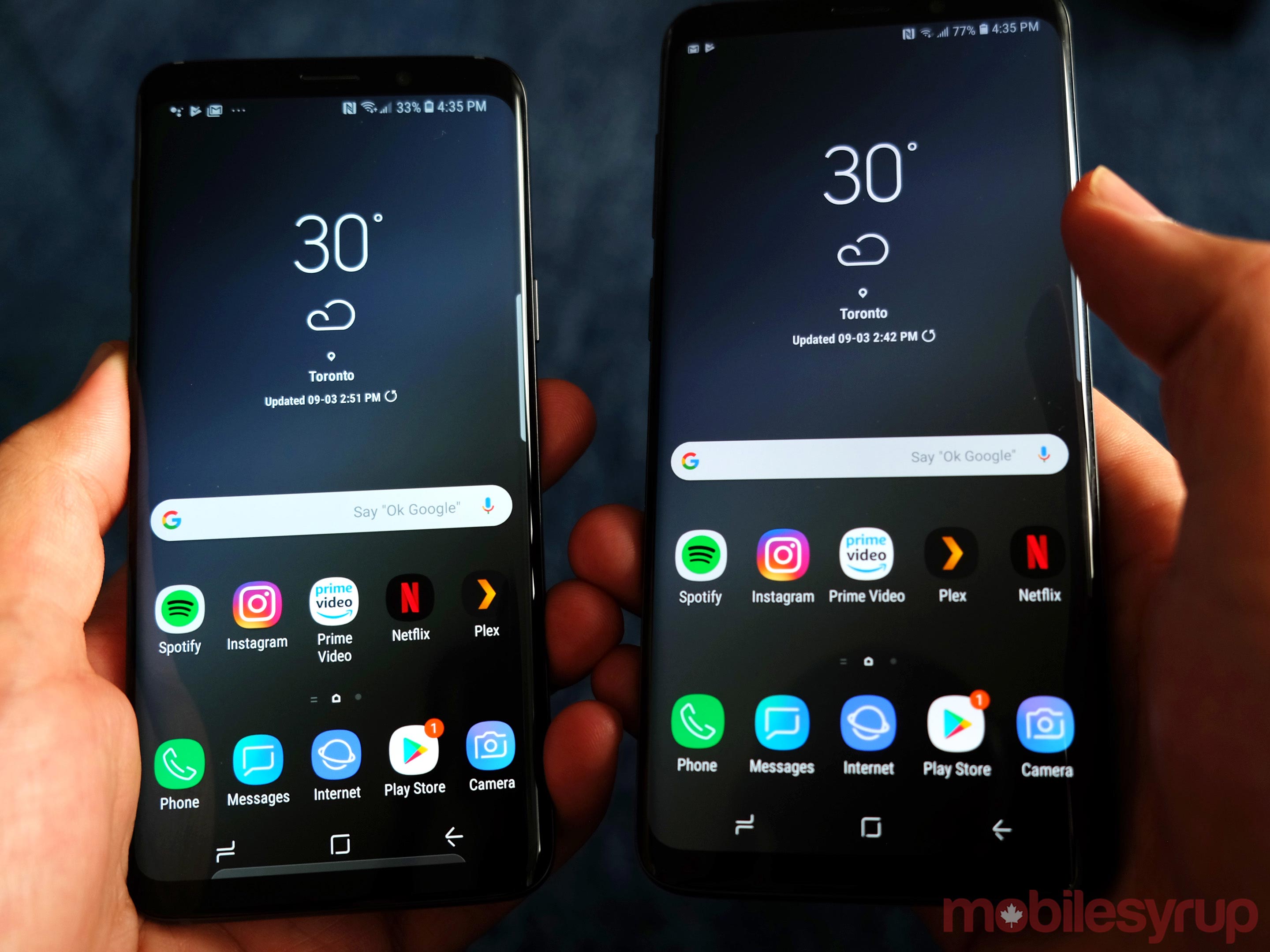
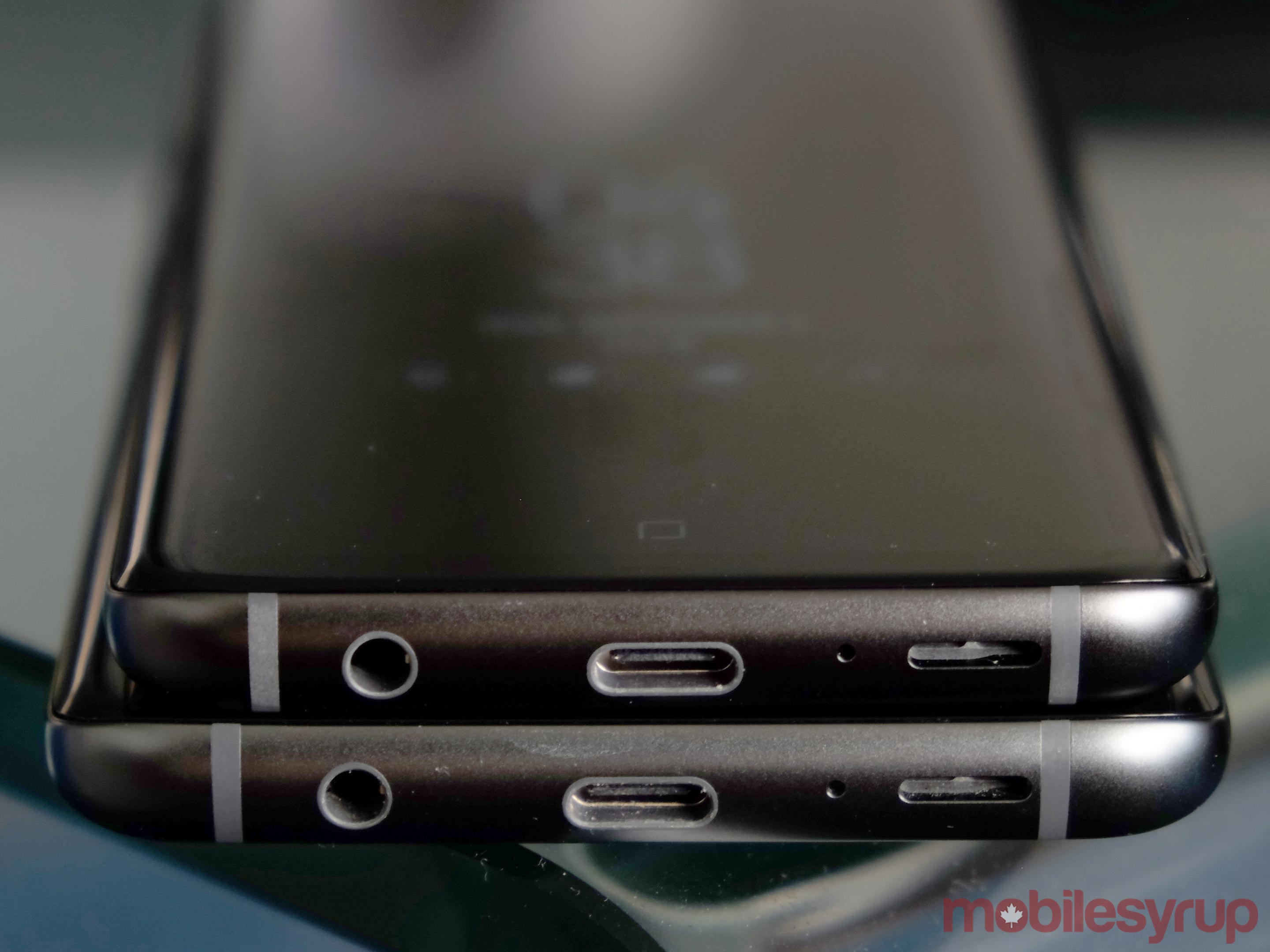
The S9+, especially, feels like a Note 8, primarily because of the large 6.2-inch Super AMOLED and dual lens camera layout. Samsung added a mechanical aperture to it, which can be useful when used properly. The S9, on the other hand, doesn’t have two lenses, though it does have the variable aperture. From wireless charging to the headphone jack and on to battery life, the similarities between these three devices are continuous.
Under the hood, the components have held up well thus far. As much as Samsung has been praised (and rewarded by all the consumers buying their phones) for its design and functional purpose, the company’s devices haven’t always aged well. And yet, the S9/S9+ seem to have stemmed that tide just a little bit. Hiccups, lag and crashes are practically non-existent, hopefully ushering in an era where a Samsung flagship isn’t measured by its longevity relative to manageable degradation.
The software
On the face of it, Samsung has reduced its overbearing presence within its software overlay. Under the surface, however, the ‘Samsung Experience becomes one of necessary acceptance rather than adamant acquiescence. It feels bloated over time, and I blame the redundancy inherent in the whole thing.
Why Samsung insists on having its own web browser is beyond me. It’s never as good as third-party ones anyway. In the past, the company shielded users from its excesses by using its Galaxy Apps app as a repository. If you completely ignored it, you could get by without really embracing anything Samsung was offering.
Looking at the preloaded apps, there is a bunch of stuff in there that speaks to the company’s ecosystem. Gear devices, SmartThings, memberships, or other stuff that arguably should’ve been abandoned already. I don’t know if Samsung Health has a large number of regular users, but I can’t imagine it does. It’s never worked well, and pales in comparison to other more dedicated third-party options.
One of the issues, at least for me, is that despite the apps being put to the side, the whole Samsung Experience feels like an app unto itself. Every part of Android has been given some sort of paint job that becomes all the more prevalent when compared to stock Android devices like the Pixel 2.
Even so, Samsung’s software is a fact of life that has clearly gained some confidence with users. The company wouldn’t sell as many units as it does otherwise. But more needs to be done to effectuate a clearer vision on how it can be more useful. For example, the Always-On display needs some change, especially when it comes to administering notifications. Giving me the gist of what’s come in is okay, but I still have to take an extra step or two just to do something with it.
The app launcher could use a few tweaks, as well. Putting the most recent apps at the top is one of those small moves that adds real convenience. Other Android handsets have it, Samsung doesn’t. There is a barrage of notifications and settings directly tied to something the company is trying to sell users on, be it an app to help copy data over to a new device, or Bixby, or Galaxy Apps, or whatever else is available.
I’m harping on the user experience here, and I know it sounds like a lot of griping, but it has more to do with how well these two phones have actually run so far. I’m just saying the right tweaks would only make it better.
I was impressed at how well games played on them. Media streaming is excellent. Phone calls and messaging are top notch. Photo and video editing don’t seem to make anything stutter, either. In other words, actually doing stuff on these phones doesn’t put up roadblocks that totally hinder one’s intent. Demanding apps run smoothly, and the automatic screen brightness is noticeably better than it once was, helping save battery life in the process.
Android updates
It’s probably never going to happen, but a Samsung flagship that runs something closer to stock Android would be special. The Samsung Experience software (plus carrier foot-dragging) complicates the Android update process, as it is, and it’s unclear when either of these devices will get to Android 9.0 Pie.
Delays in getting full OS updates has become par for the course with Android phones, in general, unless you’ve got a Pixel in hand. But for Samsung, the delays are even more unfortunate because two of the leading Android flagships aren’t going to run the latest version until months after it rolled out.
Monthly security patch updates were a bit slow to come out after launch until the last big update in July brought things up to speed.
As I write this, both the S9 and S9+ I’m using are on the June 1 patch, though I’ve seen others online on the July 1 or even August 1 patches. These should come out like clockwork to be consistent with Samsung’s focus on security.
Bixby
Samsung is pushing Bixby hard, but the hill appears to be getting steeper to climb from where I’m sitting. The conundrum here is not just how effective and ‘smart’ the company’s voice assistant can be, but also how well it ties in to everything people would use it for.
As is, the platform is more a verbal-guidance system for stuff within the S9/S9+ than anything else. Sure, it’s cool that I can tell either phone to snap a photo, take a screenshot or send a message to someone, but I have little control beyond Samsung’s own borders.
The Spotify integration announced at the Note 9 launch in Brooklyn will also come to the S9/S9+, as would the ability to order an Uber or make restaurant reservations. These are good starting points to winning more hearts and minds, except that Google Assistant runs perfectly fine on both phones. For the sake of reviewing the platform, I kept Bixby going, but I eventually just enabled Google Assistant, too.
Bixby can try to give me context, like translating a sign, or telling me where I can find a certain product (through Bixby Vision), but again, it never feels natural. Plus, I have no control over smart home devices unless I have a Samsung SmartThings Hub at home. Compatibility in different aspects remains the biggest hurdle to getting this voice assistant beyond what feels like an experiment.
The camera
Having already reviewed the camera for both phones, there’s no need to repeat myself, though I was looking for something that would change between then and now. Samsung did release an update in July that included camera improvements.
Those tweaks were for stabilizing the AR Emoji and Super Slo-Mo modes, both of which were acquired tastes from the start. Super Slo-Mo is a nice novelty that excites most when capturing an absolutely salient moment in a clip. The problem is getting that right takes multiple attempts, and once light gets dimmer, a snowfall of noise packs the footage. These were the devices Samsung first introduced the mode, which it now also put into the Note 8, lock, stock and barrel. At 720p, the resolution is still too low to work with.
The same is true of AR Emoji. This was a mode Samsung felt would resonate over time, but I’m not seeing it. At times creepy, and at other times, bizarre, the mode isn’t quite accurate or cutesy enough to make a case for being a standout feature people want. Maybe it’s just me, but I still see people preferring Snapchat or Instagram to use filters and animate themselves.
The camera comes down to the basics, which is shooting photos and video. I’ve seen other reviewers be less enthused with the variable aperture, but I see it as a real boon because it relies less on software to handle exposure. Fixed apertures are standard on phones, so to have the option of two is helpful when shooting in low-light. I found the best use was in Pro mode where it helped me rely a little less on shutter speed and ISO.
The battery
If there’s one thing the Note 9 has over these two phones, it’s a more efficient battery. The S9+, in particular, is saddled with a 3,500mAh battery that can sometimes struggle with heavier usage. The Note 9 features 4,000mAh battery, and while it’s still early into its lifespan, it showed me better performance from the get-go.
As it stands…
Much of what I’ve noted isn’t all that positive, but that’s not to say either of these phones are bad. They do the main things very well, like general usage, smooth performance, great photos and elegant design. It’s not the sum that’s bad, it’s some of the parts that force compromises.
The edge displays make the phones more susceptible to damage, yet they may otherwise be neglected as usable features. Hardware performance is slick, except the software sometimes feels imposingly weighted. The camera shoots wonderfully, albeit with gimmicky settings and modes tacked on.
These compromises become far more apparent over time. While some of them can be tucked away and ignored, others are more omnipresent. There is plenty of room for customization, what with third-party launchers and uninstalling or disabling apps, among other tweaks, but I would venture that most casual users don’t do that.
These are still $1,000 phones, but they will continue to depreciate now that the Note 9 is out, and rumours circulate about what the Galaxy S10 will have. Six months from now, these might teeter further down toward mid-range pricing.
MobileSyrup may earn a commission from purchases made via our links, which helps fund the journalism we provide free on our website. These links do not influence our editorial content. Support us here.

