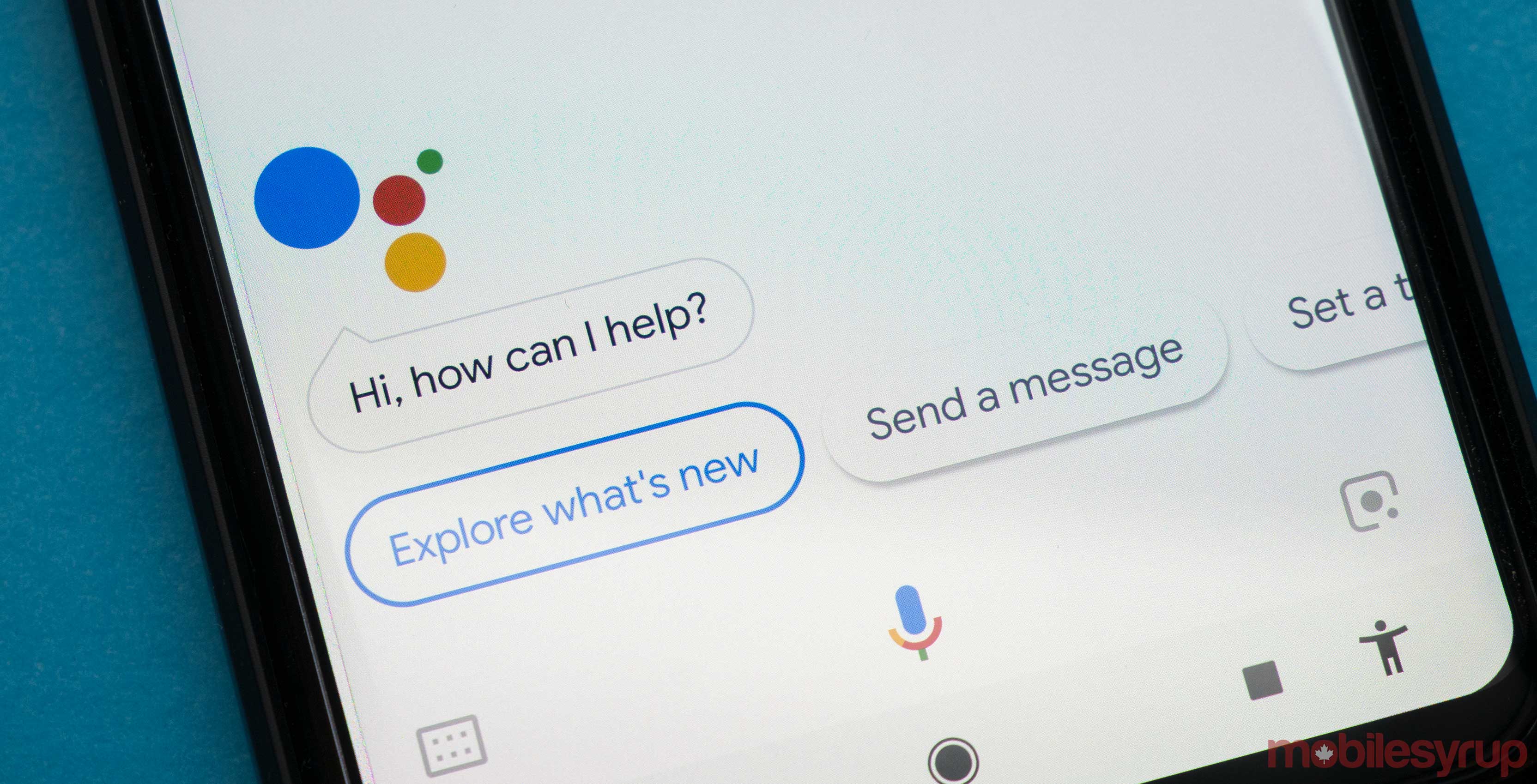
In another limited, server-side test, Google is testing a new visual look for Assistant.
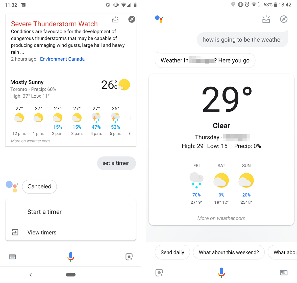
The changes centre on the cards that pop-up when asking questions like “What’s the weather?” The new cards feature a more Material look, with rounded corners and white backgrounds.
Furthermore, the cards are bigger and more visual. The weather card, for example, displays the temperate prominently with other details below.

Old Assistant style (left) compared to the new style (right).
Along with the new cards, the text bubbles now have little points to make them more like speech bubbles.
Finally, the explore and ‘My Day’ icons at the top right feature a slightly more Material look.
Overall, the changes are relatively small tweaks that bring Assistant more in line with Google’s Material Design. However, like most of Google’s new visual tweaks, it’s currently limited to a tiny subset of users.
You’ll have to exercise patience until Google rolls out the changes to more people.
Source: Android Police
MobileSyrup may earn a commission from purchases made via our links, which helps fund the journalism we provide free on our website. These links do not influence our editorial content. Support us here.


