Google is rolling out a fresh new Assistant user interface that aims to make the overall UI more touch-friendly.
According to the Mountain View-based search giant, nearly half of all Assistant interactions in the last two years involved touch.
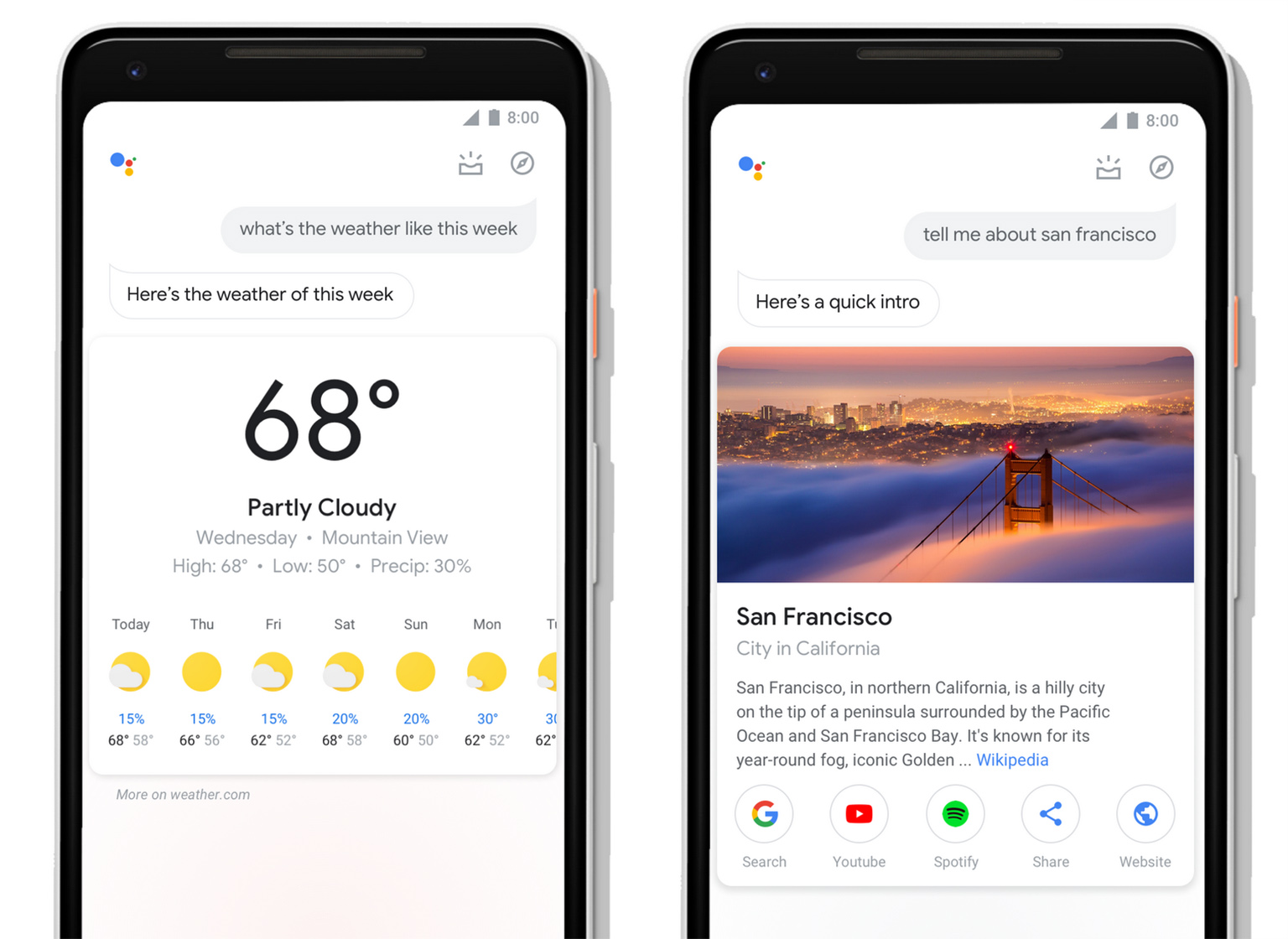
As such, the visual update brings a number of changes, including more prominent, pronounced visuals. Weather cards, for example, feature much larger symbols and temperatures. Search results also feature more sizable images and buttons are bigger and more tappable.

Furthermore, users will find new controls and sliders sprinkled throughout Assistant. These can help you manage your smart devices, such as raising the volume on your speaker or the temperature on your Nest.
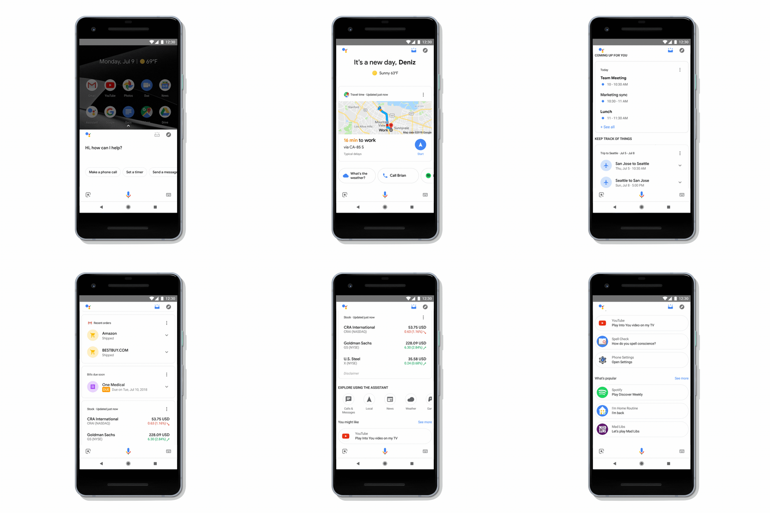
Additionally, Google is making it easier to access the overview of your day in Assistant. On Android phones, when you activate Assistant, you can swipe up to access the overview section.
Finally, Google is adding an interactive messaging interface that aims to make it easier to add commas, change words and make other quick edits when composing messages.

There are also new tools for developers that make it easier to take full advantage of the phone’s display. This means you’ll see more visuals when interacting with third-party apps through Assistant.
Overall, this new visual change is certainly welcome. Furthermore, this update also likely paves the way for Google’s Smart Display products where a visual Assistant is more critical.
Source: Google
MobileSyrup may earn a commission from purchases made via our links, which helps fund the journalism we provide free on our website. These links do not influence our editorial content. Support us here.


