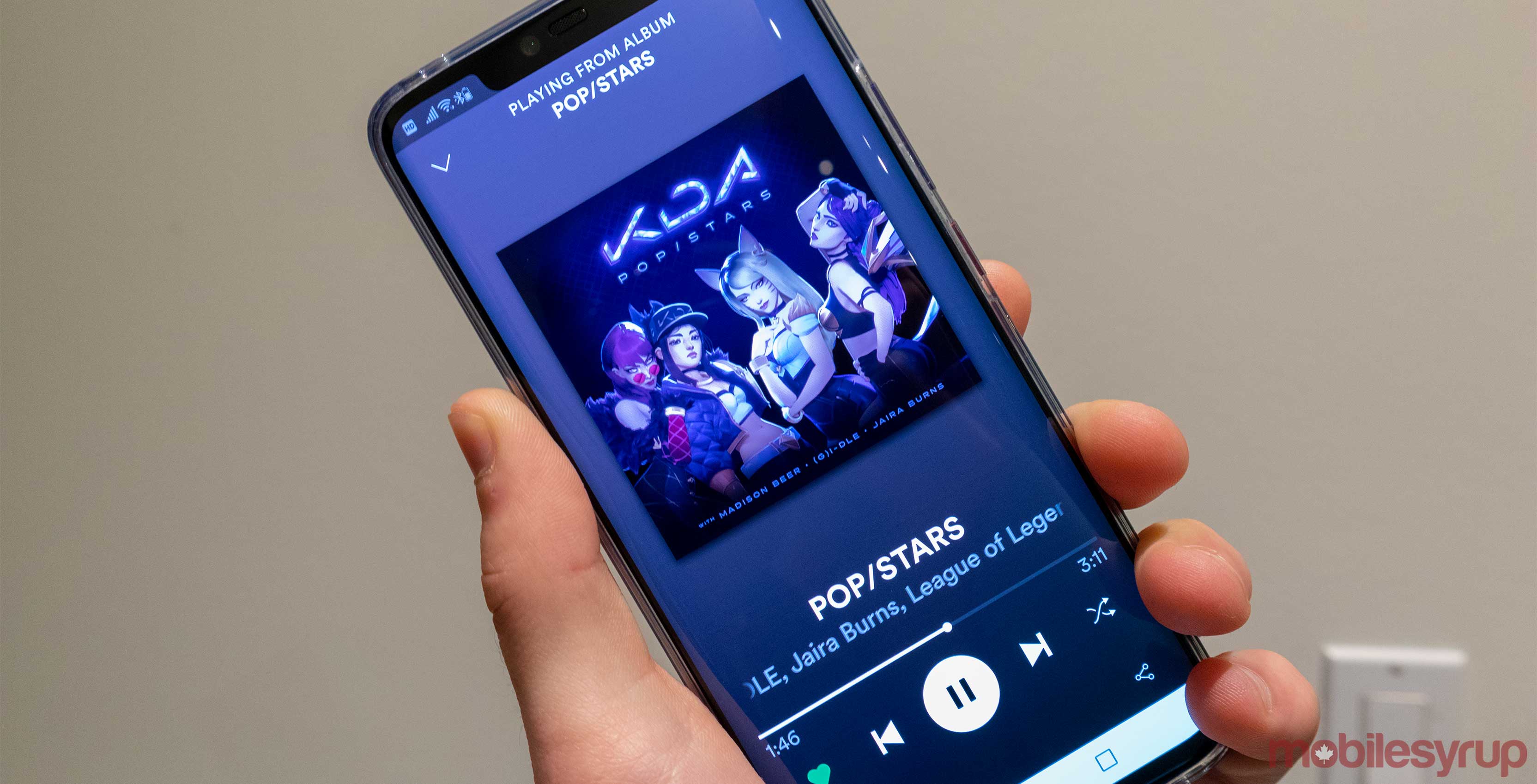
It appears that the music streaming giant Spotify is testing a new interface design on its now playing screen.
The revamped version of the app appears on some phones that are running Spotify version 8.4.78.530.
I’m running the same version of Spotify on a Huawei P20 Pro and a Mate 20 Pro and only the Mate is sporting the new look, so it seems like the update must be a server-side rollout. 
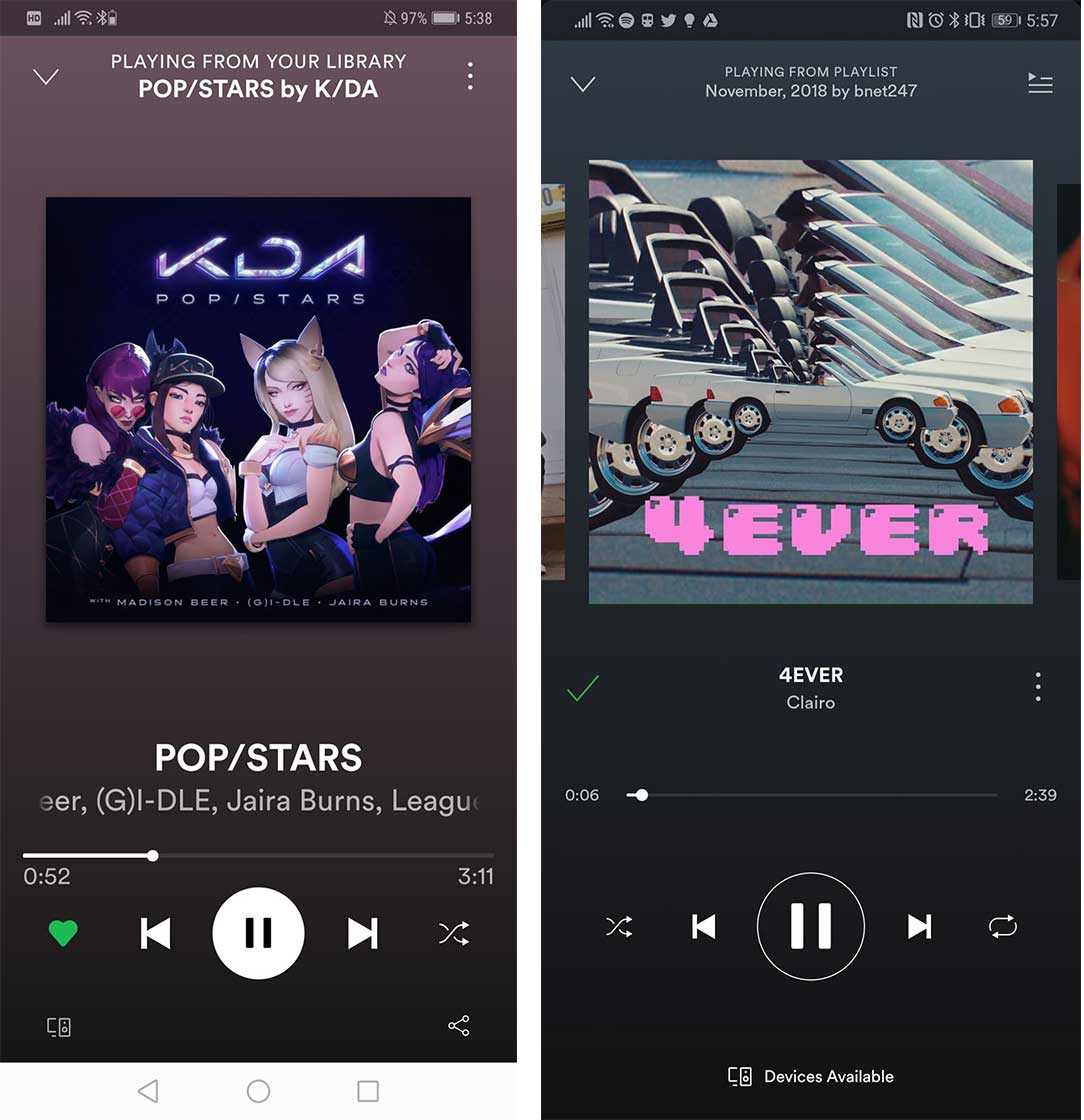
The new design is pretty subtle, but most notably it adds the heart icon that is used in the upcoming Apple Watch app, which leads me to believe Spotify is moving away from the old trusty checkmark and plus iconography.
Other than this, there is a new ‘Share’ button on the bottom right of the screen and the ‘Play/Pause’ button is white now.
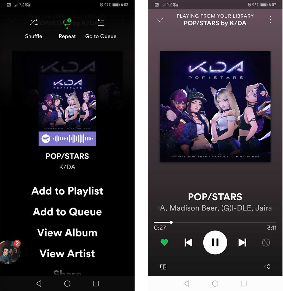
The three dot menu has been moved to the top corner of the device and it now holds the ‘Repeat’ button, the ‘Queue,’ ‘Shuffle’ and all of the regular menu items like ‘Go to Artist Radio,’ ‘Share,’ ‘Show Credits,”View Artist’ and more.
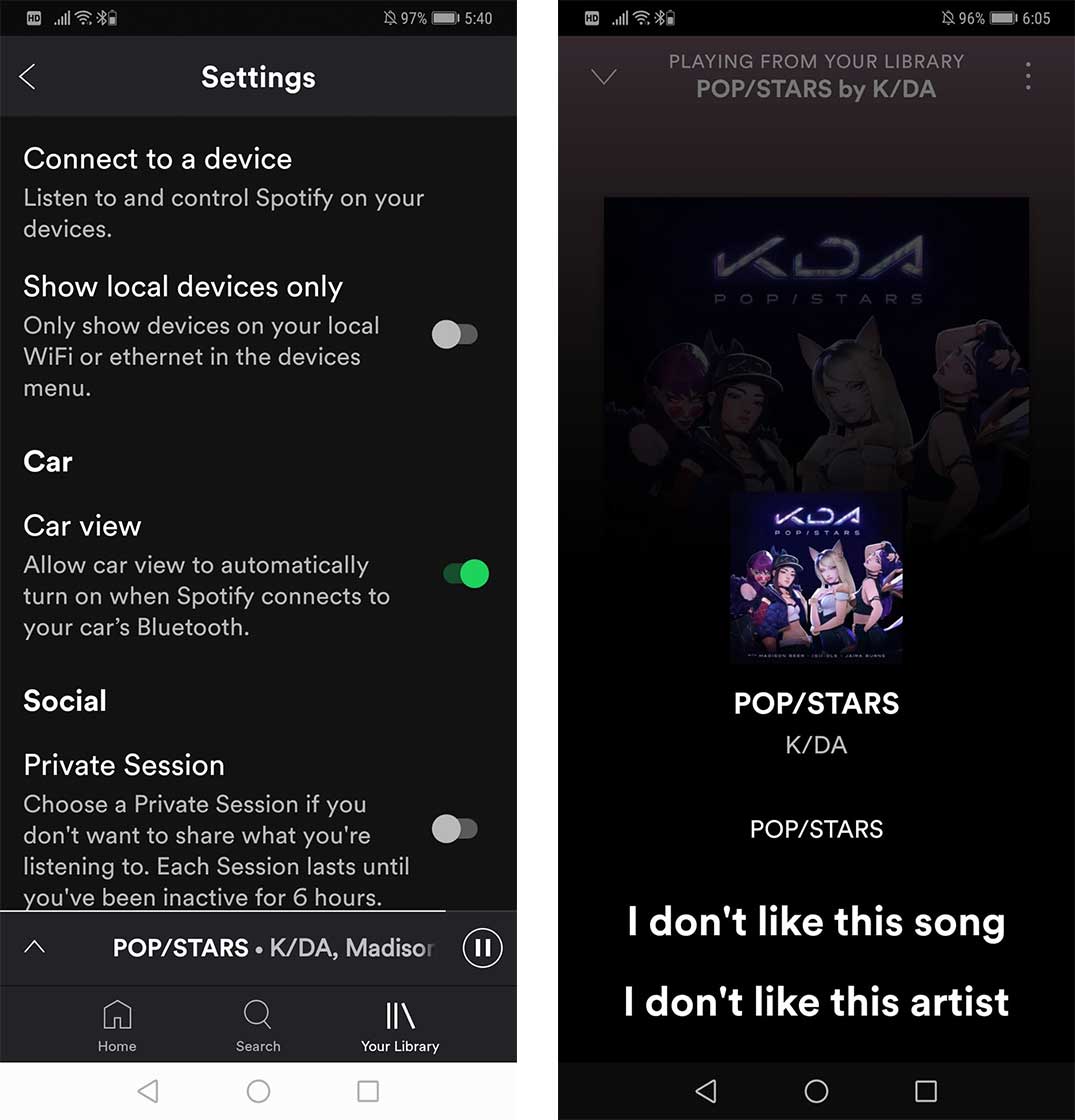
It also seems like the shuffle button is contextual. Further into my test of the app, it was replaced with a ‘prohibition’ icon the lets you indicate if you like a or dislike a specific song. 
There also seems to be a new ‘Car View’ feature that I haven’t been able to test out, but it says that it displays a new screen that I can assume makes it easier to use in a vehicle.
MobileSyrup may earn a commission from purchases made via our links, which helps fund the journalism we provide free on our website. These links do not influence our editorial content. Support us here.


