Roku’s video platform has featured the same familiar interface for years.
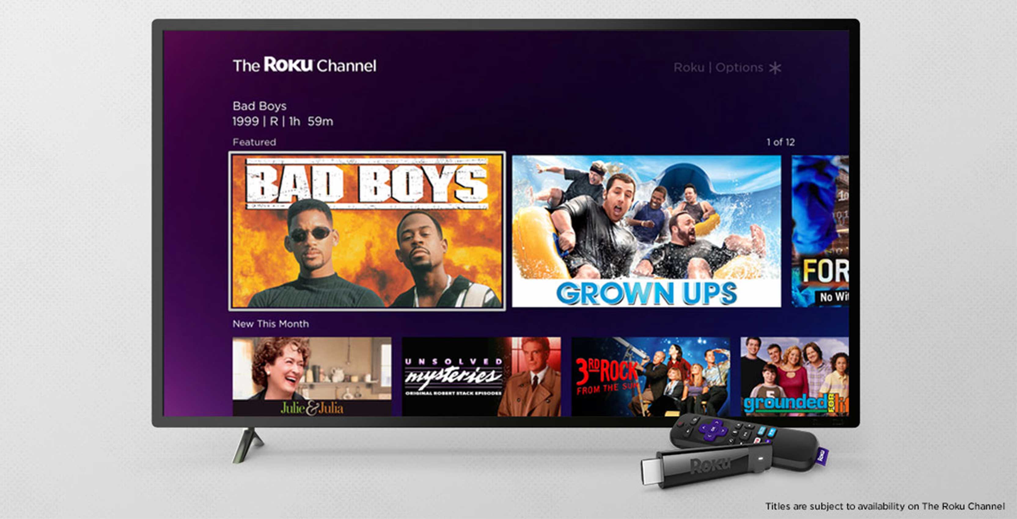
While the UI is starting to show its age, Roku CEO Anthony Wood says his company is working on an updated interface that will look similar to The Roku Channel, according to a report from CNET.
The Roku Channel is a recently launched app on the Roku platform that highlights all the free content that is available from Roku and other services.
The Roku Channel currently looks more like Netflix’s layout than Roku’s traditional appearance.
If you’re a fan of the comforting design of Roku’s home screen, this may come as a disappointment, but the company needed to do something about the low-resolution logos and texts that plague its system on a 4K TVs.
Source: CNET
MobileSyrup may earn a commission from purchases made via our links, which helps fund the journalism we provide free on our website. These links do not influence our editorial content. Support us here.


