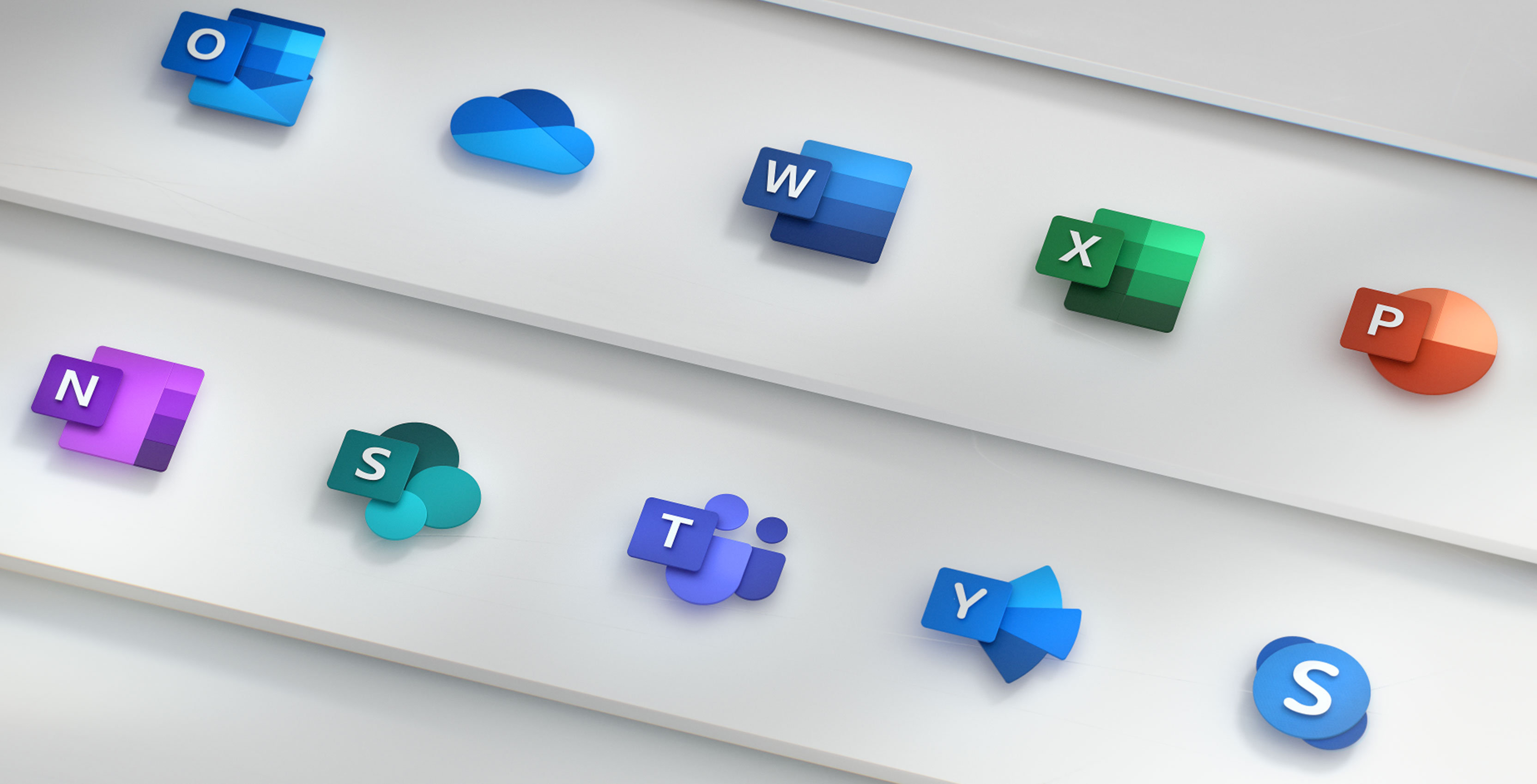
The Microsoft Office team has redesigned all the icons within the Office suite of products to better line up with the company’s new design language.
The last time these icons were updated was in 2013 when the company moved away from the soft gradient style of the previous icons to the hard and clean lines of the modern Microsoft style.
The company is now moving away from those hard lines to softer edges and new gradients. The regular apps in the Office Suite aren’t the only ones to get new icons either, Skype, Teams and Outlook are getting new icons too.
The icons are part of the smaller updates that have been happening to the Office Suite over the last year or so. This is kind of a weird update for Microsoft to update the product first and then refresh the icons later on to let people know that the service has been changing throughout the years.
These new icons are a pretty significant departure from the look of Microsoft’s products so it will be interesting to see if any of the Microsoft apps get updated to support the new design.
According to The Verge, Outlook for mobile will be getting an update soon, so maybe it will feature elements of this new design.
It’s also unclear when these icons are going to be rolling out. MobileSyrup has reached out to Microsoft for clarifications.
MobileSyrup may earn a commission from purchases made via our links, which helps fund the journalism we provide free on our website. These links do not influence our editorial content. Support us here.


