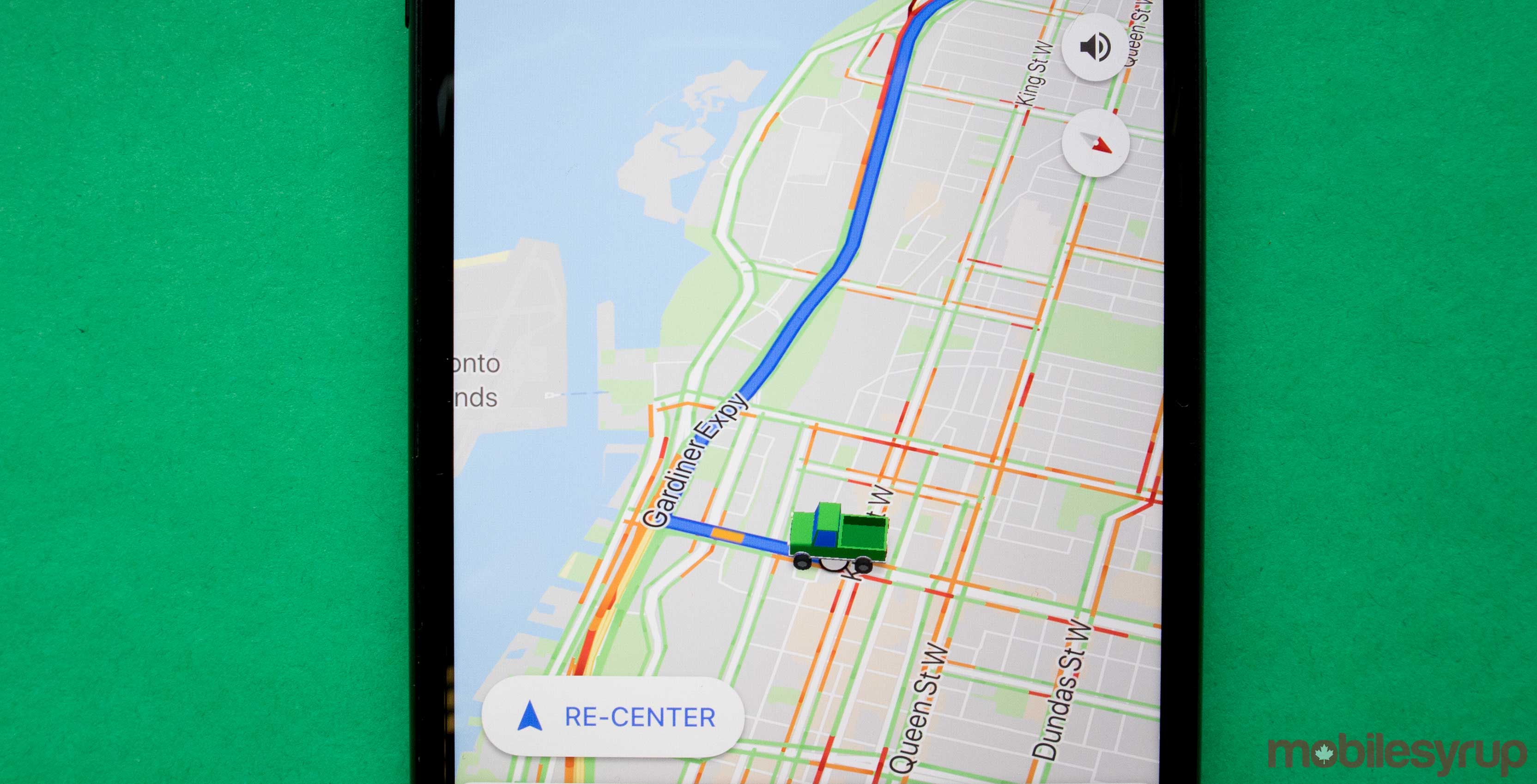
Google Assistant has had a busy few days recently, with several updates bringing new features to the platform.
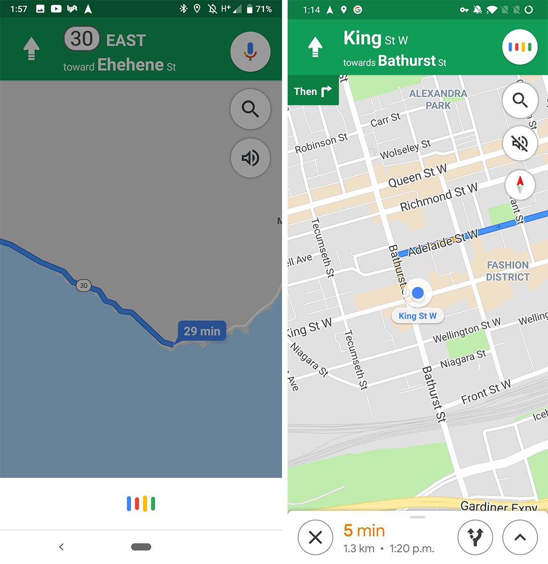
Google is continuing to expand on Assistant’s functionality with an update to Google Maps. The update, which is supposed to reduce the visual profile of Assistant to help drivers focus on driving, moves the Assistant to the bottom of the app.
Previously, a microphone button in the top right corner of Google Maps would turn white and play an animation with four colour bars when users tapped it or said “Hey Google.”
Instead, the updated Maps has a panel slide up from the bottom of the screen with the same animation. Further, the panel will change colour based on the time of day. In other words, it’s black at night and white during the day.
However, when compared to the old design, this new Assistant integration takes up more space than before. It’s a tad odd, especially considering the goal of the redesign was to be less visually distracting.

Google Maps new Assistant style (left) vs. old Assistant style (right)
Worse, the new design covers part of the navigation interface at the bottom of the screen. The added obscurity only serves to increase visual distraction.
Despite this, the update also allows commands to run in the background and not kick users out of Maps. This means when users issue commands to make calls or send messages, it happens in Google Maps.
Overall, the change has some benefits and downsides. While keeping drivers in Maps when resolving commands is excellent, the new Assistant interface is more distracting.
The changes appear to be part of a server-side update rolling out to Maps version 10.4.1.
Source: 9to5 Google Via: Android Authority
MobileSyrup may earn a commission from purchases made via our links, which helps fund the journalism we provide free on our website. These links do not influence our editorial content. Support us here.


