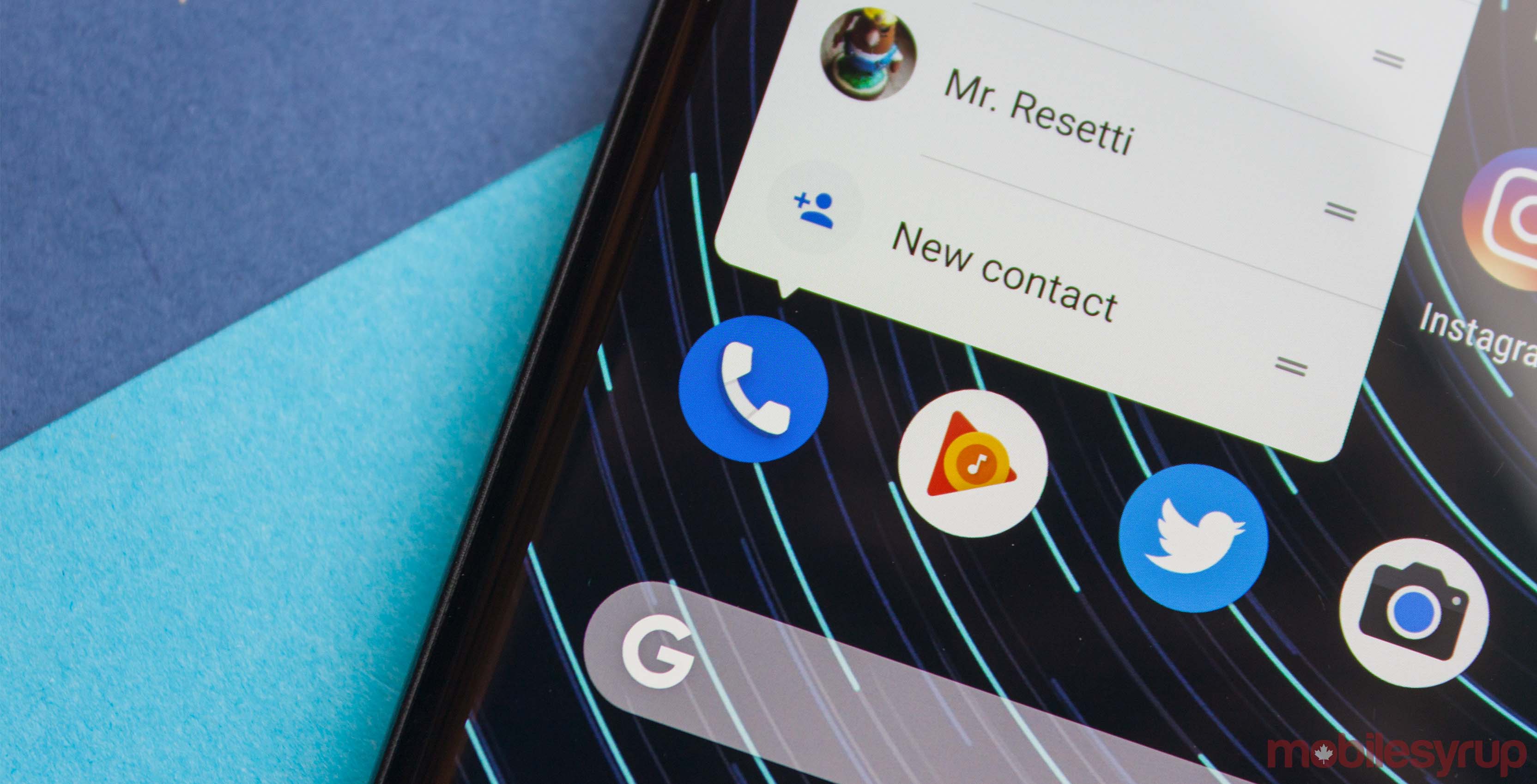
Google is rolling out a small visual update to its Phone app that changes the favourites screen.
The server-side update seems independent of Phone app version 27, with some users noting the change in older versions of the app.
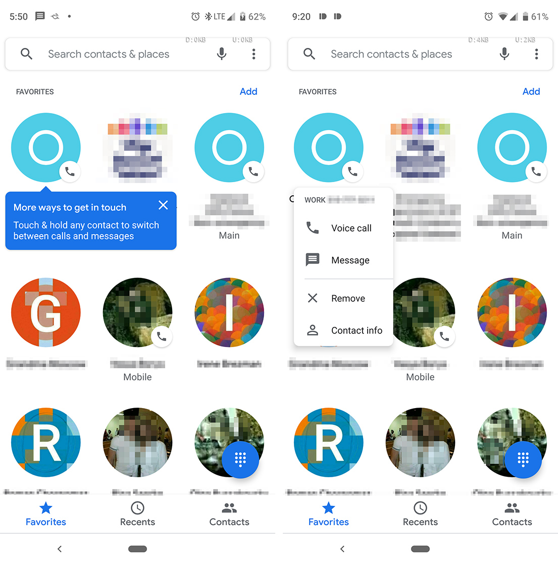
Primarily, the visual tweaks dispense with the dated square icons in favour of circular contact icons. Not only does this allow for more contacts to be visible on the screen at a given time, but it also fits with Google’s new Material Design, as well.

Additionally, the first time a user sees the new interface, a blue pop-up will explain how a long-press will switch between calls and messages.
Finally, below a user’s favourited contacts is a list of frequently contacted contacts. It’s a handy addition to the app, making it easy to get ahold of people you talk to often.
Have you received the update yet? Let us know down below if Google blessed your Phone app with more circles, or if you’ve still got the old look.
Source: Android Police
MobileSyrup may earn a commission from purchases made via our links, which helps fund the journalism we provide free on our website. These links do not influence our editorial content. Support us here.


