Following the roll-out of the new Material Design to Google Search on the web, mobile search is getting the redesign as well.
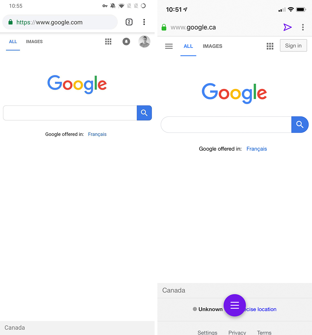
Unlike the desktop homepage, Google’s mobile website features a rounded search bar along with several other aspects of the modern design. This includes other rounded elements like buttons and a navigation drawer in the top left corner.
The navigation drawer offers quick access to Collections, Settings, ‘Your data in Search’ and more.

Old Google Search (left) vs. new Google Search (right)
In some regions, the redesign also includes the new Google Discover news feed. However, this wasn’t present on my devices at the time of writing.
Additionally, the new design detaches the search categories — like ‘All’ and ‘Images’ — from the search bar. Instead, the new design has the search categories floating beneath the search bar.

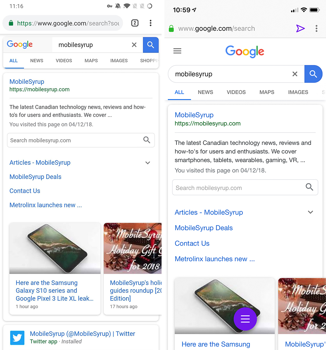
Old Google Search results (left) vs. new Google Search results (right)
Some people may find the mobile update less dramatic than the desktop update as the mobile website has undergone extensive A/B testing. I was hardpressed to point out the differences myself.
Interestingly, when I compared the look of Google on an iPhone to a OnePlus 6T, the 6T featured the older look. However, some searches resulted in Google Search switching to the more modern look.
Ultimately, it appears the visual tweaks are rolling out more widely to users now. It may take some time before the changes surface on your device.
Source: 9to5Google
MobileSyrup may earn a commission from purchases made via our links, which helps fund the journalism we provide free on our website. These links do not influence our editorial content. Support us here.


