Google is still in the process of updating its apps and services with its new, more modern Material Design. While Google updated Search’s web interface a few days ago, it’s doing so again.
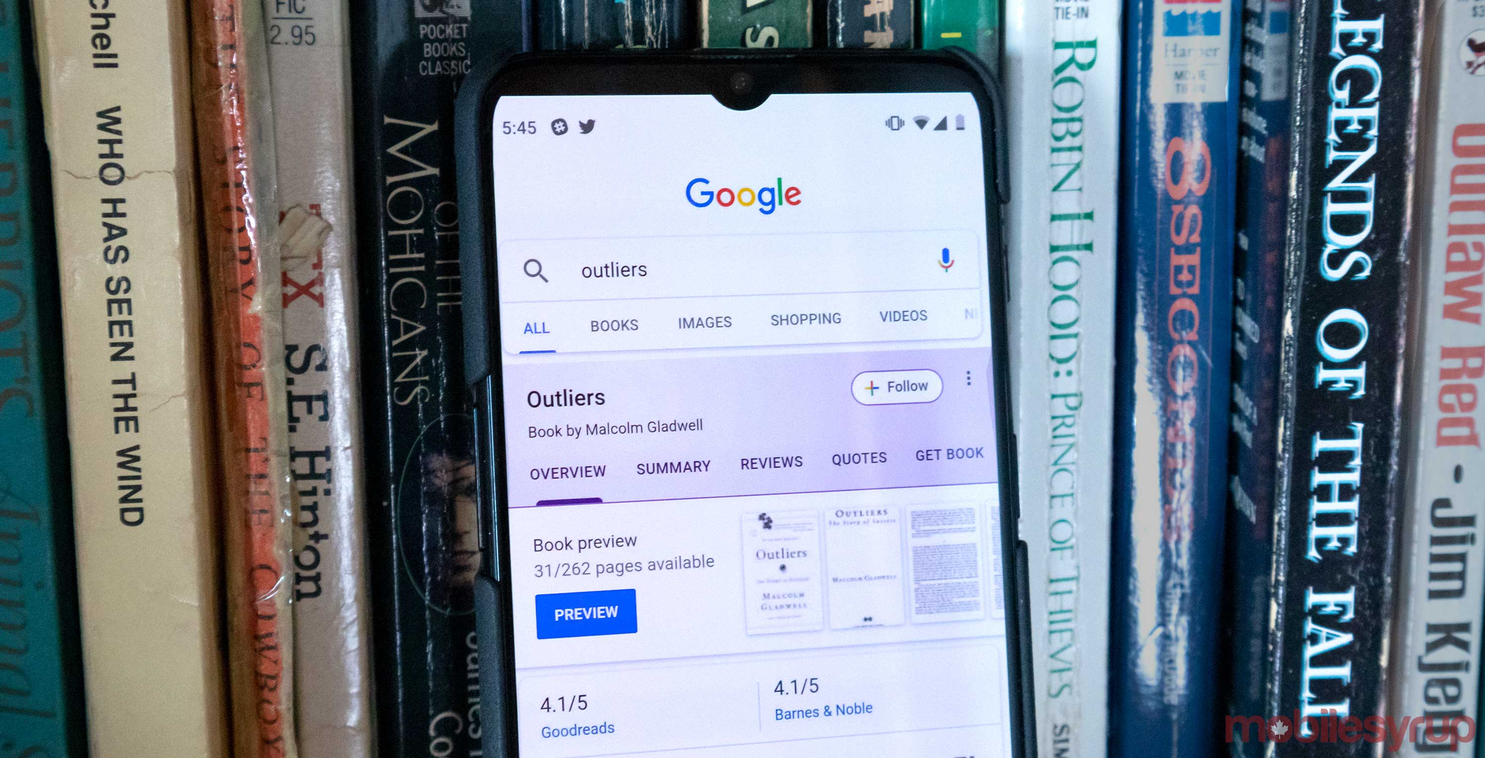
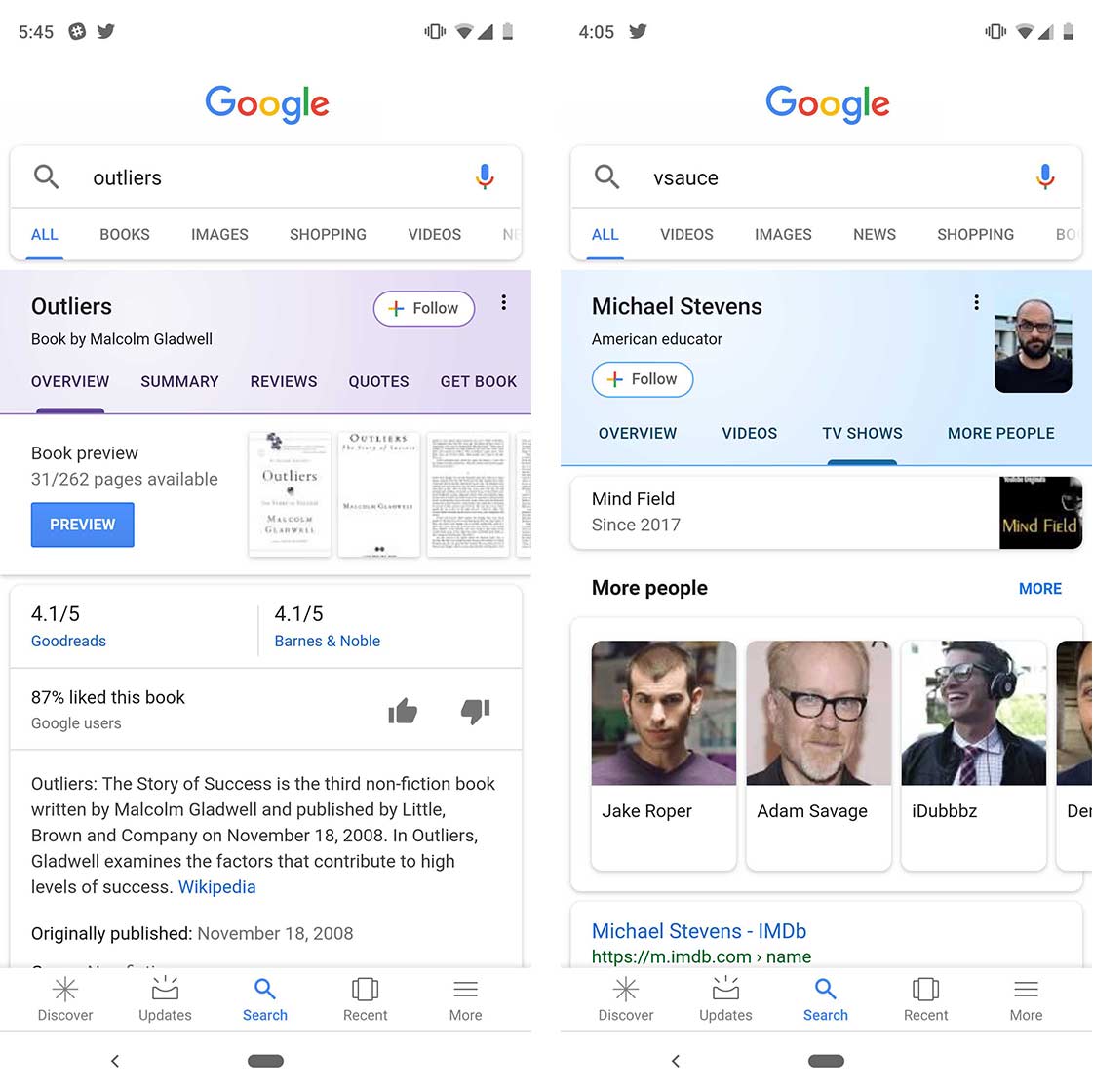
The latest update changes the colour of the Knowledge Graph search cards to make them fall in line with the company’s other updated apps like Messages and Contacts, according to Android Police.
The cards used to feature solid colour headers on mobile. The update adds a pastel gradient instead.
So far, it looks like different colours visualize specific content. Notable people are highlighted with blue, books with purple, songs and videos with red and movies with orange.
In the Play Store, Google makes use of the same colours. However, different colours represent different media types than they do in Search. For example, with the Play Store, orange is tied to music, while with Search the colour represents movies.
In addition to the colour change, the ‘Follow’ button on the cards has been replaced with the quad-coloured plus icon that has made its way into the web-based Gmail and Google Drive.
The new Knowledge Graph search cards seem to be rolling out as a server-side update since they haven’t appeared on many phones yet, according to Android Police.
Image source: Android Police
Source: Android Police
MobileSyrup may earn a commission from purchases made via our links, which helps fund the journalism we provide free on our website. These links do not influence our editorial content. Support us here.


