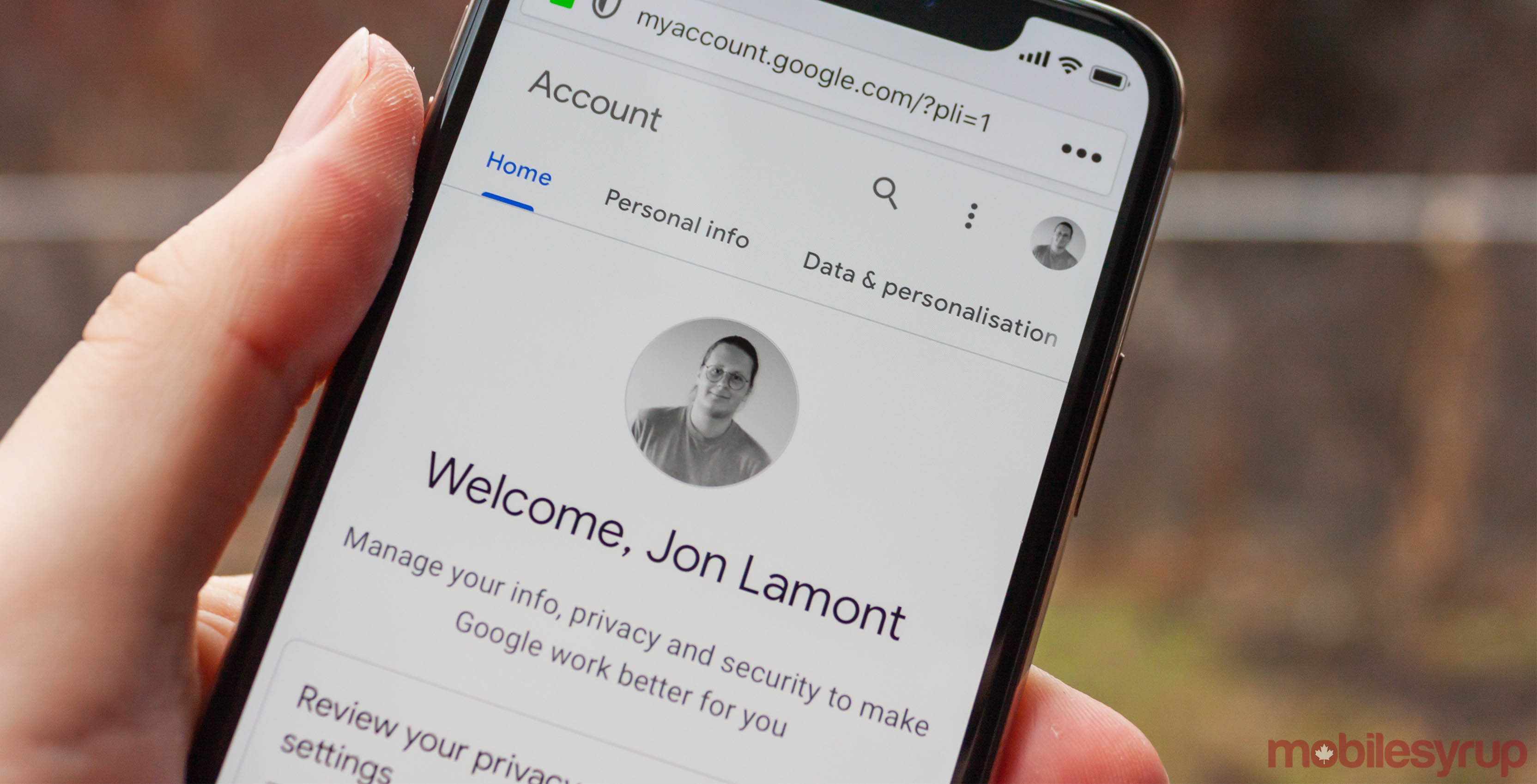
After redesigning the Google Account experience for Android this summer, Google is rolling it out to iOS and web users.
Primarily, the new design does two things: it transforms the Account experience with Material Design, and it makes it easier to find settings with a focus on search.
All the hallmarks of Google’s new Material Design are here: predominant use of white space, splashes of Google colours throughout, rounded icons and boxes. For an accounts and privacy settings page, it looks quite good.
First rolled out for Android this summer, the new Google Account experience is now on iOS and web – featuring summaries of your account information, more visible security options and more → https://t.co/skMY3mWOLH pic.twitter.com/1riO9qOhI5
— Google (@Google) December 20, 2018
As for search, it’s a welcome addition. The sheer wealth of settings and components to the Google Account experience can be daunting. Giving users the option to look for settings and features they’ll want to change improves the overall experience significantly.
The update also brings Google’s ‘guided steps’ to iOS and web users. This feature can take users through various settings to ensure everything is in good order.
For example, users can run a security checkup that will provide personalized recommendations on ways you can improve your security.
To access the new Google Account experience, navigate to myaccount.google.com.
MobileSyrup may earn a commission from purchases made via our links, which helps fund the journalism we provide free on our website. These links do not influence our editorial content. Support us here.


