Google Photos is the latest app from the Mountain View search giant to feature a new sharing menu on Android and iOS
Android VP of engineering David Burke previously said that fixing the share menu was a priority for the company and it seems fixing the sharing menu really has been a priority.
Just last month, Google Maps received an updated sharing menu that debuted along with Google News at Google I/O. Now, Photos is joining the party.
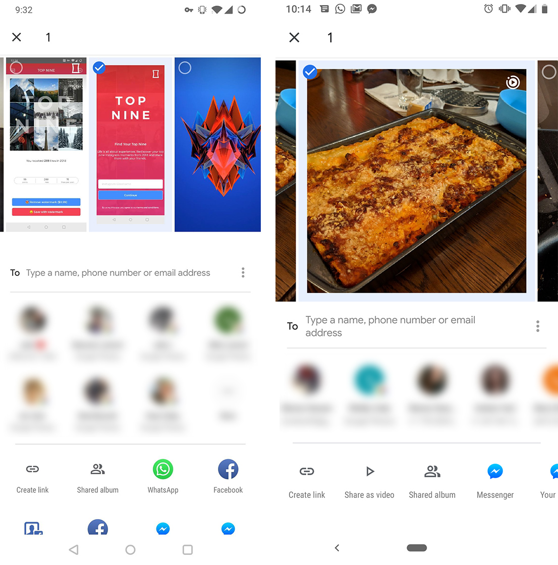
The new share menu is much smaller, reducing options to just two carousels. The first carousel contains a list of contacts. Users can scroll through the contacts horizontally. Below that is another list for apps.
The new design reduces the number of elements that need to be drawn on-screen when a user opens the menu, increasing the speed.

Old share menu (left) vs. new share menu (right)
Thanks to its smaller profile, users can see a bigger preview of the photo they want to share. However, landscape photos, unfortunately, are cropped into a square in the preview.
Finally, the sharing menu now has a search bar placed prominently at the top. The search option makes it easy to find exactly who or where you want to share something.
So far, the new menu has only appeared on a Pixel 3 at MobileSyrup. However, some users have reported seeing the new sharing menu on other devices, such as the Huawei Mate 20 Pro and even the Nexus 6P.

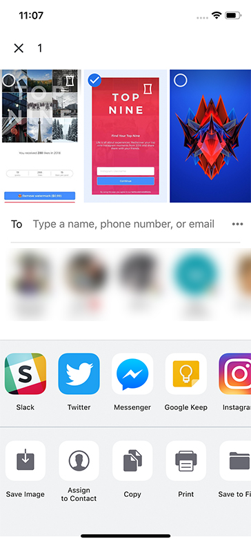
It’s also worth noting that Google Photos on iOS has a very similar redesigned sharing menu that seems to be an amalgamation of the Android sharing menu and the iOS sharing menu.
Source: 9to5 Google
MobileSyrup may earn a commission from purchases made via our links, which helps fund the journalism we provide free on our website. These links do not influence our editorial content. Support us here.


