
After showing up on a Russian phone last week, it looks like Google’s Play Books redesign is rolling out to more users.
The new look takes all the standard queues from Google’s new Material Design look. This means plenty more white, rounded corners and more.
Functionally not much as changed with the redesign. As before, Play Books opens on a large carousel of recently read books. It’s slightly bigger now, lending more prominence to your recents. Below the carousel are options to switch between e-books and audiobooks.
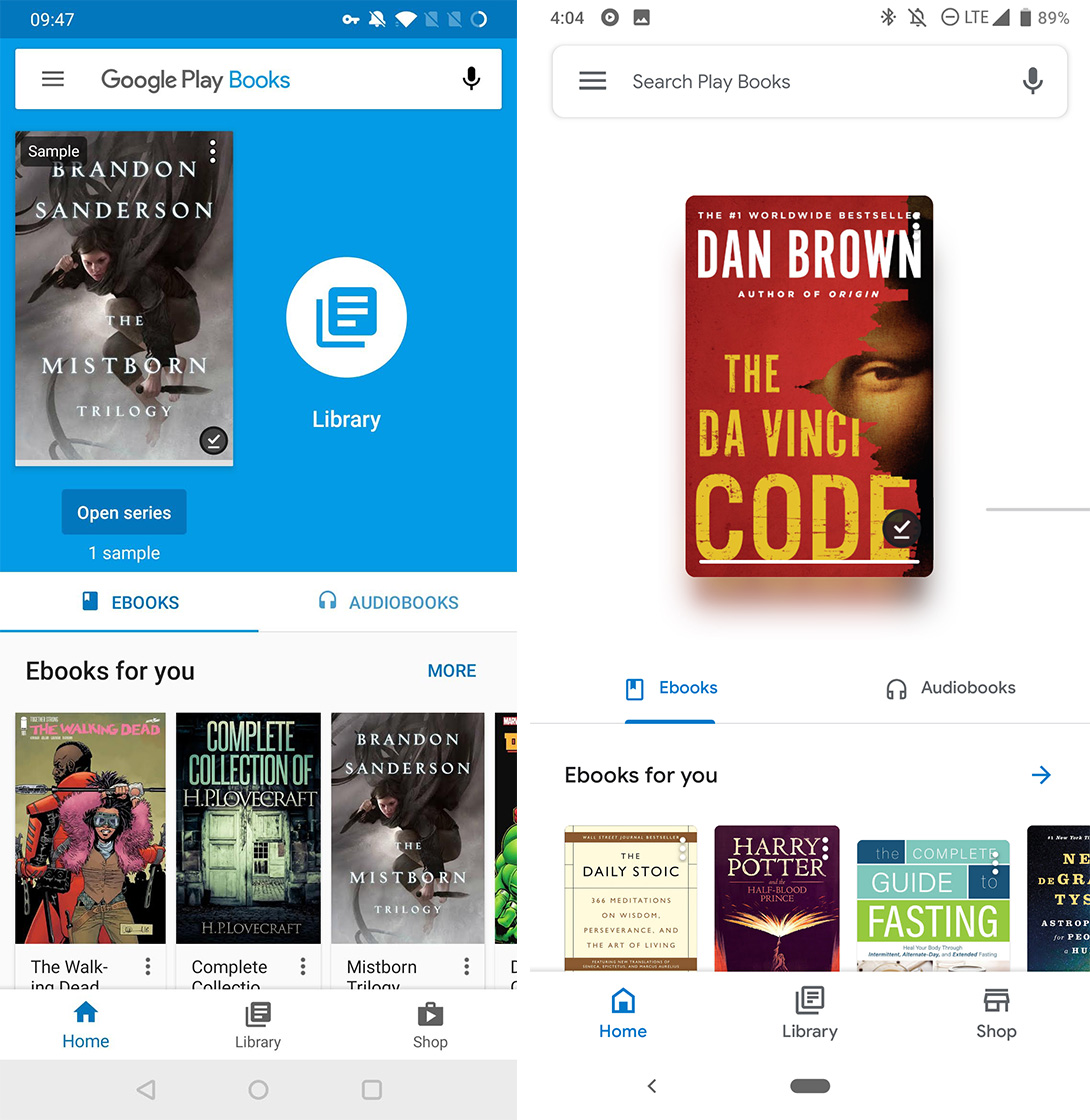
Google Play Books old (left) vs. new (right)
The search bar at the top now features rounded corners, and after launching the app, has a centred Play Books icon and the word ‘Books’ in it. After a few seconds, the icon and title fade to a search prompt.
The biggest thing you’ll notice here is the missing blue. Previously, Play Books turned the status bar and the background of the search bar and carousel blue. Now, all these areas are white, with subtle blue accents.
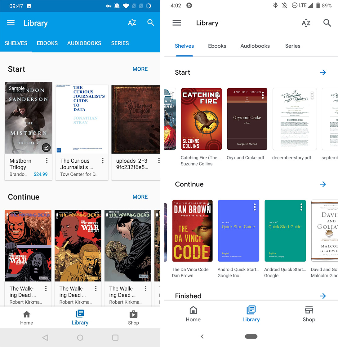
The ‘Library’ and ‘Shop’ pages are almost entirely unchanged, save for the new Material elements. Books now have rounded corners, and it looks like the app fits more items into each row.
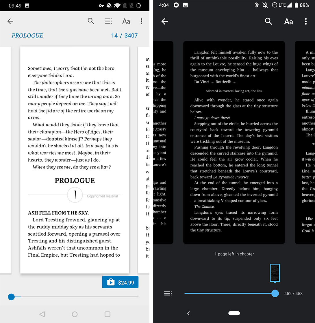
The reading mode also features some slight changes. For one, Google moved the chapter index button to the bottom left of the screen. Beyond that, everything is just Material themed.
However, the redesign is still part of a server-side rollout. It appears to be linked to app version 5.0.5, but updating to that version of Play Books doesn’t guarantee you’ll get the new look.
As always, you’ll just have to wait patiently until Google pushes the update your way.
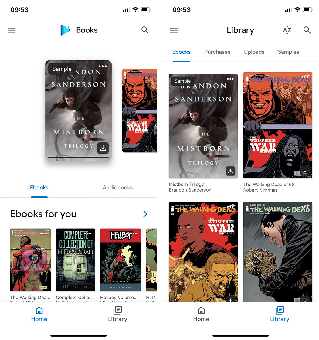
It’s also worth noting that the iOS version of Play Books sports the new Material Design as well — with a few minor tweaks primarily related to how iOS apps are structured.
Image credit: 9to5Google
Source: 9t05Google
MobileSyrup may earn a commission from purchases made via our links, which helps fund the journalism we provide free on our website. These links do not influence our editorial content. Support us here.


