Google’s Gmail redesign is starting to roll out to users on Android and iOS following its massive overhaul on web last year.
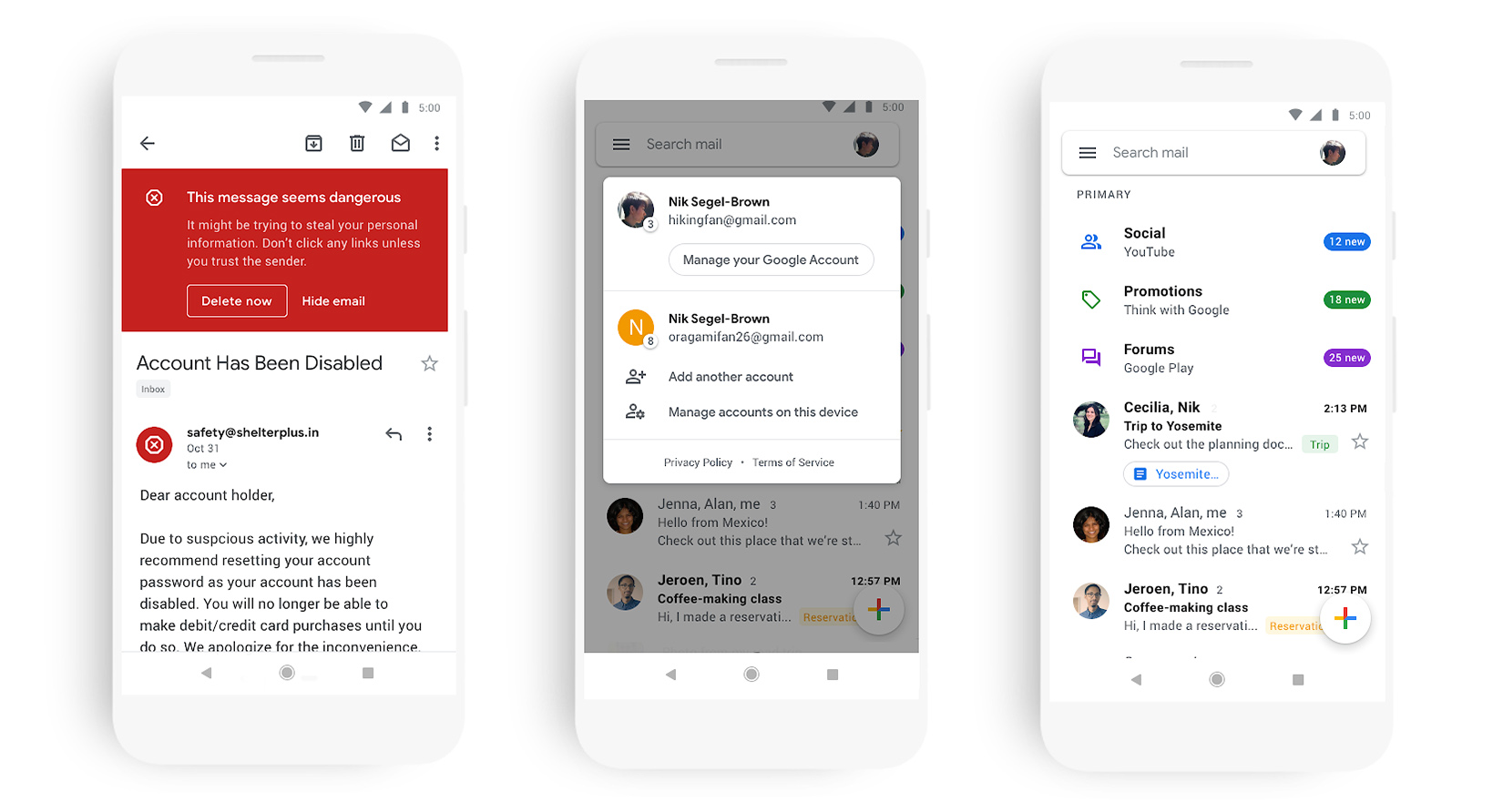
The new look continues with Google’s new Material theme, changing most of the app white and using colour to highlight essential elements.
Overall, the new app looks cleaner and lighter than before.
Further, users will notice heavy use of the Google Sans font, new icons and more. The account switcher has moved as well. Google has integrated it into the search bar at the top of the screen.
The redesign brings new spacing options as well, with default, comfortable and compact views.

Default spaces things out a fair bit and adds small buttons to directly view attachments in an email, while the comfortable view makes the app look more like the old Gmail app. Compact reduces the space and turns sender avatars into checkboxes.
It has a modern look, but it is still Gmail. If you’re a fan of Inbox — like I am — the new Gmail won’t replace it when it’s gone.
Google says the rollout will be “gradual,” starting January 29th on Android and continuing to iOS through the coming weeks.
Source: Google
MobileSyrup may earn a commission from purchases made via our links, which helps fund the journalism we provide free on our website. These links do not influence our editorial content. Support us here.


